Swipify 🃏
A beautiful and customizable Flutter widget for creating swipeable card stacks with smooth animations and depth effects.
Perfect for creating Tinder-like interfaces, product showcases, or any interactive card-based UI.
✨ Features
- 🎴 Swipeable card stack - Smooth drag-and-drop interactions
- 🎨 Fully customizable - Control colors, shadows, spacing, and more
- 📐 Depth effect - Cards scale and fade behind the top card
- ⚡ Smooth animations - Fluid transitions when cards change position
- 🎯 Type-safe - Generic support for any data type
- 🔧 Easy to use - Simple API with sensible defaults
- 🎭 Material Design 3 - Follows Flutter's latest design guidelines
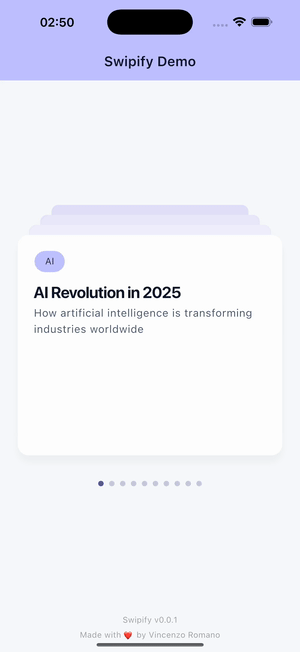
📸 Preview
🚀 Getting Started
Installation
Add swipify to your pubspec.yaml:
dependencies:
  swipify: ^0.0.1
Then run:
flutter pub get
Import
import 'package:swipify/swipify.dart';
💡 Usage
Basic Example
SwipifyWidget<String>(
  items: ['Card 1', 'Card 2', 'Card 3', 'Card 4'],
  builder: (context, item) {
    return Center(
      child: Text(
        item,
        style: TextStyle(fontSize: 24, fontWeight: FontWeight.bold),
      ),
    );
  },
)
Advanced Example with Custom Styling
SwipifyWidget<Map<String, dynamic>>(
  items: [
    {
      'title': 'AI Revolution in 2025',
      'subtitle': 'How artificial intelligence is transforming industries',
      'tag': 'AI',
      'tagBgColor': Color(0xFFBFC2FF),
      'tagFgColor': Color(0xFF1E293B),
    },
    // Add more items...
  ],
  cards: 4, // Number of cards visible in the stack
  style: SwipifyStyle(
    deckColor: Colors.grey.shade200,
    shadowColor: Colors.black26,
    elevation: 15.0,
    yOffset: 44.0,
  ),
  onCardChanged: (index, item) {
    // Called when a card is swiped
    print('New card at index $index: ${item['title']}');
    // Update your state, analytics, etc.
  },
  builder: (context, item) {
    return Padding(
      padding: const EdgeInsets.all(24.0),
      child: Column(
        crossAxisAlignment: CrossAxisAlignment.start,
        children: [
          Chip(
            label: Text(item['tag']),
            backgroundColor: item['tagBgColor'],
          ),
          SizedBox(height: 12),
          Text(
            item['title'],
            style: Theme.of(context).textTheme.titleLarge,
          ),
          SizedBox(height: 8),
          Text(
            item['subtitle'],
            style: Theme.of(context).textTheme.bodyLarge,
          ),
        ],
      ),
    );
  },
)
Example with State Management
class MyWidget extends StatefulWidget {
  @override
  State<MyWidget> createState() => _MyWidgetState();
}

class _MyWidgetState extends State<MyWidget> {
  int currentCardIndex = 0;

  @override
  Widget build(BuildContext context) {
    return Column(
      children: [
        Text('Current Card: $currentCardIndex'),
        Expanded(
          child: SwipifyWidget<String>(
            items: ['Card 1', 'Card 2', 'Card 3'],
            onCardChanged: (index, item) {
              setState(() {
                currentCardIndex = index;
              });
              // Track analytics
              analytics.logEvent('card_swiped', {'item': item});
            },
            builder: (context, item) {
              return Center(child: Text(item));
            },
          ),
        ),
      ],
    );
  }
}
🎛️ API Reference
SwipifyWidget
The main widget for creating swipeable card stacks.
Parameters
| Parameter | Type | Required | Default | Description |
|---|---|---|---|---|
items |
List<T> |
✅ Yes | - | The list of items to display as cards |
builder |
Widget Function(BuildContext, T) |
✅ Yes | - | Builder function to create card content |
cards |
int |
❌ No | 4 |
Maximum number of cards visible in the stack |
style |
SwipifyStyle? |
❌ No | null |
Custom styling for the card stack |
onCardChanged |
void Function(int, T)? |
❌ No | null |
Callback called when a card is swiped |
SwipifyStyle
Configuration class for customizing the appearance of the card stack.
Properties
| Property | Type | Default | Description |
|---|---|---|---|
deckColor |
Color |
Colors.white |
Color of the overlay on cards behind the top card |
shadowColor |
Color |
Colors.black12 |
Color of the shadow cast by each card |
elevation |
double |
15.0 |
Base elevation multiplier (higher = more prominent shadows) |
yOffset |
double |
44.0 |
Vertical spacing between cards in pixels |
Example
SwipifyStyle customStyle = SwipifyStyle(
  deckColor: Color(0xFFE6E8F2),
  shadowColor: Colors.black.withOpacity(0.1),
  elevation: 10.0,
  yOffset: 50.0,
);
SwipifyStyle Methods
// Create a copy with modified properties
SwipifyStyle newStyle = style.copyWith(
  elevation: 20.0,
  yOffset: 60.0,
);
🎨 Customization Examples
Changing Card Appearance
SwipifyWidget<Product>(
  items: products,
  style: SwipifyStyle(
    deckColor: Colors.blueGrey.shade100,
    shadowColor: Colors.blue.withOpacity(0.3),
    elevation: 20.0,
    yOffset: 50.0,
  ),
  builder: (context, product) {
    return YourCustomCardWidget(product);
  },
)
Controlling Number of Visible Cards
SwipifyWidget<Item>(
  items: myItems,
  cards: 3, // Show only 3 cards in the stack
  builder: (context, item) {
    return ItemCard(item);
  },
)
🏗️ How It Works
- Card Stack: Cards are displayed in a stack with the topmost card fully visible
- Depth Effect: Cards behind the top card are:
- Slightly scaled down (75% to 95% of full size)
- Positioned higher by
yOffsetpixels - Covered by a semi-transparent overlay
- Swipe Gesture: When the top card is dragged away:
- The card disappears immediately
- Cards behind animate smoothly to their new positions
- The removed card is moved to the bottom of the stack
- Continuous Loop: The stack cycles through all items indefinitely
📱 Platform Support
- ✅ Android
- ✅ iOS
- ✅ Web
- ✅ macOS
- ✅ Windows
- ✅ Linux
🤝 Contributing
Contributions are welcome! Please feel free to submit a Pull Request.
- Fork the repository
- Create your feature branch (
git checkout -b feature/amazing-feature) - Commit your changes (
git commit -m 'Add some amazing feature') - Push to the branch (
git push origin feature/amazing-feature) - Open a Pull Request
📝 License
This project is licensed under the MIT License - see the LICENSE file for details.
🙏 Acknowledgments
- Inspired by Tinder's swipe interface
- Built with Flutter's powerful animation framework
- Uses Material Design 3 principles
📧 Contact
For questions or suggestions, please open an issue on GitHub.
Made with ❤️ by Vincenzo Romano