Swipe Cards Package
The Swipe Cards package provides customizable card animations for Flutter applications. It includes two types of animations: Shuffle Card Animation and Stack Card Animation. This package allows developers to easily integrate card swiping functionality into their apps with minimal setup.
Features
- Shuffle Card Animation: Allows cards to be swiped in both directions (left and right).
- Stack Card Animation: Allows cards to be swiped forward only (left swipe does nothing).
- Customizable Card Styles: Define card height, width, colors, and border radius to suit your app's design.
- Easy Integration: Simple API to use the animations in your Flutter app.
Installation
To install the Swipe Cards package, add the following dependency to your pubspec.yaml file:
dependencies:
  swipe_card_animation: ^1.0.0
Usage
Import the Package
import 'package:swipe_card_animation/swipe_card_animation.dart';
Example of Shuffle Card Animation
ShuffleCardAnimation(
  cardStyle: CardStyle(
    height: 300,
    width: 200,
    activeColor: Colors.blue,
    inactiveColor: Colors.grey,
    borderRadius: 15,
  ),
  totalCards: 10,
  builder: (context, index) {
    return Container(
      alignment: Alignment.center,
      child: Text('Card $index'),
    );
  },
);
Example of Stack Card Animation
StackCardAnimation(
  cardStyle: CardStyle(
    height: 300,
    width: 200,
    activeColor: Colors.green,
    inactiveColor: Colors.grey,
    borderRadius: 15,
  ),
  totalCards: 10,
  builder: (context, index) {
    return Container(
      alignment: Alignment.center,
      child: Text('Card $index'),
    );
  },
);
Central Card Animation
The CardAnimation class provides a unified interface for both Shuffle and Stack animations. You can specify the type of animation and its direction.
Example
CardAnimation(
  animationType: AnimationType.shuffle, // or AnimationType.stack
  cardStyle: CardStyle(
    height: 300,
    width: 200,
    activeColor: Colors.red,
    inactiveColor: Colors.grey,
    borderRadius: 15,
  ),
  totalCards: 10,
  builder: (context, index) {
    return Container(
      alignment: Alignment.center,
      child: Text('Card $index'),
    );
  },
);
Running Examples
The examples for both ShuffleCardAnimation and StackCardAnimation are located in the example/ folder. To run these examples:
-
Navigate to the
example/directory:cd example -
Install the dependencies:
flutter pub get -
Run any example app:
flutter run example1
flutter run example2
flutter run example3
flutter run example4
flutter run example5
This will launch a Flutter app that demonstrates the card animations.
Adding Video Content
Here are some example GIFs demonstrating the card animations in action:
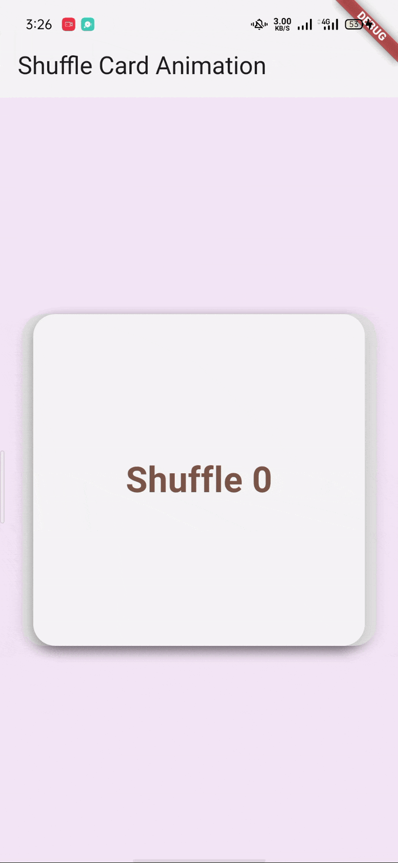
Shuffle animation showing cards swiping left and right.
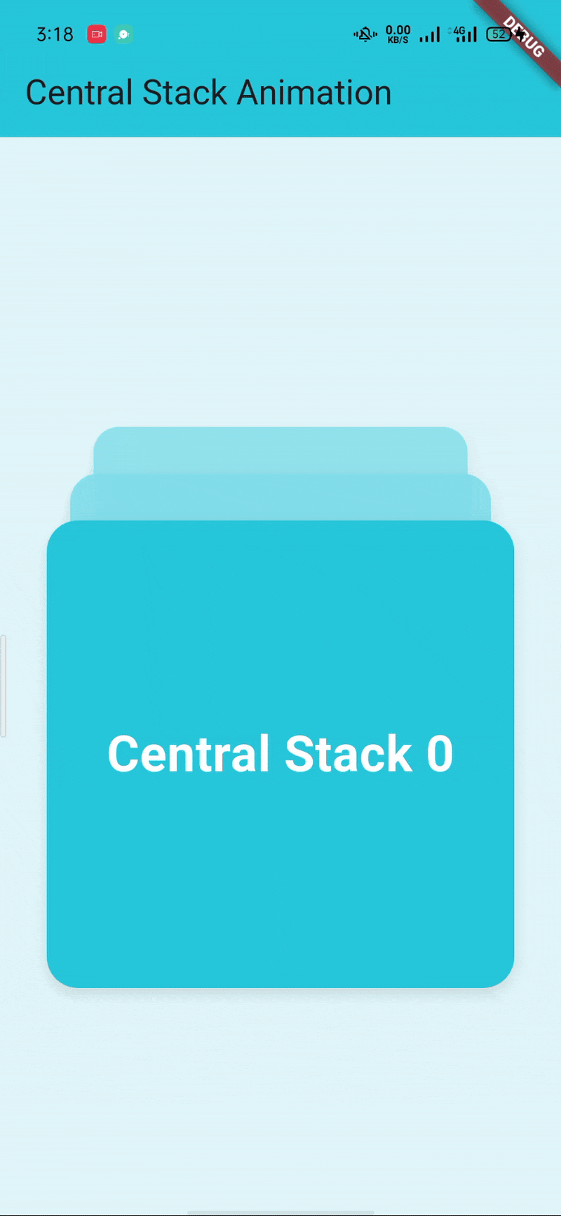
Stack animation showing only forward card swipes.
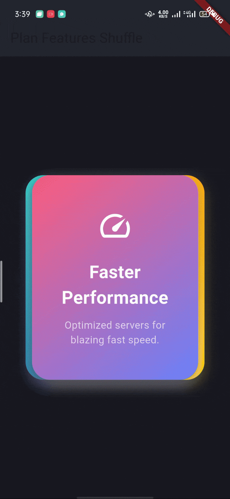
Example of customizing card colors and size.
Demonstrates the scaling of cards as they are swiped.
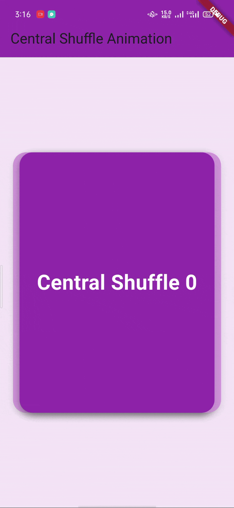
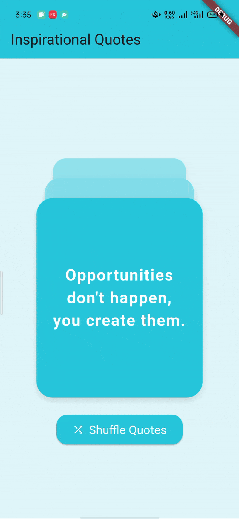
The central card animation that integrates both Shuffle and Stack types.
Contributing
Contributions are welcome! Please open an issue or submit a pull request for any enhancements or bug fixes.
License
This project is licensed under the MIT License - see the LICENSE file for details.