Simplifying your widget tree structure by defining widgets using methods.


Thanks to the introduction of extension methods in Dart 2.7.0, styled_widget makes it possible to build widget tree`s more readable and efficient.
styled_widget is build as a tool to enhance your Flutter development experience and to seamlessly integrate with your codebase.
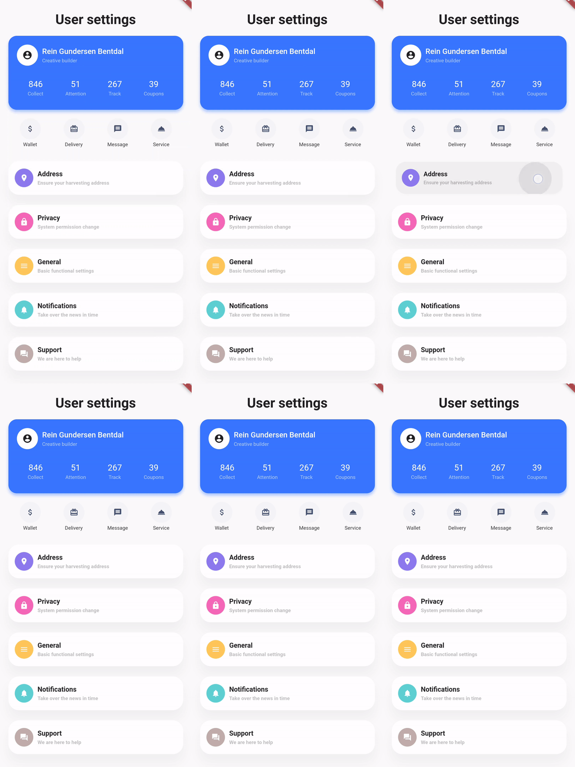
Showcase
| Design, Code | Design, Code | Design, Code |
|---|---|---|
 |
 |
 |
Basic example
styled_widget has a bottom up approach to building widget`s. This means you start with the inner most element and layer widget`s on top. The following example is structured as follows:
Icon -> blue circle -> light blue circle -> card -> background
Icon(OMIcons.home, color: Colors.white)
  .padding(all: 10)
  .decorated(color: Color(0xff7AC1E7), shape: BoxShape.circle)
  .padding(all: 15)
  .decorated(color: Color(0xffE8F2F7), shape: BoxShape.circle)
  .padding(all: 20)
  .card(
    elevation: 10,
    shape: RoundedRectangleBorder(
      borderRadius: BorderRadius.circular(20),
    ),
  )
  .alignment(Alignment.center)
  .backgroundColor(Color(0xffEBECF1));
Raw Flutter (click to show)
DecoratedBox(
  decoration: BoxDecoration(
    color: Color(0xffEBECF1),
  ),
  child: Align(
    alignment: Alignment.center,
    child: Card(
      elevation: 10,
      shape: RoundedRectangleBorder(
        borderRadius: BorderRadius.circular(20),
      ),
      child: Padding(
        padding: EdgeInsets.all(20),
        child: DecoratedBox(
          decoration: BoxDecoration(
            color: Color(0xffE8F2F7),
            shape: BoxShape.circle,
          ),
          child: Padding(
            padding: EdgeInsets.all(15),
            child: DecoratedBox(
              decoration: BoxDecoration(
                color: Color(0xff7AC1E7),
                shape: BoxShape.circle,
              ),
              child: Padding(
                padding: EdgeInsets.all(10),
                child: Icon(
                  OMIcons.home,
                  color: Colors.white,
                ),
              ),
            ),
          ),
        ),
      ),
    ),
  ),
);

Docs
See the documentation at styled_widget/wiki for more information about using styled_widget!
Quicklinks
