styled_button
A highly customizable Flutter package for creating elegant and reusable social login buttons with built-in icon support for popular authentication providers.
🚀 Installation
Add this to your pubspec.yaml:
dependencies:
  styled_button: <latest_version>
Then run:
flutter pub get
📦 Import
import 'package:styled_button/styled_button.dart';
💡 Usage Example
StyledButton(
submit: () {
print('Google login pressed');
},
provider: AuthButtonProvider.google,
text: 'Continue with Google',
)
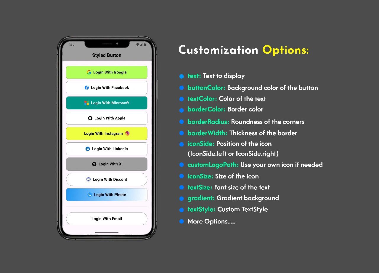
🛠 Customization Options
You can customize the button with the following parameters:
text: Text to displaybuttonColor: Background color of the buttontextColor: Color of the textborderColor: Border colorborderRadius: Roundness of the cornersborderWidth: Thickness of the bordericonSide: Position of the icon (IconSide.leftorIconSide.right)customLogoPath: Use your own icon if needediconSize: Size of the icontextSize: Font size of the textgradient: Gradient backgroundtextStyle: CustomTextStyle
🔌 Supported Providers
AuthButtonProvider.google
AuthButtonProvider.facebook
AuthButtonProvider.twitter
AuthButtonProvider.apple
AuthButtonProvider.github
AuthButtonProvider.linkedin
AuthButtonProvider.microsoft
AuthButtonProvider.instagram
AuthButtonProvider.discord
AuthButtonProvider.phone
📂 Example with Custom Icon
📂 Add Assets
Make sure to include the assets used by this package:
flutter:
  assets:
    - assets/icon/phone.png
StyledButton(
  submit: () => print('Login with phone'),
  provider: AuthButtonProvider.phone,
  customLogoPath: 'assets/icon/phone.png',
  text: 'Login with Phone',
)