StreamChannelHeader constructor
const
StreamChannelHeader({
- Key? key,
- bool showBackButton = true,
- VoidCallback? onBackPressed,
- VoidCallback? onTitleTap,
- bool showTypingIndicator = true,
- VoidCallback? onImageTap,
- bool showConnectionStateTile = false,
- Widget? title,
- Widget? subtitle,
- bool? centerTitle,
- Widget? leading,
- List<
Widget> ? actions, - Color? backgroundColor,
- double elevation = 1,
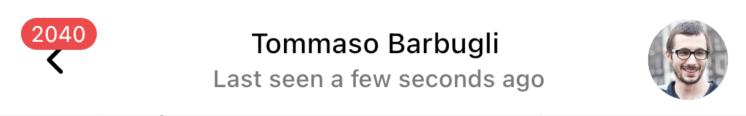
Shows information about the current Channel.
class MyApp extends StatelessWidget {
  final StreamChatClient client;
  final Channel channel;

  MyApp(this.client, this.channel);

  @override
  Widget build(BuildContext context) {
    return MaterialApp(
      home: StreamChat(
        client: client,
        child: StreamChannel(
          channel: channel,
          child: Scaffold(
            appBar: ChannelHeader(),
          ),
        ),
      ),
    );
  }
}
Usually you would use this widget as an AppBar inside a Scaffold. However, you can also use it as a normal widget.
Make sure to have a StreamChannel ancestor in order to provide the information about the channel.
Every part of the widget uses a StreamBuilder to render the channel information as soon as it updates.
By default the widget shows a backButton that calls Navigator.pop. You can disable this button using the showBackButton property. Alternatively, you can override this behaviour via the onBackPressed callback.
The UI is rendered based on the first ancestor of type StreamChatTheme and the StreamChatThemeData.channelHeaderTheme property. Modify it to change the widget's appearance.
Implementation
const StreamChannelHeader({
  super.key,
  this.showBackButton = true,
  this.onBackPressed,
  this.onTitleTap,
  this.showTypingIndicator = true,
  this.onImageTap,
  this.showConnectionStateTile = false,
  this.title,
  this.subtitle,
  this.centerTitle,
  this.leading,
  this.actions,
  this.backgroundColor,
  this.elevation = 1,
}) : preferredSize = const Size.fromHeight(kToolbarHeight);