StepWise
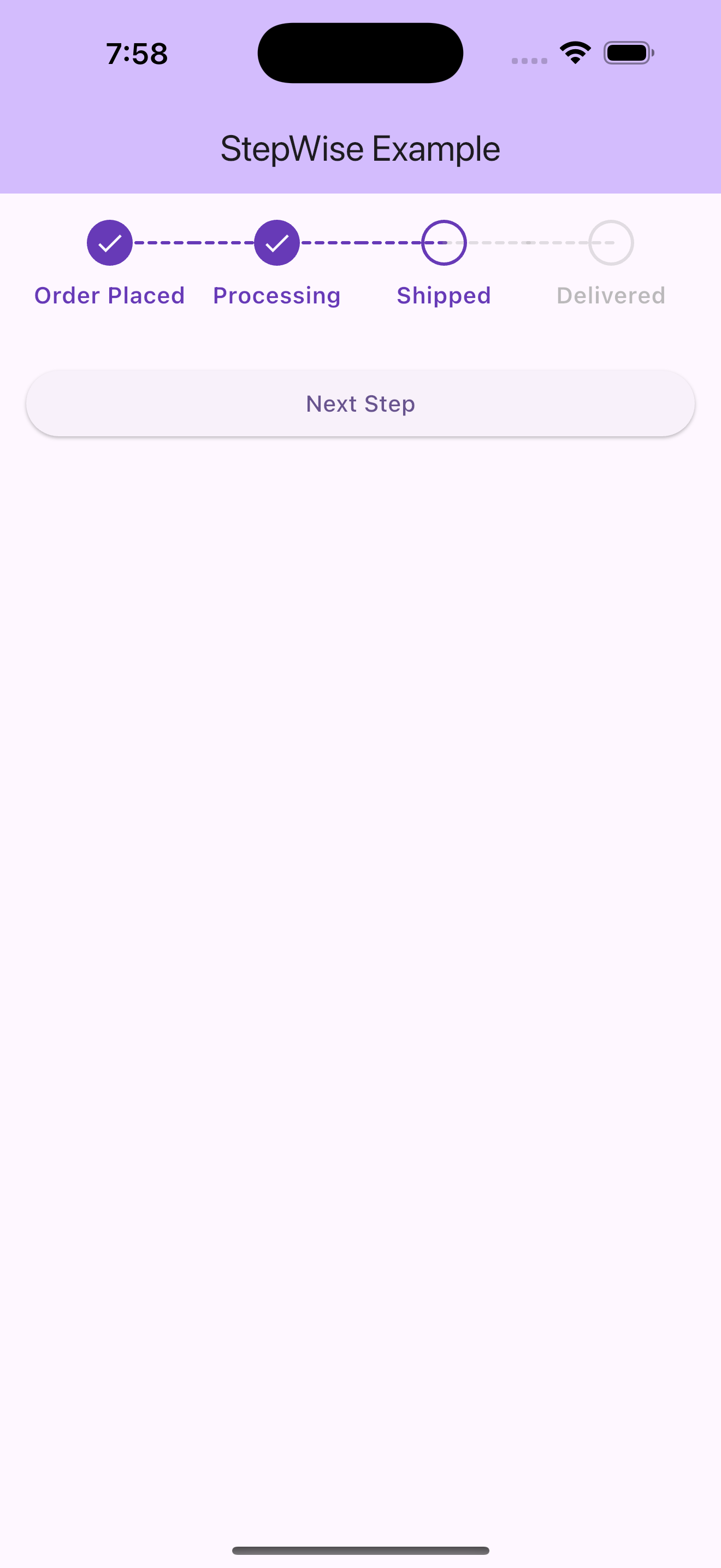
A beautiful and customizable stepper widget for Flutter applications that provides a flexible way to show progress through a series of steps.
Features
- Customizable colors for active and inactive states
- Adjustable circle radius and line thickness
- Customizable text styling
- Dotted line connectors between steps
- Responsive layout
- Support for completed, current, and upcoming steps
Installation
Add the following to your pubspec.yaml file:
dependencies:
  stepwise: ^1.0.6
Usage
import 'package:stepwise/stepwise.dart';

StepWise(
  currentStep: 2,
  steps: const [
    'Step 1',
    'Step 2',
    'Step 3',
    'Step 4',
  ],
  activeColor: Colors.blue,
  inactiveColor: Colors.grey,
  textActiveColor: Colors.blue,
  textInactiveColor: Colors.grey,
  circleRadius: 24,
  lineThickness: 1,
  fontSize: 13,
  fontWeight: FontWeight.w500,
)
Customization
The StepWise widget provides several customization options:
currentStep: The current active step (1-based index)steps: List of step labelsactiveColor: Color for active/completed stepsinactiveColor: Color for inactive stepstextActiveColor: Text color for active stepstextInactiveColor: Text color for inactive stepscircleRadius: Size of the step circleslineThickness: Thickness of the connecting linesfontSize: Size of the step labelsfontWeight: Weight of the step labels
Example
See the example directory for a complete example of how to use the StepWise widget.
License
This project is licensed under the MIT License - see the LICENSE file for details.