state_illustrator 🎨

A Flutter helper widget to display loading, empty, error, and success screen states with customizable illustrations and smooth transitions.
🎬 GIF Previews
| Loading | Empty | Error |
|---|---|---|
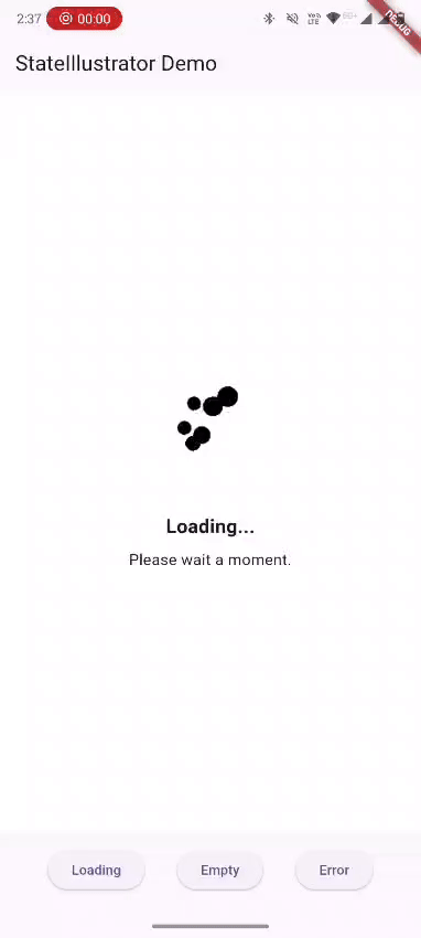 |
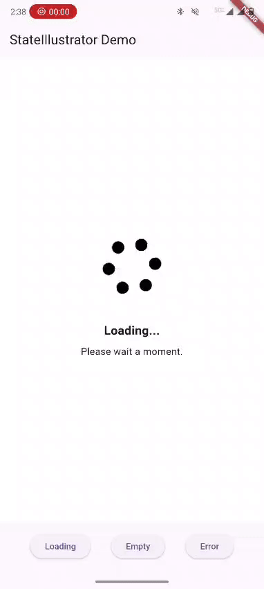 |
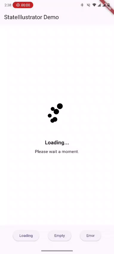 |
🚀 Features
- 📦 Built‑in support for loading, empty, error, and success states
- 🎨 Supports Lottie (
.json), SVG (.svg), and PNG (.png) assets - 🔁 Smooth fade transition between states
- 🔧 Easily customizable themes, titles, subtitles, and retry button
- 🧩 Use custom widgets in place of illustrations
📌 Screenshots
(Add screenshots or GIFs showing each state)
📦 Installation
Add the dependency to your pubspec.yaml:
dependencies:
  state_illustrator: ^1.0.0
Then run:
flutter pub get
🧠 How It Works
StateIllustrator observes a view state and shows the appropriate UI:
| ViewState | Displays |
|---|---|
initial |
Empty placeholder |
loading |
Loading animation or asset |
empty |
Empty illustration |
error |
Error illustration + retry |
success |
Your content (child) |
📘 Usage
Basic Example
StateIllustrator(
  state: _state,
  onRetry: () => _fetchData(),
  child: Center(
    child: Text(
      'Data Loaded Successfully!',
      style: TextStyle(fontSize: 18, fontWeight: FontWeight.bold),
    ),
  ),
)
🎨 Customization
You can override all visuals using GlobalIllustratorConfig:
final globalConfig = GlobalIllustratorConfig(
  loadingConfig: IllustrationConfig(
    assetPath: 'assets/animations/loading.json',
    assetType: AssetType.lottie,
    title: 'Loading...',
    subtitle: 'Fetching data, please wait...',
  ),
  emptyConfig: IllustrationConfig(
    assetPath: 'assets/images/empty.svg',
    assetType: AssetType.svg,
    title: 'No Items',
    subtitle: 'Try adding some items!',
  ),
  errorConfig: IllustrationConfig(
    assetPath: 'assets/images/error.png',
    assetType: AssetType.png,
    title: 'Something went wrong',
    subtitle: 'Please try again later.',
    buttonStyle: ElevatedButton.styleFrom(primary: Colors.red),
  ),
  theme: IllustratorTheme(
    backgroundColor: Colors.white,
    titleStyle: TextStyle(fontSize: 22, fontWeight: FontWeight.bold),
    subtitleStyle: TextStyle(fontSize: 16),
  ),
);
Then apply it in your widget:
StateIllustrator(
  state: _state,
  config: globalConfig,
  onRetry: _fetchData,
  child: YourContentWidget(),
)
🧩 Custom Widgets Support
If you want complete control, provide customWidget:
IllustrationConfig(
  customWidget: YourCustomWidget(),
)
This overrides any asset.
🛠 Defaults
The package includes default assets and texts:
| State | Asset Path | Title | Subtitle |
|---|---|---|---|
| Loading | assets/default/loading.json |
Loading... | Please wait a moment. |
| Empty | assets/default/empty.svg |
Nothing here | No data available. |
| Error | assets/default/error.png |
Oops! | Something went wrong. |
📦 Contributing
Contributions are welcome! To contribute:
- 🍴 Fork this repo
- 🧩 Create your feature branch (git checkout -b feature/AmazingFeature)
- 📝 Commit your changes (git commit -m "Add AmazingFeature")
- 🚀 Push (git push origin feature/AmazingFeature)
- 🔃 Open a Pull Request
📝 License
This project is licensed under the MIT License. © ASHISH1317