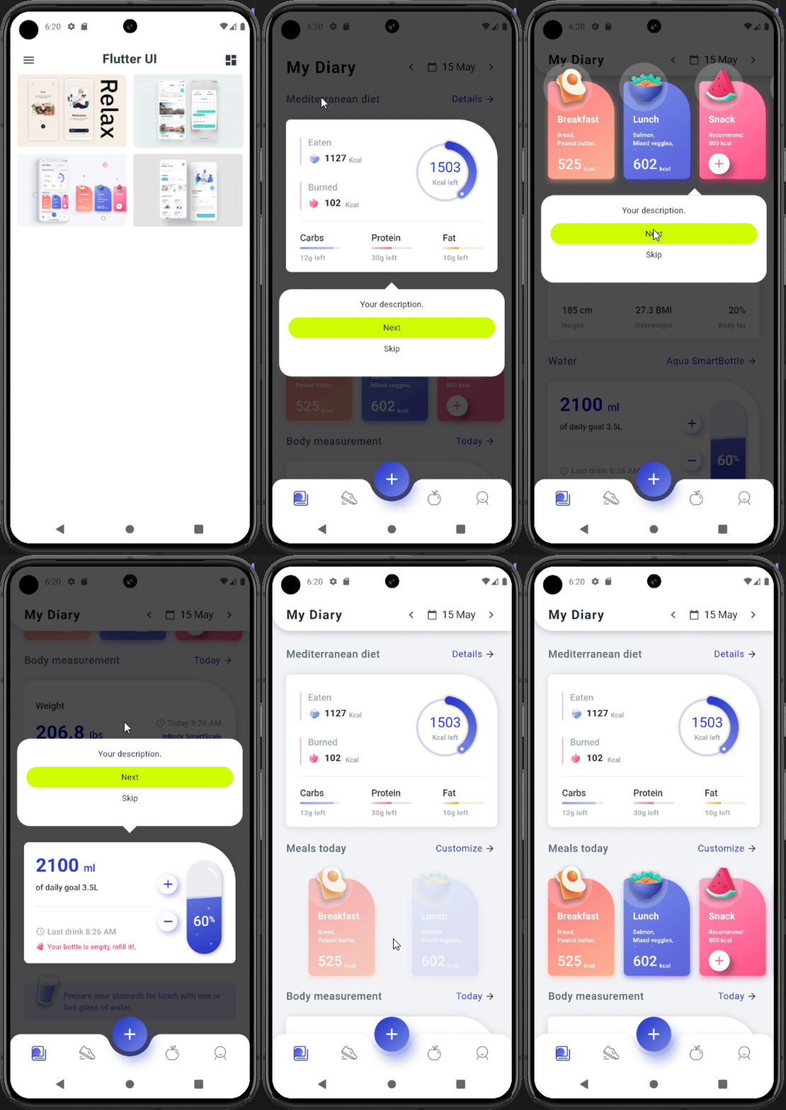
Spotlight UI
Spotlight UI is a Flutter package designed to add eye-catching spotlight effects to your user interface elements. Use it to guide users’ attention to important parts of your app with smooth, customizable animations.
Features
- Easy Integration: Quickly wrap any widget with a spotlight effect.
- Highly Customizable: Configure colors, durations, and animations to match your app’s style.
- Highlights Objects of Any Shape: The spotlight effect works with objects of any form, making it versatile for various UI elements.
- Lightweight and Performant: Designed to deliver smooth animations without sacrificing performance.
- Flexible: Use it in any part of your app, from onboarding screens to in-app tutorials.

Getting Started
Installation
Add the following dependency to your pubspec.yaml file:
dependencies:
  spotlight_ui: ^1.0.0
Then run:
flutter pub get
Basic Usage
Wrap any widget with the Spotlight widget to apply the effect. For example:
import 'package:flutter/material.dart';
import 'package:spotlight_ui/spotlight_ui.dart';

void main() {
  WidgetsFlutterBinding.ensureInitialized();
  runApp(MainApp());
}

class MainApp extends StatelessWidget {
  final SpotlightController spotlightController = SpotlightController();
  MainApp({super.key});

  @override
  Widget build(BuildContext context) {
    final ScrollController scrollController = ScrollController();
    return MaterialApp(
      home: Scaffold(
        floatingActionButton: Row(
          children: [
            const SizedBox(width: 24),
            FloatingActionButton(
                child: const Icon(Icons.stop),
                onPressed: () {
                  spotlightController.stop();
                }),
            const SizedBox(width: 12),
            FloatingActionButton(
                child: const Icon(Icons.play_arrow),
                onPressed: () {
                  spotlightController.start();
                })
          ],
        ),
        body: SpotlightOverlay(
          scrollController: scrollController,
          spotlightController: spotlightController,
          child: ListView(
            shrinkWrap: true,
            controller: scrollController,
            children: [
              Spotlight(
                step: 0,
                tooltip: const TooltipWidget(
                  height: 200,
                  backgroundColor: Colors.white,
                  child: Text("tooltip text"),
                ),
                child: Container(
                  color: Colors.blue,
                  width: 100,
                  height: 200,
                ),
              ),
              Spotlight(
                  step: 1,
                  child: Container(
                    color: Colors.cyan,
                    width: 100,
                    height: 200,
                  )),
              Spotlight(
                step: 2,
                child: Container(
                  color: Colors.pink,
                  width: 100,
                  height: 200,
                ),
              ),
              Spotlight(
                  step: 3,
                  child: Container(
                    color: Colors.cyan,
                    width: 100,
                    height: 200,
                  )),
              Spotlight(
                step: 4,
                child: Container(
                  color: Colors.pink,
                  width: 100,
                  height: 200,
                ),
              ),
            ],
          ),
        ),
      ),
    );
  }
}
This simple example shows how to add a pulsing spotlight effect to a button. You can adjust parameters like highlightColor and pulseDuration to suit your needs.
Advanced Usage
For more complex interactions or multiple spotlight effects, consider combining multiple Spotlight widgets or exploring additional properties provided by the package. Check the documentation for detailed usage instructions and customization options.
Contributing
Contributions are welcome! If you have ideas for improvements or want to add new features, please follow these steps:
- Fork the repository.
- Create a new branch for your feature or bug fix.
- Commit your changes and push to your fork.
- Submit a pull request with a clear description of your changes.
If you encounter any issues, please file an issue on GitHub.
License
This project is licensed under the MIT License – see the LICENSE file for details.
Contact
For any questions or suggestions, please open an issue on GitHub or contact the repository maintainer.
