Smart Search List
Every Flutter app with a list eventually needs search, filtering, sorting, and pagination. Building that properly means debouncing, async race conditions, disposal safety, empty states, accessibility -- roughly 200 lines of boilerplate per screen. Smart Search List handles all of it with a single widget. Zero dependencies.
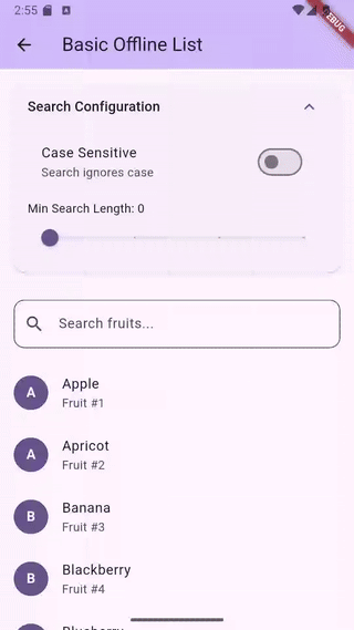
Offline search -- instant multi-field filtering
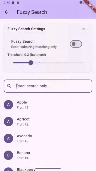
Fuzzy search -- typo-tolerant matching with character highlighting
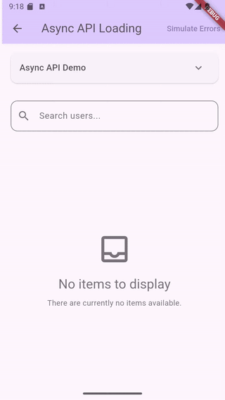
Async loading -- API pagination with search
Features
- List and Grid layouts with search, filter, sort, and pagination
- Offline filtering with multi-field search
- Async data loading with pagination and pull-to-refresh
- Fuzzy search with typo tolerance and scored ranking (opt-in)
- Built-in search term highlighting widget
- Multi-select with checkboxes and programmatic selection
- Grouped lists and grids with section headers (sticky headers in slivers)
- Sliver variants for both list and grid (
SliverSmartSearchList,SliverSmartSearchGrid) - TalkBack/VoiceOver accessible with localizable labels
- All platforms -- Android, iOS, Web, macOS, Windows, Linux
Installation
flutter pub add smart_search_list
Requires Flutter 3.35.0 or higher.
Upgrading from v0.7.x
v0.8.0 adds grid widgets and has two breaking changes for SliverSmartSearchList users:
onRefreshremoved: Sliver widgets cannot contain aRefreshIndicator. Wrap yourCustomScrollViewwithRefreshIndicatorand callcontroller.refresh()directly.onSearchChangednow fires: Previously accepted but silently ignored on sliver variants. It now fires post-debounce when the controller's query value changes. Remove the callback if you don't need it, or update it for the new timing.
Note:
onSearchChangedtiming differs by widget type. OnSmartSearchListandSmartSearchGrid, it fires on every keystroke (pre-debounce). OnSliverSmartSearchListandSliverSmartSearchGrid, it fires only when the controller's query value actually changes (post-debounce). This is because sliver variants do not own a text field — they observe controller state changes instead.
Upgrading from v0.6.x
v0.7.0 introduced named constructors for compile-time mode enforcement. Migration is straightforward:
- Offline lists (items + searchableFields): No change needed. The default constructor is identical.
- Async loading (asyncLoader): Change to
SmartSearchList.async(asyncLoader: ...)and removesearchableFields:. - External controller: Change to
SmartSearchList.controller(controller: ...). PasssearchableFields,debounceDelay, and fuzzy/case settings to the controller constructor instead ofsearchConfig.
See the CHANGELOG for full migration details with code examples.
Quick Start
Offline List
SmartSearchList<String>(
  items: ['Apple', 'Banana', 'Cherry', 'Date'],
  searchableFields: (item) => [item],
  itemBuilder: (context, item, index, {searchTerms = const []}) {
    return ListTile(title: Text(item));
  },
)
Async Loading
SmartSearchList<Product>.async(
  asyncLoader: (query, {page = 0, pageSize = 20}) async {
    return await api.searchProducts(query, page: page);
  },
  itemBuilder: (context, product, index, {searchTerms = const []}) {
    return ProductCard(product: product);
  },
  paginationConfig: const PaginationConfiguration(
    pageSize: 20,
    enabled: true,
  ),
)
External Controller
Use .controller() when you need programmatic access to search, filter, and sort state from outside the widget:
class ProductScreen extends StatefulWidget {
  const ProductScreen({super.key});
  @override
  State<ProductScreen> createState() => _ProductScreenState();
}

class _ProductScreenState extends State<ProductScreen> {
  final controller = SmartSearchController<Product>(
    searchableFields: (p) => [p.name, p.category],
  );

  @override
  void initState() {
    super.initState();
    controller.setFilter('in-stock', (p) => p.inStock);
    controller.setSortBy((a, b) => a.price.compareTo(b.price));
    controller.setItems(products);
  }

  @override
  void dispose() {
    controller.dispose();
    super.dispose();
  }

  @override
  Widget build(BuildContext context) {
    return SmartSearchList<Product>.controller(
      controller: controller,
      itemBuilder: (context, product, index, {searchTerms = const []}) {
        return ListTile(title: Text(product.name));
      },
    );
  }
}
Search Highlighting
Use the built-in SearchHighlightText widget. It handles both exact and fuzzy matches:
itemBuilder: (context, item, index, {searchTerms = const []}) {
  return ListTile(
    title: SearchHighlightText(
      text: item,
      searchTerms: searchTerms,
      fuzzySearchEnabled: true,
      highlightColor: Colors.yellow.withValues(alpha: 0.3),
    ),
  );
},
Fuzzy Search
Enable typo-tolerant matching with a single flag. Uses a 3-phase cascade: exact substring, ordered subsequence, then bounded edit distance (max 2 edits). Results are scored -- exact matches rank first.
searchConfig: const SearchConfiguration(
  fuzzySearchEnabled: true,
  fuzzyThreshold: 0.3,
),
Threshold Guide
| Threshold | Behavior |
|---|---|
0.1 |
Very lenient -- includes weak fuzzy matches |
0.3 |
Default -- good balance for most use cases |
0.5 |
Moderate -- filters out edit-distance matches |
0.6+ |
Strict -- only exact and strong subsequence |
1.0 |
Exact substring only |
For lists over 5,000 items, test performance on target devices. Raising the threshold to 0.6+ skips the expensive edit-distance phase. Using SearchTriggerMode.onSubmit also helps by reducing search frequency.
Multi-Select
SmartSearchList<String>(
  items: ['Apple', 'Banana', 'Cherry'],
  searchableFields: (item) => [item],
  itemBuilder: (context, item, index, {searchTerms = const []}) {
    return ListTile(title: Text(item));
  },
  selectionConfig: const SelectionConfiguration(
    enabled: true,
    showCheckbox: true,
    position: CheckboxPosition.leading,
  ),
  onSelectionChanged: (selected) {
    // selected is a Set<String> of currently checked items
    // Example: setState(() => _selectedItems = selected);
  },
)
Programmatic control via the controller: selectAll(), deselectAll(), selectWhere((item) => ...), toggleSelection(item).
Grouped Lists and Grids
SmartSearchList<Product>(
  items: products,
  searchableFields: (p) => [p.name, p.category],
  itemBuilder: (context, product, index, {searchTerms = const []}) {
    return ListTile(title: Text(product.name));
  },
  groupBy: (product) => product.category,
  groupComparator: (a, b) => (a as String).compareTo(b as String),
)
Grids support the same grouping API:
SmartSearchGrid<Product>(
  items: products,
  searchableFields: (p) => [p.name, p.category],
  itemBuilder: (context, product, index, {searchTerms = const []}) {
    return ProductCard(product: product);
  },
  gridConfig: const GridConfiguration(
    gridDelegate: SliverGridDelegateWithFixedCrossAxisCount(
      crossAxisCount: 2,
      childAspectRatio: 0.7,
    ),
  ),
  groupBy: (product) => product.category,
  groupComparator: (a, b) => (a as String).compareTo(b as String),
)
Sticky headers are supported in SliverSmartSearchList and SliverSmartSearchGrid via SliverMainAxisGroup.
Grid Layout
Use SmartSearchGrid for grid-based layouts. It shares the same constructors and features as SmartSearchList -- the main difference is gridConfig (with a required gridDelegate) instead of listConfig:
SmartSearchGrid<Product>(
  items: products,
  searchableFields: (p) => [p.name, p.category],
  itemBuilder: (context, product, index, {searchTerms = const []}) {
    return ProductCard(product: product);
  },
  gridConfig: const GridConfiguration(
    gridDelegate: SliverGridDelegateWithFixedCrossAxisCount(
      crossAxisCount: 2,
      childAspectRatio: 0.7,
    ),
  ),
)
For async grids with pagination, use SmartSearchGrid.async() — the API is identical to SmartSearchList.async().
All features work the same: .async() and .controller() constructors, grouping, multi-select, fuzzy search, pagination, accessibility. Use SliverSmartSearchGrid for CustomScrollView integration.
Customization
Every UI component is replaceable via builders:
SmartSearchList<T>(
  items: myItems,
  searchableFields: (item) => [item.name],
  itemBuilder: (context, item, index, {searchTerms = const []}) => ...,
  searchFieldBuilder: (context, controller, focusNode, onClear) {
    return CustomSearchField(controller: controller);
  },
  loadingStateBuilder: (context) => const CircularProgressIndicator(),
  errorStateBuilder: (context, error, onRetry) {
    return ErrorWidget(error: error, onRetry: onRetry);
  },
  emptyStateBuilder: (context) => const Text('No data'),
  emptySearchStateBuilder: (context, query) => Text('No results for "$query"'),
  progressIndicatorBuilder: (context, isLoading) {
    if (!isLoading) return const SizedBox.shrink();
    return const LinearProgressIndicator(minHeight: 2);
  },
  belowSearchWidget: Wrap(
    spacing: 8,
    children: [
      FilterChip(label: Text('In Stock'), onSelected: (_) {}),
      FilterChip(label: Text('On Sale'), onSelected: (_) {}),
    ],
  ),
)
Configuration
SmartSearchList<T>(
  items: myItems,
  searchableFields: (item) => [item.name],
  itemBuilder: (context, item, index, {searchTerms = const []}) => ...,
  searchConfig: const SearchConfiguration(
    enabled: true,
    autofocus: false,
    debounceDelay: Duration(milliseconds: 300),
    hintText: 'Search...',
    caseSensitive: false,
    minSearchLength: 0,
    triggerMode: SearchTriggerMode.onEdit, // or .onSubmit
    fuzzySearchEnabled: false,
    fuzzyThreshold: 0.3,
  ),
  listConfig: const ListConfiguration(
    pullToRefresh: true,
    shrinkWrap: false,
    itemExtent: 72.0, // fixed height for better scroll performance
  ),
  paginationConfig: const PaginationConfiguration(
    pageSize: 20,
    enabled: true,
    triggerDistance: 200.0,
  ),
)
Accessibility
TalkBack and VoiceOver work out of the box. Default widgets include semantic labels, tooltips, and result count announcements via SemanticsService.sendAnnouncement().
Customize labels for localization:
SmartSearchList<String>(
  accessibilityConfig: AccessibilityConfiguration(
    searchFieldLabel: 'Buscar frutas',
    clearButtonLabel: 'Borrar búsqueda',
    searchButtonLabel: 'Buscar',
    resultsAnnouncementBuilder: (count) {
      if (count == 0) return 'Sin resultados';
      return '$count resultados encontrados';
    },
  ),
  // ...
)
Set searchSemanticsEnabled: false to disable all automatic semantics if you handle accessibility in your own builders.
Example App
The example app includes 19 demos covering every feature: basic search, async pagination, fuzzy search, multi-select, grouped lists, grid layouts, sliver integration, accessibility, and more.
cd example && flutter run
License
Apache 2.0. See LICENSE.
Libraries
- smart_search_list
- A highly performant, customizable searchable list and grid widget for Flutter.