smart_overlay 🌊
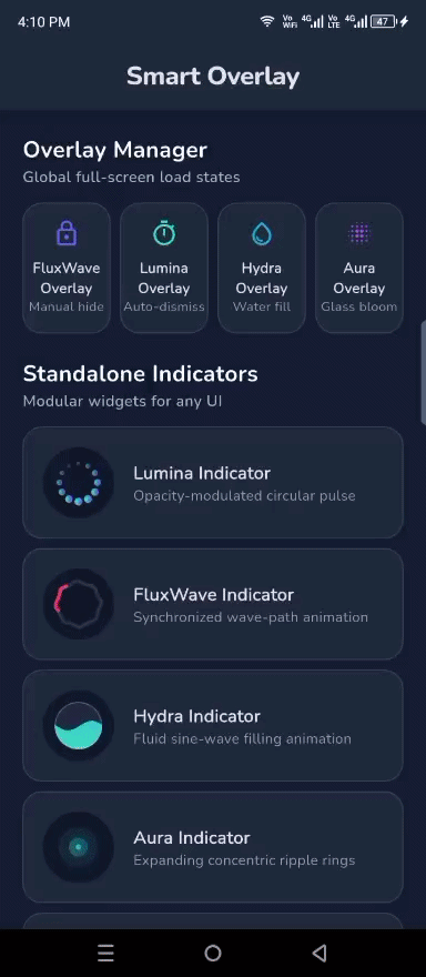
A premium, lightweight loading overlay manager for Flutter. Featuring the unique FluxWave (Wavy) Progress Indicator with full gradient support.
✨ Features
- Multiple Styles: Choose between the unique
FluxWaveProgressIndicatoror the professionalLuminaProgressIndicator. - Custom Indicators: Inject any custom widget as your progress indicator.
- Built-in Accessibility: All loaders come with
Semanticssupport out of the box. - Gradients Galore: Apply beautiful gradients to your loaders for a high-end feel.
- Micro-Animations: Smooth scale and fade transitions for a premium UX.
- Glassmorphism: Optional background blur (
useBlur) for the full-screen loader. - Simple API: Easy-to-use
SmartOverlaystatic methods orBuildContextextensions. - Elite Customization: Control
dotSize,dotCount, and spreadradiusfor indicators. - Hybrid Messages: Use simple
Stringmessages or complexWidgetmessage builders.
🚀 Quick Start
1. Installation
Add smart_overlay to your pubspec.yaml:
dependencies:
  smart_overlay: ^0.0.1
2. Basic Usage
Show a simple full-screen loader using the named API (Professional) or extensions (Convenient):
// Named API
SmartOverlay.show(context: context, message: "Setting things up...");

// Access via context
context.showLoader(message: "Setting things up...");

// To hide
SmartOverlay.hide(); // Or context.hideOverlay();
3. Premium Gradient Style
Bring your UI to life with gradients and blur:
SmartOverlay.show(
  context: context,
  message: "Syncing your data...",
  useBlur: true,
  backgroundColor: Colors.indigo.withOpacity(0.4),
  gradient: LinearGradient(
    colors: [Colors.purple, Colors.blueAccent],
  ),
);
4. Hybrid Messages (Advanced)
Inject complex widgets or rich text as your loading message:
SmartOverlay.show(
  context: context,
  messageWidget: Column(
    children: [
      Text("AI Syncing", style: TextStyle(fontWeight: FontWeight.bold)),
      Text("Analyzing patterns...", style: TextStyle(fontSize: 12)),
    ],
  ),
);
5. Custom Indicator Style
Switch to the new professional fading dots or use your own widget:
context.showLoader(
  message: "Premium experience...",
  indicator: LuminaProgressIndicator(
    size: 80,
    color: Colors.white,
  ),
);
6. Direct Indicator Usage
All indicators can be used as standalone widgets anywhere in your UI:
// Standalone Lumina Dots
LuminaProgressIndicator(
  size: 60,
  gradient: SweepGradient(
    colors: [Colors.blue, Colors.cyan],
  ),
)
🛠️ Configuration Options
| Option | Description | Default |
|---|---|---|
backgroundColor |
Background color of the overlay | Colors.black54 (dark) |
textColor |
Color of the message text | Colors.white |
useBlur |
Enable background glassmorphism blur | false |
gradient |
Apply a gradient to the progress indicator | null |
indicator |
Inject a custom indicator widget | FluxWaveProgressIndicator |
message |
Optional text to display below the loader | null |
messageWidget |
Inject a custom widget as the message | null |
autoDismissDuration |
If set, the overlay hides automatically | null (sticky) |
📜 License
This project is licensed under the MIT License - see the LICENSE file for details.