


What this library is
A collection of experimental and creative slivers for Flutter. Extend your scrolling experience beyond the basics.
Gallery


Demo
Overview
Sliver Catalog provides a set of advanced and experimental slivers for Flutter, enabling developers to create unique, visually engaging scroll effects. The package includes basic slivers as a platform for creating effects and specific implementations that provide ready-to-use effects.
Basics
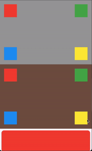
- ScrollHijackSliver: A sliver that consumes a specified amount of scrollable space before allowing its child to start scrolling.
- LeavingViewportShaderSliver: Applies a shader on top of the child while it leaves the viewport.
- LeavingViewportTransformedRenderSliver: A render object that applies a transformation to the child while it leaves the viewport.
Ready-to-use effects
- SpinnerSliver: Rotates its child as it leaves the viewport, with configurable anchor and angle.
- GliderSliver: Smoothly shifts the child in and out of the viewport.
- FreezeSliver: Applies a freezing effect to the child while it leaves the viewport.
- BloodSliver: Applies a blood covering effect to the child while it leaves the viewport.
Explore the library
ScrollHijackSliver
A sliver that consumes a specified amount of scrollable space before allowing its child to start scrolling. This is useful for creating custom scroll-driven animations and effects.
Key features:
- Exposes a
ValueListenable<double>progress (0.0–1.0) to the builder, so you can animate your child based on the progress. - Supports different progress calculation behaviors via
ScrollHijackProgressBehavior.
Example:
CustomScrollView(
  slivers: [
    ScrollHijackSliver(
      consumingSpaceSize: 800,
      builder: (context, consumingProgress) {
        return Container(
          color: Colors.grey,
          height: 300,
          child: ValueListenableBuilder(
            valueListenable: consumingProgress,
            builder: (context, value, child) {
              return CustomPaint(
                painter: MyCustomPainter(progress: value),
              );
            },
          ),
        );
      },
    ),
    // ... other slivers ...
  ],
)
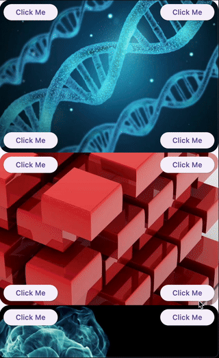
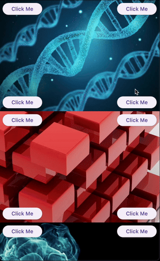
LeavingViewportShaderSliver
A sliver that applies a fragment shader effect to its child as it leaves the viewport. This enables advanced visual effects as the user scrolls.
Key features:
- Can operate with a raw
FragmentShaderthat uses a specific order of arguments (size, offset, progress), or with a custom shader wrapper for any uniform order via theLeavingViewportShaderinterface. - The shader receives the child's size, paint offset, and a progress value (0.0–1.0) indicating how much the child has left the viewport.
Example:
CustomScrollView(
  slivers: [
    // Using a raw FragmentShader (default uniform order)
    LeavingViewportShaderSliver.fromFragmentShader(
      shader: myFragmentShader,
      child: Image.network('https://...'),
    ),
    // Using a custom wrapper for arbitrary uniform order
    LeavingViewportShaderSliver(
      shader: MyCustomLeavingViewportShader(),
      child: Image.network('https://...'),
    ),
    // ... other slivers ...
  ],
)
There are also two built-in inheritances of LeavingViewportShaderSliver:
FreezeSliver
A sliver that applies a "freezing" shader effect to its child as it leaves the viewport. This effect is built-in and requires no manual shader setup.
Key features:
- Uses a predefined freezing shader bundled with the package.
- No shader code required—just wrap a content with the sliver.
Example:
CustomScrollView(
  slivers: [
    FreezeSliver(
      child: Image.network('https://...'),
    ),
    // ... other slivers ...
  ],
)
BloodSliver
A sliver that applies a "blood covering" shader effect to its child as it leaves the viewport. This effect is built-in and requires no manual shader setup.
Key features:
- Uses a predefined blood shader bundled with the package.
- No shader code required—just wrap a content with the sliver.
Example:
CustomScrollView(
  slivers: [
    BloodSliver(
      child: Image.network('https://...'),
    ),
    // ... other slivers ...
  ],
)
LeavingViewportTransformedRenderSliver
A base render sliver for creating scroll-driven 3D or 2D transformations as a child leaves the viewport. This class is intended for advanced use, enabling you to define custom transformation effects (such as rotation, scaling, skewing, etc.) based on scroll progress.
Key features:
- Exposes a
performTransformmethod to define any transformation matrix based on child size and leaving progress. - Handles all the layout, painting, and hit testing logic for you.
- Allows to define a custom hit testing logic if it is necessary.
Usage:
To create a custom effect, extend LeavingViewportTransformedRenderSliver and implement performTransform.
Example:
class MyCustomTransformedSliver extends SingleChildRenderObjectWidget {
  const MyCustomTransformedSliver({super.key, required super.child});

  @override
  RenderObject createRenderObject(BuildContext context) =>
      _MyCustomTransformedRenderSliver();
}

class _MyCustomTransformedRenderSliver extends LeavingViewportTransformedRenderSliver {
  @override
  Matrix4? performTransform(Size childSize, double progress) {
    // Scale pulsation: scale oscillates as the child leaves the viewport
    final double scale = 1.0 - 0.2 * (math.sin(progress * math.pi * 4)).abs();
    final Matrix4 matrix = Matrix4.identity();
    matrix.translate(childSize.width / 2, childSize.height / 2);
    matrix.scale(scale, scale);
    matrix.translate(-childSize.width / 2, -childSize.height / 2);
    return matrix;
  }
}
There are also two built-in inheritances of LeavingViewportTransformedRenderSliver:
SpinnerSliver
A sliver that rotates its child as it leaves the viewport. The rotation is anchored to a configurable side and the maximum angle can be customized.
Key features:
- Rotates the child around a specified anchor (left or right).
- Configurable maximum rotation angle.
Example:
CustomScrollView(
  slivers: [
    SpinnerSliver(
      anchorSide: SpinnerAnchorSide.left, // or SpinnerAnchorSide.right
      maxAngle: math.pi / 2, // 90 degrees
      child: Image.network('https://...'),
    ),
    // ... other slivers ...
  ],
)
GliderSliver
A sliver that smoothly slides its child left or right as it leaves the viewport, creating a gliding effect.
Key features:
- Shifts the child along the cross axis based on scroll progress.
- Configurable exit side (left or right).
Example:
CustomScrollView(
  slivers: [
    GliderSliver(
      exitSide: GliderExitSide.left, // or GliderExitSide.right
      child: Image.network('https://...'),
    ),
    // ... other slivers ...
  ],
)
Maintainer

Mikhail Zotyev
Support
We appreciate any form of support, whether it's a financial donation, a public sharing, or a star on GitHub and a like on Pub. If you want to provide financial support, there are several ways you can do it:
Thank you for all your support!
License
This project is licensed under the MIT License. See LICENSE for details.