
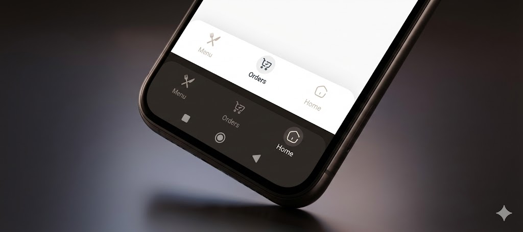
Simple Clean NavBar
The Ultimate Navigation Bar for Flutter. Simple, animated, responsive, and highly customizable. Version 1.0.2 introduces Floating Mode, Side Rail support, 3 Animation types, and Immersive System UI integration.
Designed to look clean on phones, tablets, and the web, automatically handling RTL (Persian/Arabic) and Dark Mode.
✨ Features
-
🎈 Floating & Fixed Modes: Switch between a modern floating design or a classic fixed bar.
-
📐 Fully Responsive: Automatically adapts to a Bottom Bar (Mobile) or a vertical Side Rail (Tablet/Web).
-
🎨 3 Animation Types: Choose between Circle, Zoom, and Float (Jump) animations.
-
📝 Smart Text Modes: Control labels with onSelect, alwaysShow, or neverShow.
-
📱 Immersive UI: Automatically matches the Android System Navigation Bar color with your navbar.
-
🌓 Theme Aware: Seamless support for Dark and Light modes.
-
🌍 RTL Support: Built-in support for Right-to-Left languages.
📦 Installation
Add this to your pubspec.yaml:
dependencies:
  simple_clean_navbar: ^1.0.2
🚀 Usage
1. Minimal Example

Get started in seconds. Just provide the items and the current index.

import 'package:simple_clean_navbar/simple_clean_navbar.dart';

SimpleCleanNavBar(
  currentIndex: _selectedIndex,
  onTap: (index) => setState(() => _selectedIndex = index),
  items: const [
    SimpleNavBarItem(label: 'Home', icon: Icons.home),
    SimpleNavBarItem(label: 'Explore', icon: Icons.explore),
    SimpleNavBarItem(label: 'Profile', icon: Icons.person),
  ],
)
- The Ultimate Configuration
Unleash the full power of v1.0.0 with animations, floating mode, and side rail support.
SimpleCleanNavBar(
  // Data
  currentIndex: _selectedIndex,
  onTap: (index) => setState(() => _selectedIndex = index),
  items: const [
    SimpleNavBarItem(label: 'Home', icon: Icons.home_rounded),
    SimpleNavBarItem(label: 'Shop', icon: Icons.shopping_bag_rounded),
    SimpleNavBarItem(label: 'Settings', icon: Icons.settings_rounded),
  ],

  // Design & Colors
  backgroundColor: Colors.white,
  selectedColor: Colors.blue,
  unselectedColor: Colors.grey,

  // Layout Modes
  isFloating: true,  // Enables the floating rounded design with shadow
  isSideRail: false, // Set to true for vertical layout (Tablet/Web)
  isRailOnLeft: true,// Position the rail on Left or Right

  // Animations & Text
  animationType: SimpleNavAnimType.float, // Options: .circle, .zoom, .float
  textMode: SimpleNavTextMode.onSelect,   // Options: .alwaysShow, .onSelect, .neverShow

  // System UI
  updateSystemNavBar: true, // Automatically colors the Android bottom bar to match
)
📱 Responsive Layout Guide (Phone vs Tablet)
One of the best features of simple_clean_navbar is the ability to transform from a Bottom Bar to a Side Rail.
Use MediaQuery or a LayoutBuilder to toggle isSideRail.
@override
Widget build(BuildContext context) {
  // Check if the screen is wide (Tablet/Web)
  final isWide = MediaQuery.of(context).size.width > 600;

  return Scaffold(
    // 1. On Mobile: Show Bottom Navigation Bar
    bottomNavigationBar: isWide
        ? null
        : SimpleCleanNavBar(
            currentIndex: _index,
            onTap: (i) => setState(() => _index = i),
            items: _items,
            isFloating: true, // Optional: Make it floating on mobile
          ),

    // 2. On Tablet/Web: Show Side Rail next to the body
    body: Row(
      children: [
        if (isWide)
          SimpleCleanNavBar(
            isSideRail: true, // Enable vertical mode
            isRailOnLeft: true,
            currentIndex: _index,
            onTap: (i) => setState(() => _index = i),
            items: _items,
            isFloating: true, // Optional: Make the rail floating
          ),

        // Your Main Content
        Expanded(child: MyPageContent()),
      ],
    ),
  );
}
❤️ Support
If you find this package useful, please give it a generic Like on pub.dev and a ⭐️ on GitHub.
Created with ❤️ by Nima Kharraji.