simple_accordion
 |
 |
 |
 |
 |
 |
If you like, you can contribute to this repository by making PR.
About Widget
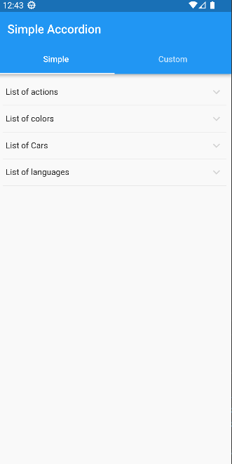
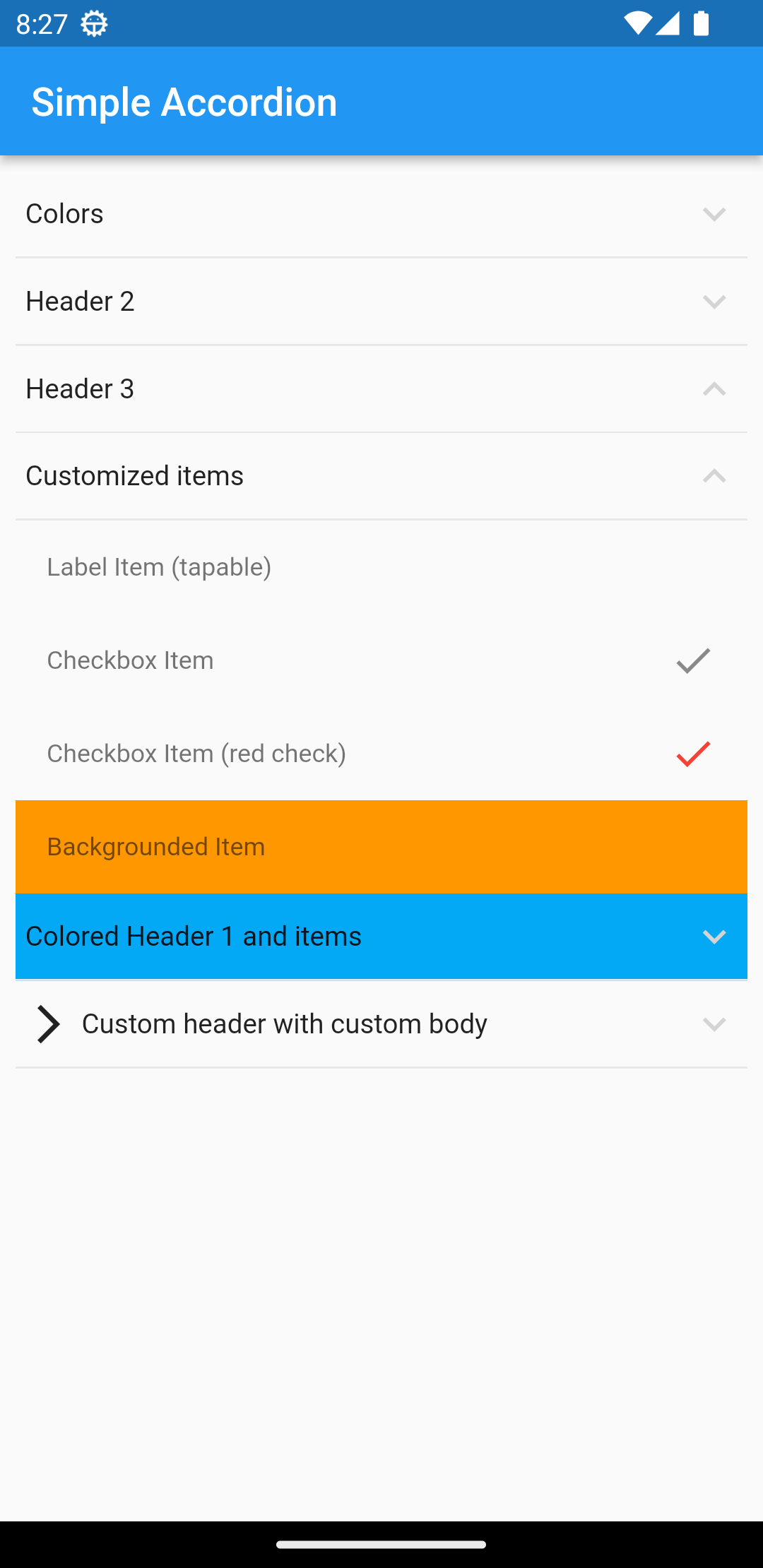
this is an accordion widget that supports usual types of an accordion widget and easy to use! view in pub.dev
Add to your project
flutter pub add simple_accordion
Import and use it!
import 'package:simple_accordion/simple_accordion.dart';
How to use
The main widget is SimpleAccordion and it has children parameter that you can pass accrodion items as AccordionHeaderItem array to that like below:
SimpleAccordion(
              children: [
                AccordionHeaderItem(
                  title: "Colors",
                  children: [
                    AccordionItem(title: "Blue"),
                    AccordionItem(title: "Red"),
                    AccordionItem(title: "Green"),
                    AccordionItem(title: "Black"),
                  ],
                ),
              ],
)
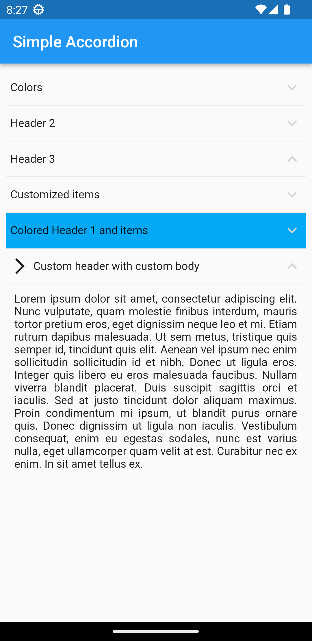
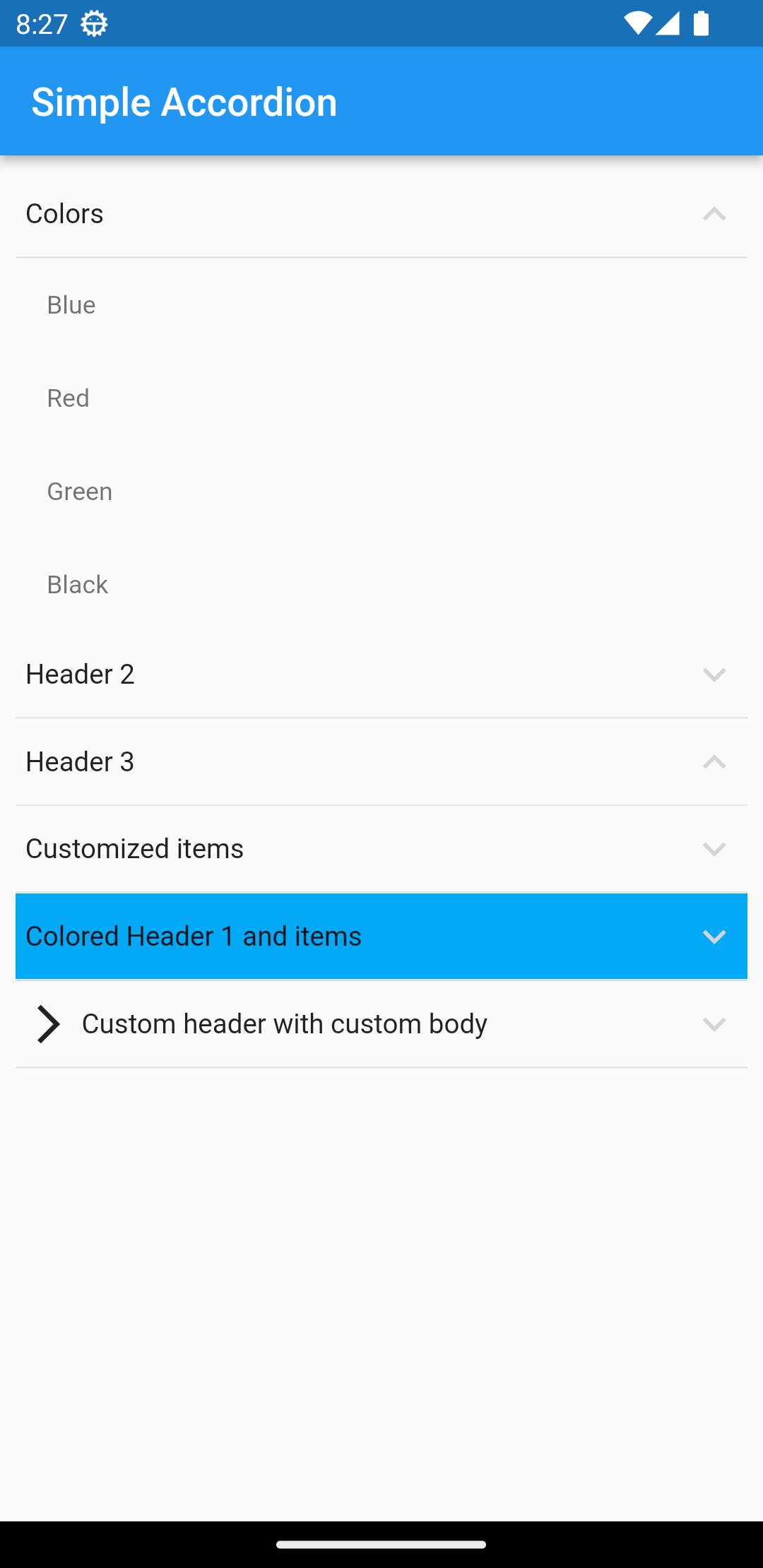
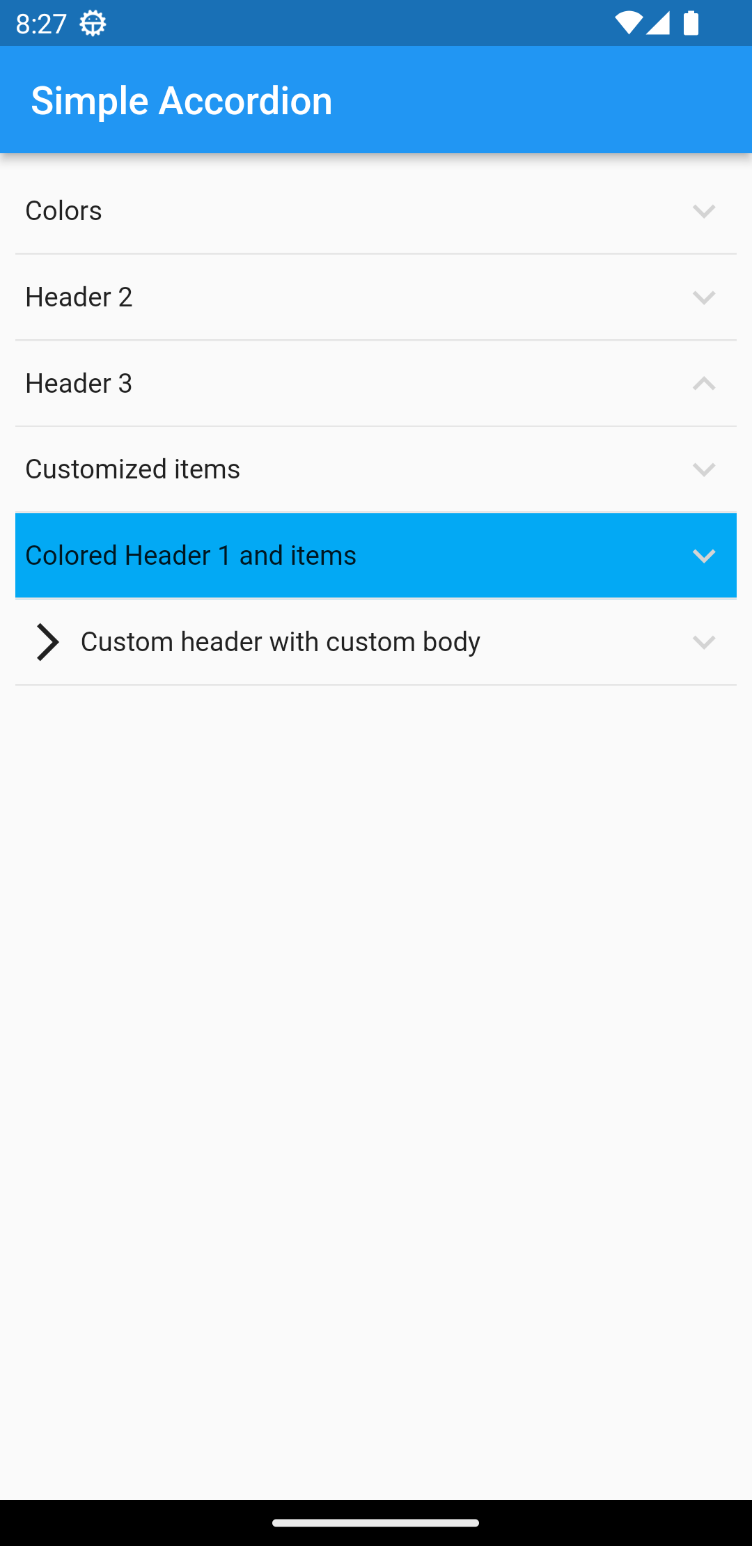
Usage Tree
SimpleAccordion
	-AccordionHeaderItem
		-AccordionItem
		-AccordionItem
		-AccordionItem
	-AccordionHeaderItem
		-AccordionItem
		...
Properies of SimpleAccordion
| Parameter | Description |
|---|---|
| children | Array of AccordionHeaderItem |
| headerColor | set the color of all headers background |
| itemColor | set the color of all Items background |
| maxSelectCount | Maximum possible selection for user |
| headerTextStyle | set the style of all headers title |
| itemTextStyle | set the style of all items title of headers |
| onSelectedChanged | return all checked items changes |
| selectedItems | default selected items |
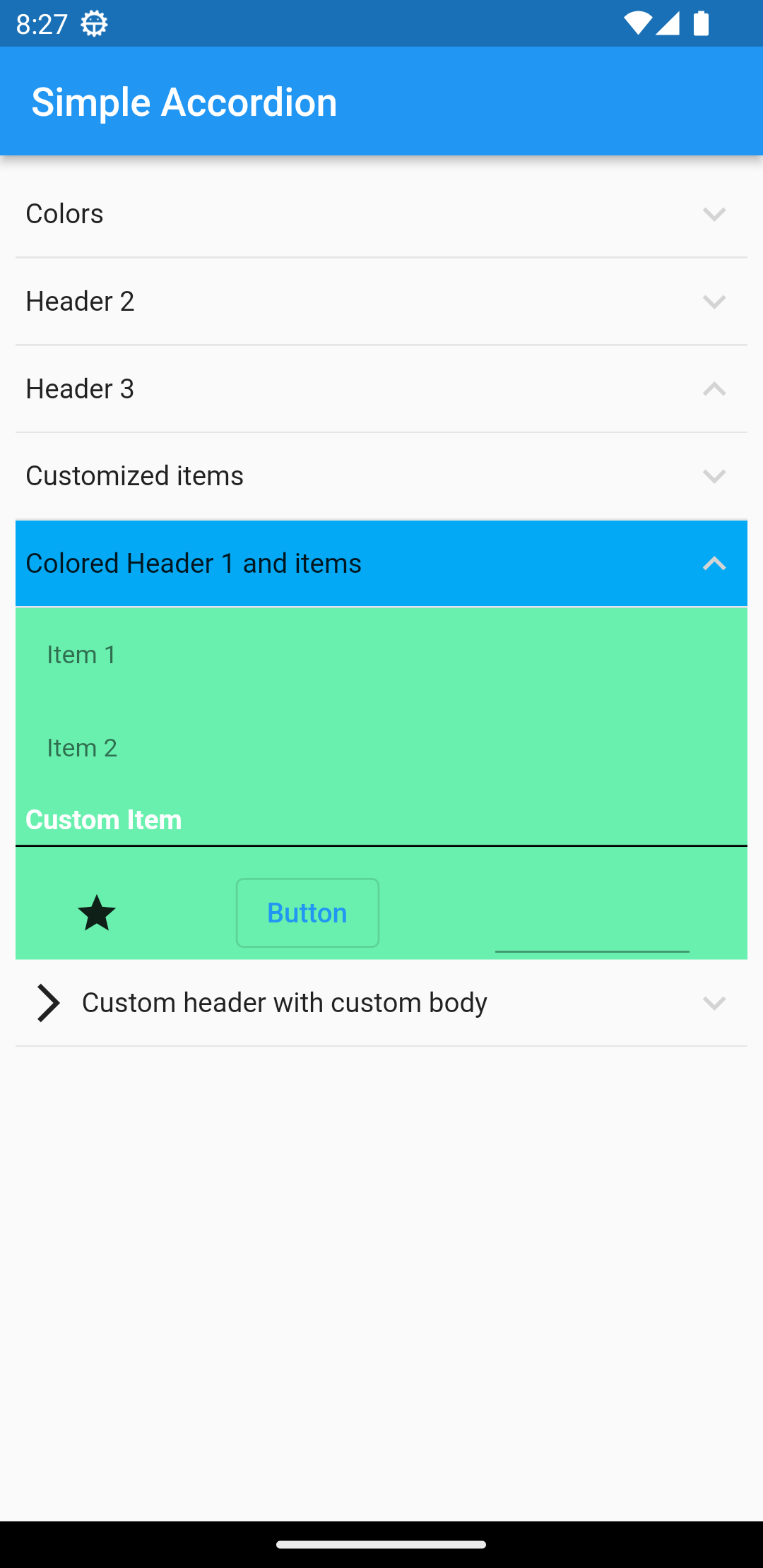
Properies of AccordionHeaderItem
| Parameter | Description |
|---|---|
| isOpen | initial state of a header (open/close) |
| title | header title |
| child | header child as widget |
| children | array of AccordionItem |
| headerColor | set the color of header's background |
| itemColor | set the color of all Items of current header background |
| headerTextStyle | set the style of header's title |
| itemTextStyle | set the style of all items title of current header |
Properies of AccordionItem
| Parameter | Description |
|---|---|
| title | header title |
| child | header child as widget |
| onChange | used to handle CheckBox mode value |
| checked | initial state of Checkbox |
| checkColor | set the color of Checkbox |
| itemColor | set the backcolor of item |
| accrodionItemType | set the mode of item (lable, checkbox). you can place everything in label mode |
| itemTextStyle | set the style of current item |
all of customizations are available in example file.