https://pub.dev/packages/semicircular_stage_progress
# Semicircular Stage Progress Indicator
Made with Love By - Karan Rana

A customizable Flutter widget that visually represents progress through multiple stages using a beautiful, animated **semicircular arc** design.
Ideal for onboarding flows, delivery tracking, and any multi-step process.

---

## ✨ Features

- 🎨 Fully customizable colors, arc thickness, padding, and text
- 🔘 Optional animated indicator dot for the current stage
- 📏 Gap-controlled arc segments for aesthetic spacing
- 📄 Text support below the semicircle for dynamic messaging
- ⚡ Lightweight and performant, built entirely with `CustomPainter`

---

## 🚀 Installation

Add the dependency to your `pubspec.yaml`:

```yaml
dependencies:
  semicircular_stage_progress: ^1.0.3
Then run:
flutter pub get
🧑💻 Usage
Basic Usage
import 'package:semicircular_stage_progress/semicircular_stage_progress.dart';
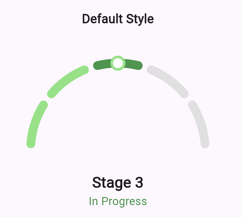
SemicircularStageProgress(
totalStages: 6,
currentStage: 3,
)
![Basic Example]
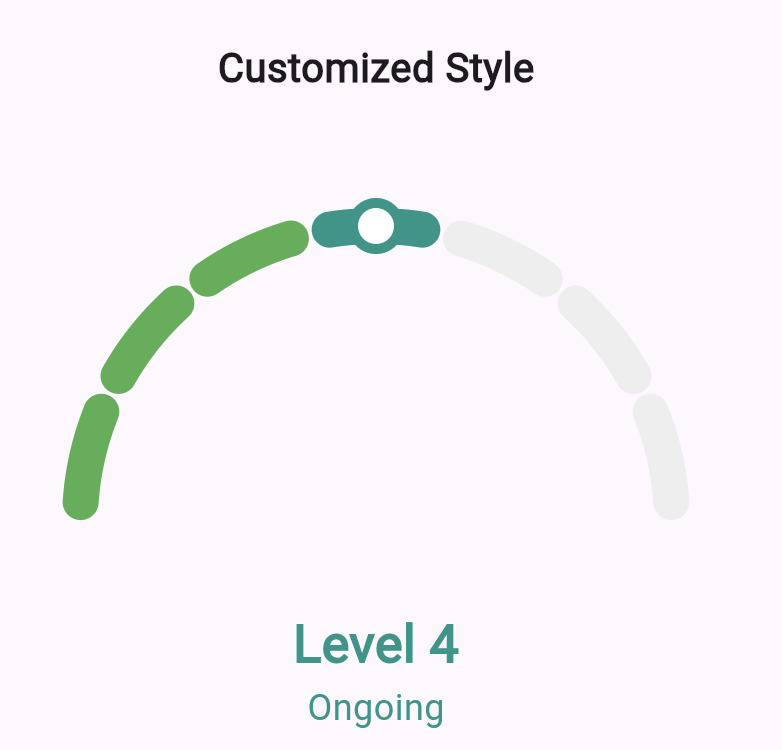
Fully Customized Example
SemicircularStageProgress(
  totalStages: 8,
  currentStage: 5,
  completedColor: Colors.blue,
  currentColor: Colors.blueAccent,
  futureColor: Colors.blueGrey[100],
  arcWidth: 16,
  gapFactor: 0.7,
  stageText: 'Step 5 of 8',
  statusText: 'Processing...',
)
![Customized Example]
🔧 Parameters
| Parameter | Type | Description | Default |
|---|---|---|---|
totalStages |
int |
Required. Total number of steps/stages. | – |
currentStage |
int |
Required. Current active stage (1-based index). | – |
width |
double? |
Width of the widget. | 300 |
height |
double? |
Height of the widget. | 200 |
arcWidth |
double? |
Thickness of arc segments. | 14 |
padding |
double? |
Padding around the semicircle. | 10 |
gapFactor |
double? |
Gap ratio between arcs (0.0 to 1.0). | 0.75 |
completedColor |
Color? |
Color for completed stages. | Color(0xff7FE47E) |
currentColor |
Color? |
Color for current stage. | Color(0xff309646) |
futureColor |
Color? |
Color for future/unvisited stages. | Colors.grey.shade300 |
showCurrentIndicator |
bool? |
Whether to show the circular dot indicator. | true |
indicatorOuterSize |
double? |
Size of outer indicator circle. | 12 |
indicatorInnerSize |
double? |
Size of inner indicator circle. | 8 |
indicatorOuterColor |
Color? |
Color of outer indicator circle. | Same as completedColor |
indicatorInnerColor |
Color? |
Color of inner indicator circle. | Colors.white |
stageText |
String? |
Text below the arc (e.g., "Step 3 of 6"). | 'Stage $currentStage' |
stageTextStyle |
TextStyle? |
Style for the stageText. |
Bold, 24px |
statusText |
String? |
Additional message below stageText. |
'Completed' / 'In Progress' |
statusTextStyle |
TextStyle? |
Style for the statusText. |
18px, color based on state |
textSpacing |
double? |
Space between arc and text. | 20 |
🧪 Examples
Purple Theme
SemicircularStageProgress(
  totalStages: 5,
  currentStage: 2,
  completedColor: Colors.purple,
  currentColor: Colors.deepPurple,
  futureColor: Colors.purple[100],
)
Minimal Design (No Indicator or Text)
SemicircularStageProgress(
  totalStages: 4,
  currentStage: 1,
  showCurrentIndicator: false,
  stageText: null,
  statusText: null,
)
![More Customized Example]
📄 License
MIT License © Your Name or Organization
Permission is hereby granted, free of charge, to any person obtaining a copy
of this software and associated documentation files (the "Software"), to deal
in the Software without restriction...
🤝 Contributing
Pull requests and feature suggestions are welcome!
Feel free to open an issue or PR at:
GitHub Repository
🗨️ Support & Contact
For questions, suggestions, or bug reports, open an issue on GitHub.
If you're using this in a project, share it with us—we'd love to see it in action!