select_card Flutter widget
A Flutter package with animated customizable items selection.
Features
You can customize the card group, card and dropdown selection with options such as different colors, animation times, and enrich your widget with photo and detail information lists.
Widgets
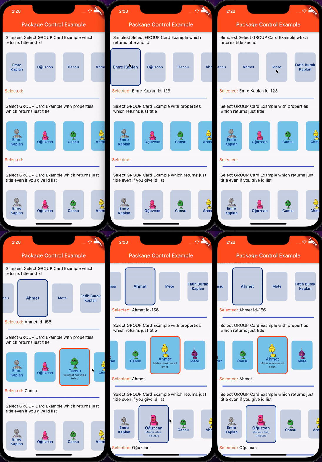
SelectGroupCard(); This widget represents a card group, it includes lists for its use. It has to get the list of headers by necessity, the lists of contents and images can be provided optionally. With this widget, you can move forward by choosing one among many groups. It will add animated visual beauty to your application.
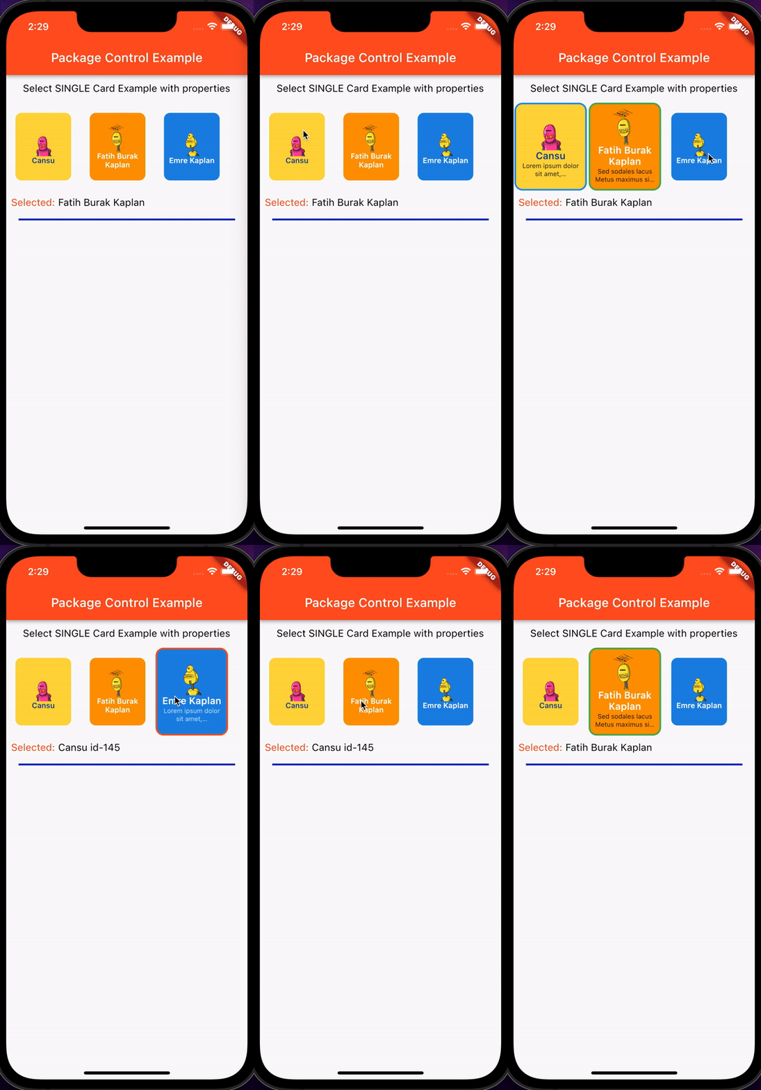
SelectSingleCard(); This widget represents a card, it gets string parameters for its use. It has to take title. Content and image parameters can be optionally provided. With this widget you can choose a lot from cards. Single cards will add animated visual beauty to your application.
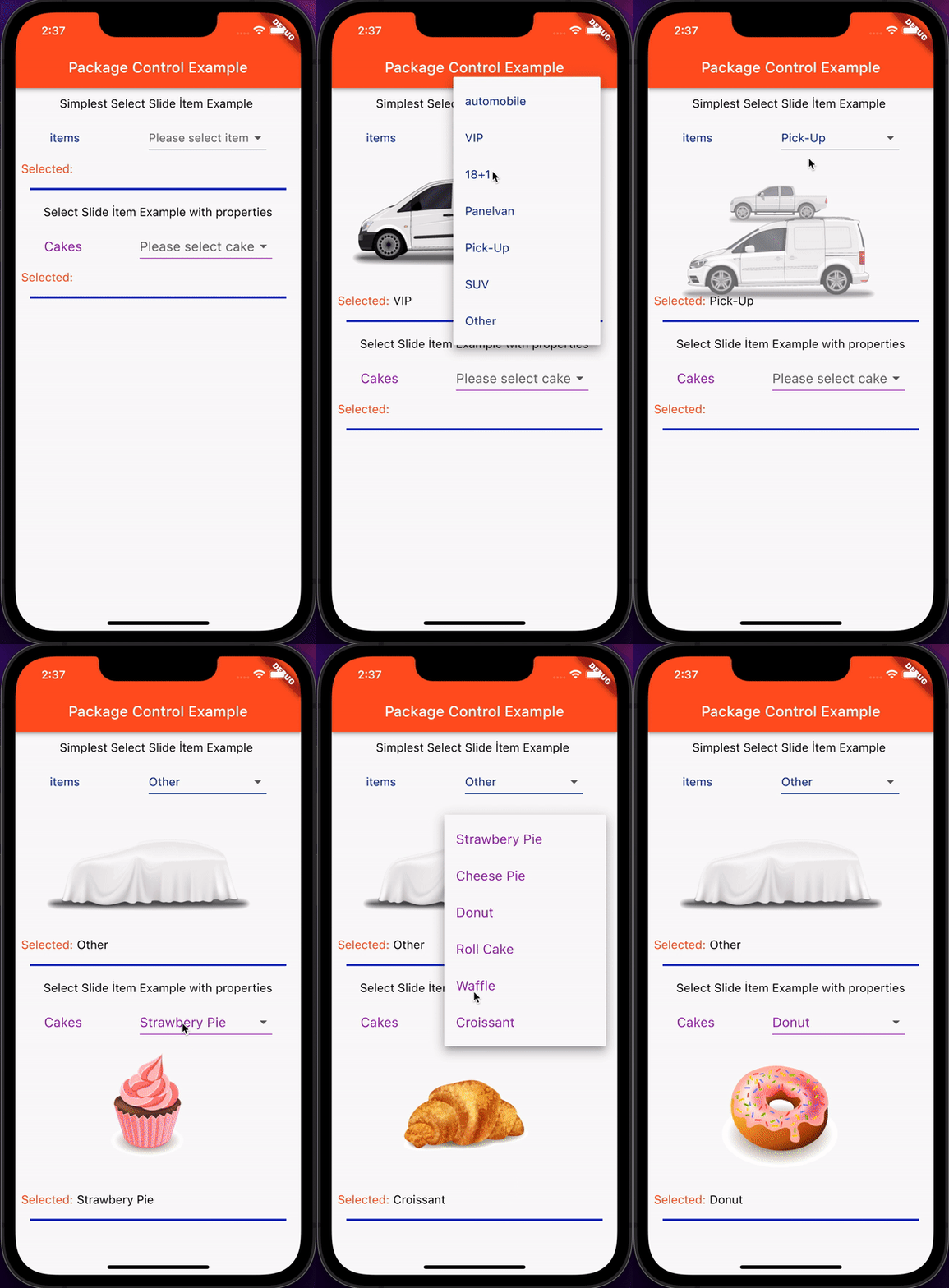
SelectSlideItem(); This widget represents a dropdown and an image object. It takes the values into it with the map object and reflects the images you transmit with the map to the screen. With this widget, you can visually see many options you choose. 3 different animation processes were used in this widget. A 3D transition effect is presented with animation.
Simple Usage
SelectGroupCard(context,
              titles: titles,
              onTap: (title) {
                debugPrint(title);
              }),

SelectSingleCard(context,
                title: "Title",
                onTap: (String selectedTitle) {
                debugPrint(selectedTitle);
                });
Usage of SelectGroupCard Widget

              //this widget returns both title and id
              SelectGroupCard(context, titles: titles, ids: ids,
                  onTap: (title, id) {
                debugPrint(title);
                debugPrint(id);
              }),
  //this widget just returns title
              SelectGroupCard(context,
                  titles: titles,
                  imageSourceType: ImageSourceType.network,
                  images: imagesFromNetwork,
                  contents: contents,
                  cardBackgroundColor: const Color.fromARGB(255, 128, 201, 235),
                  cardSelectedColor: Colors.deepOrange,
                  titleTextColor: Colors.blue.shade900,
                  contentTextColor: Colors.black87, onTap: (title) {
                debugPrint(title);
                setState(() {
                  cardGroupResult2 = title;
                });
              });
Usage of SelectSingleCard Widget

              Row(
                children: [
                  // this single card returns title and id
                  SelectSingleCard(context,
                      title: titles[2],
                      id: ids[2],
                      imageSourceType: ImageSourceType.network,
                      image: imagesFromNetwork[1],
                      content: contents[0],
                      cardBackgroundColor: Colors.amberAccent,
                      cardSelectedColor: Colors.blue,
                      titleTextColor: Colors.blue.shade900,
                      contentTextColor: Colors.black87, onTap: (title, id) {
                    debugPrint(title);
                    debugPrint(id);
                    setState(() {
                      singleCardResult = title + " " + id;
                    });
                  }),
                  // this single card returns just title
                  SelectSingleCard(context,
                      title: titles[5],
                      imageSourceType: ImageSourceType.network,
                      image: imagesFromNetwork[5],
                      content: contents[5],
                      cardBackgroundColor: Colors.orange,
                      cardSelectedColor: Colors.green,
                      titleTextColor: Colors.white,
                      contentTextColor: Colors.black87, onTap: (title) {
                    debugPrint(title);
                    setState(() {
                      singleCardResult = title;
                    });
                  }),
                  // this single card returns title even if you give id param
                  SelectSingleCard(context,
                      title: titles[0],
                      id: ids[0],
                      imageSourceType: ImageSourceType.network,
                      image: imagesFromNetwork[3],
                      content: contents[0],
                      cardBackgroundColor: Colors.blue.shade600,
                      cardSelectedColor: Colors.deepOrange,
                      titleTextColor: Colors.white,
                      contentTextColor: Colors.white70, onTap: (title) {
                    debugPrint(title);
                    setState(() {
                      singleCardResult = title;
                    });
                  }),
                ],
              ),
Usage of SelectSlideItem Widget

  SelectSlideItem(
                  mapList: carMap,
                  onChange: (title) {
                    debugPrint(title);
                    setState(() {
                      selectSlideResult = title;
                    });
                  });

                     SelectSlideItem(
                  mapList: cakeMap,
                  fontColor: Colors.purple,
                  fontSize: 18,
                  text: "Cakes",
                  hint: "Please select cake",
                  imageHeight: 200,
                  duration: const Duration(milliseconds: 900),
                  onChange: (title) {
                    debugPrint(title);
                    setState(() {
                      selectSlideResult2 = title;
                    });
                  });
