Kest Scrollable Calendar
A beautiful, customizable scrollable calendar widget for Flutter that provides both traditional form field integration and standalone bottom sheet functionality.
Complete feature overview showing all available examples and customization options
Features
🎨 Highly Customizable
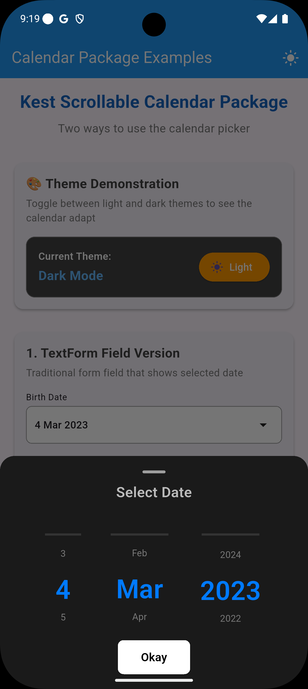
- Complete theme system with light/dark modes
- Customizable colors for every component
- Custom button text or completely custom button widgets
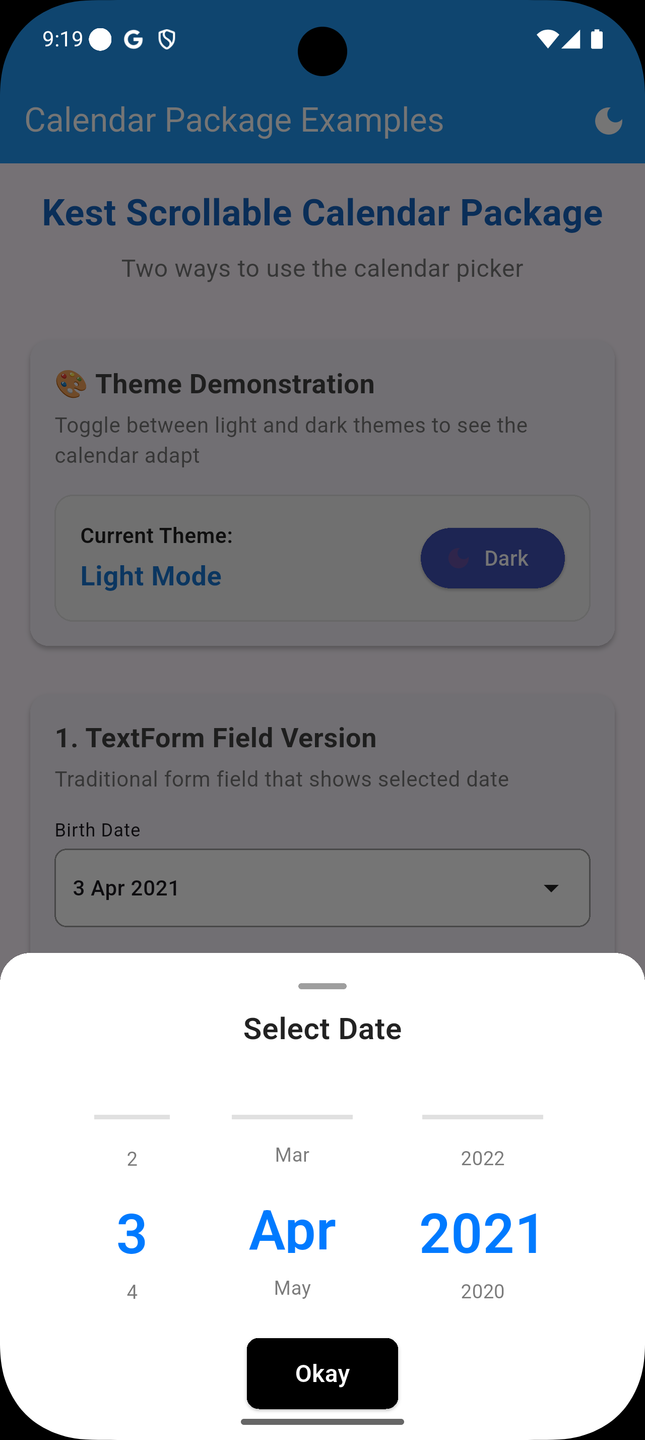
📱 Two Usage Patterns
- Traditional
TextFormfield integration - Standalone bottom sheet methods for any widget
🎯 Smart Center Detection
- Only the selected item appears bold and prominent
- Automatic selection when scrolling to center
- Clean, minimal design with 3-4 visible items
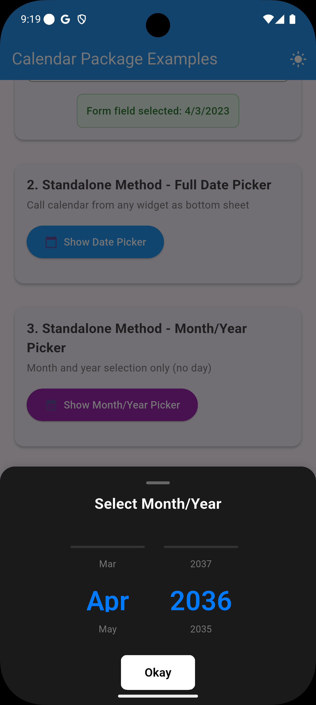
📅 Multiple Picker Types
- Full date picker (day, month, year)
- Month/Year picker only
- Customizable date ranges
🎬 Visual Showcase
Main App Overview
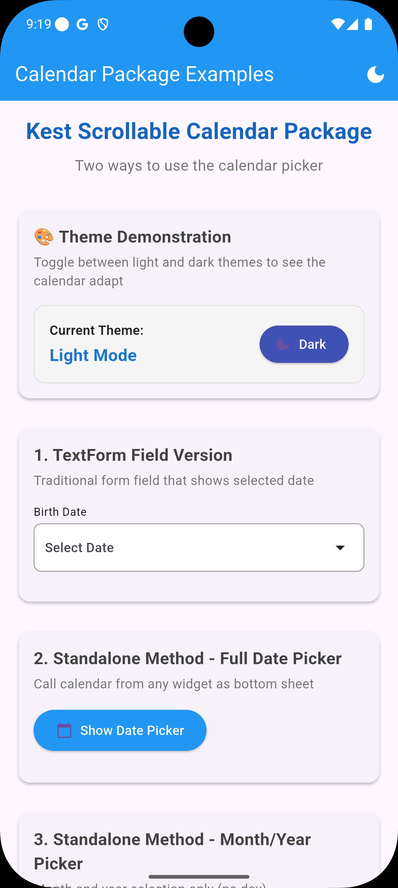
Complete feature overview showing all available examples and customization options |
Theme Comparison
| Light Theme | Dark Theme | Month/Year Picker |
|---|---|---|
 |
 |
 |
Custom Button Examples
| Custom Button 1 | Custom Button 2 |
|---|---|
 |
 |
Video Demo
Interactive demonstration showing smooth scrolling animations and theme switching |
Live Demo
Try the interactive demo in the example app:
git clone https://github.com/kest-cloud/scrollable_calender.git
cd scrollable_calender/example
flutter run
Installation
Add this to your package's pubspec.yaml file:
dependencies:
  scrollable_calender: 0.0.4
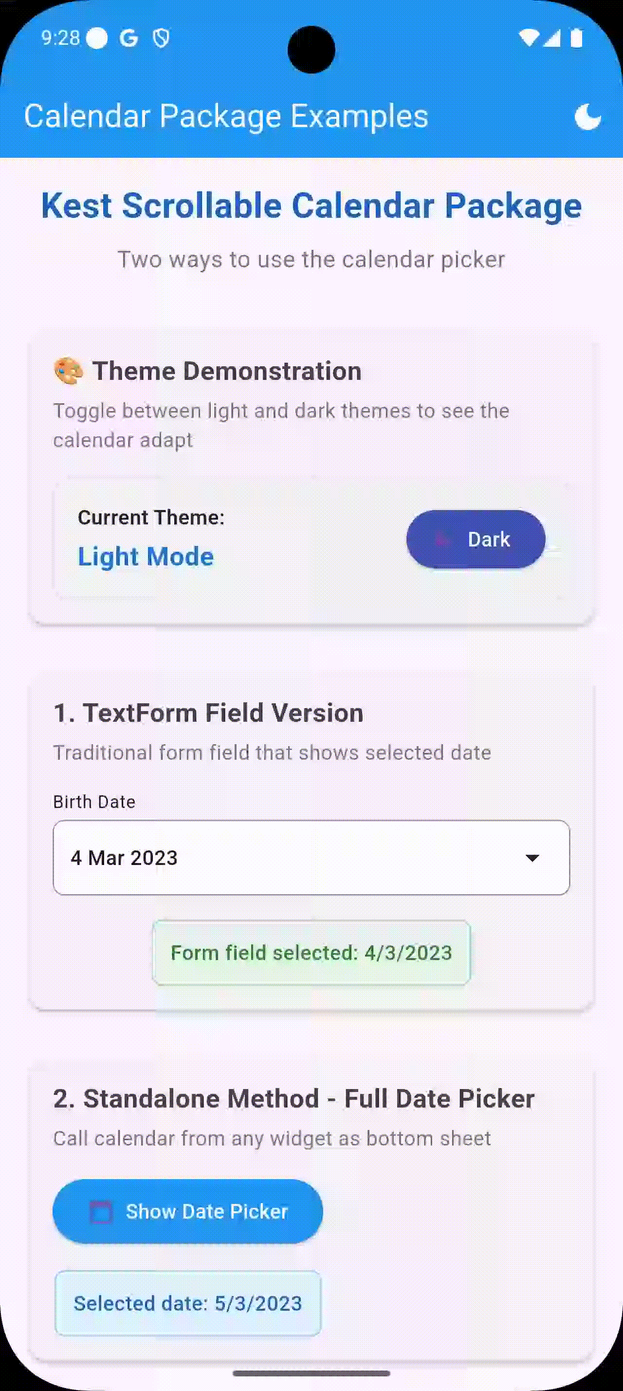
Usage
1. TextForm Field Integration
Perfect for traditional form inputs:
import 'package:kest_scrollable_calender/kest_scrollable_calender.dart';

CustomDateSelector(
  label: "Birth Date",
  theme: CalendarTheme.light, // or CalendarTheme.dark // also has a copy with for your colors...
  onDateSelected: (year, month, day) {
    print('Selected: $day/$month/$year');
  },
)
2. Standalone Bottom Sheet Methods
Call the calendar from anywhere in your app:
Full Date Picker
CalendarBottomSheet.showDatePicker(
  context,
  title: "Select Date",
  theme: CalendarTheme.light,
  onDateSelected: (year, month, day) {
    print('Selected: $day/$month/$year');
  },
);
Month/Year Picker Only
CalendarBottomSheet.showMonthYearPicker(
  context,
  title: "Select Month/Year",
  theme: CalendarTheme.dark,
  onDateSelected: (year, month, day) {
    print('Selected: $month/$year');
  },
);
3. Dropdown Integration
Trigger calendar from dropdown menus:
DropdownButtonFormField<String>(
  items: [
    DropdownMenuItem(value: 'full_date', child: Text('Pick Full Date')),
    DropdownMenuItem(value: 'month_year', child: Text('Pick Month/Year')),
  ],
  onChanged: (value) {
    if (value == 'full_date') {
      CalendarBottomSheet.showDatePicker(context, /* ... */);
    } else if (value == 'month_year') {
      CalendarBottomSheet.showMonthYearPicker(context, /* ... */);
    }
  },
)
🎨 Customization Examples
Visual Theme Comparison
| Light Theme | Dark Theme | Custom Buttons |
|---|---|---|
|
|
|
Button Customization Examples
Custom Button Variations
|
Gradient and styled button examples |
|
Additional custom button designs |
Customization
Themes
Use built-in themes or create custom ones:
// Built-in themes
CalendarTheme.light
CalendarTheme.dark

// Custom theme
CalendarTheme.light.copyWith(
  backgroundColor: Colors.grey[100],
  primaryColor: Colors.blue[800],
  textColor: Colors.black87,
  selectedColor: Colors.blue[600],
  buttonColor: Colors.orange,
  buttonTextColor: Colors.white,
)
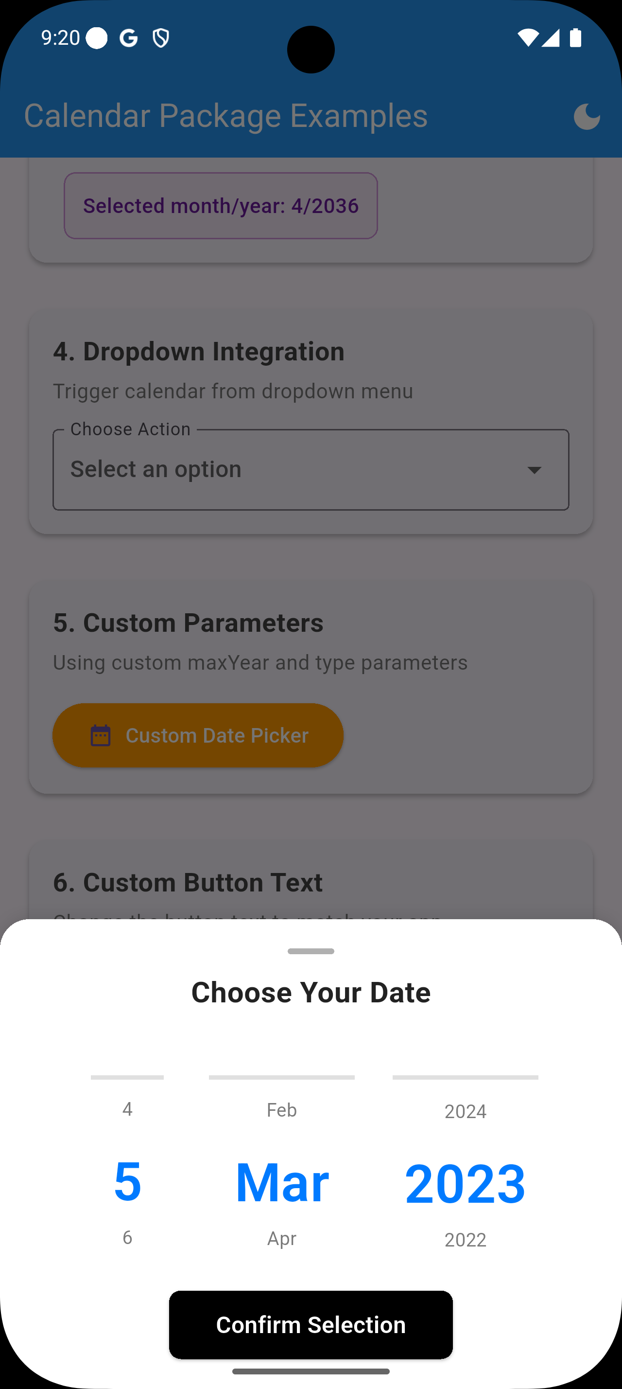
Custom Button Text
CalendarBottomSheet.showDatePicker(
  context,
  title: "Choose Your Date",
  buttonText: "Confirm Selection", // Custom button text
  onDateSelected: (year, month, day) { /* ... */ },
);
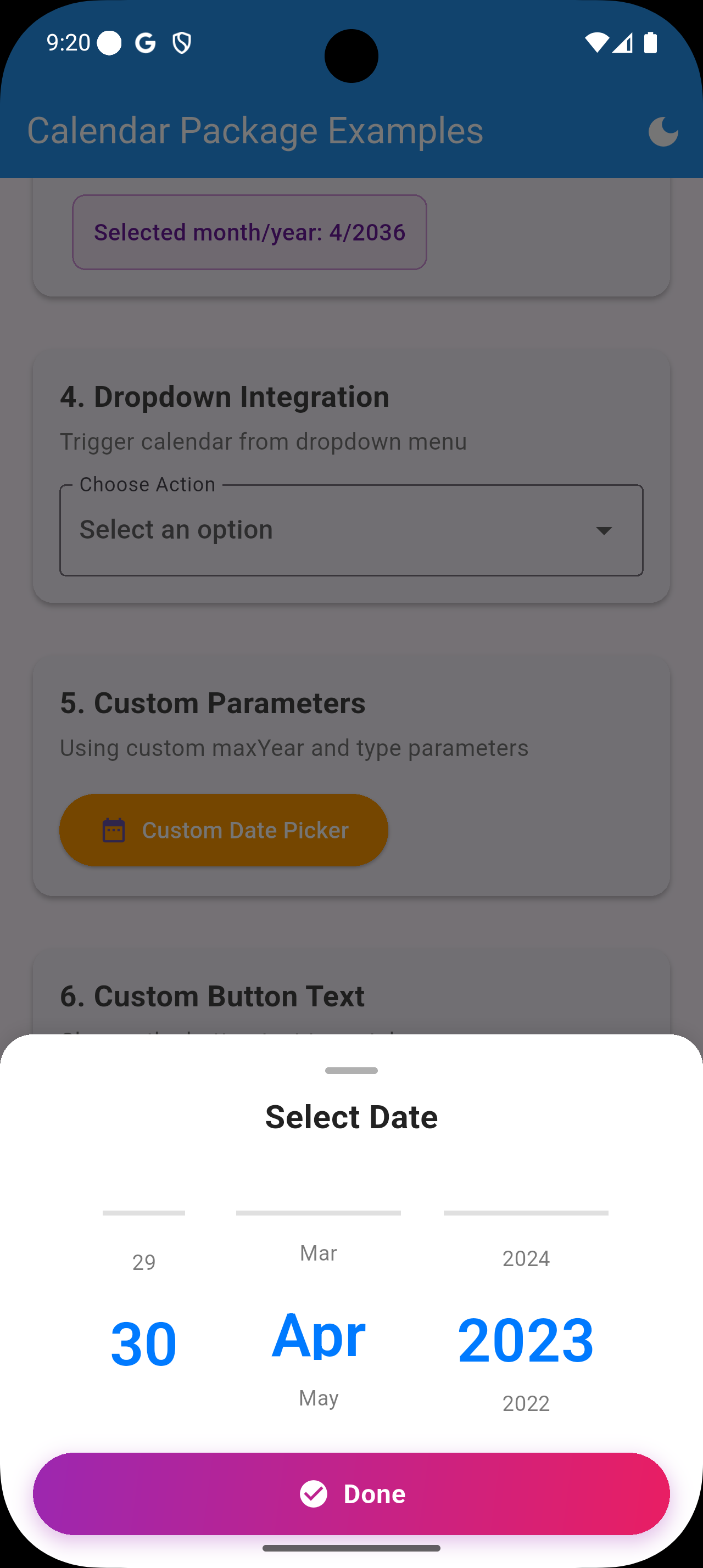
Custom Button Widget
Provide your own completely custom button:
CalendarBottomSheet.showDatePicker(
  context,
  title: "Select Date",
  customButton: Container(
    width: double.infinity,
    height: 50,
    decoration: BoxDecoration(
      gradient: LinearGradient(
        colors: [Colors.purple, Colors.pink],
        begin: Alignment.topLeft,
        end: Alignment.bottomRight,
      ),
      borderRadius: BorderRadius.circular(25),
    ),
    child: Material(
      color: Colors.transparent,
      child: InkWell(
        onTap: () => Navigator.of(context).pop(),
        child: Center(
          child: Row(
            mainAxisAlignment: MainAxisAlignment.center,
            children: [
              Icon(Icons.check_circle, color: Colors.white),
              SizedBox(width: 8),
              Text('Done', style: TextStyle(color: Colors.white)),
            ],
          ),
        ),
      ),
    ),
  ),
  onDateSelected: (year, month, day) { /* ... */ },
);
Advanced Parameters
CalendarBottomSheet.showDatePicker(
  context,
  title: "Select Future Date",
  maxYear: 2030,           // Custom year range
  type: "1",              // Custom type identifier
  theme: CalendarTheme.light,
  onDateSelected: (year, month, day) { /* ... */ },
);
CalendarTheme Properties
| Property | Description | Default (Light) | Default (Dark) |
|---|---|---|---|
backgroundColor |
Background color | Colors.white |
Colors.grey[900] |
primaryColor |
Primary text color | Colors.black87 |
Colors.white |
textColor |
General text color | Colors.black87 |
Colors.white |
selectedColor |
Selected item color | Colors.blue[700] |
Colors.blue[300] |
dividerColor |
Divider lines color | Colors.grey[300] |
Colors.grey[600] |
buttonColor |
Button background | Colors.blue |
Colors.blue[600] |
buttonTextColor |
Button text color | Colors.white |
Colors.white |
titleColor |
Title text color | Colors.blue[700] |
Colors.blue[300] |
handleColor |
Handle/drag color | Colors.grey[400] |
Colors.grey[500] |
Key Features Explained
Smart Center Detection
- Only the item at the visual center appears bold and large
- Automatic selection when scrolling to center
- Clean design with 3-4 items visible at once
Responsive Design
- Adapts to different screen sizes
- Optimized spacing for mobile, tablet, and desktop
- Consistent font sizes across all pickers
Theme System
- Complete color customization
- Light and dark mode support
- Easy theme inheritance with
copyWith()
Example App
Check out the complete example in the example/ directory to see all features in action, including:
- Theme switching
- Custom button widgets
- Dropdown integration
- Form field usage
- Advanced customization
Contributing
Contributions are welcome! Please feel free to submit a Pull Request.
License
This project is licensed under the MIT License - see the LICENSE file for details.