Save Points Chart 📊
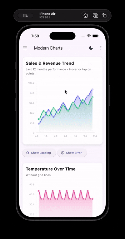
A modern, high-performance Flutter charting library with full theme support, featuring 17 chart types, Material 3 design, smooth animations, and interactive context menus with visual border highlighting.

🌐 Live Demo
Try it out in your browser: Live Demo →
🎥 Demo
🎯 Features
- 17 Chart Types: Line, Bar, Area, Stacked Area, Pie, Donut, Radial, Sparkline, Scatter, Bubble, Radar, Gauge, Spline, Step Line, Stacked Column, Pyramid, and Funnel charts
- Zero Dependencies: No external packages required - uses only Flutter SDK
- Modern Design: Material 3, Neumorphism, and Glassmorphism effects
- Full Theme Support: Automatic light/dark theme adaptation with InheritedWidget
- Interactive Context Menus: Awesome context menus on tap with actions
- Click Interaction: All charts support click interaction with visual border highlighting
- Visual Border Highlighting: White borders (3-4px) appear on selected elements for clear feedback
- Haptic Feedback: Tactile feedback on all chart interactions for better UX
- Hover Support: Mouse hover effects on Line, Bar, Area, Scatter, Bubble, and Radial charts
- High Performance: Optimized rendering with cached calculations and minimal rebuilds
- Smooth Animations: Beautiful entrance animations for all chart types
- Clean Architecture: Modular, reusable, and maintainable code
- Highly Customizable: Extensive configuration options
📦 Installation
Add this to your package's pubspec.yaml file:
dependencies:
  save_points_chart: ^1.5.0
Then run:
flutter pub get
Note: This package has zero external dependencies! Charts work perfectly without any state management - just pass a
ChartThemedirectly. The includedThemeProvideruses Flutter's built-inInheritedWidgetfor theme management.
🚀 Quick Start
import 'package:save_points_chart/save_points_chart.dart';

LineChartWidget(
  dataSets: [
    ChartDataSet(
      label: 'Sales',
      color: Colors.blue,
      dataPoints: [
        ChartDataPoint(x: 0, y: 10),
        ChartDataPoint(x: 1, y: 20),
        ChartDataPoint(x: 2, y: 15),
      ],
    ),
  ],
  theme: ChartTheme.light(),
  title: 'Sales Trend',
  subtitle: 'Last 3 months',
)
The demo showcases all 17 chart types with interactive features, click interactions, border highlighting, animations, and theme switching.
The video is also included in the published package on pub.dev.
📦 Dependencies
- Zero external dependencies! - Uses only Flutter SDK
- No external charting library - Uses custom
CustomPainterimplementations for full control - Built-in state management -
ThemeProvideruses Flutter'sInheritedWidget(no provider package needed)
🏗️ Architecture
lib/
├── models/          # Data models (ChartDataPoint, PieData, ChartDataSet)
├── theme/           # Theme configuration (ChartTheme)
├── painters/        # Custom painters (BaseChartPainter, LineChartPainter, etc.)
├── widgets/          # Chart widgets (Line, Bar, Area, Stacked Area, Pie, Donut, Radial, Sparkline, Scatter, Bubble, Radar, Gauge, Spline, Step Line, Stacked Column, Pyramid, Funnel)
├── providers/        # Theme provider for state management
├── data/            # Sample data generators
└── screens/         # Demo screens
🎨 Design Decisions
Chart Implementation: Custom CustomPainter
Why Custom Implementation?
- ✅ Zero external dependencies - No charting library required
- ✅ Full control - Complete customization of every aspect
- ✅ Lightweight - No unnecessary features or bloat
- ✅ High performance - Optimized rendering with direct canvas access
- ✅ Theme-aware - Built from the ground up with theme support
- ✅ Maintainable - Simple, understandable code structure
Architecture:
BaseChartPainter- Common utilities (grid, axes, labels)- Specialized painters for each chart type
- Efficient rendering with minimal repaints
- Smooth animations through Flutter's animation system
Theme System
- Adaptive Colors: Automatically adjusts based on light/dark mode
- Material 3: Uses Material Design 3 principles
- Gradient Support: Modern gradient fills for visual appeal
- Shadow System: Configurable elevation and shadows
- Glassmorphism: Optional frosted glass effect
- Neumorphism: Optional soft shadow effect
🚀 Usage
Basic Example
import 'package:flutter/material.dart';
import 'package:save_points_chart/save_points_chart.dart';

LineChartWidget(
  dataSets: [
    ChartDataSet(
      label: 'Sales',
      color: Colors.blue,
      dataPoints: [
        ChartDataPoint(x: 0, y: 10),
        ChartDataPoint(x: 1, y: 20),
        ChartDataPoint(x: 2, y: 15),
      ],
    ),
  ],
  theme: ChartTheme.light(),
  title: 'Sales Trend',
  subtitle: 'Last 3 months',
)
With Theme Provider (Optional)
If you want to use the included ThemeProvider for automatic theme switching, wrap your app with it:
Complete App Setup:
import 'package:flutter/material.dart';
import 'package:save_points_chart/save_points_chart.dart';

void main() {
  runApp(const MyApp());
}

class MyApp extends StatelessWidget {
  const MyApp({super.key});

  @override
  Widget build(BuildContext context) {
    return ThemeProvider(
      child: _MaterialAppWithTheme(),
    );
  }
}

class _MaterialAppWithTheme extends StatelessWidget {
  const _MaterialAppWithTheme();

  @override
  Widget build(BuildContext context) {
    final themeProvider = ThemeProvider.of(context);

    return MaterialApp(
      theme: ThemeData.light(),
      darkTheme: ThemeData.dark(),
      themeMode: themeProvider.themeMode,
      home: MyHomePage(),
    );
  }
}
Using ThemeProvider in Widgets:
// Get theme provider anywhere in your widget tree
final themeProvider = ThemeProvider.of(context);

// Access chart theme
LineChartWidget(
  dataSets: dataSets,
  theme: themeProvider.chartTheme,
  useGlassmorphism: true,
)

// Toggle theme
IconButton(
  icon: Icon(themeProvider.isDarkMode ? Icons.light_mode : Icons.dark_mode),
  onPressed: () => themeProvider.toggleTheme(),
)
Note: ThemeProvider uses Flutter's built-in InheritedWidget, so no external dependencies are required! The widget automatically rebuilds when the theme changes.
Click Interaction & Visual Feedback
All charts support click interaction with visual border highlighting. When you tap on chart elements (points, bars, segments), they show a prominent white border (3-4px) for clear visual feedback:
LineChartWidget(
  dataSets: dataSets,
  theme: chartTheme,
  onPointTap: (point, datasetIndex, pointIndex, position) {
    // Selected point will show white border automatically
    // Handle tap event
  },
)
Interactive Context Menu
All charts support interactive context menus on tap with haptic feedback:
LineChartWidget(
  dataSets: dataSets,
  theme: chartTheme,
  onPointTap: (point, datasetIndex, pointIndex, position) {
    ChartContextMenuHelper.show(
      context,
      point: point,
      position: position,
      datasetIndex: datasetIndex,
      elementIndex: pointIndex,
      datasetLabel: 'Sales',
      theme: chartTheme,
      onViewDetails: () {
        // Handle view details
      },
      onExport: () {
        // Handle export
      },
      onShare: () {
        // Handle share
      },
    );
  },
)
Hover Support
Line, Bar, Area, Scatter, Bubble, and Radial charts support mouse hover with visual feedback:
LineChartWidget(
  dataSets: dataSets,
  theme: chartTheme,
  onPointHover: (point, datasetIndex, pointIndex) {
    // Handle hover - point is null when mouse exits
    if (point != null) {
      print('Hovering over: ${point.y}');
    }
  },
)

BarChartWidget(
  dataSets: dataSets,
  theme: chartTheme,
  onBarHover: (point, datasetIndex, barIndex) {
    // Handle bar hover
    if (point != null) {
      print('Hovering over bar: ${point.y}');
    }
  },
)
🎛️ Customization Options
All charts support extensive customization:
- Colors: Theme-aware adaptive colors
- Gradients: Linear gradients for fills and backgrounds
- Line Thickness: Configurable stroke width
- Border Radius: Rounded corners
- Shadows: Elevation and shadow effects
- Axis Styling: Customizable axis appearance
- Grid Lines: Toggle grid visibility
- Legends: Show/hide legends
- Tooltips: Interactive tooltips
- Padding & Spacing: Configurable spacing
⚡ Performance Optimizations
- Minimal Rebuilds: Charts only rebuild when data changes
- Cached Styling: Theme objects are cached and reused
- Efficient Rendering: Optimized paint operations
- Lightweight Animations: Smooth 60fps animations
- Lazy Loading: Data processed only when needed
🌓 Theme Switching
The ThemeProvider supports automatic theme switching between:
- Light mode - Always use light theme
- Dark mode - Always use dark theme
- System mode - Follows device system settings
The theme automatically updates all charts and widgets that use ThemeProvider.of(context).chartTheme.
📱 Example App
Try the live demo: https://startling-concha-05444f.netlify.app/
Or check out the example app in the repository to see all chart types in action.
📊 Chart Types
Line Chart
- Smooth curves
- Gradient area fills
- Interactive tooltips with haptic feedback
- Mouse hover support with visual feedback
- Multiple datasets
Bar Chart
- Grouped or stacked bars
- Rounded corners
- Gradient fills
- Customizable spacing
- Mouse hover support with elevation effects
- Haptic feedback on tap
Area Chart
- Filled areas with gradients
- Smooth curves
- Multiple datasets overlay
- Interactive point tapping
Stacked Area Chart
- Cumulative multi-series visualization
- Stacked layers for trend comparison
- Multiple datasets required
- Smooth gradient fills
- Interactive point tapping
Pie Chart
- Percentage labels
- Customizable colors
- Legend support
- Smooth animations
Donut Chart
- Center value display
- Similar to pie with center space
- Modern donut design
Radial Chart
- Multi-dimensional data
- Radar/spider chart
- Performance metrics visualization
- Mouse hover support with glow effects
- Haptic feedback on tap
Sparkline Chart
- Compact inline charts
- Positive/negative color coding
- Trend visualization
Scatter Chart
- Relationship visualization
- Correlation analysis
- Multiple data series support
- Interactive point tapping
- Mouse hover support
Bubble Chart
- Three-dimensional data visualization
- Size-based encoding
- Multiple data series
- Interactive bubble tapping
- Mouse hover support
Radar Chart
- Multi-dimensional data comparison
- Spider/web chart visualization
- Multiple series overlay
- Customizable grid levels
- Performance metrics display
Gauge Chart
- Single metric visualization
- KPI and progress indicators
- Customizable segments
- Semi-circular or circular gauge
- Center label and unit display
- Interactive chart tapping
Spline Chart
- Smooth bezier curves
- Gradient area fills
- Interactive point tapping with border highlighting
- Multiple datasets support
Step Line Chart
- Step function visualization
- Horizontal and vertical segments
- Interactive point tapping with border highlighting
- Area fill support
Stacked Column Chart
- Multiple datasets stacked vertically
- Interactive bar tapping with border highlighting
- Gradient fills per segment
- Customizable bar width
Pyramid Chart
- Hierarchical data visualization
- Largest to smallest segments
- Interactive segment tapping with border highlighting
- Gradient fills
Funnel Chart
- Sales funnel and conversion tracking
- Top to bottom narrowing
- Interactive segment tapping with border highlighting
- Gradient fills
🎨 Design Effects
Glassmorphism
Enable with useGlassmorphism: true for a frosted glass effect with backdrop blur.
Neumorphism
Enable with useNeumorphism: true for soft shadows and embossed appearance.
📝 Example Screens
The demo screen includes:
- Drawer navigation for chart type selection
- Theme toggle button
- Design effect selector (Glassmorphism/Neumorphism)
- Multiple chart examples per type
- Responsive layout
🔧 Extending
To add new chart types:
- Create a new widget in
lib/widgets/ - Follow the existing pattern
- Use
ChartContainerfor consistent styling - Support
ChartThemefor theme awareness
📄 License
This project is open source and available for use.
🤝 Contributing
Contributions are welcome! Please feel free to submit a Pull Request.
📧 Support
For issues, questions, or suggestions, please open an issue on GitHub.
Libraries
- models/chart_data
- models/chart_interaction
- painters/bar_chart_painter
- painters/base_chart_painter
- painters/bubble_chart_painter
- painters/funnel_chart_painter
- painters/gauge_chart_painter
- painters/line_chart_painter
- painters/pie_chart_painter
- painters/pyramid_chart_painter
- painters/radar_chart_painter
- painters/radial_chart_painter
- painters/scatter_chart_painter
- painters/spline_chart_painter
- painters/stacked_area_chart_painter
- painters/stacked_column_chart_painter
- painters/step_line_chart_painter
- providers/theme_provider
- save_points_chart
- A modern, high-performance Flutter charting library with full theme support.
- theme/chart_theme
- utils/chart_cache
- utils/chart_interaction_helper
- utils/performance_utils
- widgets/area_chart_widget
- widgets/bar_chart_widget
- widgets/bubble_chart_widget
- widgets/chart_container
- widgets/donut_chart_widget
- widgets/funnel_chart_widget
- widgets/gauge_chart_widget
- widgets/line_chart_widget
- widgets/pie_chart_widget
- widgets/pyramid_chart_widget
- widgets/radar_chart_widget
- widgets/radial_chart_widget
- widgets/scatter_chart_widget
- widgets/sparkline_chart_widget
- widgets/spline_chart_widget
- widgets/stacked_area_chart_widget
- widgets/stacked_column_chart_widget
- widgets/step_line_chart_widget