saifu_qr
A package that enables single to many QR code generation.
You can now decide, whether you want the package to split the data into specified character chunks of data and then put them into QRs, or simply provide the data and it will 1-1 the data index to the QR image bool splitData = true/false
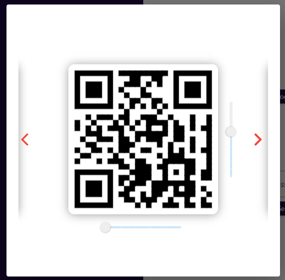
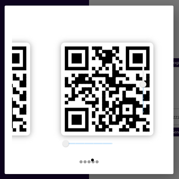
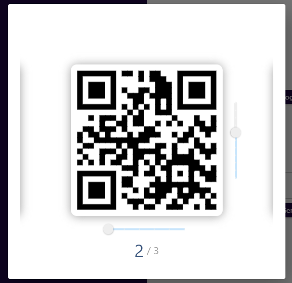
Dataset needs to be provided, and regrex expression is used to split the datasets into equal amounts, which is then broken into separate QR-Codes. A single QRcode is displayed at a time, until all the qrcodes are shown and repeated. This animates from one QR to the next.
This package includes addition features that will enable you to change it to suit your criteria.
Feel free to modify the inner source code to add Pagination, Controls and change criterias.
Usage
To use this plugin, add multiple_qrcodes as a dependency in your pubspec.yaml file
Import it into your dart file
import 'package:saifu_qr/saifu_sq.dart';
Example
  Column(mainAxisAlignment: MainAxisAlignment.center,
    children: [
        SizedBox(
             width: 500,
             height: 500,
                child: SaifuQR(data: ["This must be", "a data set"]),
                )
             ])
Example with Data Split
This provides a datalist, and set's the amount of character per QR Image to be 100 characters. This generates QR Images in which, the max amount of character is 100 each.
  Column(mainAxisAlignment: MainAxisAlignment.center,
    children: [
        SizedBox(
             width: 500,
             height: 500,
                child: SaifuQR(
                data: datalist,
                splitData: true,
                charPerFrame: 100,
          ),
                )
             ])
This package includes addition features that will enable you to change it to suit your criteria. This is past examples of the UX used. Refer to older versions. This package has simplified the UX.
refer to the Swiper library (https://pub.dev/packages/card_swiper) for more information on layouts and building a custom design
Issues with NULL error at initialisation of multiple frames : https://github.com/best-flutter/flutter_swiper/issues/139#issuecomment-553876950
| # Swiper Layouts | # Screenshot | # Code Example |
|---|---|---|
| # Stack |  |
SwiperLayout.STACK |
| # Tinder |  |
SwiperLayout.TINDER |
| # Default |  |
SwiperLayout.DEFAULT |
| # Custom | SwiperLayout.CUSTOM |
SwiperControl
control: new SwiperControl(color: Colors.red)
Page Indicator.(DROP/SLIDE e.g.)
PageIndicatorLayout.DROP
Pagination Builder
DotSwiper
DotSwiperPaginationBuilder()
Fraction
FractionPaginationBuilder();
RectSwiper
RectSwiperPaginationBuilder();
These properties are required to be depending on the type of builder used: e.g. itemHeight: x --> this property is valid if layout=STACK or layout=TINDER or LAYOUT=CUSTOM, itemWidth: x --> this property is valid if layout=STACK or layout=TINDER or LAYOUT=CUSTOM,