s_sidebar

A beautiful, customizable, and responsive sidebar widget for Flutter applications. Features smooth animations, adaptive layouts, and extensive customization options.
Features
✨ Collapsible Design - Easily toggle between minimized and expanded states 🎨 Highly Customizable - Extensive styling options for colors, sizes, and spacing 📱 Responsive - Intelligently adapts to available space 🔔 Badge Support - Display notifications or counts on menu items 🎯 Smart Layout - Automatically optimizes space usage ⚡ Smooth Animations - Beautiful transitions and effects ♿ Accessible - Built-in semantics and tooltip support 🎛️ Programmatic Control - SideBarController for external control
Installation
Add this to your package's pubspec.yaml file:
dependencies:
  s_sidebar: ^1.0.3
Then run:
flutter pub get
Usage
Basic Example
import 'package:flutter/material.dart';
import 'package:s_sidebar/s_sidebar.dart';

class MyApp extends StatelessWidget {
  @override
  Widget build(BuildContext context) {
    return MaterialApp(
      home: Scaffold(
        body: Row(
          children: [
            SSideBar(
              sidebarItems: [
                SSideBarItem(
                  iconSelected: Icons.home,
                  iconUnselected: Icons.home_outlined,
                  title: 'Home',
                ),
                SSideBarItem(
                  iconSelected: Icons.dashboard,
                  iconUnselected: Icons.dashboard_outlined,
                  title: 'Dashboard',
                ),
                SSideBarItem(
                  iconSelected: Icons.settings,
                  iconUnselected: Icons.settings_outlined,
                  title: 'Settings',
                ),
              ],
              onTapForAllTabButtons: (index) {
                print('Tapped item at index: $index');
              },
            ),
            Expanded(
              child: Center(
                child: Text('Main Content'),
              ),
            ),
          ],
        ),
      ),
    );
  }
}
Advanced Example with Customization
SSideBar(
  sidebarItems: [
    SSideBarItem(
      iconSelected: Icons.home,
      iconUnselected: Icons.home_outlined,
      title: 'Home',
      tooltip: 'Go to Home',
    ),
    SSideBarItem(
      iconSelected: Icons.notifications,
      iconUnselected: Icons.notifications_outlined,
      title: 'Notifications',
      badgeText: '5',
      badgeColor: Colors.red,
    ),
    SSideBarItem(
      iconSelected: Icons.settings,
      iconUnselected: Icons.settings_outlined,
      title: 'Settings',
      onTap: (offset) {
        print('Settings tapped at offset: $offset');
      },
    ),
  ],
  onTapForAllTabButtons: (index) {
    print('Selected index: $index');
  },
  // Styling
  sideBarColor: Color(0xff1D1D1D),
  selectedIconColor: Colors.white,
  unselectedIconColor: Color(0xffA0A5A9),
  selectedTextColor: Colors.white,
  unSelectedTextColor: Color(0xffA0A5A9),
  selectedIconBackgroundColor: Color(0xff323232),

  // Dimensions
  sideBarWidth: 240,
  sideBarSmallWidth: 84,
  sideBarHeight: 600, // Optional: null for full height
  borderRadius: 20,
  sideBarItemHeight: 48,

  // Behavior
  isMinimized: false,
  compactMode: false,
  settingsDivider: true,
  showTooltipsWhenMinimized: true,
  preSelectedItemIndex: 0,

  // Customization
  itemHorizontalPadding: 10,
  itemIconTextSpacing: 12,
  itemBorderRadius: 10,

  // Callbacks
  minimizeButtonOnTap: (isMinimized) {
    print('Sidebar minimized: $isMinimized');
  },

  // Optional logo
  logo: FlutterLogo(size: 40),
)
Using SideBarController
The SideBarController provides static methods for programmatic control and popup sidebar functionality:
// Get the controller instance
final controller = SideBarController.getController();

// Check if popup sidebar is currently active
bool isActive = SideBarController.isSideBarActive();

// Check if sidebar is minimized
bool isMinimized = SideBarController.isSideBarMinimized();

// Control minimized state
SideBarController.setMinimizedState(true);

// Create a popup/overlay sidebar (useful for context menus, floating sidebars)
// This displays a sidebar as an overlay using the `pop_overlay` package
SideBarController.activateSideBar(
  SSideBar(
    sidebarItems: [
      SSideBarItem(
        iconSelected: Icons.favorite,
        title: 'Favorites',
        badgeText: '3',
      ),
      SSideBarItem(
        iconSelected: Icons.history,
        title: 'Recent',
      ),
    ],
    onTapForAllTabButtons: (index) {
      print('Popup item selected: $index');
    },
    sideBarHeight: 400, // Optional fixed height
  ),
);

// Dismiss the popup sidebar
SideBarController.deactivateSideBar();

// You can also pass null to activateSideBar for default sidebar
SideBarController.activateSideBar(null);
Popup Sidebar Features:
- Creates an overlay sidebar that floats above content
- Dismisses when tapping outside (barrier dismiss)
- Fully customizable like regular sidebar
- Useful for context menus, quick actions, or temporary navigation
- Controlled programmatically via static methods
Disabling Specific Items
SSideBar(
  sidebarItems: [
    SSideBarItem(iconSelected: Icons.home, title: 'Home'),
    SSideBarItem(iconSelected: Icons.settings, title: 'Settings'),
  ],
  shouldTapItems: [true, false], // Disable settings item
  onTapForAllTabButtons: (index) {},
)
Parameters
SSideBar Parameters
| Parameter | Type | Default | Description |
|---|---|---|---|
sidebarItems |
List<SSideBarItem> |
required | List of sidebar menu items |
onTapForAllTabButtons |
ValueChanged<int>? |
required | Callback when any item is tapped |
sideBarColor |
Color |
Color(0xff1D1D1D) |
Background color of the sidebar |
selectedIconColor |
Color |
Colors.white |
Color of selected item icon |
unselectedIconColor |
Color |
Color(0xffA0A5A9) |
Color of unselected item icons |
selectedTextColor |
Color |
Colors.white |
Color of selected item text |
unSelectedTextColor |
Color |
Color(0xffA0A5A9) |
Color of unselected item text |
selectedIconBackgroundColor |
Color |
Color(0xff323232) |
Background color of selected item |
sideBarWidth |
double |
240 |
Width when expanded |
sideBarSmallWidth |
double |
84 |
Width when minimized |
sideBarHeight |
double? |
null |
Fixed height (null for full height) |
borderRadius |
double |
20 |
Corner radius of sidebar |
sideBarItemHeight |
double |
48 |
Height of each menu item |
isMinimized |
bool |
false |
Initial minimized state |
compactMode |
bool |
false |
Reduces spacing between items |
settingsDivider |
bool |
true |
Show divider before last item |
showTooltipsWhenMinimized |
bool |
true |
Show tooltips in minimized state |
preSelectedItemIndex |
int? |
null |
Initially selected item index |
logo |
Widget? |
null |
Widget to display at top of sidebar |
minimizeButtonOnTap |
Function(bool)? |
null |
Callback when minimize button tapped |
shouldTapItems |
List<bool> |
[] |
Enable/disable individual items |
itemHorizontalPadding |
double |
10 |
Horizontal padding of items |
itemIconTextSpacing |
double |
12 |
Space between icon and text |
itemBorderRadius |
double |
10 |
Border radius of items |
SSideBarItem Parameters
| Parameter | Type | Required | Description |
|---|---|---|---|
iconSelected |
IconData |
✓ | Icon shown when item is selected |
title |
String |
✓ | Text label for the item |
iconUnselected |
IconData? |
✗ | Icon shown when item is not selected |
tooltip |
String? |
✗ | Tooltip text (shown when minimized) |
badgeText |
String? |
✗ | Text to display in badge |
badgeColor |
Color? |
✗ | Background color of badge |
badgeTextStyle |
TextStyle? |
✗ | Style for badge text |
onTap |
Function(Offset?)? |
✗ | Item-specific tap callback |
Adaptive Layout
The sidebar intelligently adapts to available space:
- Plenty of space: The minimize button expands to fill remaining vertical space
- Constrained space: The minimize button takes minimal space and remains visible at the bottom
- Items scrolling: The sidebar items scroll smoothly when content exceeds available height
Example
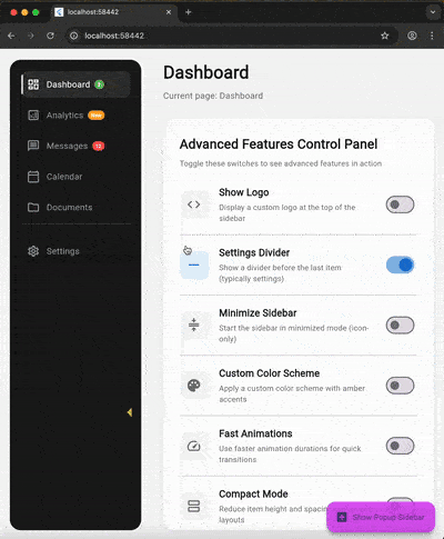
Check out the example directory for a complete working example.
Contributing
Contributions are welcome! Please feel free to submit a Pull Request.
License
This project is licensed under the MIT License - see the LICENSE file for details.
Credits
Developed by SoundSliced
Support
If you find this package useful, please consider giving it a ⭐ on GitHub!
Libraries
- s_sidebar package