s_expendable_menu

A beautiful, customizable expandable menu widget for Flutter with smooth animations and multiple expansion directions.
Features
✨ Flexible Expansion - Expands in 4 directions (left, right, up, down) plus auto mode
🎨 Highly Customizable - Colors, sizes, icons, and animations
📱 Responsive - Automatic scrolling for many items (max 5 visible)
🌍 RTL Support - Works seamlessly with right-to-left layouts
⚡ Smooth Animations - Staggered item animations with customizable curves
🎯 Easy to Use - Simple API with sensible defaults
🔧 Advanced Control - Standalone handle widget for custom implementations
Installation
Add this to your package's pubspec.yaml file:
dependencies:
  s_expendable_menu: ^3.1.1
Then run:
flutter pub get
Basic Usage
Here's a simple example to get you started:
import 'package:flutter/material.dart';
import 'package:s_expendable_menu/s_expendable_menu.dart';

class MyWidget extends StatelessWidget {
  @override
  Widget build(BuildContext context) {
    return SExpandableMenu(
      items: [
        SExpandableItem(
          icon: Icons.home,
          onTap: (position) => print('Home tapped'),
        ),
        SExpandableItem(
          icon: Icons.search,
          onTap: (position) => print('Search tapped'),
        ),
        SExpandableItem(
          icon: Icons.favorite,
          onTap: (position) => print('Favorite tapped'),
        ),
        SExpandableItem(
          icon: Icons.settings,
          onTap: (position) => print('Settings tapped'),
        ),
      ],
    );
  }
}
Advanced Usage
Custom Colors and Size
SExpandableMenu(
  width: 80.0,
  height: 80.0,
  backgroundColor: const Color(0xFF283149),
  iconColor: const Color(0xFFFFD369),
  itemContainerColor: const Color(0xFF00A8CC),
  items: [
    SExpandableItem(icon: Icons.home),
    SExpandableItem(icon: Icons.search),
    SExpandableItem(icon: Icons.favorite),
  ],
)
Expansion Direction Control
// Expand to the right
SExpandableMenu(
  expandDirection: ExpandDirection.right,
  items: [...],
)

// Expand upward
SExpandableMenu(
  expandDirection: ExpandDirection.up,
  items: [...],
)

// Auto mode (defaults to left)
SExpandableMenu(
  expandDirection: ExpandDirection.auto,
  items: [...],
)
Custom Animation
SExpandableMenu(
  animationDuration: const Duration(milliseconds: 600),
  animationCurve: Curves.elasticOut,
  items: [...],
)
Many Items with Scrolling
SExpandableMenu(
  items: List.generate(
    10,
    (index) => SExpandableItem(
      icon: Icons.star,
      onTap: (pos) => print('Item $index tapped at $pos'),
    ),
  ),
)
Custom Icon Sizes
SExpandableMenu(
  items: [
    SExpandableItem(
      icon: Icons.home,
      size: 30.0, // Custom size for this item
      onTap: (pos) => print('Tapped'),
    ),
    SExpandableItem(
      icon: Icons.search,
      // Uses default size (itemSize * 0.9)
    ),
  ],
)
Using the Standalone Handle Widget
The SExpandableHandles widget can be used independently for custom implementations:
Standalone Mode (Simple)
SExpandableHandles(
  width: 70,
  height: 70,
  iconColor: Colors.white,
  onTap: () => print('Handle tapped!'),
)
Controlled Mode (Advanced)
class MyWidget extends StatefulWidget {
  @override
  State<MyWidget> createState() => _MyWidgetState();
}

class _MyWidgetState extends State<MyWidget> {
  bool _isExpanded = false;

  @override
  Widget build(BuildContext context) {
    return SExpandableHandles(
      width: 70,
      height: 70,
      iconColor: Colors.white,
      isExpanded: _isExpanded,
      expandsRight: true, // Horizontal expansion to the right
      onTap: () {
        setState(() => _isExpanded = !_isExpanded);
      },
    );
  }
}
External Trigger Mode
class MyWidget extends StatefulWidget {
  @override
  State<MyWidget> createState() => _MyWidgetState();
}

class _MyWidgetState extends State<MyWidget> {
  bool _triggerAnimation = false;

  void _animateHandle() {
    setState(() => _triggerAnimation = !_triggerAnimation);
  }

  @override
  Widget build(BuildContext context) {
    return Column(
      children: [
        SExpandableHandles(
          width: 70,
          height: 70,
          iconColor: Colors.white,
          triggerOnTap: _triggerAnimation,
          onTap: () => print('Animation triggered'),
        ),
        ElevatedButton(
          onPressed: _animateHandle,
          child: Text('Trigger Animation'),
        ),
      ],
    );
  }
}
API Reference
SExpandableMenu
| Parameter | Type | Default | Description |
|---|---|---|---|
items |
List<SExpandableItem> |
required | List of menu items to display |
width |
double |
50.0 |
Width of the collapsed menu and slot width per item |
height |
double |
70.0 |
Height of the menu |
backgroundColor |
Color |
Color(0xFF4B5042) |
Background color of the menu |
iconColor |
Color |
Colors.white |
Color of all icons |
itemContainerColor |
Color? |
null |
Background color for item containers (defaults to white with 40% opacity) |
animationDuration |
Duration |
Duration(milliseconds: 400) |
Duration of expand/collapse animation |
animationCurve |
Curve |
Curves.easeOutCubic |
Animation curve |
expandDirection |
ExpandDirection |
ExpandDirection.auto |
Direction of menu expansion |
onExpansionChanged |
void Function(bool)? |
null |
Callback when expansion state changes |
SExpandableItem
| Parameter | Type | Default | Description |
|---|---|---|---|
icon |
IconData |
required | Icon to display |
size |
double? |
null |
Optional size override (defaults to 90% of item container size) |
onTap |
void Function(Offset)? |
null |
Callback when item is tapped, receives tap position |
tooltip |
String? |
null |
Tooltip text shown on hover or long-press |
disabled |
bool |
false |
Render at reduced opacity with null tap handler |
SExpandableHandles
| Parameter | Type | Default | Description |
|---|---|---|---|
onTap |
VoidCallback |
required | Callback when handle is tapped |
width |
double |
required | Width of the handle container |
height |
double |
required | Height of the handle container |
iconColor |
Color |
required | Color of the arrow icon |
isExpanded |
bool |
false |
Whether the menu is expanded (controlled mode) |
expandsRight |
bool? |
null |
If true, menu expands horizontally to the right |
expandsDown |
bool? |
null |
If true, menu expands vertically downward |
shoulAutodReverseHamburgerAnimationWhenComplete |
bool? |
null |
Controls automatic animation reversal |
onHamburgerStateAnimationCompleted |
Function(bool?)? |
null |
Callback when animation completes |
triggerOnTap |
bool? |
null |
Triggers animation when value changes |
ExpandDirection
enum ExpandDirection {
  left,   // Expands horizontally to the left
  right,  // Expands horizontally to the right
  up,     // Expands vertically upward
  down,   // Expands vertically downward
  auto,   // Automatically determines direction (defaults to left)
}
Implementation Details
- Maximum Visible Items: 5 items are visible at once; additional items are scrollable
- Item Animation: Each item has a staggered fade-in and scale animation
- Close Button: Fades in during the last 15% of the expansion animation
- Border: Automatically darkened border based on background color
- Scrolling: Uses
BouncingScrollPhysicsfor a natural feel - Performance: Item lists are wrapped in
RepaintBoundaryfor optimization
Dependencies
This package depends on:
- soundsliced_tween_animation_builder - For smooth animations
- soundsliced_dart_extensions - Dart utility extensions
- s_button - Customizable button widget
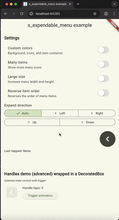
Example
Check out the example directory for a complete demo app that showcases:
- All expansion directions
- Custom colors and sizes
- Multiple items with scrolling
- RTL support
- Handle widget demonstrations
- External state control
To run the example:
cd example
flutter run
Contributing
Contributions are welcome! Please feel free to submit a Pull Request.
License
This project is licensed under the MIT License - see the LICENSE file for details.
Author
SoundSliced
Changelog
See CHANGELOG.md for a list of changes.
Issues
If you encounter any issues or have suggestions, please file them in the issue tracker.
Libraries
- s_expendable_menu package