responsify
A new Flutter package for creating Responsive UI based on device type
Overview of this library
- The
responsifypackage is a pure Dart package based on this tutorial by FilledStacks. - With this library, you can:
- Get the device type (Mobile, Tablet, Computer or Wearable) and create different layouts depending on device type
- Get the device's orientation
- Get the device's platform brightness, i.e., light mode or dark mode
- Get the parent widget's size (Width X Height)
- Get the child widget's size (Width X Height)
- Get the device operating system as a String
- Get the device type (Mobile, Tablet, Computer or Wearable) and create different layouts depending on device type
How this library works
- The library has a single widget, known as the
ResponsiveUiWidgetthat returns a widget in itsbuildmethod - The library takes the device's pixel density into account. It is determined using the device's pixel ratio and a baseline pixel density
of 160. Older computers have a lower pixel density (such as 96 or 120 ppi). In this case, the pixel density is not
considered when determining if the device is a computer
- The
ResponsiveUiWidgethas a required parameter calledtargetOlderComputers. If true, this flag allows you to target older computer models that have pixel density of lower than 160. Also, when true, only this flag and the computer's Platform OS (Windows, macOS, Linux) is used to determine if the device is a computer. If false, the device type is determined to be a computer using the Pythogoras theorem (see the next point) along with the Platform OS - The Pythogoras theorem is used to calculated the diagonal dimensions of the device screen in pixels. This resulting value is then used with the device pixel density to determine the diagonal screen size in inches. Device Screen Size (inches) = Device Screen Size (pixels)/Device pixel density (PPI). This result, along with the device's Platform OS, is used to determine the device type (Mobile, Tablet, Wearable, Computer)
- If the above three points sound confusing, here is the code block:
    ///The checkHandheldDevicePlatform flag is used to determine a Handheld device's OS Platform
    bool checkHandheldDevicePlatform = Platform.isAndroid || Platform.isIOS || Platform.isFuchsia;

    ///The checkComputerPlatform flag is used to determine a Computer device's OS Platform
    ///Here a Computer may be any Desktop or Laptop/Notebook device that runs either Windows,
    ///macOS or Linux
    bool checkComputerPlatform = Platform.isWindows || Platform.isMacOS || Platform.isLinux;

    ///if...else block used to determine the device type based on the DeviceType enum and the
    ///DeviceInformation class. All threshold values are in inches
    if (deviceSize! <= 3) {
      return deviceType = DeviceTypeInformation.WEARABLE;
    } else if (deviceSize! > 3 && deviceSize! < 7.1 && checkHandheldDevicePlatform) {
      return deviceType = DeviceTypeInformation.MOBILE;
    } else if (deviceSize! > 7.1 && deviceSize! < 13.5 && checkHandheldDevicePlatform) {
      return deviceType = DeviceTypeInformation.TABLET;
    } else if ((deviceSize! > 13.5 && deviceSize! < 55 && checkComputerPlatform) ||
        (targetOlderComputers! && checkComputerPlatform)) {
      return deviceType = DeviceTypeInformation.COMPUTER;
    } else {
      return deviceType = DeviceTypeInformation.UNKNOWN;
    }
- Device pixel density = Device pixel ratio * 160. The Device Pixel Ratio is retrieved using MediaQuery
- The thresholds for device screen sizes were determined by performing a search for minimum and maximum screen sizes for each device type.
As such, you do not have to specify thresholds for device sizes
Usage
- Add
responsifyto yourpubspec.yamland runpub get - Import
responsify.dartinto your project, like so:
import 'package:responsify/responsify.dart';' - Use it. As an example, like so:
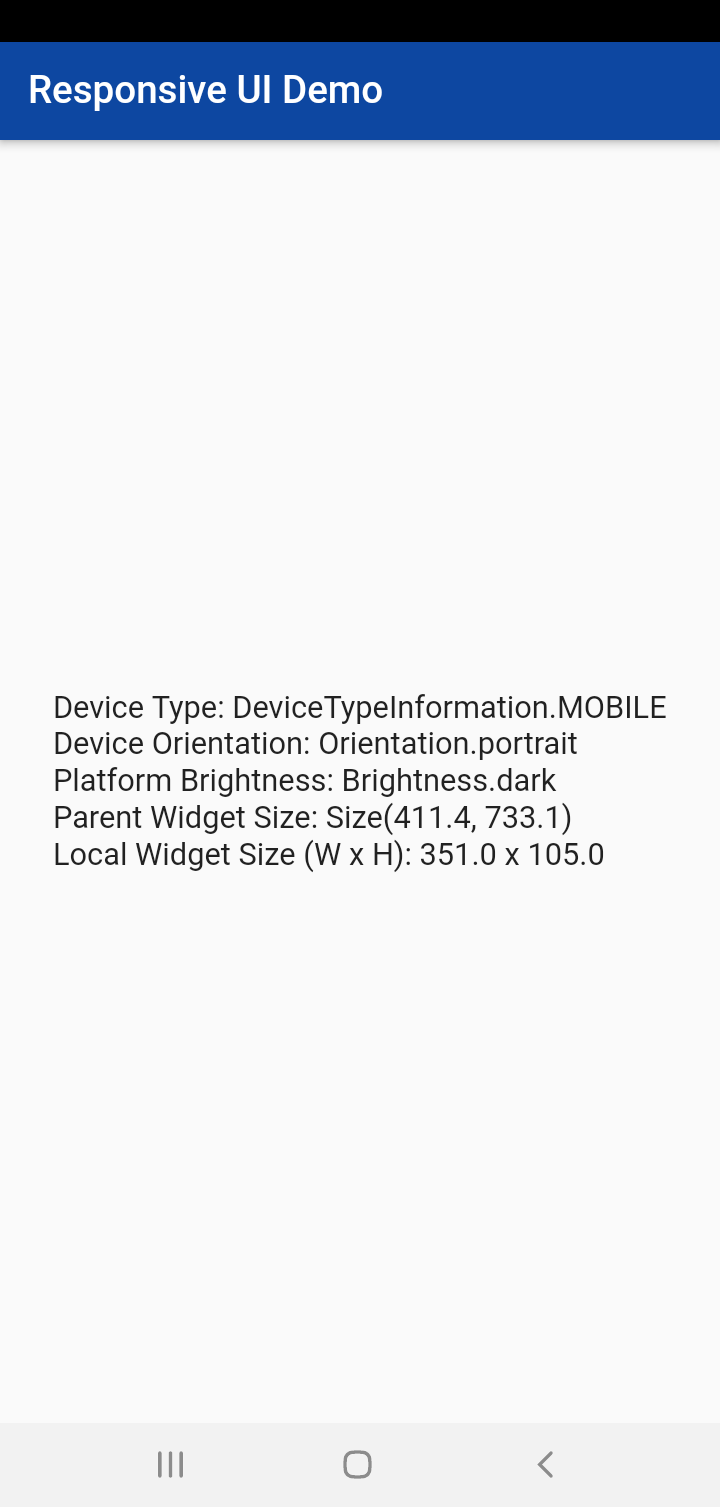
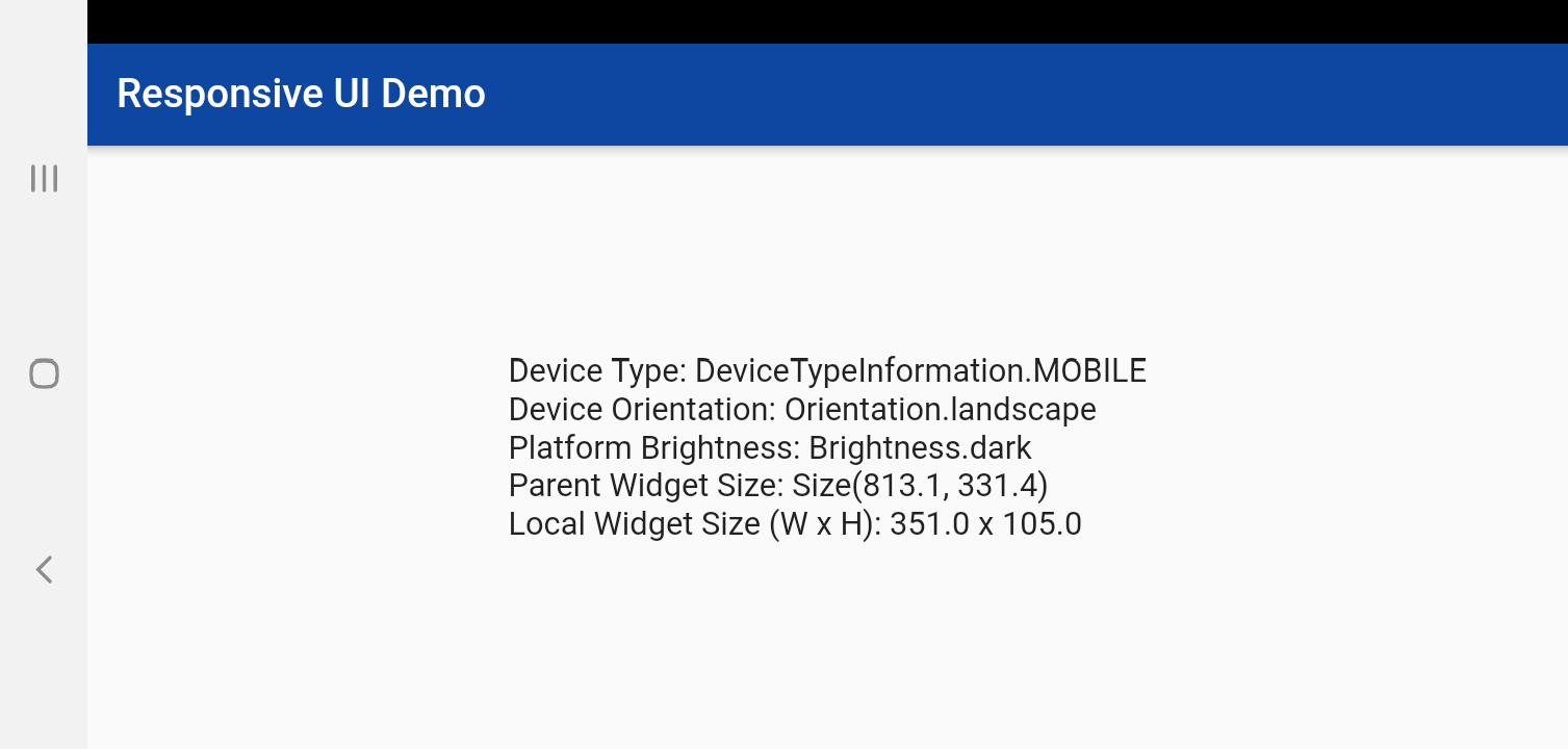
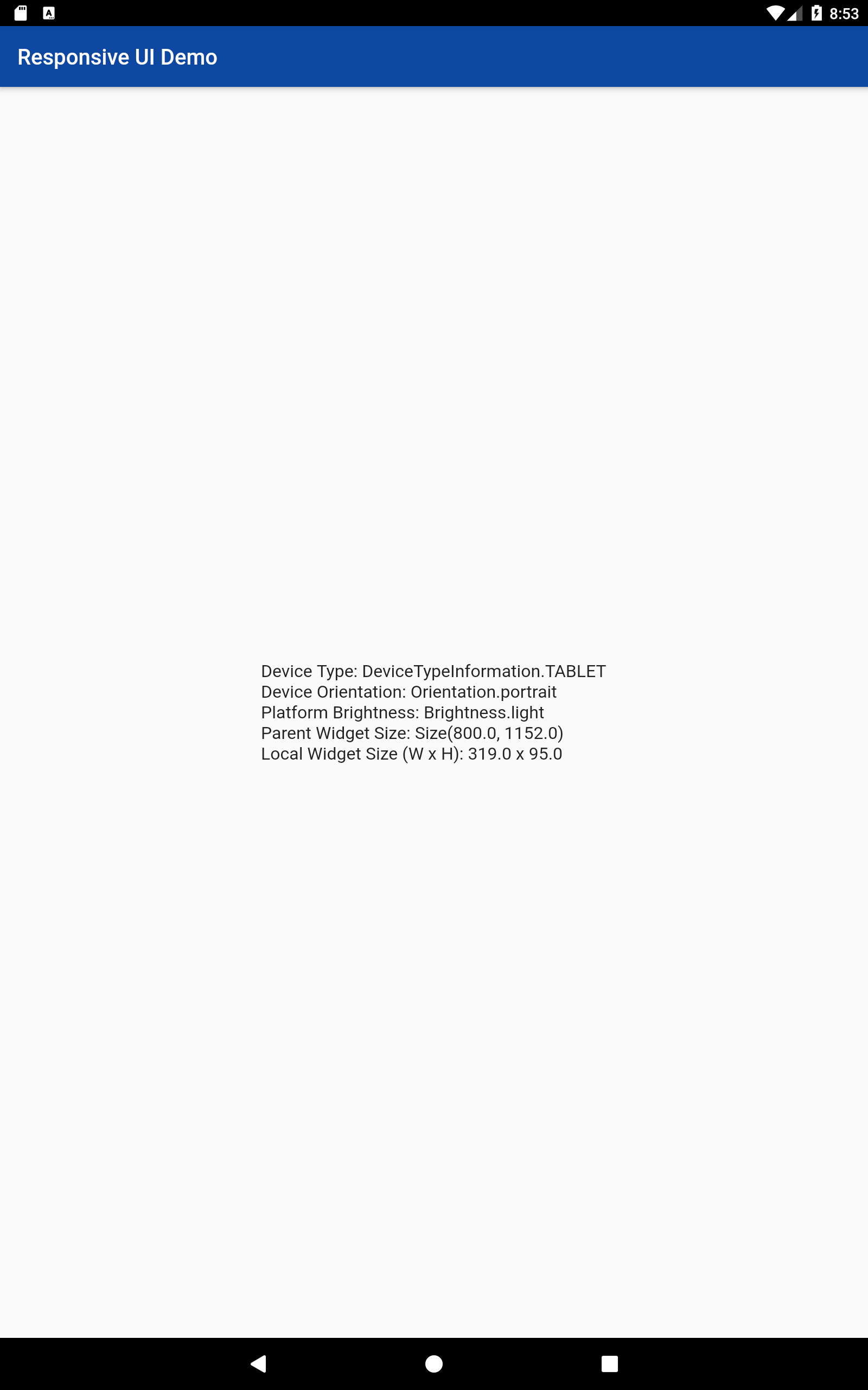
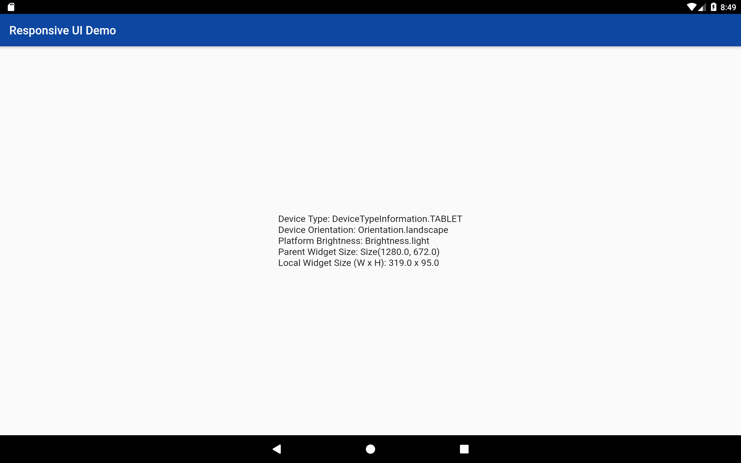
class DeviceInformation extends StatelessWidget {
  DeviceInformation({Key? key}) : super(key: key);

  @override
  Widget build(BuildContext context) {
    return Center(
      child: ResponsiveUiWidget(
        targetOlderComputers: true,
        builder: (context, deviceInformation) {
          @override
          String toString() {
            return "Device Type: ${deviceInformation.deviceTypeInformation}\n"
                "Device OS: ${deviceInformation.deviceOS}\n"
                "Device Orientation: ${deviceInformation.orientation}\n"
                "Platform Brightness: ${deviceInformation.platformBrightness}\n"
                "Parent Widget Size: ${deviceInformation.parentWidgetSize}\n"
                "Local Widget Size (W x H): ${deviceInformation.localWidgetWidth} x ${deviceInformation.localWidgetHeight}";
          }

          return Text(
            toString(),
            style: TextStyle(fontSize: deviceInformation.deviceTypeInformation == DeviceTypeInformation.WEARABLE ? 8 : 16),
          );
        },
      ),
    );
  }
}
- Another example, using
MaterialPageRouteandPageRouteBuilder:
class ResponsifyApp extends StatelessWidget {
  ResponsifyApp({Key? key}) : super(key: key);

  @override
  Widget build(BuildContext context) {
    return Center(
      child: Column(mainAxisAlignment: MainAxisAlignment.center, children: [
        MaterialButton(
          onPressed: () {
            Navigator.push(
              context,
              MaterialPageRoute(
                builder: (context) => ResponsiveUiWidget(
                    targetOlderComputers: false,
                    builder: (context, deviceInformation) {
                      if (deviceInformation.deviceTypeInformation == DeviceTypeInformation.MOBILE) {
                        return MobileVersion();
                      } else {
                        return Scaffold(
                          body: Center(
                            child: Text("This app is compatible only with a Mobile device"),
                          ),
                        );
                      }
                    }),
              ),
            );
          },
          textColor: Colors.white,
          child: Text("Mobile"),
          color: Colors.black,
        ),
        MaterialButton(
          onPressed: () {
            Navigator.push(
              context,
              PageRouteBuilder(
                pageBuilder: (_, __, ___) => ResponsiveUiWidget(
                  targetOlderComputers: false,
                  builder: (context, deviceInformation) {
                    if (deviceInformation.deviceTypeInformation == DeviceTypeInformation.TABLET) {
                      return TabletVersion();
                    } else {
                      return Scaffold(
                        body: Center(
                          child: Text("This app is compatible only with a Tablet device"),
                        ),
                      );
                    }
                  },
                ),
              ),
            );
          },
          textColor: Colors.white,
          child: Text("Tablet"),
          color: Colors.black,
        )
      ]),
    );
  }
}

class MobileVersion extends StatelessWidget {
  const MobileVersion({Key? key}) : super(key: key);

  @override
  Widget build(BuildContext context) {
    return Scaffold(
      body: Center(child: Text("This is a Mobile Device")),
    );
  }
}

class TabletVersion extends StatelessWidget {
  const TabletVersion({Key? key}) : super(key: key);

  @override
  Widget build(BuildContext context) {
    return Scaffold(
      body: Center(child: Text("This is a Tablet Device")),
    );
  }
}
Screenshots

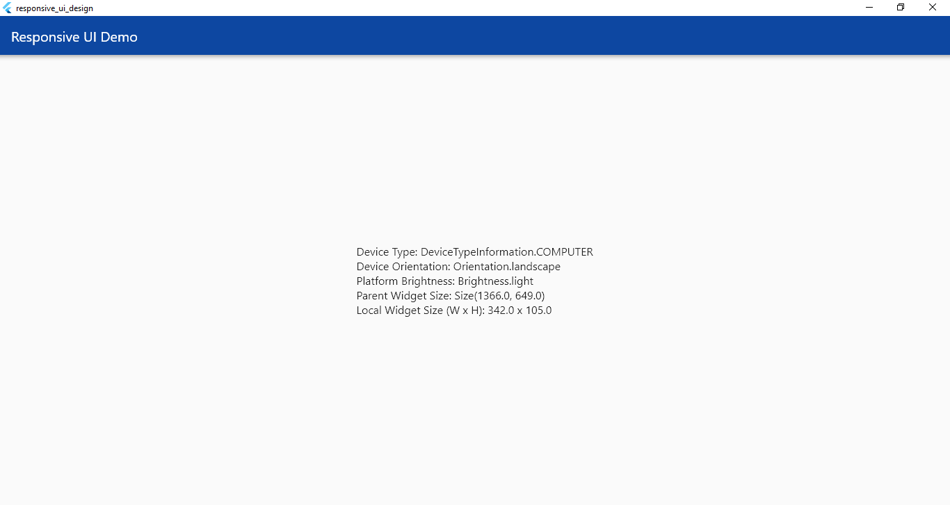
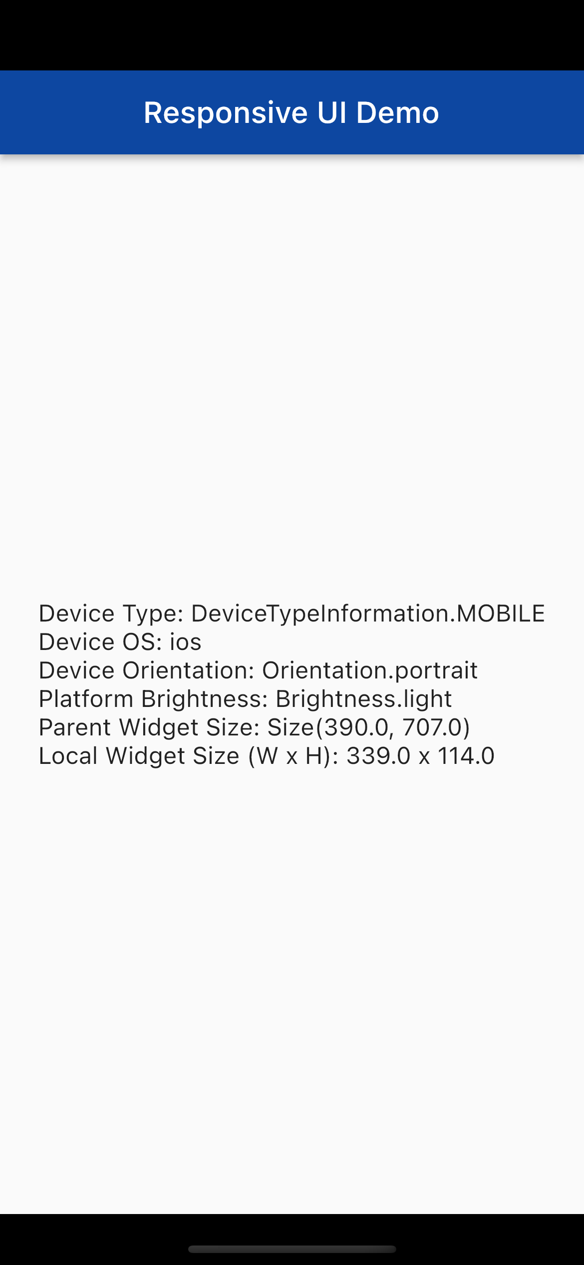
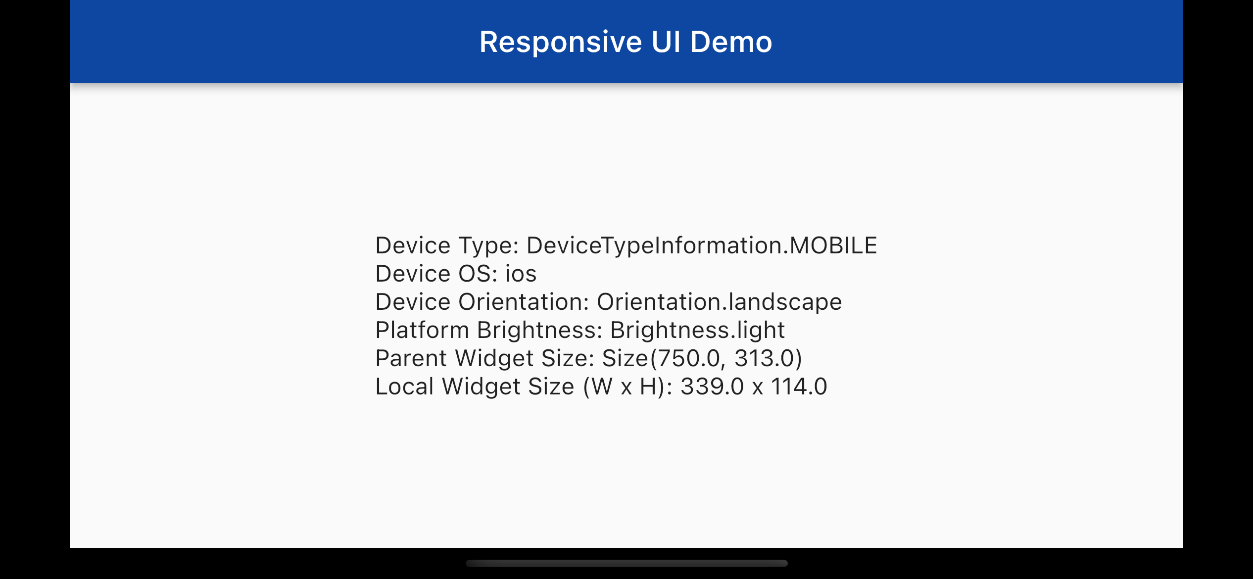
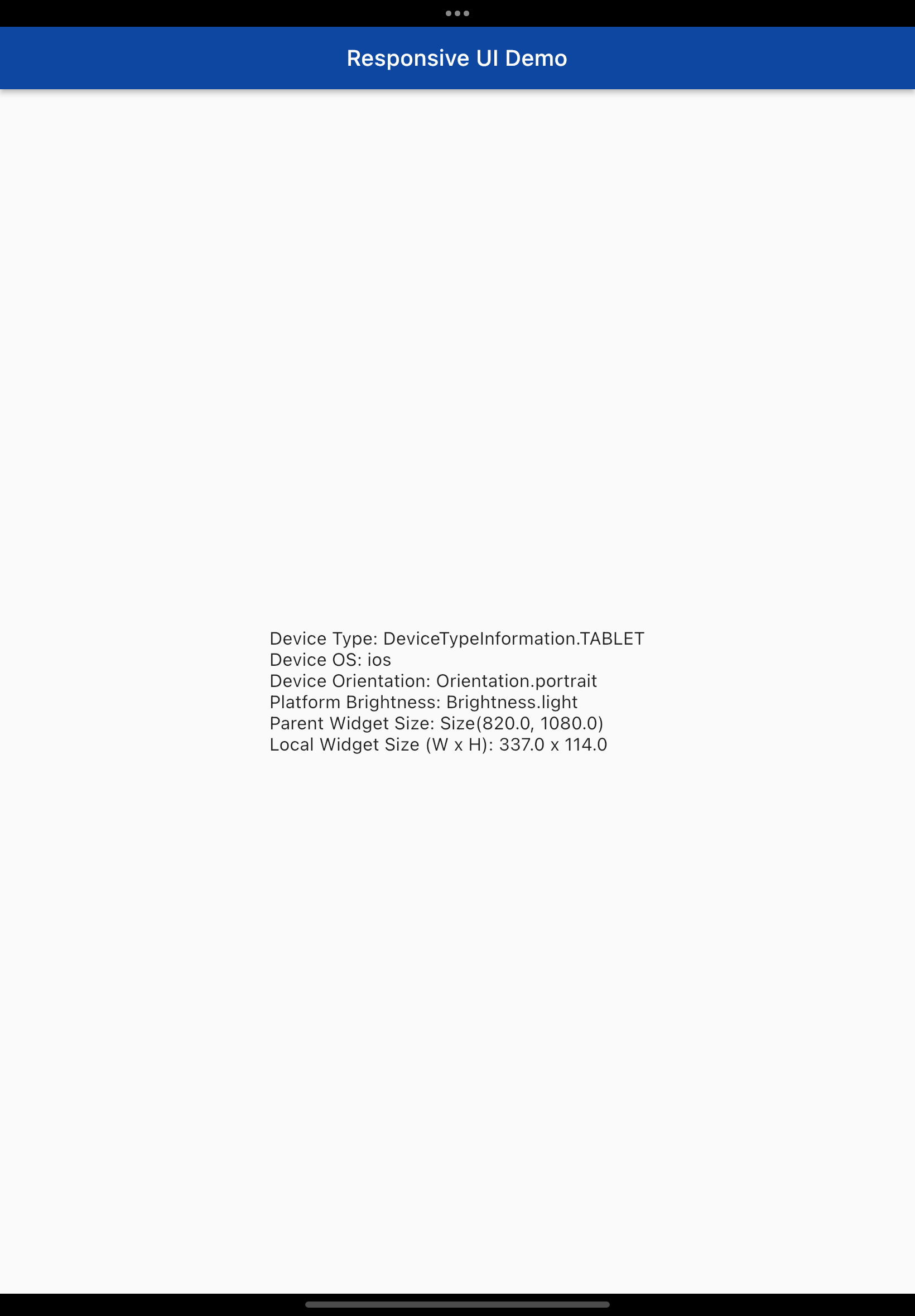
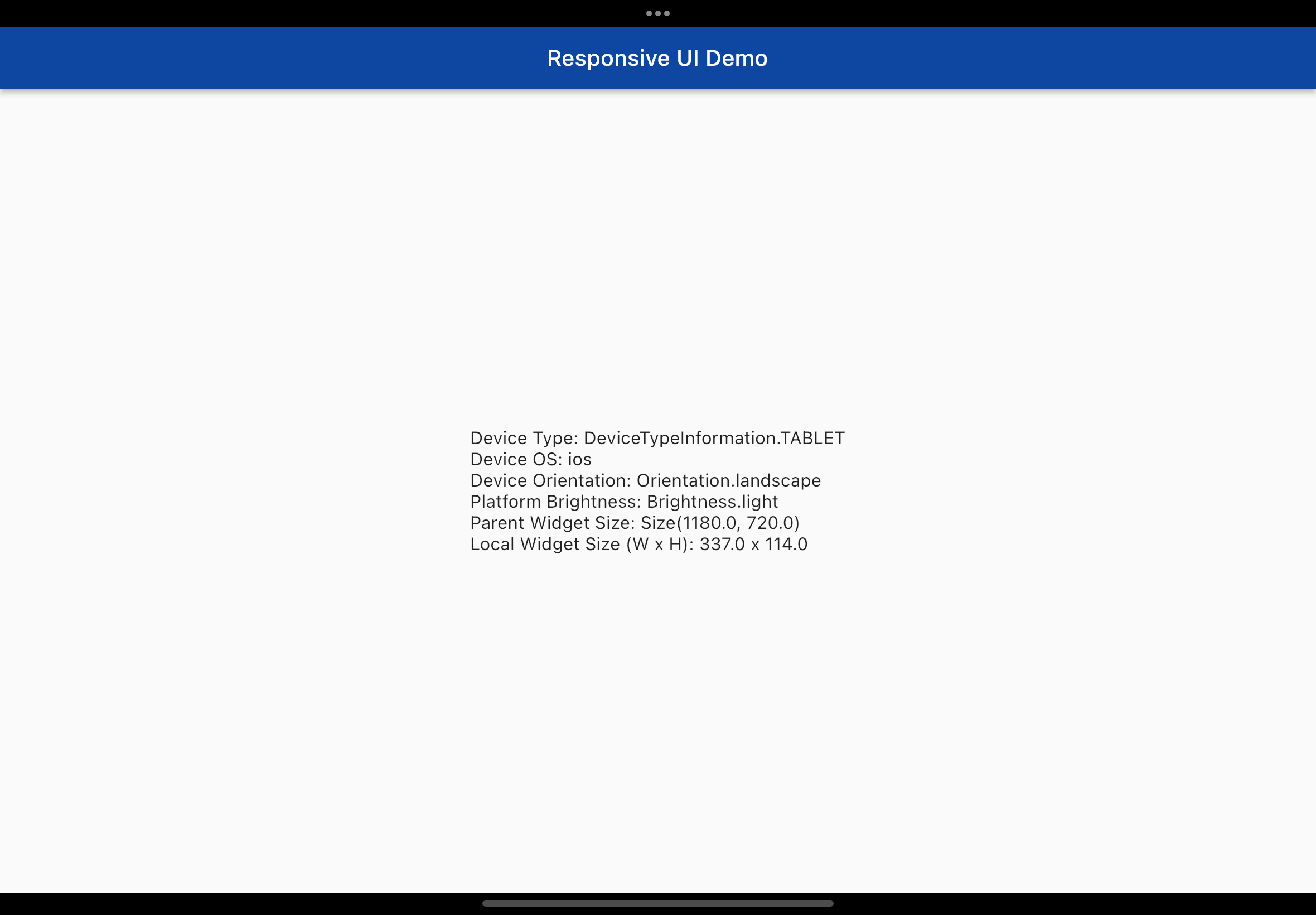
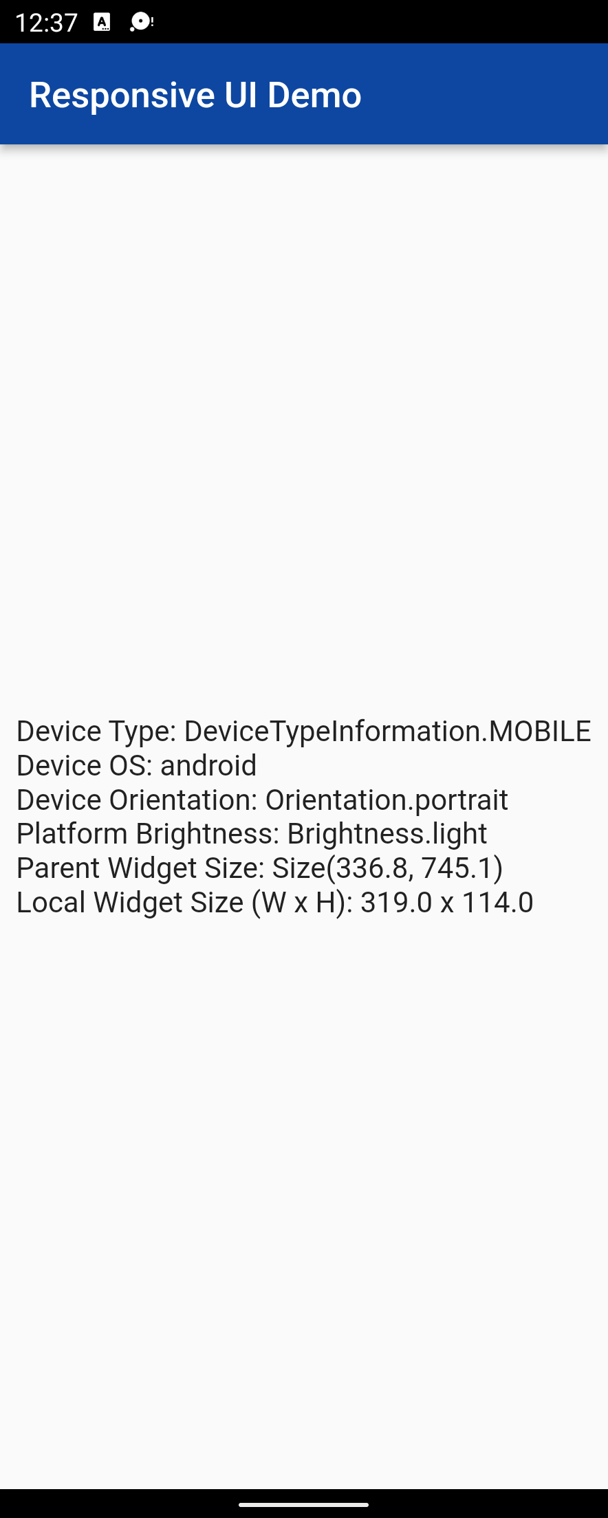
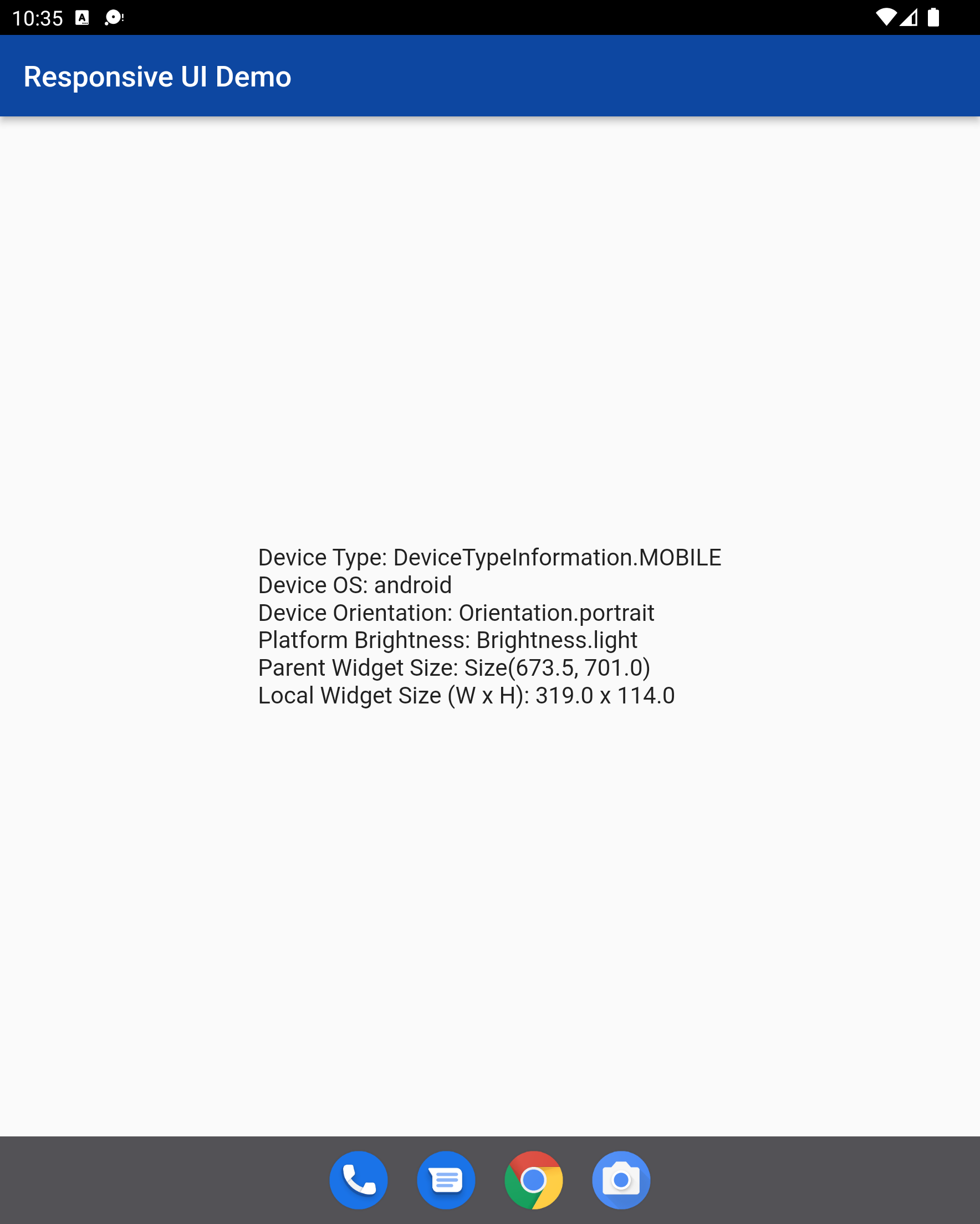
Note
- The benchmarks for determining thresholds for device screen sizes were determined by
performing a Google search for minimum and maximum screen sizes for each device type - This library has not been tested on Microsoft Surface devices, but has been tested on an emulated foldable phone
- I currently have no way to test this library on Linux devices
Known Issues
- For a Windows computer that has dark mode enabled, the Platform brightness is identified as light mode. I do not know why.
References
- https://material.io/blog/device-metrics
- https://developer.android.com/training/multiscreen/screendensities
- https://www.calculatorsoup.com/calculators/technology/ppi-calculator.php
- https://groups.google.com/g/flutter-dev/c/oYN_prI7sio
- https://medium.com/flutter-community/the-best-flutter-responsive-ui-pattern-ba52875d70cd
- https://stackoverflow.com/questions/49307677/how-to-get-height-of-a-widget
- https://github.com/flutter/flutter/issues/14488
Conclusion
I hope this library is useful for those who want an easy way to create different layouts based on device type. PRs are welcome.
Libraries
- responsify
- responsify_files/responsify_enum
- responsify_files/responsify_function
- responsify_files/responsify_model
- responsify_files/responsify_ui_widget
- The responsive UI Widget aids in creating responsive UIs across devices