Pulsing Dots Loader
A smooth, minimal animated pulsing dots loading widget for Flutter.
Features
- 🎨 Automatically uses your app's theme primary color
- 🖌️ Supports custom colors
- 📐 Configurable size — responsive by default
- ⚡ Lightweight with zero dependencies
- 🔘 Works inside buttons, cards, dialogs — anywhere!
Installation
dependencies:
  pulsing_dots_loader: ^0.0.2
flutter pub get
Import
import 'package:pulsing_dots_loader/pulsing_dots_loader.dart';
Usage
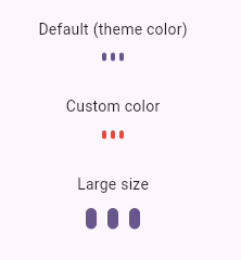
Default — uses your app theme color
PulsingDotsLoader()
Custom color
PulsingDotsLoader(color: Colors.red)
Custom size
PulsingDotsLoader(size: 32)
Inside a button
ElevatedButton(
  onPressed: () {},
  child: Row(
    mainAxisSize: MainAxisSize.min,
    children: [
      Text('Loading'),
      SizedBox(width: 8),
      PulsingDotsLoader(size: 20, color: Colors.white),
    ],
  ),
)

Preview

Parameters
| Parameter | Type | Default | Description |
|---|---|---|---|
size |
double |
16 |
Overall size. Everything scales from this. |
color |
Color? |
null |
Dot color. Uses Theme.of(context).colorScheme.primary if null. |
License
MIT © Hafis Ali