English | 中文
Introduce
The function and design idea of package refer to giffy_dialog,compared with giffy_dialog, provides higher degree of freedom and stronger scalability,you can use various types of prompts preset in the package, or you can set the widget you want to display.Compared to giffy_ Dialog, customization is not limited to images, you can also pass in any widget or custom animation.proste_dialog needs ShowDialog to display. If you want to use animation effects in the display process, you can refer to the flutter_animated_dialog.
2.0.0 add new button layout
only set btnInARow: false is fine, if you want to adjust the distance between the two buttons or the distance between the button and the border, you can set confirmButtonMargin, which only takes effect when btnsInARow: false
ProsteDialog(
type: _tipType,
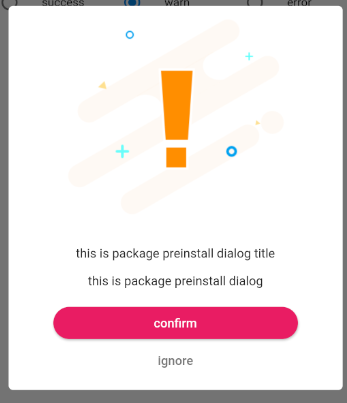
content: Text('this is package preinstall dialog'),
insetPadding: EdgeInsets.all(15),
title: Text('this is package preinstall dialog title'),
titlePadding: EdgeInsets.only(top: 20),
contentPadding: EdgeInsets.all(15),
confirmButtonColor: Colors.pink,
confirmButtonText: Text('confirm', style: TextStyle(color: Colors.white)),
cancelButtonText: Text('ignore', style: TextStyle(color: Colors.grey[600])),
showConfirmButton: true,
showCancelButton: true,
btnsInARow: false,
btnPadding: EdgeInsets.symmetric(vertical: 10),
confirmButtonMargin: EdgeInsets.symmetric(horizontal: 50),
buttonRadius: 20,
onConfirm: () {
print('preinstall confirm pressed');
Navigator.pop(context);
},
onCancel: () {
print('preinstall cancel pressed');
Navigator.pop(context);
},
);
Usage
Note that if you pass in duration, the dialog will disappear automatically after the specified time. Even if your showconfirmbutton, showcancelbutton and showcloseicon are all true, the button will not be displayed
confirmButtonMargin is only butsInARow is false is it valid
ProsteDialogdialog of preset animation prompt in package
| parameter | parameterType | default |
|---|---|---|
| insetPadding | EdgeInsets | EdgeInsets.symmetric(horizontal: 40.0, vertical: 24.0) |
| dialogRadius | double | 5 |
| type | DialogTipType | DialogTipType.success |
| title | Widget | null |
| content | Widget(required) | null |
| titlePadding | EdgeInsets | EdgeInsets.only(top: 15, left: 15, right: 15) |
| contentPadding | EdgeInsets | EdgeInsets.all(10) |
| confirmButtonText | Text | Text('Confirm') |
| cancelButtonText | Text | Text('Cancel') |
| showConfirmButton | bool | true |
| showCancelButton | bool | true |
| buttonRadius | double | 5 |
| confirmButtonColor | Color | null |
| cancelButtonColor | Color | null |
| onConfirm | void Funtion() | null |
| onCancel | void Funtion() | null |
| duration | Duration | null |
| background | Color | Colors.white |
| elevation | double | 0 |
| shadowColor | Color | null |
| btnInARow | boolean | true |
| btnPadding | EdgeInsets | null |
| confirmButtonMargin | EdgeInsets | null |
showDialog(
  context: context,
  builder: (_) => ProsteDialog(
    type: _tipType,
    content: Text('this is package preinstall dialog'),
    insetPadding: EdgeInsets.all(15),
    dialogRadius: 10,
    title: Text('this is package preinstall dialog title'),
    titlePadding: EdgeInsets.only(top: 20),
    contentPadding: EdgeInsets.all(15),
    confirmButtonText: Text('next', style: TextStyle(color: Colors.white)),
    cancelButtonText: Text('back', style: TextStyle(color: Colors.green)),
    showConfirmButton: true,
    showCancelButton: true,
    confirmButtonColor: Colors.cyan,
    cancelButtonColor: Colors.black,
    onConfirm: () {
      print('preinstall confirm pressed');
      Navigator.pop(context);
    },
    onCancel: () {
      print('preinstall cancel pressed');
      Navigator.pop(context);
    },
  ),
);
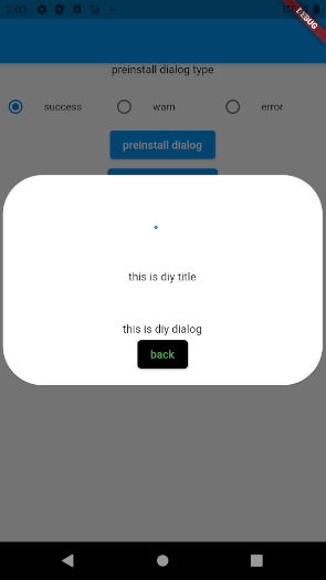
ProsteCustomDialogcustomize dialog for header
| parameter | parameterType | default |
|---|---|---|
| insetPadding | EdgeInsets | EdgeInsets.symmetric(horizontal: 40.0, vertical: 24.0) |
| dialogRadius | double | 5 |
| header | Widget | null |
| title | Widget | null |
| content | Widget(required) | null |
| titlePadding | EdgeInsets | EdgeInsets.only(top: 15, left: 15, right: 15) |
| contentPadding | EdgeInsets | EdgeInsets.all(10) |
| confirmButtonText | Text | Text('Confirm') |
| cancelButtonText | Text | Text('Cancel') |
| showConfirmButton | bool | true |
| showCancelButton | bool | true |
| buttonRadius | double | 5 |
| confirmButtonColor | Color | null |
| cancelButtonColor | Color | null |
| onConfirm | void Funtion() | null |
| onCancel | void Funtion() | null |
| duration | Duration | null |
| background | Color | Colors.white |
| elevation | double | 0 |
| shadowColor | Color | null |
| btnInARow | boolean | true |
| btnPadding | EdgeInsets | null |
| confirmButtonMargin | EdgeInsets | null |
showDialog(
  context: context,
  builder: (_) => ProsteCustomDialog(
    insetPadding: EdgeInsets.zero,
    dialogRadius: 50,
    header: AnimatedBuilder(
      animation: _animationController,
      builder: (context, child) {
        return Container(
          height: _animation.value,
          alignment: Alignment.center,
          child: CircularProgressIndicator(),
        );
      },
    ),
    title: Text('this is diy title'),
    content: Text('this is diy dialog'),
    titlePadding: EdgeInsets.only(top: 20),
    contentPadding: EdgeInsets.only(top: 50),
    confirmButtonText: Text('next', style: TextStyle(color: Colors.white)),
    cancelButtonText: Text('back', style: TextStyle(color: Colors.green)),
    showConfirmButton: false,
    showCancelButton: true,
    confirmButtonColor: Colors.cyan,
    cancelButtonColor: Colors.black,
    onConfirm: () {
      print('diy confirm pressed');
      Navigator.pop(context);
    },
    onCancel: () {
      print('diy cancel pressed');
      Navigator.pop(context);
    },
  ),
);
ProsteAdvertiseDialogDialog box with pictures only
| parameter | parameterType | default |
|---|---|---|
| factor | double (0< value <=1) | .9 |
| image | ImageProvider(required) | null |
| closeIconColor | Colors | Colors.white70 |
| onImagePressed | void Function() | null |
| onImagePressed | void Function() | null |
| showCloseIcon | bool | false |
| imageRadius | BorderRadius | BorderRadius.zero |
| closeBtnSize | double | 32 |
| duration | Duration | null |
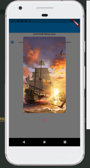
showDialog(
  context: context,
  builder: (_) => ProsteAdvertiseDialog(
    factor: .6,
    showCloseIcon: true,
    closeIconColor: Colors.pink,
    closeBtnSize: 20,
    image: NetworkImage(networkImg),
    imageRadius: BorderRadius.circular(10),
    onImagePressed: () {
      print('image pressed');
      Navigator.pop(context);
    },
    onClosePressed: () {
      print('close pressed');
      Navigator.pop(context);
    },
  ),
);
Issue
If there is any problem or bug, please submit it to issue, I will deal with it as soon as I see it, thanks!