Progression TreeMap
Progression TreeMap is an open source Flutter package, that is used to display a tree list, to the ui, you can use it to interpret any complex tree or progression map to the ui of your app and customize it to your liking.
How to use
Add Dependency
Add this to your pubspec.yaml dependencies:
dependencies:

  progression_tree_map: ^1.1.0
Then make sure to call the import
import 'package:progression_tree_map/progression_tree_map.dart';
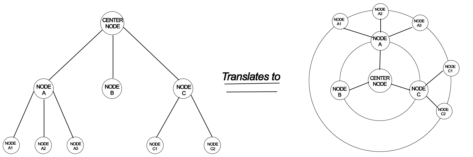
The package examines the left-side tree diagram and generates the user interface (UI) on the right.
Example Usages:
Create a variable with list of nodes, as well as its sublist as below:
Map<TreeNode?, List<TreeNode>> nodes = {
  TreeNode(): [
    TreeNode(nodes: [
      TreeNode(),
      TreeNode(nodes: [
        TreeNode(nodes: [
          TreeNode(nodes: [TreeNode(), TreeNode()])
        ])
      ])
    ])
  ]
};
Then call the ProgressionTreeMap as below
ProgressionTreeMap(treeNodes: nodes);
Screenshots & Implementations
Example 1 - Colored Nodes & Outlines

ProgressionTreeMap(
    treeNodes: nodes,
    circleBoundaryColor: Colors.grey.shade300,
    circleBoundaryShade: false,
    nodeSeparationAngleFac: 1.3,
    globalNodeSize: 20,
    centerNodeSize: 40,
    circleBoundaryStrokeWidth: 1.5,
    linesStrokeWidth: 2,
    linesStrokeColor: Colors.blueAccent,
    nodeDecoration: const BoxDecoration(
    shape: BoxShape.circle, color: Colors.blueAccent)
)
Example 2 - Colored Nodes & Icons
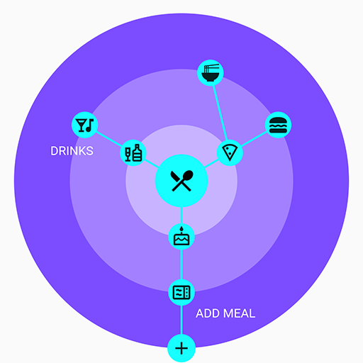
ProgressionTreeMap(
    treeNodes: nodes,
    circleBoundaryPaintingStyle: PaintingStyle.fill,
    circleBoundaryColor: Colors.deepPurpleAccent,
    nodePlacement: NodesPlacement.border,
    nodeSeparationAngleFac: 3,
    globalNodeSize: 30,
    centerNodeSize: 60,
    linesStartFromOrigin: true,
    linesStrokeWidth: 2,
    linesStrokeColor: Colors.cyanAccent,
    nodeDecoration: const BoxDecoration(
    shape: BoxShape.circle, color: Colors.cyanAccent)
)
Example 3 - Glowing Nodes & Background Text
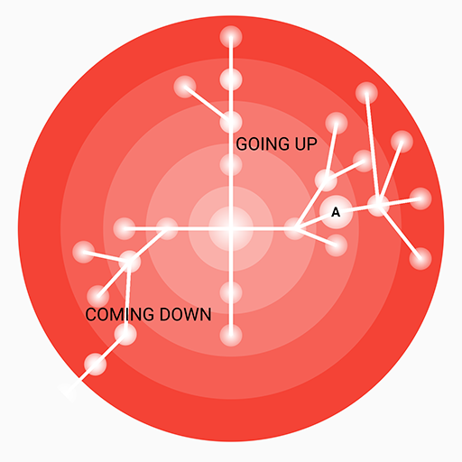
ProgressionTreeMap(
    treeNodes: nodes,
    circleBoundaryPaintingStyle: PaintingStyle.fill,
    circleBoundaryColor: Colors.red,
    nodePlacement: NodesPlacement.centerOut,
    nodeSeparationAngleFac: 1.2,
    globalNodeSize: 20,
    centerNodeSize: 40,
    linesStrokeWidth: 3,
    nodeDecoration: const BoxDecoration(
    shape: BoxShape.circle, gradient:
    RadialGradient(
        colors: [Colors.white, Colors.white30])
    )
)
Example 4 - Collection & Ui Items
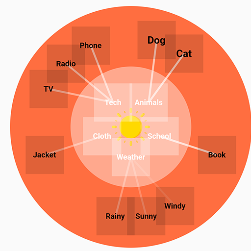
ProgressionTreeMap(
    treeNodes: nodes,
    circleBoundaryPaintingStyle: PaintingStyle.fill,
    circleBoundaryColor: Colors.deepOrangeAccent,
    nodePlacement: NodesPlacement.centerIn,
    nodeSeparationAngleFac: 1.3,
    centerNodeSize: 60,
    linesStartFromOrigin: false,
    linesStrokeWidth: 3,
    linesStrokeColor: Colors.white10)
),
More info
A TreeNode can have several properties, you can customize each individually as below:
TreeNode(
    child: Icon(
        Icons.restaurant_menu,
        color: Colors.black,
        size: 32,
        ),
    decoration:
        BoxDecoration(shape: BoxShape.circle, color: Colors.blue),
        size: 30
)
Very customizable, feel free to customize however you like! 😎