
📸 Photo Opener View
A powerful, highly customizable, and easy-to-use Flutter package for viewing images and videos with beautiful UI styles, animations, and gesture support.


✨ Features
📸 Advanced Image Viewer
- Pinch-to-zoom & Double-tap zoom (powered by
photo_view) - Swipe-to-dismiss gestures (Instagram/Facebook style)
- Hero animation support for seamless transitions
- Rotation support & customizable zoom limits
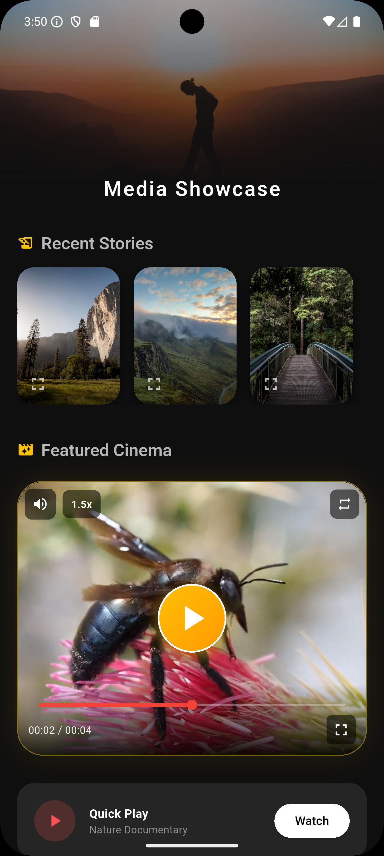
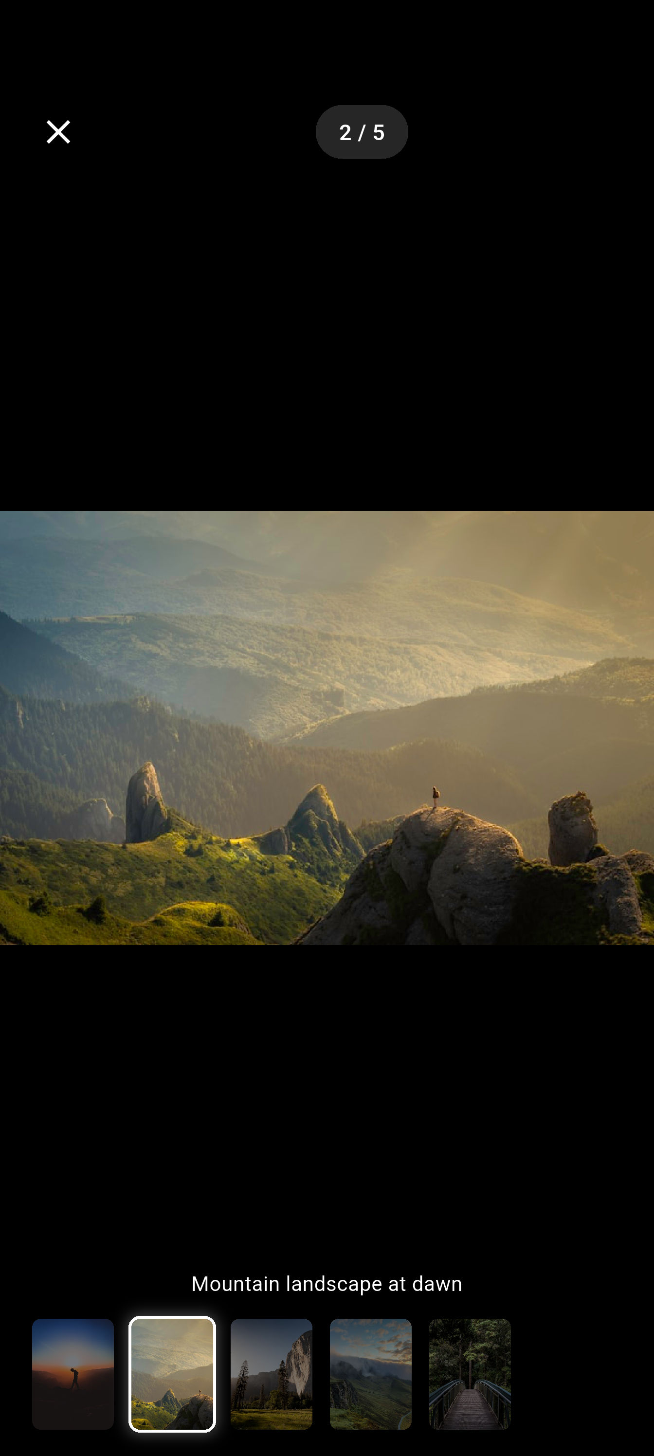
🖼️ Image Gallery
- Swipeable gallery with smooth page transitions
- Thumbnail strip navigation
- Captions support per image
- Page indicators (1/10)
🎥 Full-Featured Video Player
- Custom UI controls (Play/Pause, Seek, Volume, Speed)
- Double-tap to seek forward/backward (10s)
- Playback speed control (0.25x to 2.0x)
- Looping & Auto-play options
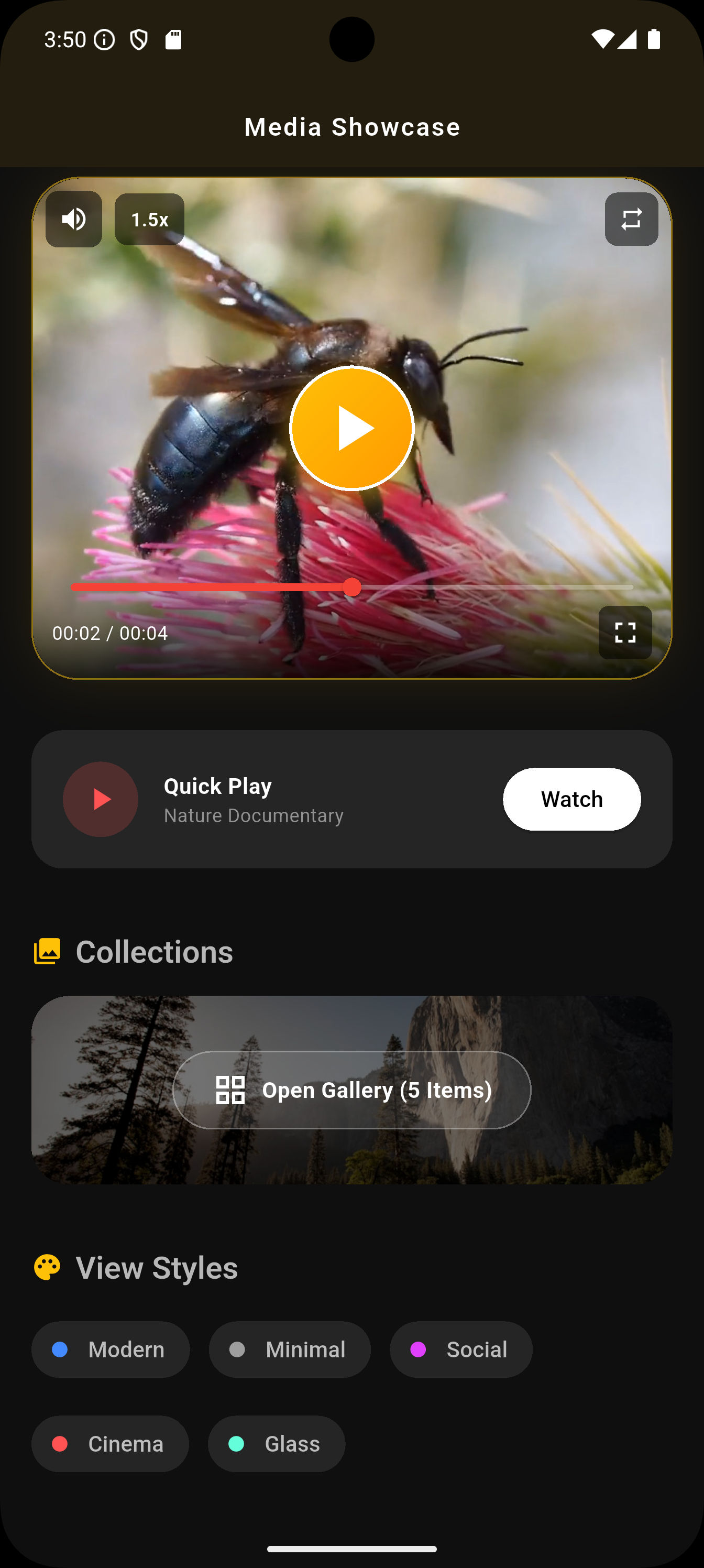
🆕 VideoThumbnailContainer (NEW!)
An embeddable, inline video player widget with thumbnail preview — perfect for feeds, cards, and lists!
- Thumbnail Preview Mode — Show a beautiful thumbnail before playing
- 6 Play Button Styles —
circular,rounded,square,gradient,outlined,minimal - 6 Predefined Themes —
default,modern,minimal,outlined,neon,elegant - Full Customization — Custom decorations, gradients, borders, shadows
- Inline Controls — Mute, speed control, progress bar, skip buttons
- Callbacks —
onVideoStart,onVideoEndfor analytics - Fullscreen Support — Tap to expand to fullscreen player
🎨 5 Beautiful Built-in Styles
| Style | Description |
|---|---|
modern |
Clean, dark theme (Default) |
minimal |
Light, distraction-free UI |
instagram |
Social media inspired look |
cinematic |
Deep black, immersive experience |
glassmorphism |
Trendy frosted glass effect |
🛠️ Highly Customizable
- Custom builders for loading and error states
- Replace default headers and footers with your own widgets
- Add overlays to video players
- Configure zoom limits, colors, and more
📱 Platform Support
Works on Android, iOS, Web, Windows, macOS, and Linux
📷 Screenshots
📦 Installation
Add photo_opener_view to your pubspec.yaml:
dependencies:
  photo_opener_view: ^1.0.1
Then run:
flutter pub get
🚀 Quick Start
1️⃣ Open a Single Image
import 'package:photo_opener_view/photo_opener_view.dart';

MediaViewer.openImage(
  context,
  'https://example.com/image.jpg',
  heroTag: 'my_image_hero',
  style: MediaViewerStyle.modern,
  onShare: () => print('Share clicked'),
  onDownload: () => print('Download clicked'),
  onFavorite: () => print('Added to favorites'),
);
2️⃣ Open an Image Gallery
MediaViewer.openImageGallery(
  context,
  [
    'https://example.com/image1.jpg',
    'https://example.com/image2.jpg',
    'https://example.com/image3.jpg',
  ],
  initialIndex: 0,
  captions: ['Beautiful sunset', 'Mountain landscape', 'City lights'],
  style: MediaViewerStyle.glassmorphism,
  showThumbnails: true,
);
3️⃣ Open a Video
MediaViewer.openVideo(
  context,
  'https://example.com/video.mp4',
  title: 'My Awesome Video',
  subtitle: 'Captured on iPhone',
  autoPlay: true,
  looping: true,
  style: MediaViewerStyle.cinematic,
);
🆕 VideoThumbnailContainer Widget
The brand new VideoThumbnailContainer allows you to embed video players directly in your UI with stunning thumbnail previews!
Basic Usage
VideoThumbnailContainer(
  videoUrl: 'https://example.com/video.mp4',
  thumbnailUrl: 'https://example.com/thumbnail.jpg',
  height: 220,
  title: 'Amazing Video',
  subtitle: 'Watch now',
)
Advanced Customization
VideoThumbnailContainer(
  // Data Sources
  videoUrl: 'https://example.com/video.mp4',
  thumbnailUrl: 'https://example.com/thumbnail.jpg',
  isNetworkVideo: true,

  // Initial State
  showThumbnail: true,
  enableMute: false,
  playbackSpeed: 1.5,

  // Behavior
  enableLoop: true,
  showControls: true,
  showProgressBar: true,

  // Dimensions & Styling
  height: 320,
  width: double.infinity,
  decoration: BoxDecoration(
    color: const Color(0xFF1E1E1E),
    borderRadius: BorderRadius.circular(30),
    border: Border.all(color: Colors.amber.withOpacity(0.5), width: 1),
    boxShadow: [
      BoxShadow(
        color: Colors.amber.withOpacity(0.15),
        blurRadius: 30,
        spreadRadius: -5,
      ),
    ],
  ),

  // Metadata
  title: "Golden Bee",
  subtitle: "Captured in 4K resolution",

  // Custom Play Button Theme
  playButtonTheme: const PlayButtonTheme(
    style: PlayButtonStyle.gradient,
    size: 80,
    iconSize: 50,
    gradientColors: [Colors.amber, Colors.orange],
    iconColor: Colors.white,
    elevation: 10,
    opacity: 0.9,
  ),

  // Callbacks
  onVideoStart: () => print("Video Started"),
  onVideoEnd: () => print("Video Finished"),
)
🎨 Play Button Themes
Use predefined themes or create your own:
// Predefined Themes
PlayButtonTheme.defaultTheme  // Classic white circular
PlayButtonTheme.modern        // Gradient orange-red
PlayButtonTheme.minimal       // Subtle black
PlayButtonTheme.outlined      // White border only
PlayButtonTheme.neon          // Cyan-purple glow
PlayButtonTheme.elegant       // Gold on dark

// Custom Theme
PlayButtonTheme(
  style: PlayButtonStyle.gradient,
  size: 85,
  iconSize: 48,
  gradientColors: [Color(0xFF00F5FF), Color(0xFF7B2FFF)],
  iconColor: Colors.white,
  elevation: 12,
  opacity: 0.85,
)
Play Button Styles
| Style | Description |
|---|---|
circular |
Perfect circle button |
rounded |
Rounded rectangle |
square |
Sharp corners |
gradient |
Gradient background |
outlined |
Border only, transparent fill |
minimal |
Subtle, low opacity |
🎨 Advanced Customization
Custom Builders & Overlays
MediaViewer.openImage(
  context,
  'https://example.com/image.jpg',

  // Custom loading widget
  loadingBuilder: (context) => Center(
    child: CircularProgressIndicator(color: Colors.purple),
  ),

  // Custom error widget
  errorBuilder: (context) => Center(
    child: Text('Oops! Could not load image.'),
  ),

  // Replace the top bar
  customHeader: SafeArea(
    child: Padding(
      padding: EdgeInsets.all(16),
      child: Row(
        children: [
          BackButton(color: Colors.white),
          Text('My Custom Header'),
        ],
      ),
    ),
  ),

  // Configure zoom limits
  minScale: 0.5,
  maxScale: 10.0,

  // Disable immersive mode
  immersive: false,
);
Video Player Options
MediaViewer.openVideo(
  context,
  'https://example.com/video.mp4',

  // Start video at specific time
  startAt: Duration(seconds: 30),

  // Control visibility
  allowFullScreen: false,
  allowPlaybackSpeed: false,
  allowMuting: true,

  // Add an overlay (e.g., watermark)
  overlay: Positioned(
    top: 20,
    right: 20,
    child: Opacity(
      opacity: 0.5,
      child: Text('WATERMARK'),
    ),
  ),
);
📋 API Reference
MediaViewer
| Method | Description |
|---|---|
openImage() |
Opens a single image with zoom & gestures |
openImageGallery() |
Opens a swipeable image gallery |
openVideo() |
Opens a fullscreen video player |
VideoThumbnailContainer Properties
| Property | Type | Default | Description |
|---|---|---|---|
videoUrl |
String |
required | URL of the video |
thumbnailUrl |
String? |
null | Thumbnail image URL |
isNetworkVideo |
bool |
true | Network or local file |
showThumbnail |
bool |
true | Show thumbnail initially |
height |
double |
220 | Container height |
width |
double |
double.infinity | Container width |
decoration |
BoxDecoration? |
null | Custom decoration |
title |
String? |
null | Video title |
subtitle |
String? |
null | Video subtitle |
enableLoop |
bool |
false | Loop video |
enableMute |
bool |
false | Start muted |
showControls |
bool |
true | Show control buttons |
showProgressBar |
bool |
true | Show progress bar |
playbackSpeed |
double |
1.0 | Initial playback speed |
playButtonTheme |
PlayButtonTheme? |
null | Custom play button |
onVideoStart |
VoidCallback? |
null | Called when video starts |
onVideoEnd |
VoidCallback? |
null | Called when video ends |
📄 License
This project is licensed under the MIT License - see the LICENSE file for details.
👨💻 Author
Satish Parmar
📦 Repository • 🌟 smart_review_prompter
⭐ If you like this package, please give it a star on GitHub! ⭐
Libraries
- media_viewer
- photo_opener_view
- A Flutter package for viewing images and videos with beautiful UI.