Orient UI
Theming and widgets for Flutter. Works with Material, Cupertino, or on its own.
Live Demo • See in Production • Pub.dev


🧩 What is Orient UI?
Orient UI gives you two things:
Styleis a simple, Material-independent theming system. Colors, typography, radii, durations, breakpoints. All in one file you own. NoThemeExtension, no boilerplate.- Widgets are neutral widgets (buttons, toggles, popovers, navigation, and more) that work on mobile, web, and desktop.
Use both, or just the theming. Your call.
🪩 Why Orient UI?
- Nothing to replace. Keep your
MaterialApp, yourScaffold, your existing widgets. Orient UI sits alongside them. - You own the code. Every file lives in your project. Change anything you want. No package lock-in.
- Cross-platform. Responsive layouts, hover states, keyboard navigation. Mobile, web, and desktop.
- Zero dependencies. Nothing added to your pubspec.
🏁 Getting Started
1. Install the CLI
dart pub global activate orient_ui
2. Add theming
orient_ui init
This creates lib/style.dart with light/dark colors, typography, radii, durations, and breakpoints. You own this file. Move it, rename it, extend it.
Use it anywhere:
final ColorTokens colors = context.style.colors;
final TextStyle heading = context.typography.heading;
That's it. If all you need is theming, you're done.
3. Add widgets (optional)
orient_ui add button
This creates lib/button.dart. Update the style import to match where you placed style.dart:
import 'package:your_app/style.dart'; // adjust to your path
Button(
  label: 'Click me',
  onPressed: () {},
)
Dark Mode
Widgets follow system brightness by default. To control it manually:
Style(
  brightness: Brightness.dark,
  child: MaterialApp(
    home: MyHomePage(),
  ),
)
🧬 Customizing
Open style.dart and make it yours. Add color tokens, change typography scales, adjust breakpoints.
final ColorTokens _colorsLight = ColorTokens(
  background: Color(0xFFFFFFFF),
  foreground: Color(0xFF2A2A2A),
  accent: Color(0xFF18181B),
  // ... change these to match your brand
);
🗺️ Roadmap
Available Now
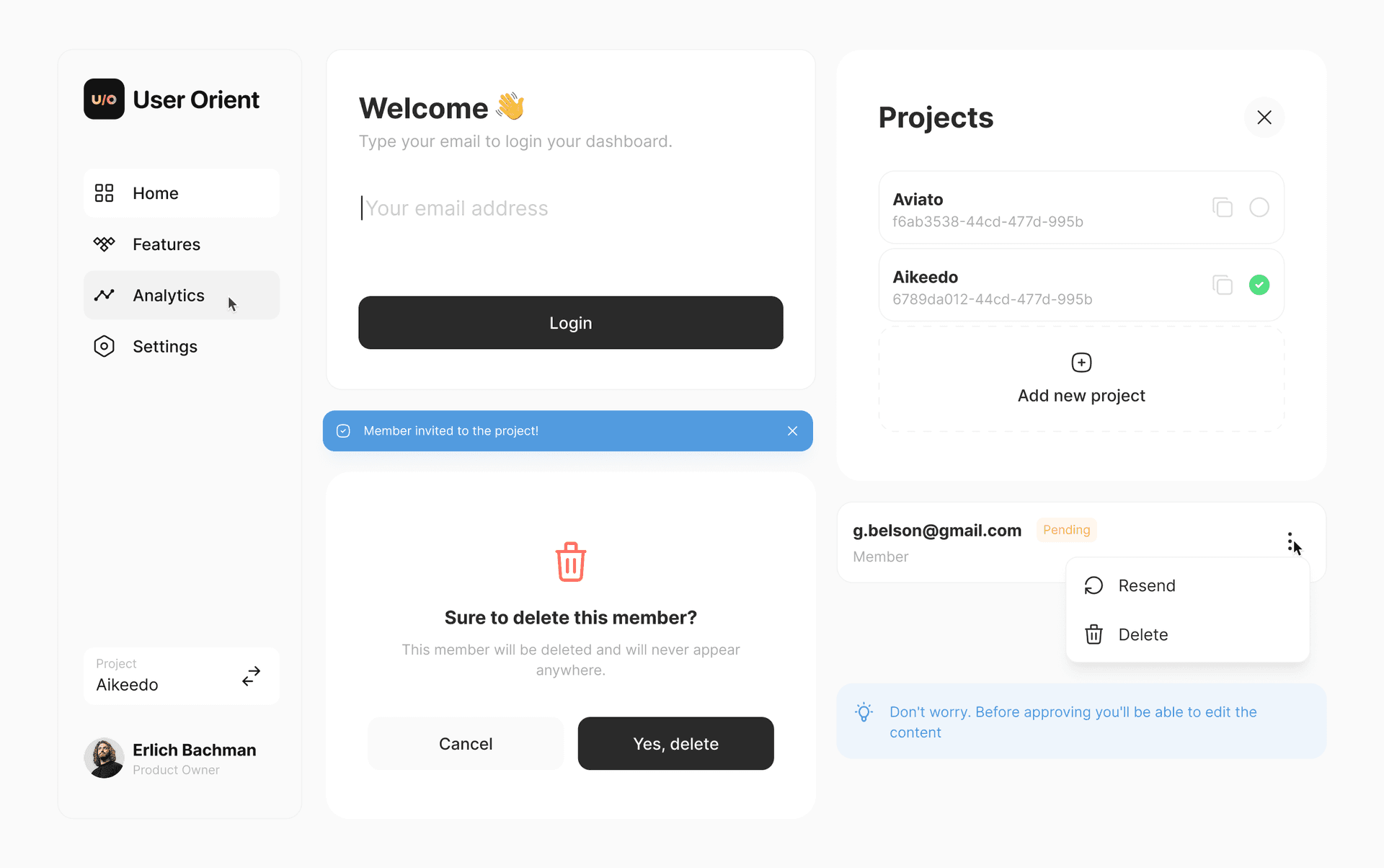
xButton (6 variants)xSpinnerxNavBar (Navigation Rail + Bottom Bar)xToastxEmptyStatexCopyButtonxPopupxAlertPopupxConfirmationPopupxSearchFieldxCardBoxxTilexTogglexToggleTilexSingleChoicexSingleChoiceTilexMultiChoicexMultiChoiceTilexTypographyxPickerxInfoBannerxPopoverMenuxTappableIconxSegmentBarxTagxTabs
Coming Soon
Try them at the interactive demo.
🧪 Quality
All widgets are tested.
License
Built by UserOrient