OrbitMenu Flutter Package
Description
OrbitMenu is a versatile Flutter package for creating dynamic circular menus with interactive animations. It now features new animation styles - bouncing and rotating, enhancing user engagement.
You can achieve with this package :
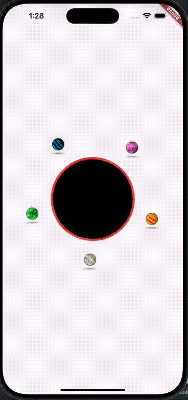
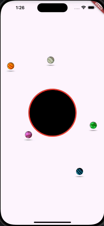
Animation Examples
Features
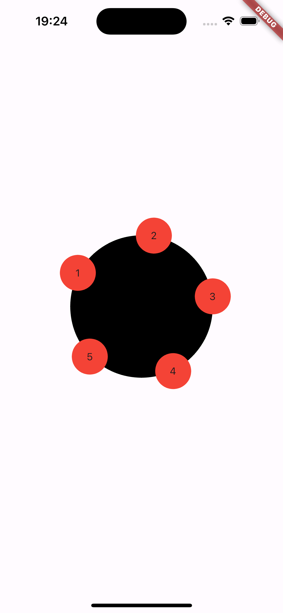
- Circular menu with a large central circle.
- Smaller circles around the central circle acting as buttons.
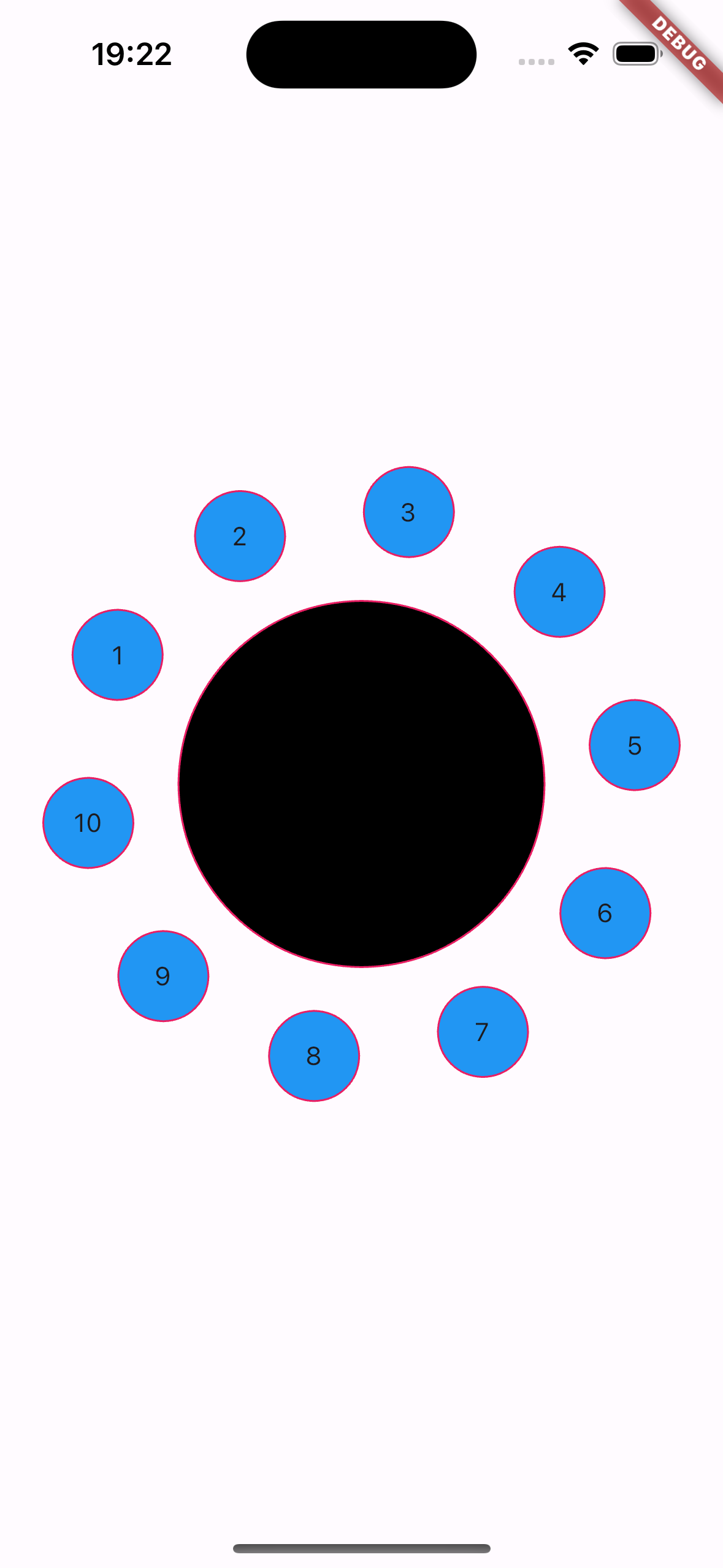
- Full customization of colors, sizes, and behaviors.
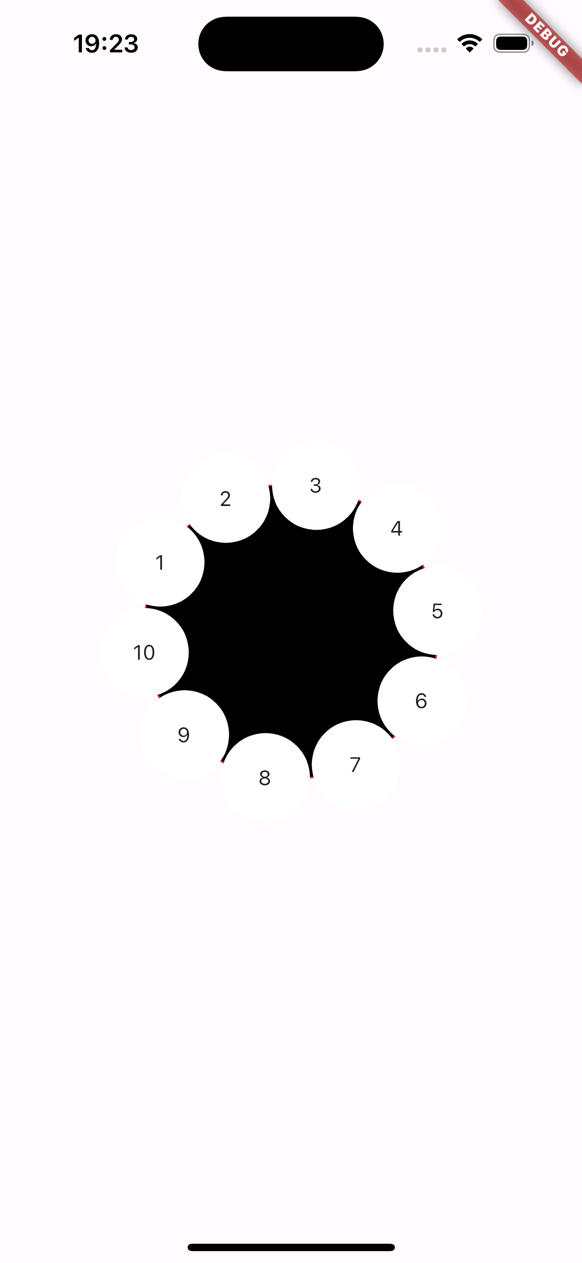
- Ability to adjust the distance of the smaller circles from the central circle.
- Central circle with customizable circular buttons.
- Three animation styles: bouncing, rotating, orbit.
- Complete customization of colors, sizes, and behaviors.
- Toggle animations with a simple boolean.
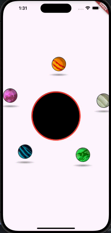
- Add images in the items
- Fixed big details! 🙇🏾
Installation
To use OrbitMenu in your Flutter project, add the following dependency to your pubspec.yaml file:
dependencies:
  orbitmenu: ^latest_version
Then, run flutter pub get to install the package.
Usage
To implement the circular menu in your Flutter app, follow these steps:
Import and use AnimatedOrbitMenu in your Dart file:
import 'package:orbitmenu/animated_orbit_menu.dart';
import 'package:orbitmenu/orbit_menu_config.dart';
import 'package:orbitmenu/orbit_menu_animation_type.dart';
Use the AnimatedOrbitMenu class to create the menu:
   AnimatedOrbitMenu(
      animate: true,
      config: OrbitMenuConfig(
          animationDuration: const Duration(seconds: 15),
          animationType: OrbitMenuAnimationType.bouncing,
          menuPositionX: widthSize / 2,
          menuPositionY: heightSize / 2,
          menuColor: const Color.fromARGB(255, 1, 1, 1),
          radius: 100,
          menuItems: itemList,
          itemSize: 100,
          borderCentralMenu: Border.all(color: Colors.red, width: 5),
          itemOffsetPercentage: 1,),
    );
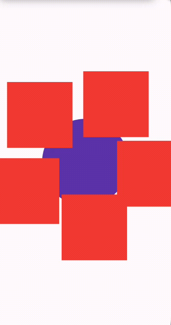
Add your custom widget
Now, You can add your custom widget to the list of widgets orbiting around the parent circle. Keep in mind that you should declare the size within the configuration as itemSize to keep the elements in sync with the parent circle. Your widget will be embedded within a parent container.
  AnimatedOrbitMenu(
        animate: true,
        config: OrbitMenuConfig(
              animationDuration: Duration(seconds:5),
              animationType: OrbitMenuAnimationType.rotating,
              menuPositionX: widthSize / 2,
              menuPositionY: heightSize / 2,
              menuColor: Colors.deepPurple,
              radius: 100,
              menuItems: itemList,
              itemSize: 150,
              titleStyle: TextStyle(color: Colors.white),
              itemOffsetPercentage: 0.5,
              myWidget: Container(color: Colors.red,)
        )
    ),
  );
Example
Contributions to this package are welcome.
If you find a bug or have a suggestion, please open an issue or a pull request.