On Process Button Widget
A button with many functionalities
NOTE
Now Material 3 theme is enabled.
Getting Started
To use the on_process_button_widget widget in your project, follow these steps:
-
Install the widget according to the instructions on the install page
-
Add this code in your project
OnProcessButtonWidget()
- For better understanding follow the example
Customizing the button
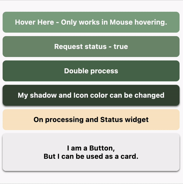
Hovering effect
    //! Hovering effect && On processing loading indicator
    OnProcessButtonWidget(
        backgroundColor: const Color(0XFF86A789),
        onTap: () async => await onCallFunction(),
        onHover: (isEnter) => buttonText.value = isEnter ? "Hi" : "Hover Here - Only works in Mouse hovering.",
        child: Text(buttonText.value),
    ),
Example - Hovering effect && On processing loading indicator
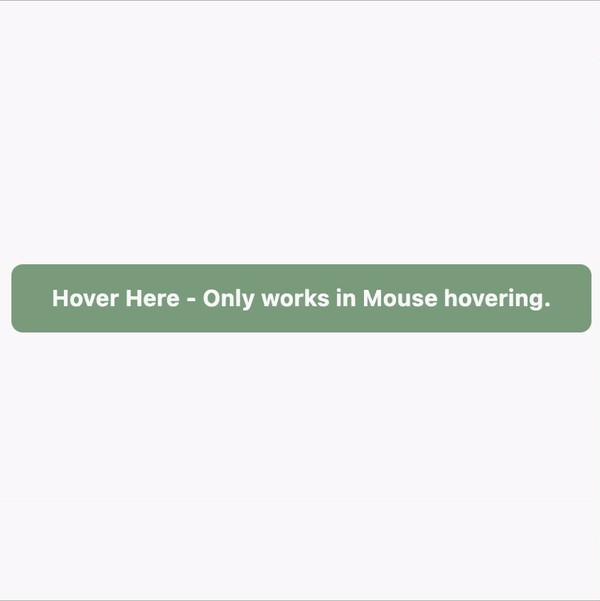
Request status
    //! Request status - true and false
    OnProcessButtonWidget(
        backgroundColor: const Color(0XFF739072),
        onTap: () async => await onCallFunction(type: true),
        // onTap: () async => await onCallFunction(type: false),
        child: const Text("Request status - true"),
    ),

    OnProcessButtonWidget(
        backgroundColor: const Color(0XFF739072),
        onTap: () async => await onCallFunction(type: false),
        // onTap: () async => await onCallFunction(type: false),
        child: const Text("Request status - false"),
    ),
Example - Request status - true and false
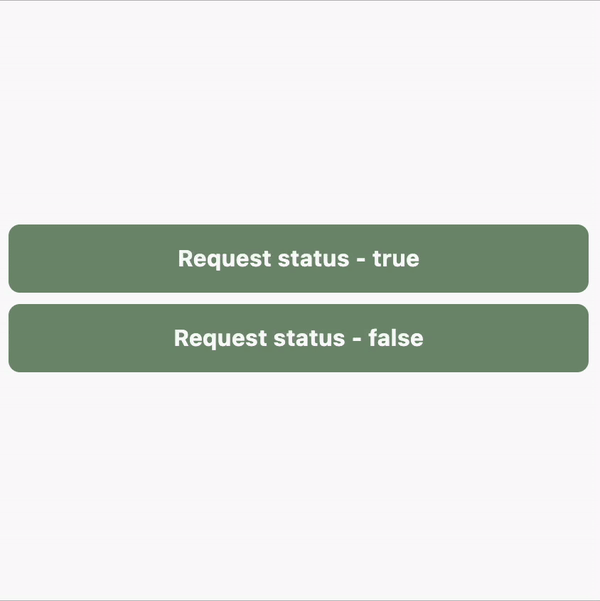
Double process
    //! Double process
    OnProcessButtonWidget(
        backgroundColor: const Color(0XFF4F6F52),
        onTap: () async {
        processDone.value = "Running first task.";
        var s = await onCallFunction(type: true);
        processDone.value = "First operation status $s";
        return s;
        },
        onDone: (isSuccess) async {
        // TODO: You can your homepage here. If onTap function (Login process) return true it will redirect to the homepage.
        processDone.value = "Running second task.";
        await onCallFunction();
        processDone.value = "";
        },
        child: const Text("Double process"),
    ),
    if (processDone.isNotEmpty) Padding(padding: const EdgeInsets.symmetric(vertical: 8), child: Text("Process status: ${processDone.value}")),
Example - Double process
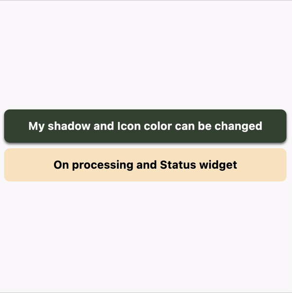
Easily customizable
    //! Shadow and Icon color can be changed
    OnProcessButtonWidget(
        iconColor: Colors.white,
        backgroundColor: const Color(0XFF3A4D39),
        onTap: () async => await onCallFunction(type: false),
        boxShadow: const [
        BoxShadow(offset: Offset(0, 2), color: Colors.black54, blurRadius: 2)
        ],
        child: const Text("My shadow and Icon color can be changed"),
    ),

    //! On processing widget is changeable
    OnProcessButtonWidget(
        backgroundColor: const Color(0XFFFAE7C9),
        onTap: () async => await onCallFunction(type: true),
        onRunningWidget: const Column(
        mainAxisAlignment: MainAxisAlignment.center,
        children: [
            Text(
            "On processing widget is changed",
            style: TextStyle(color: Colors.black),
            ),
        ],
        ),
        onSuccessWidget: const Icon(
        Icons.wallpaper_rounded,
        color: Colors.black,
        ),
        child: const Text(
        "On processing and Status widget",
        style: TextStyle(color: Colors.black),
        ),
    ),
Example - Easily customizable
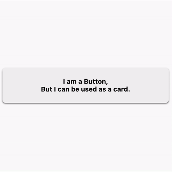
Use as a card
    //! Use as a card
    const OnProcessButtonWidget(
        enable: false,
        contentPadding: EdgeInsets.symmetric(vertical: 24),
        backgroundColor: Color.fromARGB(255, 242, 242, 242),
        boxShadow: [
        BoxShadow(offset: Offset(0, 2), color: Colors.black54, blurRadius: 2)
        ],
        child: Text(
        "I am a Button,\nBut I can be used as a card.",
        style: TextStyle(color: Colors.black),
        ),
    ),
Example - Use as a card
And many more.