Nepali Calendar Plus

A feature-rich Flutter package for implementing a Nepali calendar system in your applications. This package provides highly customizable calendar widgets with support for Nepali (Bikram Sambat) dates, extensive styling options, and flexible event management.
Quick Navigation
| Section | Description |
|---|---|
| Installation | How to add the package to your project |
| Quick Start | Basic usage examples |
| Features | Complete feature list |
| Styling | Customize appearance |
| Controller | Programmatic control |
| Events | Working with events |
| Custom Builders | Advanced customization |
| Migration Guide | Upgrade from older versions |
| API Reference | Complete API documentation |
| FAQ | Common questions |
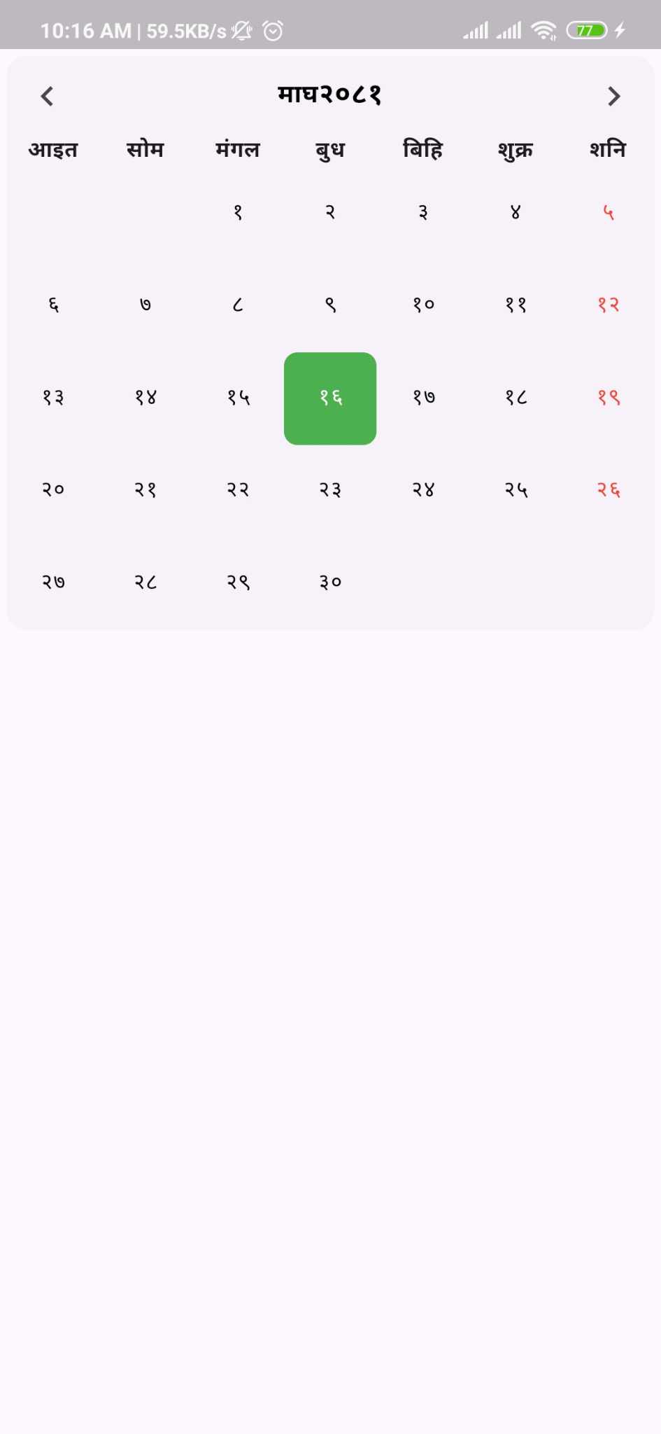
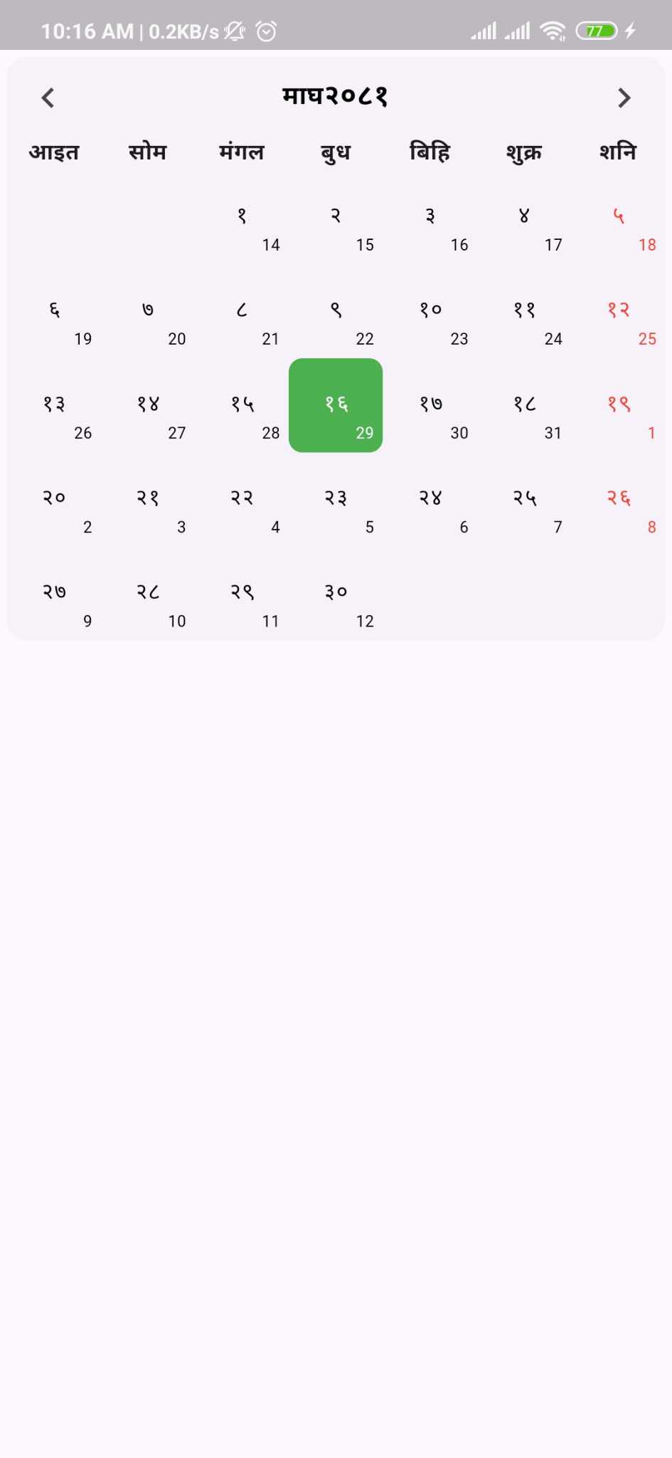
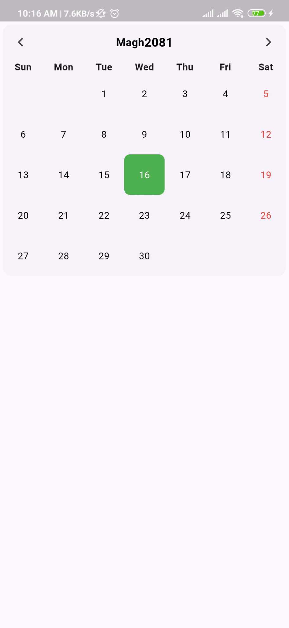
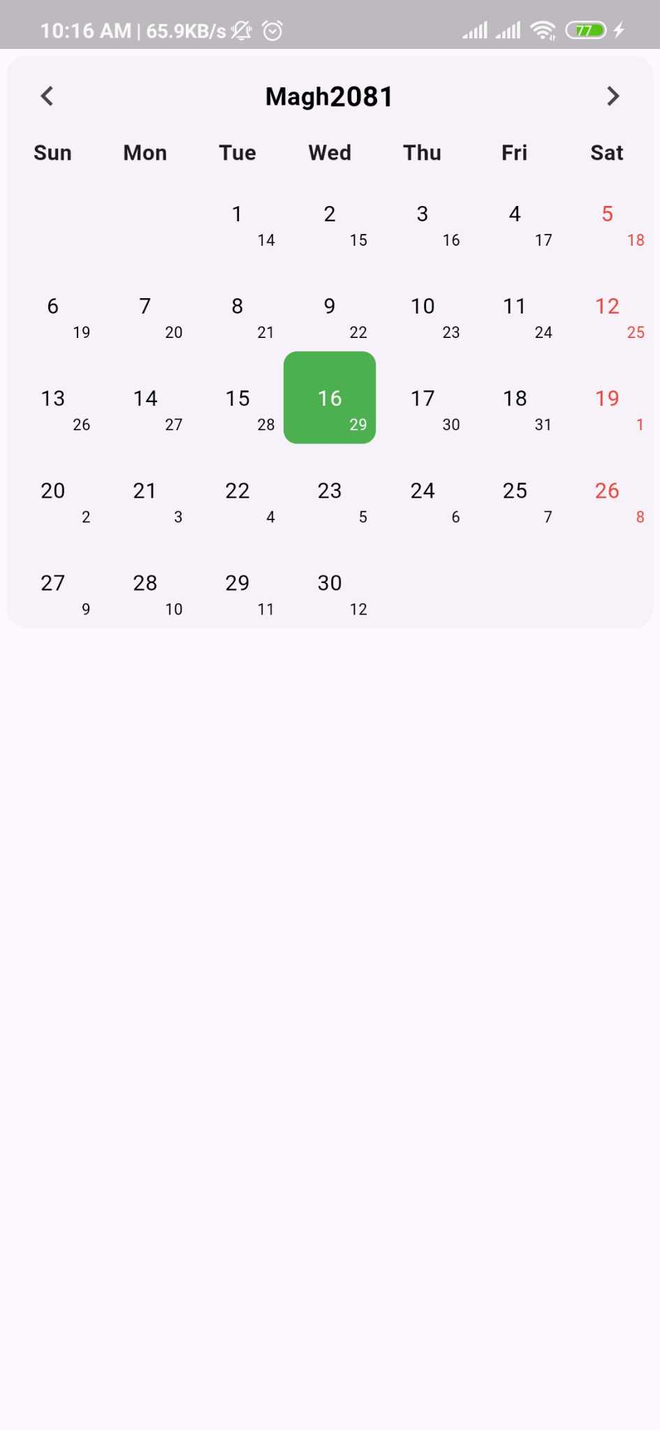
?? Preview
 |
 |
 |
 |
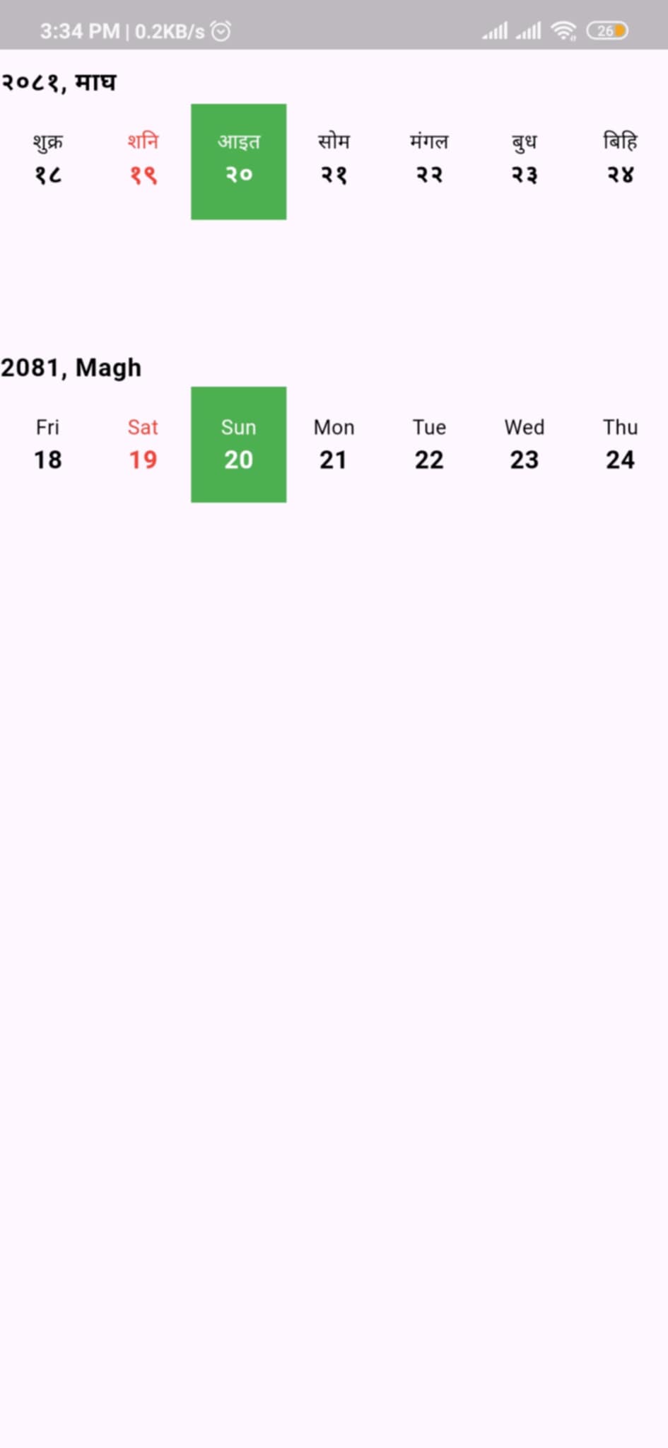 |
|---|
Key Features
-
Dual Calendar System
- Nepali dates (Bikram Sambat) display
- Optional English date conversion and display
- Automatic today's date highlighting
-
Horizontal Calendar View
- Compact horizontal date picker
- Smooth scrolling navigation
- Perfect for date selection in forms
-
Programmatic Control
NepaliCalendarControllerfor state management- Navigate to specific dates, months, or today
- Listen to date and month changes
-
Custom Builders
CalendarBuilderfor complete UI customization- Custom event rendering
- Custom cell, header, and weekday builders
-
Events & Holidays
- Generic event system with type safety
- Event indicators with dot markers
- Holiday highlighting support
- Custom event widgets
-
Weekend Configuration
- Multiple weekend patterns (Sat-Sun, Fri-Sat, etc.)
- Configurable week start day (Sunday/Monday)
- Regional calendar conventions support
-
Localization
- Bilingual support (Nepali/English)
- Customizable weekday title formats (full, half)
-
Extensive Customization
- Centralized
CalendarConfigfor easy setup - Comprehensive styling options
- Custom themes and colors
- Border and layout controls
- Centralized
Installation
Run this command:
With Dart:
dart pub add nepali_calendar_plus
With Flutter:
flutter pub add nepali_calendar_plus
This will add a line like this to your package's pubspec.yaml
dependencies:
  nepali_calendar_plus: ^latest_version
Then run:
flutter pub get
Quick Start
Basic Usage
import 'package:nepali_calendar_plus/nepali_calendar_plus.dart';

class MyApp extends StatelessWidget {
  @override
  Widget build(BuildContext context) {
    return Scaffold(
      body: NepaliCalendar(
        calendarStyle: NepaliCalendarStyle(
          config: CalendarConfig(
            showEnglishDate: true,
            showBorder: true,
            language: Language.nepali,
          ),
        ),
        onDayChanged: (date) {
          print('Selected date: $date');
        },
      ),
    );
  }
}
With Controller
class CalendarScreen extends StatefulWidget {
  @override
  State<CalendarScreen> createState() => _CalendarScreenState();
}

class _CalendarScreenState extends State<CalendarScreen> {
  late final NepaliCalendarController _controller;

  @override
  void initState() {
    super.initState();
    _controller = NepaliCalendarController();
  }

  @override
  void dispose() {
    _controller.dispose();
    super.dispose();
  }

  @override
  Widget build(BuildContext context) {
    return Scaffold(
      body: NepaliCalendar(
        controller: _controller,
        calendarStyle: NepaliCalendarStyle(
          config: CalendarConfig(
            showEnglishDate: true,
            language: Language.english,
          ),
        ),
      ),
      floatingActionButton: FloatingActionButton(
        onPressed: () => _controller.jumpToToday(),
        child: Icon(Icons.today),
      ),
    );
  }
}
Styling & Customization
Complete Calendar Configuration
NepaliCalendar(
  calendarStyle: NepaliCalendarStyle(
    // Centralized Configuration (Recommended)
    config: CalendarConfig(
      showEnglishDate: true,
      showBorder: true,
      language: Language.nepali,
      // Weekend configuration
      weekendType: WeekendType.saturdayAndSunday,
      // Week start day
      weekStartType: WeekStartType.monday,
      // Weekday title format
      weekTitleType: TitleFormat.half, // full, half, or short
    ),

    // Cell Styling
    cellsStyle: CellStyle(
      dayStyle: TextStyle(
        fontSize: 14,
        fontWeight: FontWeight.w400,
        color: Colors.black87,
      ),
      todayColor: Colors.green.shade300,
      selectedColor: Colors.blue.shade400,
      dotColor: Colors.red,
      baseLineDateColor: Colors.grey,
      weekDayColor: Colors.red,
    ),

    // Header Styling
    headersStyle: HeaderStyle(
      weekHeaderStyle: TextStyle(
        fontSize: 14,
        fontWeight: FontWeight.bold,
      ),
      monthHeaderStyle: TextStyle(
        fontSize: 18,
        fontWeight: FontWeight.w600,
        color: Colors.blue,
      ),
      yearHeaderStyle: TextStyle(
        fontSize: 20,
        fontWeight: FontWeight.bold,
      ),
    ),
  ),
)
Weekend Configuration Options
// Saturday and Sunday as weekend
weekendType: WeekendType.saturdayAndSunday

// Friday and Saturday as weekend (common in Middle East)
weekendType: WeekendType.fridayAndSaturday

// Only Saturday as weekend (Nepal standard)
weekendType: WeekendType.saturday

// Only Sunday as weekend
weekendType: WeekendType.sunday
Week Start Configuration
// Start week on Sunday (default)
weekStartType: WeekStartType.sunday

// Start week on Monday
weekStartType: WeekStartType.monday
Event Management
// Define your custom event model
class MyEvent {
  final String title;
  final String description;
  final String type;

  const MyEvent({
    required this.title,
    required this.description,
    required this.type,
  });
}

// Create event list with type safety
final eventList = [
  CalendarEvent<MyEvent>(
    date: NepaliDateTime(year: 2082, month: 9, day: 10),
    isHoliday: true,
    additionalInfo: MyEvent(
      title: "Christmas Day",
      description: "Christmas celebration",
      type: "holiday",
    ),
  ),
  CalendarEvent<MyEvent>(
    date: NepaliDateTime(year: 2082, month: 10, day: 1),
    isHoliday: true,
    additionalInfo: MyEvent(
      title: "Maghe Sankranti",
      description: "Ghyu-Chaku Khane Din",
      type: "festival",
    ),
  ),
];

// Add to calendar
NepaliCalendar<MyEvent>(
  eventList: eventList,
  checkIsHoliday: (event) => event.isHoliday,
  onDayChanged: (date) {
    print('Selected date: $date');
  },
  onMonthChanged: (date) {
    print('Month changed to: ${date.month}/${date.year}');
  },
)
Calendar Controller
The NepaliCalendarController provides programmatic control over the calendar.
class MyCalendarScreen extends StatefulWidget {
  @override
  State<MyCalendarScreen> createState() => _MyCalendarScreenState();
}

class _MyCalendarScreenState extends State<MyCalendarScreen> {
  late final NepaliCalendarController _controller;

  @override
  void initState() {
    super.initState();
    _controller = NepaliCalendarController();
  }

  @override
  void dispose() {
    _controller.dispose();
    super.dispose();
  }

  @override
  Widget build(BuildContext context) {
    return Column(
      children: [
        // Control buttons
        Row(
          children: [
            ElevatedButton(
              onPressed: () => _controller.jumpToToday(),
              child: Text('Today'),
            ),
            ElevatedButton(
              onPressed: () => _controller.previousMonth(),
              child: Icon(Icons.chevron_left),
            ),
            ElevatedButton(
              onPressed: () => _controller.nextMonth(),
              child: Icon(Icons.chevron_right),
            ),
            ElevatedButton(
              onPressed: () => _controller.jumpToDate(
                NepaliDateTime(year: 2080, month: 1),
              ),
              child: Text('Baishak 2080'),
            ),
          ],
        ),

        // Calendar widget
        Expanded(
          child: NepaliCalendar(
            controller: _controller,
            // ... other properties
          ),
        ),
      ],
    );
  }
}
Controller Methods
// Jump to today's date
_controller.jumpToToday();

// Navigate to previous month
_controller.previousMonth();

// Navigate to next month
_controller.nextMonth();

// Jump to specific date
_controller.jumpToDate(NepaliDateTime(year: 2080, month: 5, day: 15));

// Get currently selected date
final selectedDate = _controller.selectedDate;
Horizontal Calendar
A compact horizontal calendar view perfect for date selection in forms and dialogs.
HorizontalNepaliCalendar(
  initialDate: NepaliDateTime.now(),
  calendarStyle: NepaliCalendarStyle(
    config: CalendarConfig(
      language: Language.nepali,
      weekendType: WeekendType.saturday,
    ),
    cellsStyle: CellStyle(
      todayColor: Colors.blue,
      selectedColor: Colors.green,
    ),
  ),
  onDateSelected: (date) {
    print('Selected date: $date');
  },
)
Custom Builders
Use CalendarBuilder to completely customize calendar components.
Custom Event Builder
NepaliCalendar<MyEvent>(
  eventList: eventList,
  calendarBuilder: CalendarBuilder<MyEvent>(
    eventBuilder: (context, index, date, event) {
      return Container(
        margin: EdgeInsets.symmetric(horizontal: 16, vertical: 8),
        padding: EdgeInsets.all(16),
        decoration: BoxDecoration(
          color: event.isHoliday ? Colors.red.shade50 : Colors.blue.shade50,
          borderRadius: BorderRadius.circular(12),
        ),
        child: Column(
          crossAxisAlignment: CrossAxisAlignment.start,
          children: [
            Text(
              event.additionalInfo!.title,
              style: TextStyle(
                fontSize: 16,
                fontWeight: FontWeight.bold,
              ),
            ),
            SizedBox(height: 4),
            Text(event.additionalInfo!.description),
          ],
        ),
      );
    },
  ),
)
Custom Cell Builder
calendarBuilder: CalendarBuilder(
  cellBuilder: (data) {
    return GestureDetector(
      onTap: data.onTap,
      child: Container(
        decoration: BoxDecoration(
          color: data.isToday
            ? Colors.blue
            : data.isSelected
              ? Colors.green
              : Colors.transparent,
          shape: BoxShape.circle,
        ),
        child: Center(
          child: Text(
            '${data.day}',
            style: TextStyle(
              color: data.isDimmed ? Colors.grey : Colors.black,
              fontWeight: data.isToday ? FontWeight.bold : FontWeight.normal,
            ),
          ),
        ),
      ),
    );
  },
)
Custom Weekday Builder
calendarBuilder: CalendarBuilder(
  weekdayBuilder: (data) {
    return Text(
      data.weekdayName,
      style: TextStyle(
        color: data.isWeekend ? Colors.red : Colors.black,
        fontWeight: FontWeight.bold,
      ),
    );
  },
)
Custom Header Builder
calendarBuilder: CalendarBuilder(
  headerBuilder: (date, controller) {
    return Row(
      mainAxisAlignment: MainAxisAlignment.spaceBetween,
      children: [
        IconButton(
          icon: Icon(Icons.chevron_left),
          onPressed: () => controller.previousPage(
            duration: Duration(milliseconds: 300),
            curve: Curves.easeInOut,
          ),
        ),
        Text(
          '${MonthUtils.getMonthName(date.month, Language.nepali)} ${date.year}',
          style: TextStyle(fontSize: 20, fontWeight: FontWeight.bold),
        ),
        IconButton(
          icon: Icon(Icons.chevron_right),
          onPressed: () => controller.nextPage(
            duration: Duration(milliseconds: 300),
            curve: Curves.easeInOut,
          ),
        ),
      ],
    );
  },
)
Migration Guide
Migrating from 0.0.5 or earlier to 0.0.6+
Version 0.0.6 introduces CalendarConfig and CalendarBuilder for better organization. Here's how to migrate:
Old Way (Deprecated)
NepaliCalendar(
  calendarStyle: NepaliCalendarStyle(
    showEnglishDate: true,
    showBorder: true,
    language: Language.nepali,
    headersStyle: HeaderStyle(
      weekTitleType: TitleFormat.half,
    ),
  ),
)
New Way (Recommended)
NepaliCalendar(
  calendarStyle: NepaliCalendarStyle(
    config: CalendarConfig(
      showEnglishDate: true,
      showBorder: true,
      language: Language.nepali,
      weekTitleType: TitleFormat.half,
      weekendType: WeekendType.saturday,
      weekStartType: WeekStartType.sunday,
    ),
    headersStyle: HeaderStyle(),
  ),
)
Deprecated Properties
The following properties are deprecated and will be removed in a future version:
In NepaliCalendarStyle:
showEnglishDate? Useconfig.showEnglishDateshowBorder? Useconfig.showBorderlanguage? Useconfig.language
In HeaderStyle:
weekTitleType? Useconfig.weekTitleType
New Features in 0.0.6
NepaliCalendarControllerfor programmatic controlCalendarBuilderfor custom component renderingCalendarConfigfor centralized configurationWeekendTypeenum for weekend configurationWeekStartTypeenum for week start day- Display of previous/next month days in calendar grid
Contributing
Contributions are welcome! Here's how you can help:
- Fork the repository
- Create your feature branch (
git checkout -b feature/amazing-feature) - Commit your changes (
git commit -m 'Add some amazing feature') - Push to the branch (
git push origin feature/amazing-feature) - Open a Pull Request
Development Guidelines
- Follow the existing code style
- Add tests for new features
- Update documentation
- Ensure all tests pass
- Keep commits atomic and well-described
License
This project is licensed under the MIT License - see the LICENSE file for details.
API Reference
NepaliCalendar
Main calendar widget with full month view.
| Property | Type | Description |
|---|---|---|
controller |
NepaliCalendarController? |
Controller for programmatic navigation |
eventList |
List<CalendarEvent<T>>? |
List of events to display |
checkIsHoliday |
bool Function(CalendarEvent<T>)? |
Function to determine if event is holiday |
onDayChanged |
ValueChanged<NepaliDateTime>? |
Callback when day selection changes |
onMonthChanged |
ValueChanged<NepaliDateTime>? |
Callback when month changes |
calendarStyle |
NepaliCalendarStyle |
Styling configuration |
calendarBuilder |
CalendarBuilder<T>? |
Custom component builders |
HorizontalNepaliCalendar
Horizontal scrolling calendar for compact date selection.
| Property | Type | Description |
|---|---|---|
initialDate |
NepaliDateTime |
Initial selected date |
onDateSelected |
ValueChanged<NepaliDateTime> |
Callback when date is selected |
calendarStyle |
NepaliCalendarStyle |
Styling configuration |
CalendarConfig
Centralized configuration for calendar behavior.
| Property | Type | Default | Description |
|---|---|---|---|
showEnglishDate |
bool |
false |
Show English dates below Nepali dates |
showBorder |
bool |
false |
Show borders around cells |
language |
Language |
Language.nepali |
Display language |
weekendType |
WeekendType |
WeekendType.saturday |
Weekend day configuration |
weekStartType |
WeekStartType |
WeekStartType.sunday |
Week start day |
weekTitleType |
TitleFormat |
TitleFormat.half |
Weekday title format |
CalendarBuilder
Custom builders for calendar components.
| Property | Type | Description |
|---|---|---|
headerBuilder |
Widget? Function(NepaliDateTime, PageController)? |
Custom header builder |
cellBuilder |
Widget Function(CalendarCellData<T>)? |
Custom cell builder |
weekdayBuilder |
Widget Function(WeekdayData)? |
Custom weekday header builder |
eventBuilder |
Widget? Function(BuildContext, int, NepaliDateTime, CalendarEvent<T>)? |
Custom event builder |
Enums
Language
Language.nepali- Nepali languageLanguage.english- English language
WeekendType
WeekendType.saturdayAndSunday- Both daysWeekendType.fridayAndSaturday- Both daysWeekendType.saturday- Saturday onlyWeekendType.sunday- Sunday only
WeekStartType
WeekStartType.sunday- Week starts on SundayWeekStartType.monday- Week starts on Monday
TitleFormat
TitleFormat.full- Full weekday name (e.g., "Sunday")TitleFormat.half- Half weekday name (e.g., "Sun")
FAQ
How do I migrate from version 0.0.5 to 0.0.6?
See the Migration Guide section above. The main change is using CalendarConfig instead of individual properties.
Can I use both Nepali and English dates?
Yes! Set showEnglishDate: true in CalendarConfig:
config: CalendarConfig(
  showEnglishDate: true,
)
How do I change the weekend days?
Use the weekendType property in CalendarConfig:
config: CalendarConfig(
  weekendType: WeekendType.saturdayAndSunday, // or other options
)
How do I start the week on Monday instead of Sunday?
Use the weekStartType property:
config: CalendarConfig(
  weekStartType: WeekStartType.monday,
)
Can I customize the event display?
Yes! Use CalendarBuilder with eventBuilder:
calendarBuilder: CalendarBuilder<MyEvent>(
  eventBuilder: (context, index, date, event) {
    return YourCustomEventWidget(event: event);
  },
)
How do I navigate to a specific date programmatically?
Use NepaliCalendarController:
final controller = NepaliCalendarController();
controller.jumpToDate(NepaliDateTime(2080, 1, 1));
Why am I seeing deprecation warnings?
You're using the old API. Update to use CalendarConfig as shown in the Migration Guide.
Can I use custom event types?
Yes! The calendar supports generic types:
class MyEvent {
  final String title;
  final String description;
}

NepaliCalendar<MyEvent>(
  eventList: List<CalendarEvent<MyEvent>>[...],
)
Useful Links
Contact
For any queries or support, please:
- Create an issue on GitHub
- Email: work.sabinghimire@gmail.com