
Neon Widgets💡
Most commonly used flutter widgets in neon version.
Live Example : https://ojas-jain.web.app/#/
Neon Widgets 2.0 => Breaking Changes
Animation disposal issues resolved. and every class' name have been changed, to comply with the standard dart syntax.
All the class names have been changed, to comply with the standard dart syntax. Previously every class had the name convention such that non-neon class' name started with the letter 'o', and neon classes started with 'oNeon'. But in the update, the neon class names now starts with 'Neon', and the letter 'o' has been removed from the starting of non-neon classes.
For example :
1 : 'oNeonContainer' is now changed to 'NeonContainer'.
2 : 'oNeonCustomVerticesProgressBar' is now changed to 'NeonCustomVerticesProgressBar'.
3 : 'oSearchBar' is now changed to 'SearchBar'.
Getting started
Readme Changelog Installing Versions Scores Admin Activity log Use this package as a library Depend on it Run this command:
Run this command:
With Dart:
$ dart pub add neon_widgets
With Flutter:
$ flutter pub add neon_widgets
This will add a line like this to your package's pubspec.yaml (and run an implicit dart pub get):
dependencies:
  neon_widgets: ^2.0.0
Alternatively, your editor might support dart pub get or flutter pub get. Check the docs for your editor to learn more.
Import it Now in your Dart code, you can use:
import 'package:neon_widgets/neon_widgets.dart';
Features
ExampleApp
Neon Widgets :
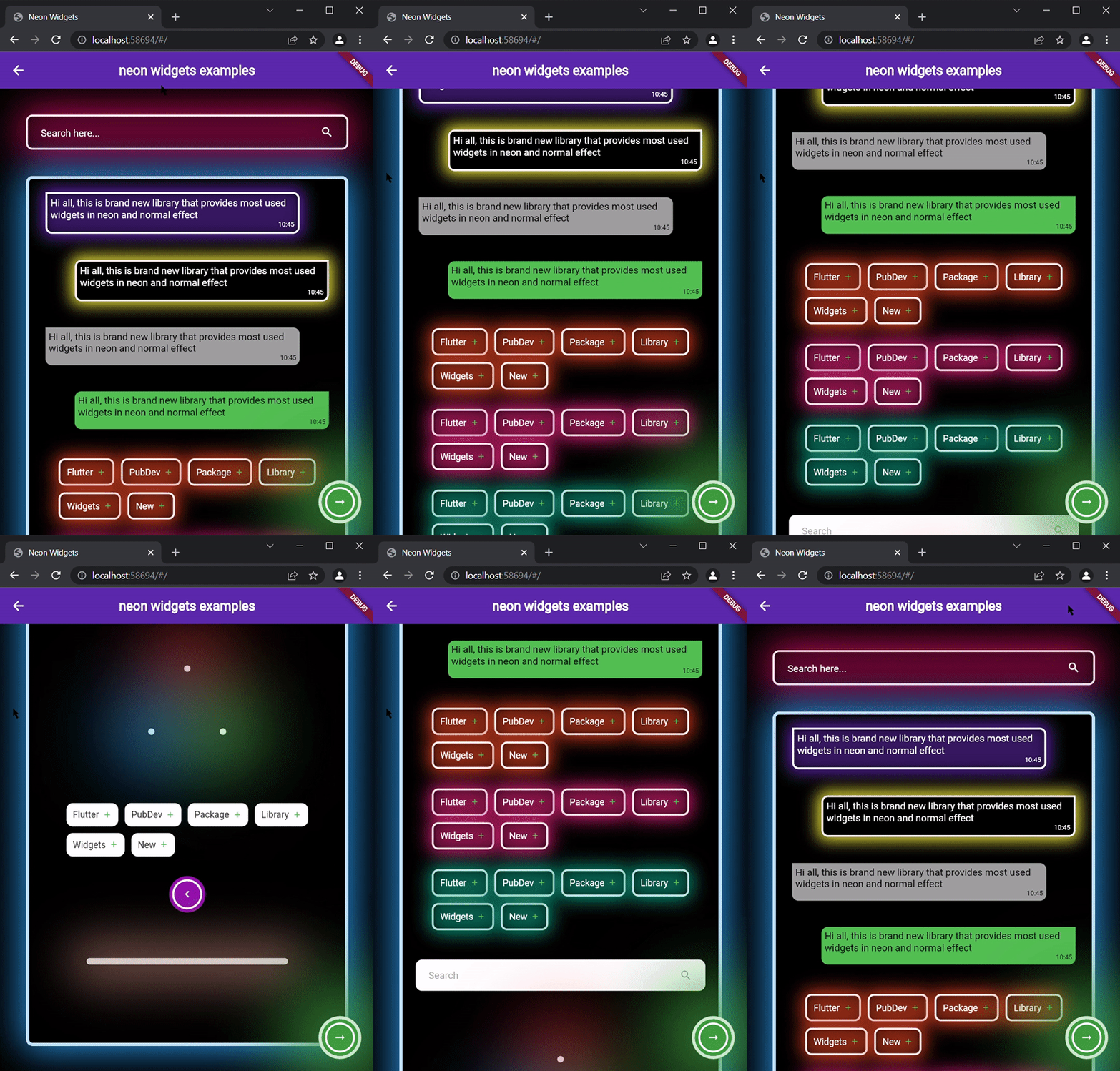
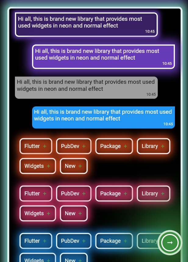
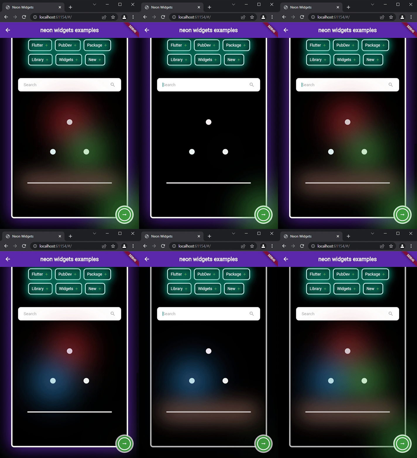
Flickering Neon Widgets (with random flicker rate) :
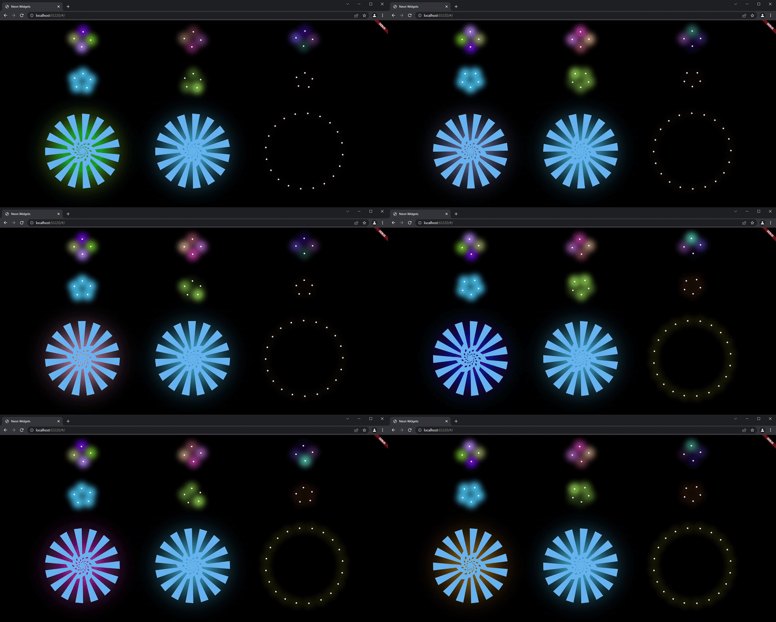
Loaders :
Widgets
neonText :

// neon text

 NeonText(
   text: "Neon text",
   spreadColor: Colors.pink,
   blurRadius: 20,
   textSize: 74,
   textColor: Colors.white,
 ),

// flickering neon text

 FlickerNeonText(
   text: "Flicker neon text",
   flickerTimeInMilliSeconds: 600,
   spreadColor: Colors.blue,
   blurRadius: 20,
   textSize: 74,
 ),
neonSearchBar :

NeonSearchBar()
Chat widgets :
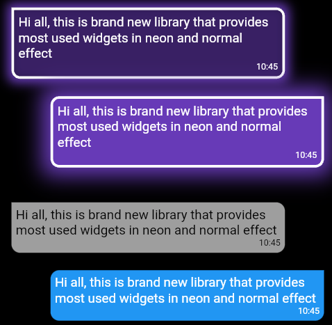
// Left message card in neon theme
NeonLeftMsgCard(
  lightBlurRadius: 20,
  lightSpreadRadius: 5,
  msg:
      "Hi all, this is brand new library that provides most used widgets in neon and normal effect",
  time: "10:45",
),

const SizedBox(
  height: 20,
),

// Right message card in neon theme
NeonRightMsgCard(
    lightBlurRadius: 20,
    lightSpreadRadius: 10,
    backgroundColor: Colors.deepPurple,
    msg:
    "Hi all, this is brand new library that provides most used widgets in neon and normal effect",
    time: "10:45",
 ),

const SizedBox(
  height: 20,
),

// Left massage card

LeftMsgCard(
    msg:
    "Hi all, this is brand new library that provides most used widgets in neon and normal effect",
    time: "10:45",
),

const SizedBox(
  height: 20,
),

// Right massage card

RightMsgCard(
    msg:
    "Hi all, this is brand new library that provides most used widgets in neon and normal effect",
    time: "10:45",
),

const SizedBox(
  height: 20,
),
Add items widget :
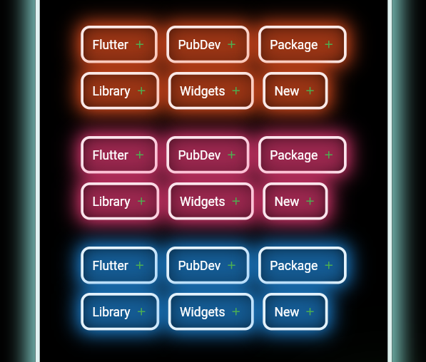
Wrap(
direction: Axis.horizontal,
children: <Widget>[
  ...(searchedResults.map((e) =>
      NeonAddItemButton(
          data: e,
          borderColor: Colors.deepOrange.shade50,
          spreadColor: Colors.deepOrange,
          lightSpreadRadius: 3,
          lightBlurRadius: 18))),
],
),
NeonPoint widget :
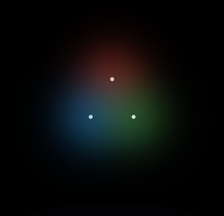
NeonPoint(
  pointSize: 00,
  pointColor: Colors.red.shade100,
  spreadColor: Colors.red,
),
NeonLine widget :
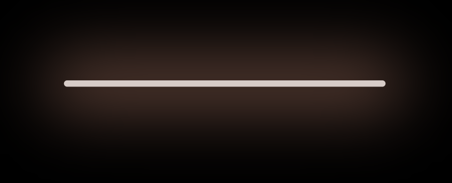
NeonLine(
  spreadColor: Colors.brown,
  lightSpreadRadius: 30,
  lightBlurRadius: 90,
  lineWidth: 400,
  lineHeight: 0.02,
  lineColor: Colors.brown.shade100,
),
Flickering Neon widgets :
// Flickering neon line
FlickerNeonLine(
  spreadColor: Colors.brown,
  lightSpreadRadius: 30,
  lightBlurRadius: 60,
  lineWidth: 300,
  lineHeight: 2,
  lineColor: Colors.brown.shade100,

  // flicker rate which is selects a random value by default
  randomFlicker: false,
  flickerTimeInMilliSeconds: 1000,
),
// Flickering neon point
FlickerNeonPoint(
  pointSize: 010,
  pointColor: Colors.blue.shade100,
  spreadColor: Colors.blue,
),
// Flickering neon container
FlickerNeonContainer(
    spreadColor: Colors.green.shade700,
    child: WIDGET
),
Loaders :
 //loader type 1 : loader made of polynomial of n number of side
 oNeonShapeVerticesProgressBar(number: 4)

 //loader type 2 : triangle shape with all colors customizable
 NeonTriangleVerticesProgressBar()

 //loader type 3 : square shape with all colors customizable
 NeonSquareVerticesProgressBar()

 //loader type 4 : image
 ImageProgressBar(image : "assets/images/abc.png")
Non Neon widgets :
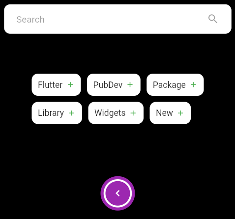
SearchBar(),
const SizedBox(
  height: 20,
),
Wrap(
  direction: Axis.horizontal,
  children: <Widget>[
    ...(searchedResults
        .map((e) => AddItemButton(data: e))),
  ],
),
const SizedBox(
  height: 20,
),
Container(
  padding: const EdgeInsets.all(20),
  child: CircumscribingIconButton(
      icon: Icons.keyboard_arrow_left_sharp,
      onTap: () {},
      backgroundColor: Colors.purple),
),
Usage
Example code provided
NeonContainer(
  spreadColor: Colors.green.shade700,
  child: CircumscribingIconButton(
        icon: Icons.arrow_right_alt_sharp,
        onTap: () {},
        backgroundColor: Colors.green.shade700),
    borderRadius: BorderRadius.circular(100),
    lightBlurRadius: 100,
    lightSpreadRadius: 50,
  borderColor: Colors.green.shade100
)
Additional information
Wanna improve this package? Contribute to project on
github : https://github.com/ojasjain24/neon_widgets_flutter
create issue : https://github.com/ojasjain24/neon_widgets_flutter/issues
Contributing rules :
1 : create an issue describing the feature.
2 : comment on this issue that you are interested in resolving this issue.


