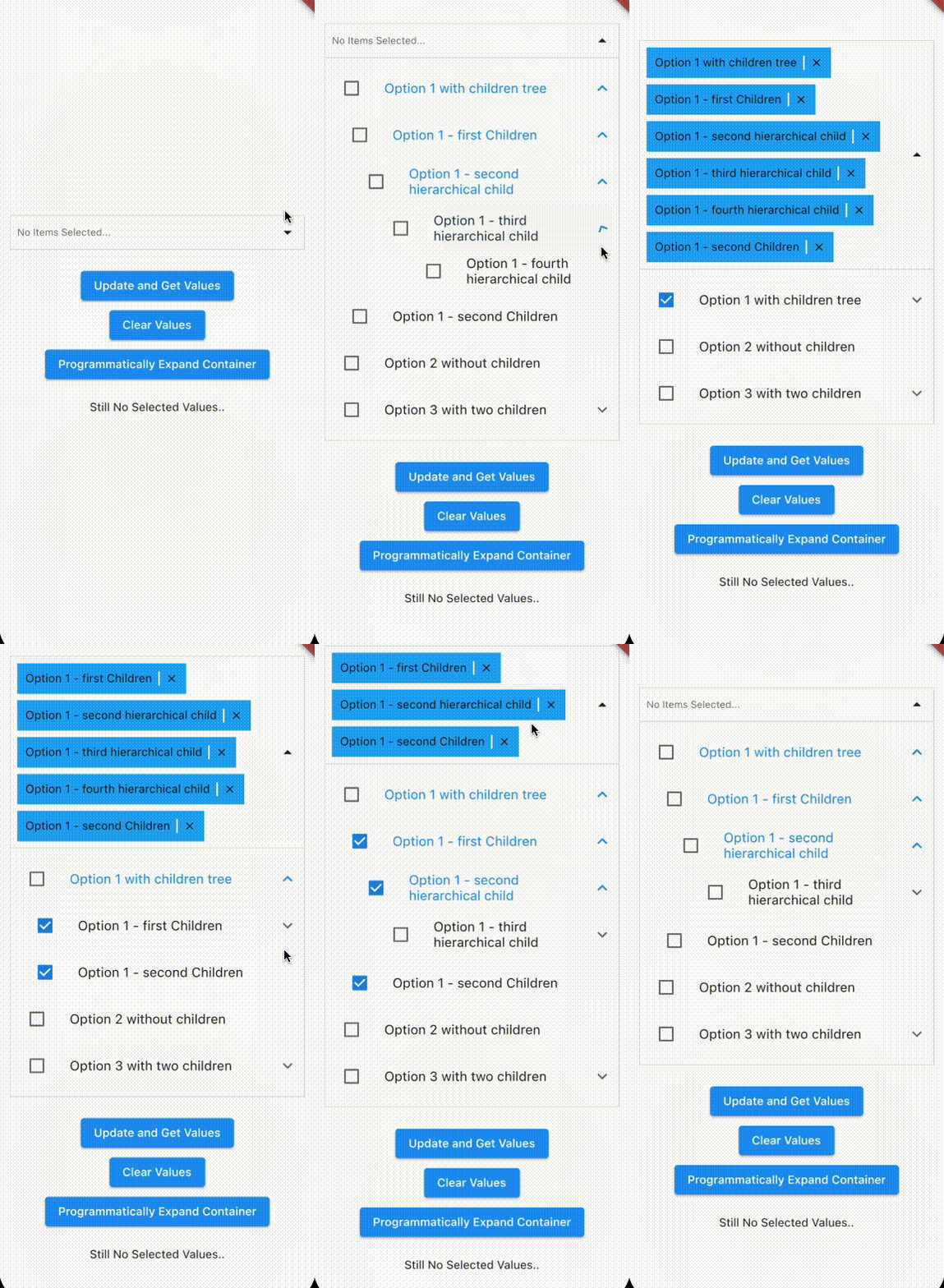
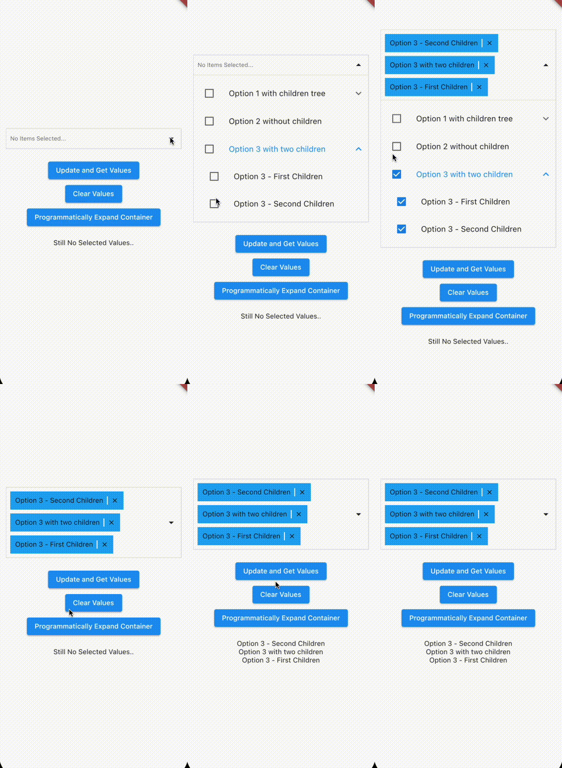
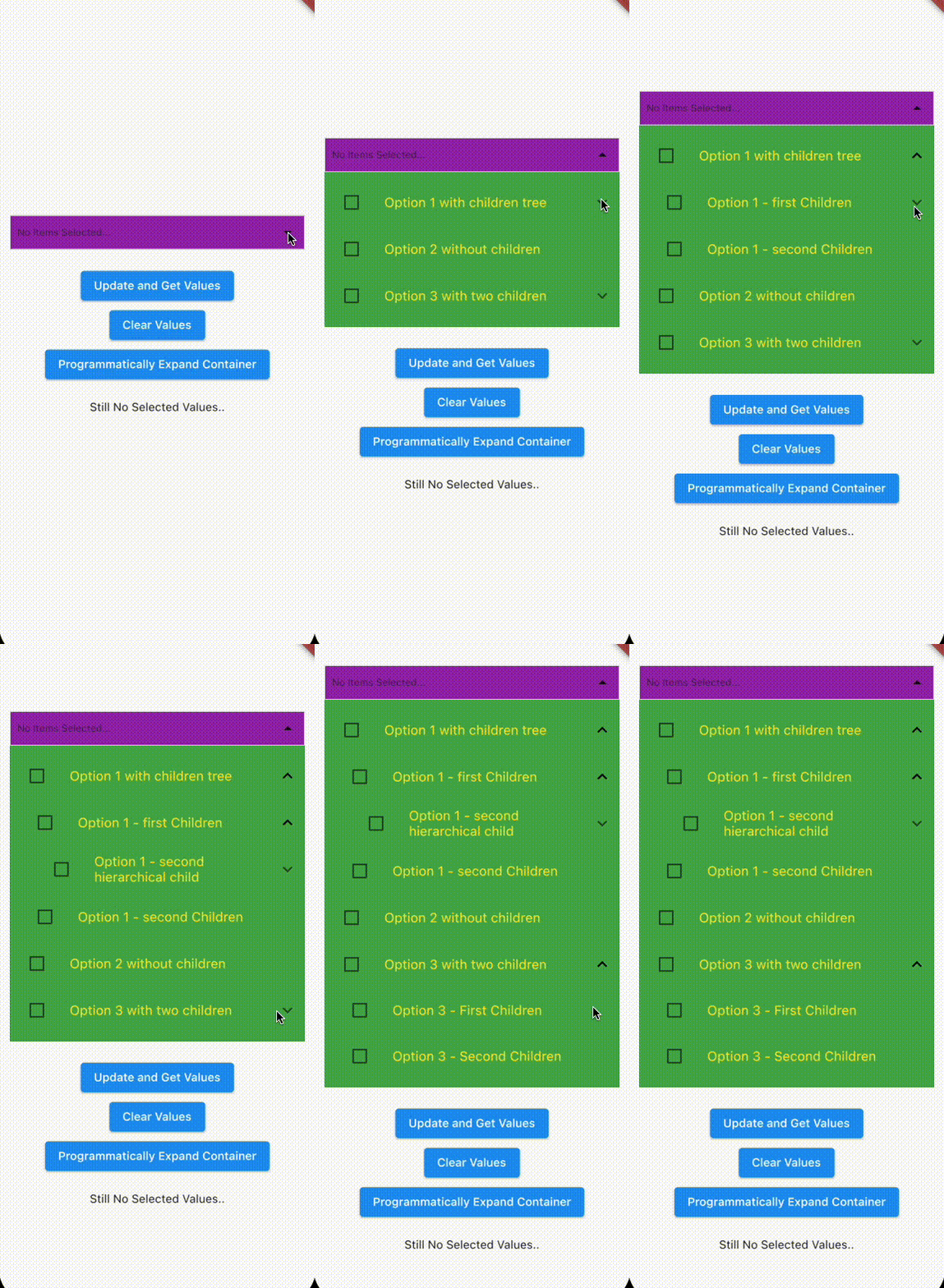
Multi Select Nested
Multi Select Nested is a package with nested options support for Flutter.
 General Use |
 Ready-to-use controller |
 Pass AnimatedContainer: true to use animations |
 Fully customizable |
|---|
Features
- Single & multiple select with nested options support
- Rich options & highly customizable
Getting Started
add it to pubspec.yaml
dependencies:
  flutter:
    sdk: flutter
  multiselect_nested: # use latest version
Import the library
import 'package:multiselect_nested/multiselect_nested.dart';
If you want you can create a MultiSelectNestedController to pass as a prop
import 'package:multiselect_nested/models/multiselect_nested.dart';

MultiSelectNestedController multiSelectController = MultiSelectNestedController();
You can also import the Model: multiselect_nested_item , helpful to use the correct interface when passing the options and the pre-selected items to the library
import 'package:multiselect_nested/models/multiselect_nested_item.dart';
Add the MultiSelectNested widget to your method
import 'package:multiselect_nested/multiselect_nested.dart';
import 'package:multiselect_nested/models/multiselect_nested_item.dart';
import 'package:multiselect_nested/models/multiselect_nested_controller.dart';

List<MultiSelectNestedItem> options = [
    MultiSelectNestedItem(
      id: 1,
      name: 'Option 1',
      children: [],
    ),
    MultiSelectNestedItem(
      id: 2,
      name: 'Option 2 ',
      children: [],
    ),
  ];
List<MultiSelectNestedItem> selected = [];
MultiSelectNestedController multiSelectController = MultiSelectNestedController();

MultiSelectNested(
    controller: multiSelectController,
    options: options,
    selectedValues: selected,
    setSelectedValues:
        (List<MultiSelectNestedItem> newValues) {
      setState(() {
        selected = newValues;
      });
    },
  ),
Example with a Future
.
.
.
List<MultiSelectNestedItem> selected = [];
MultiSelectNestedController multiSelectController = MultiSelectNestedController();

Future<List<MultiSelectNestedItem>> getJson() async {
    var data = await rootBundle.loadString('assets/example_data.json');
    return multiSelectItemsFromJson(data);
}

FutureBuilder<List<MultiSelectNestedItem>>(
    future: getJson(),
    builder: (BuildContext context,
      AsyncSnapshot<List<MultiSelectNestedItem>> snapshot) {
    switch (snapshot.connectionState) {
      case ConnectionState.waiting:
        return const Text('Loading....');
      default:
        if (snapshot.hasError) {
          return Text('Error: ${snapshot.error}');
        } else {
          return Column(
            children: [
              MultiSelectNested(
                controller: multiSelectController,
                options: snapshot.data!,
                selectedValues: selected,
                setSelectedValues:
                    (List<MultiSelectNestedItem> newValues) {
                  setState(() {
                    selected = newValues;
                  });
                },
              ),
            ],
          );
        }
    }
  },
),
.
.
.
See the complete example
Constructor
| Parameter | Type | Description |
|---|---|---|
options |
List< MultiSelectNestedItem > | The options which a user can see and select. |
selectedValues |
List< MultiSelectNestedItem > | Preselected options. |
setSelectedValues |
Function(List< MultiSelectNestedItem >)? | Callback to pass the selectedValues to the parent. It's triggered when you add or remove elements from the selected items. Only works with the liveUpdateValues set to true |
liveUpdateValues |
bool | Set to true if you want a live update of the values. Be careful because it will trigger e rebuild on every added or removed element from the selectedValues which remove the smooth effect from the dropdown container. |
controller |
MultiSelectNestedController | Use this controller to get access to internal state of the Multiselect. |
paddingDropdown |
EdgeInsets | Padding Dropdown content. |
paddingSelectedItems |
EdgeInsets | Padding Row Selected Items. |
isAnimatedContainer |
bool | Set to true to use an Animated container which can accept Curve's effects. |
effectAnimatedContainer |
Curve | Customize the effect of the animated container. |
durationEffect |
Duration | Duration of the Effect of the Animated Container. |
heightDropdownContainer |
double | Height of the Animated Container. This value is only read with the Animated Container set to true because it requires a specific height to work. If it is not set, will be used the default height as value. |
heightDropdownContainerDefault |
Duration | Overwrite the default height of the animated container. |
dropdownContainerColor |
Color | Background Color of the Collapsible Dropdown. |
selectedItemColor |
Color | Background Color of the Selected Items. |
selectedItemDividerColor |
Color | Color of the divider between the selected items. |
collapsedIconColor |
Color | Color of icon when items are collapsed. |
selectedItemsRowColor |
Color | Color of the row of the selected items. |
noItemsText |
String | Text to display in case of no items are provided. |
noItemsTextStyle |
TextStyle | Text Style of noItemsText. |
styleDropdownItemName |
TextStyle | Text Style of the labels inside the dropdown. |
. . .
Contributing
Pull requests are always welcome. Please open an issue first to discuss what you would like to change.
Follow me to get updated
The Next Releases will implement these features.
- Async searching
- Delayed loading (load data of deep level options only when needed)
Stay Tuned!