
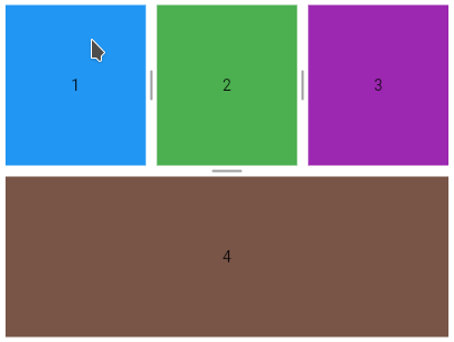
Multi split view
A widget to provides horizontal or vertical multiple split view for Flutter.
- Horizontal or vertical
- Configurable weight or size for each child
- Automatic calculation of weights when:
- Child added without defined weight
- Weight redistribution when a child is removed
- Listener to detect children size changes
Usage
- Horizontal
- Vertical
- Horizontal and vertical
- Size
- Divider
- Support this project
Horizontal
MultiSplitView(children: [child1, child2, child3]);

Vertical
MultiSplitView(axis: Axis.vertical, children: [child1, child2]);

Horizontal and vertical
    MultiSplitView(axis: Axis.vertical, children: [
      MultiSplitView(children: [child1, child2, child3]),
      child4
    ]);

Setting the initial weights
Using in a StatelessWidget
    // setting 10% of weight for the first child
    MultiSplitView multiSplitView = MultiSplitView(
        children: [child1, child2, child3], initialWeights: [0.1]);
Using in a StatefulWidget
  MultiSplitViewController _controller =
      MultiSplitViewController(weights: [0.1]);
    // setting 10% of weight for the first child
    MultiSplitView multiSplitView = MultiSplitView(
        children: [child1, child2, child3], controller: _controller);

Changing the weights programmatically
controller.weights = [0.3, 0.7];
Minimal child weight
MultiSplitView(children: [child1, child2], minimalWeights: [.25, .25]);
Global minimal children weight
Used if minimalWeights has not been set.
    MultiSplitView(axis: Axis.vertical, children: [
      MultiSplitView(children: [child1, child2], globalMinimalWeight: .40),
      MultiSplitView(children: [child3, child4])
    ]);

Minimal child size in pixels
Used if globalMinimalWeight has not been set.
The size will be converted into weight and will respect the limit defined by the MultiSplitView.defaultMinimalWeight constant, allowing all children to be visible.
The value zero is ignored and indicates that no size has been set.
MultiSplitView(children: [child1, child2], minimalSizes: [150, 0]);
Global minimal children size in pixels
Used if minimalSizes has not been set.
The size will be converted into weight and will respect the limit defined by the MultiSplitView.defaultMinimalWeight constant, allowing all children to be visible.
MultiSplitView(children: [child1, child2], globalMinimalSize: 100);
Resizable
MultiSplitView(children: [child1, child2, child3], resizable: false);
Listener
    MultiSplitView(
        children: [child1, child2, child3, child4],
        onSizeChange: (childIndex1, childIndex2) => print(
            'Index of children whose size has changed: $childIndex1 and $childIndex2'));
Divider thickness
    MultiSplitView multiSplitView =
        MultiSplitView(children: [child1, child2, child3]);

    MultiSplitViewTheme theme = MultiSplitViewTheme(
        child: multiSplitView,
        data: MultiSplitViewThemeData(dividerThickness: 30));

Widget as a custom divider
    MultiSplitView multiSplitView = MultiSplitView(
        children: [child1, child2, child3],
        dividerBuilder:
            (axis, index, resizable, dragging, highlighted, themeData) {
          return Container(
            color: dragging ? Colors.grey[300] : Colors.grey[100],
            child: Icon(
              Icons.drag_indicator,
              color: highlighted ? Colors.grey[600] : Colors.grey[400],
            ),
          );
        });

    MultiSplitViewTheme theme = MultiSplitViewTheme(
        child: multiSplitView,
        data: MultiSplitViewThemeData(dividerThickness: 24));

Divider painters
Allows customizing the divider through the DividerPainter class.
The DividerPainters factory class offers default painters.
Divider - background color
The DividerPainters.background allows setting the background color. The default color is NULL.
    MultiSplitView multiSplitView = MultiSplitView(children: [child1, child2]);

    MultiSplitViewTheme theme = MultiSplitViewTheme(
        child: multiSplitView,
        data: MultiSplitViewThemeData(
            dividerPainter: DividerPainters.background(color: Colors.black)));

Divider - highlighted background color
    MultiSplitView multiSplitView = MultiSplitView(children: [child1, child2]);

    MultiSplitViewTheme theme = MultiSplitViewTheme(
        child: multiSplitView,
        data: MultiSplitViewThemeData(
            dividerPainter: DividerPainters.background(
                color: Colors.grey[200], highlightedColor: Colors.grey[800])));

Dashed divider
    MultiSplitView multiSplitView = MultiSplitView(children: [child1, child2]);

    MultiSplitViewTheme theme = MultiSplitViewTheme(
        child: multiSplitView,
        data: MultiSplitViewThemeData(
            dividerPainter: DividerPainters.dashed(
                color: Colors.deepOrange, highlightedColor: Colors.black)));

Dashed divider - Customizations
    MultiSplitViewTheme theme = MultiSplitViewTheme(
        child: multiSplitView,
        data: MultiSplitViewThemeData(
            dividerPainter: DividerPainters.dashed(
                gap: 30, size: 20, thickness: 3, highlightedThickness: 6)));

Grooved divider 1
    MultiSplitView multiSplitView = MultiSplitView(children: [child1, child2]);

    MultiSplitViewTheme theme = MultiSplitViewTheme(
        child: multiSplitView,
        data: MultiSplitViewThemeData(
            dividerPainter: DividerPainters.grooved1(
                color: Colors.indigo[100]!,
                highlightedColor: Colors.indigo[900]!)));

Grooved divider 1 - Customizations
    MultiSplitViewTheme theme = MultiSplitViewTheme(
        child: multiSplitView,
        data: MultiSplitViewThemeData(
            dividerPainter: DividerPainters.grooved1(
                size: 5,
                highlightedSize: 30,
                thickness: 3,
                highlightedThickness: 6)));

Grooved divider 2
    MultiSplitView multiSplitView = MultiSplitView(children: [child1, child2]);

    MultiSplitViewTheme theme = MultiSplitViewTheme(
        child: multiSplitView,
        data: MultiSplitViewThemeData(
            dividerPainter: DividerPainters.grooved2(
                color: Colors.grey[400]!, highlightedColor: Colors.red)));

Grooved divider 2 - Customizations
    MultiSplitViewTheme theme = MultiSplitViewTheme(
        child: multiSplitView,
        data: MultiSplitViewThemeData(
            dividerPainter: DividerPainters.grooved2(
                gap: 15,
                thickness: 4,
                count: 3,
                highlightedCount: 9,
                strokeCap: StrokeCap.square)));

Divider - Custom painter
It is possible to extend the DividerPainter class to create a painter from scratch.
class MyDividerPainter extends DividerPainter {
  @override
  Map<int, Tween> buildTween() {
    Map<int, Tween> map = super.buildTween();
    // create your tween here, example:
    map[100] = Tween<double>(begin: 1, end: 5);
    return map;
  }

  @override
  void paint(
      {required Axis dividerAxis,
      required bool resizable,
      required bool highlighted,
      required Canvas canvas,
      required Size dividerSize,
      required Map<int, dynamic> animatedValues}) {
    super.paint(
        dividerAxis: dividerAxis,
        resizable: resizable,
        highlighted: highlighted,
        canvas: canvas,
        dividerSize: dividerSize,
        animatedValues: animatedValues);
    double myAnimatedValue = animatedValues[100];
    // ...
  }
}
    MultiSplitView multiSplitView = MultiSplitView(children: [child1, child2]);

    MultiSplitViewTheme theme = MultiSplitViewTheme(
        child: multiSplitView,
        data: MultiSplitViewThemeData(dividerPainter: MyDividerPainter()));
Support this project
Bitcoin
bc1qhqy84y45gya58gtfkvrvass38k4mcyqnav803h
Ethereum (ERC-20) or Binance Smart Chain (BEP-20)
0x9eB815FD4c88A53322304143A9Aa8733D3369985
Solana
7vp45LoQXtLYFXXKx8wQGnzYmhcnKo1TmfqUgMX45Ad8