Material Floating Search Bar


Continued version of the material_floating_search_bar package, as the original repository was deleted. This package serves as a continuation of bxqm's popular work, similar to the implicitly_animated_reorderable_list_2 package.
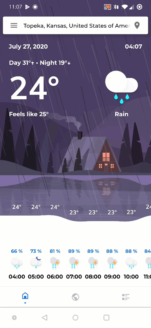
A Flutter implementation of an expandable floating search bar, also known as persistent search, similar to the ones used extensively by Google in their own apps.
If you like this package, consider supporting it by giving it a star on GitHub and a like on pub.dev :heart:
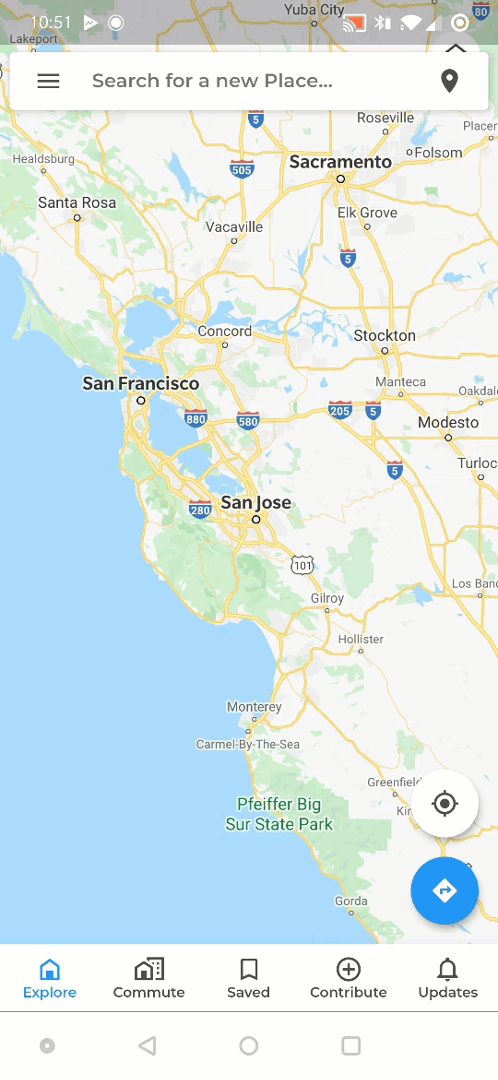
Click here to view the full example.
Installing
See Installing
Usage
A FloatingSearchBar should be placed above your main content in your widget tree and be allowed to fill all the available space.
@override
Widget build(BuildContext context) {
  return Scaffold(
    // This is handled by the search bar itself.
    resizeToAvoidBottomInset: false,
    body: Stack(
      fit: StackFit.expand,
      children: [
        buildMap(),
        buildBottomNavigationBar(),
        buildFloatingSearchBar(),
      ],
    ),
  );
}

Widget buildFloatingSearchBar() {
  final isPortrait = MediaQuery.of(context).orientation == Orientation.portrait;

  return FloatingSearchBar(
    hint: 'Search...',
    scrollPadding: const EdgeInsets.only(top: 16, bottom: 56),
    transitionDuration: const Duration(milliseconds: 800),
    transitionCurve: Curves.easeInOut,
    physics: const BouncingScrollPhysics(),
    axisAlignment: isPortrait ? 0.0 : -1.0,
    openAxisAlignment: 0.0,
    width: isPortrait ? 600 : 500,
    debounceDelay: const Duration(milliseconds: 500),
    onQueryChanged: (query) {
      // Call your model, bloc, controller here.
    },
    // Specify a custom transition to be used for
    // animating between opened and closed stated.
    transition: CircularFloatingSearchBarTransition(),
    actions: [
      FloatingSearchBarAction(
        showIfOpened: false,
        child: CircularButton(
          icon: const Icon(Icons.place),
          onPressed: () {},
        ),
      ),
      FloatingSearchBarAction.searchToClear(
        showIfClosed: false,
      ),
    ],
    builder: (context, transition) {
      return ClipRRect(
        borderRadius: BorderRadius.circular(8),
        child: Material(
          color: Colors.white,
          elevation: 4.0,
          child: Column(
            mainAxisSize: MainAxisSize.min,
            children: Colors.accents.map((color) {
              return Container(height: 112, color: color);
            }).toList(),
          ),
        ),
      );
    },
  );
}
Usage with Scrollables
By default, the Widget returned by the builder is not allowed to have an unbounded (infinite) height. This is necessary in order for the search bar to be able to dismiss itself, when the user taps below the area of the child. (For example, when you have a list of items but there are not enough items to fill the whole screen, as shown in the gifs above, the user would expect to be able to close the search bar when tapping below the last item in the list).
Therefore, shrinkWrap should be set to true on all Scrollables and physics to NeverScrollableScrollPhysics. On Columns, the mainAxisSize should be set to MainAxisSize.min.
If you don't want this behavior, you can set the isScrollControlled flag to true. Then you are allowed to use expanding Widgets such as Scrollables with the caveat that the search bar may not be able to detect taps on the backdrop area.
Customizations
There are many customization options:
| Field | Description |
|---|---|
body |
The widget displayed below the FloatingSearchBar. This is useful, if the FloatingSearchBar should react to scroll events (i.e. hide from view when a Scrollable is being scrolled down and show it again when scrolled up). See here for more info. |
accentColor |
The color used for elements such as the progress indicator. Defaults to the themes accent color if not specified. |
backgroundColor |
The color of the card. If not specified, defaults to theme.cardColor. |
shadowColor |
The color of the shadow drawn when elevation > 0. If not specified, defaults to Colors.black54. |
iconColor |
When specified, overrides the themes icon color for this FloatingSearchBar, for example to easily adjust the icon color for all actions and leadingActions. |
backdropColor |
The color that fills the available space when the FloatingSearchBar is opened. Typically a black-ish color. If not specified, defaults to Colors.black26. |
margins |
The insets from the edges of its parent. This can be used to position the FloatingSearchBar. If not specifed, the FloatingSearchBar will try to position itself at the top offsetted by MediaQuery.of(context).viewPadding.top to avoid the status bar. |
padding |
The padding of the card. Only the horizontal values will be honored. |
insets |
The padding between leadingActions, the input field and actions respectively. Only the horizontal values will be honored. |
height |
The height of the card. If not specified, defaults to 48.0 pixels. |
elevation |
The elevation of the card. |
width |
The width of the FloatingSearchBar. By default the FloatingSearchBar will expand to fill all the available width. This value can be set to avoid this. |
openWidth |
The width of the FloatingSearchBar when opened. This can be used, when the max width when opened should be different from the one specified by maxWidth. When not specified, will use the value of maxWidth. |
axisAlignment |
How the FloatingSearchBar should be aligned when the available width is bigger than the width specified by maxWidth. When not specified, defaults to 0.0 which centers the FloatingSearchBar. |
openAxisAlignment |
How the FloatingSearchBar should be aligned when the available width is bigger than the width specified by openMaxWidth. When not specified, will use the value of axisAlignment. |
border |
The border of the card. |
borderRadius |
The BorderRadius of the card. When not specified, defaults to BorderRadius.circular(4). |
hintStyle |
The TextStyle for the hint in the TextField. |
queryStyle |
The TextStyle for the input in the TextField. |
clearQueryOnClose |
Whether the current query should be cleared when the FloatingSearchBar was closed. When not specifed, defaults to true. |
automaticallyImplyDrawerHamburger |
Whether a hamburger menu should be shown when there is a Scaffold with a Drawer in the widget tree. |
closeOnBackdropTap |
Whether the FloatingSearchBar should be closed when the backdrop was tapped. When not specified, defaults to true. |
automaticallyImplyBackButton |
Whether to automatically display a back button if the enclosing route can be popped. When not specified, defaults to true. |
progress |
The progress of the LinearProgressIndicator inside the card. When set to a double between 0..1, will show show a determined LinearProgressIndicator. When set to true, the FloatingSearchBar will show an indetermined LinearProgressIndicator. When null or false, will hide the LinearProgressIndicator. |
transitionDuration |
The duration of the animation between opened and closed state. |
transitionCurve |
The curve for the animation between opened and closed state. |
debounceDelay |
The delay between the time the user stopped typing and the invocation of the onQueryChanged callback. This is useful for example if you want to avoid doing expensive tasks, such as making a network call, for every single character. |
title |
A widget that is shown in place of the TextField when the FloatingSearchBar is closed. |
hint |
The text value of the hint of the TextField. |
actions |
A list of widgets displayed in a row after the TextField. Consider using FloatingSearchBarActions for more advanced actions that can interact with the FloatingSearchBar. In LTR languages, they will be displayed to the left of the TextField. |
leadingActions |
A list of widgets displayed in a row before the TextField. Consider using FloatingSearchBarActions for more advanced actions that can interact with the FloatingSearchBar. In LTR languages, they will be displayed to the right of the TextField. |
onQueryChanged |
A callback that gets invoked when the input of the query inside the TextField changed. |
onSubmitted |
A callback that gets invoked when the user submitted their query (e.g. hit the search button). |
onFocusChanged |
A callback that gets invoked when the FloatingSearchBar receives or looses focus. |
transition |
The transition to be used for animating between closed and opened state. See below for a list of all available transitions. |
builder |
The builder for the body of this FloatingSearchBar. Usually, a list of items. Note that unless isScrollControlled is set to true, the body of a FloatingSearchBar must not have an unbounded height meaning that shrinkWrap should be set to true on all Scrollables. |
controller |
The controller for this FloatingSearchBar which can be used to programatically open, close, show or hide the FloatingSearchBar. |
isScrollControlled |
Whether the body of this FloatingSearchBar is using its own Scrollable. This will allow the body of the FloatingSearchBar to have an unbounded height. Note that when set to true, the FloatingSearchBar won't be able to dismiss itself when tapped below the height of child inside the Scrollable, when the child is smaller than the avaialble height. |
initiallyHidden |
Set to true to hide the search bar intially. You have to call show on the controller to in order to show the FloatingSearchBar again, |
Transitions
As of now there are three types of transitions that are exemplified above:
| Transition | Description |
|---|---|
CircularFloatingSearchBarTransition |
Clips its child in an expanding circle. |
ExpandingFloatingSearchBarTransition |
Fills all the available space with the background of the FloatingSearchBar. Similar to the ones used in many Google apps like Gmail. |
SlideFadeFloatingSearchBarTransition |
Vertically slides and fades its child. |
You can also easily create you own custom transition by extending FloatingSearchBarTransition.
Scrolling

A common behavior for floating search bars is to disappear when the user scrolls a Scrollable down and appear again when scrolling up. This can be easily achieved by passing your Widget to the body field of FloatingSearchBar. This way FloatingSearchBar can listen for ScrollNotifications. In order that the FloatingSearchBar doesn't interact with every Scrollable below in the widget tree, you should wrap every Scrollable that should interact with the FloatingSearchBar inside a FloatingSearchBarScrollNotifier.
Example
class Home extends StatelessWidget {
  @override
  Widget build(BuildContext context) {
    return FloatingSearchBar(
      // Your pages or just a simple Scaffold...
      body: IndexedStack(
        children: [
          MyAwesomePage(),
        ],
      ),
    );
  }
}

class MyAwesomePage extends StatelessWidget {
  @override
  Widget build(BuildContext context) {
    /// Wrap your Scrollable in a FloatingSearchBarScrollNotifier
    /// to indicate that the FloatingSearchBar should react to
    /// scroll events from this Scrollable.
    return FloatingSearchBarScrollNotifier(
      child: ListView.builder(
        itemCount: 42,
        itemBuilder: (_, index) => Item('Item $index'),
      ),
    );
  }
}
FloatingSearchBarController
The FloatingSearchBarController can be used to control the
FloatingSearchBar (duh).
| Method | Description |
|---|---|
open() |
Expands the FloatingSearchBar |
close() |
Closes the FloatingSearchBar |
show() |
Reveals the FloatingSearchBar when it was previously hidden using hide(). |
hide() |
Visually hides the FloatingSearchBar (slides off screen) |
query |
Sets the input of the query inside the InputField |
clear() |
Clears the query |
Floating Search App Bar
Sometimes a FloatingSearchBar might not be the most appriopriate search method for your use case. For this reason there is also the FloatingSearchAppBar. It is a normal AppBar with easy search integration very similar to the normal FloatingSearchBar.

Additional Customizations
In addition to most of the fields from the FloatingSearchBar, FloatingSearchAppBar has the following additional fields:
| Field | Description |
|---|---|
colorOnScroll |
The color of the bar when a Scrollable inside the body was scrolled (i.e. the Scrollable is not at the top) |
liftOnScrollElevation |
The elevation of the bar when a Scrollable inside the body was scrolled (i.e. the Scrollable is not at the top) |
alwaysOpened |
Whether the bar should be always in opened state. This is useful for example, if you have a page dedicated only for search. |
hideKeyboardOnDownScroll |
Hides the keyboard if a Scrollable inside the body was scrolled and shows it again when the user scrolls to the top. |