Material Charts
Material Charts is a Flutter package designed to offer versatile, customizable chart components that adapt to a variety of use cases. It supports Line Charts, Pie Charts, Bar Charts, CandleStick Charts, Gantt Charts, and Area Charts, with extensive customization, smooth animations, and real-time data updates.


Available Charts
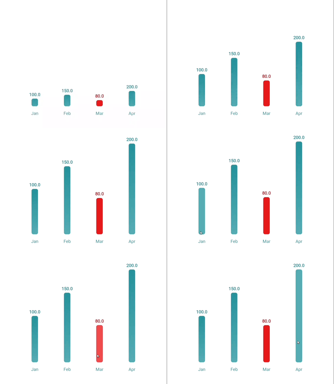
Bar Chart
A beautiful, interactive, and animated bar chart, ideal for visualizing discrete data categories and comparisons.

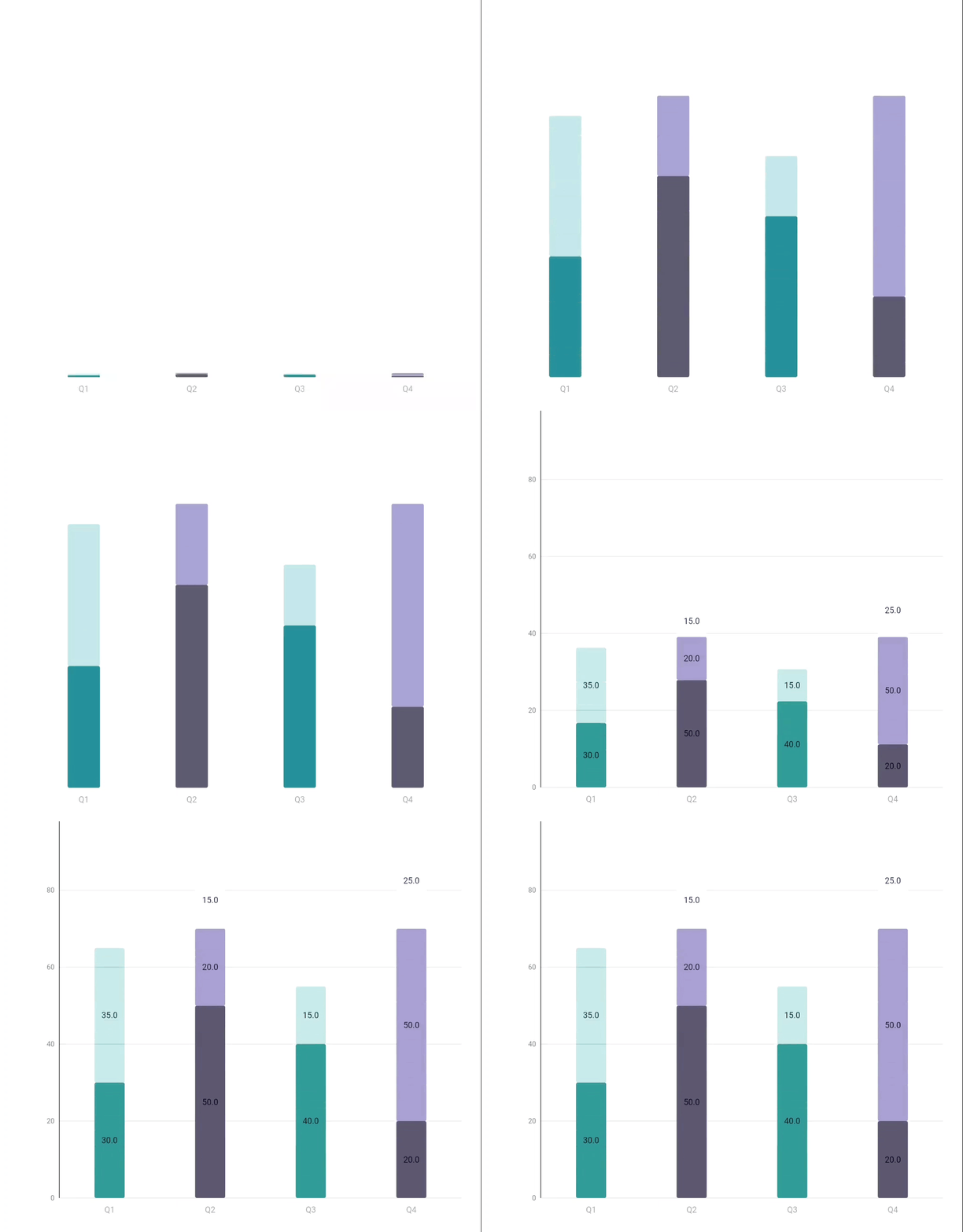
Stacked Bar Chart
A versatile bar chart that visually represents comparisons, progress, featuring customizable colors and interactive elements.

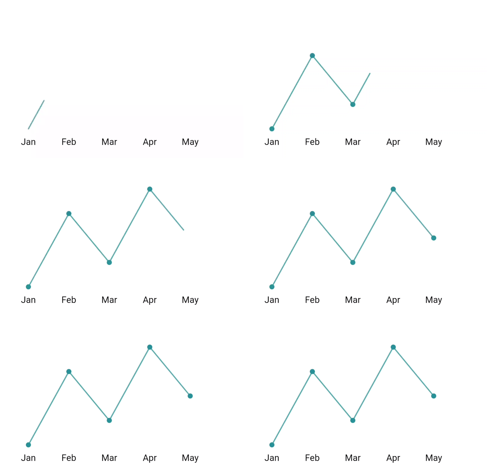
Line Chart
An animated line chart with customizable styling, perfect for showing trends and time series data.

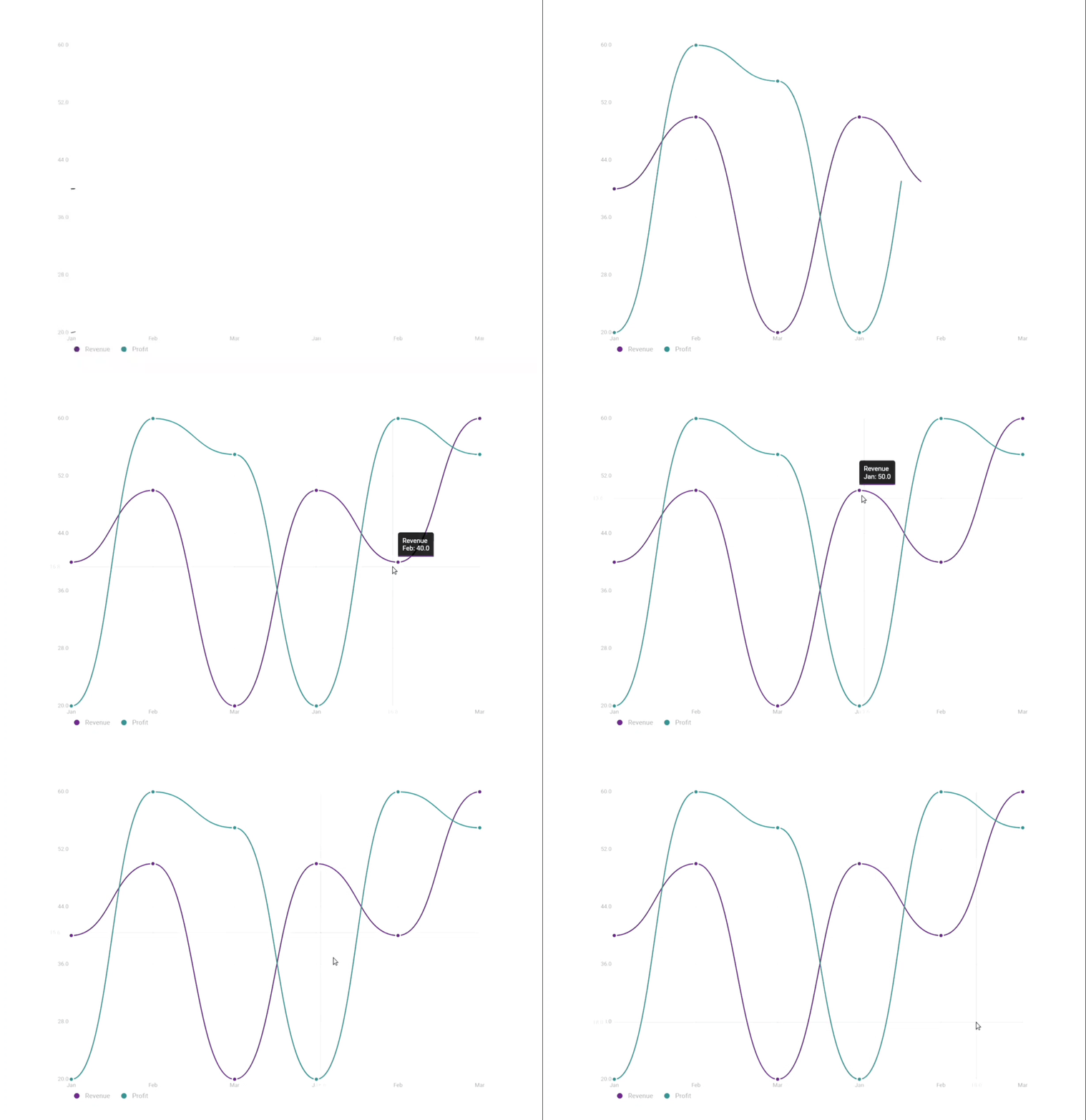
MultiLine Chart
A customizable Flutter widget for displaying multiple line series in a chart, with support for tooltips, legends, animations, and interactions like zoom and pan.

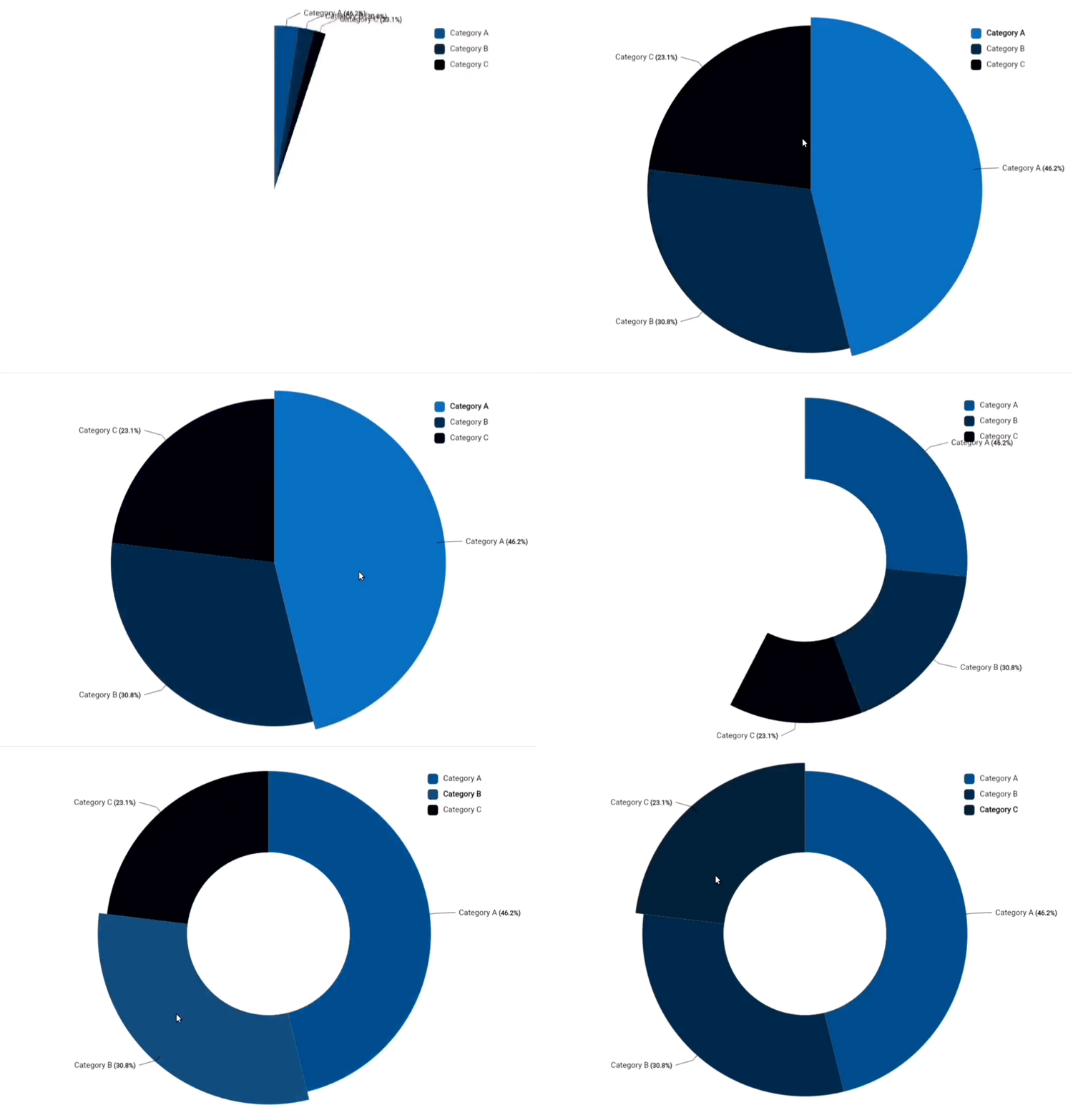
PieChart / Donut Chart
A customizable Flutter widget for displaying a pie chart with multiple segments, supporting animations, interactivity, and customizable styling options.

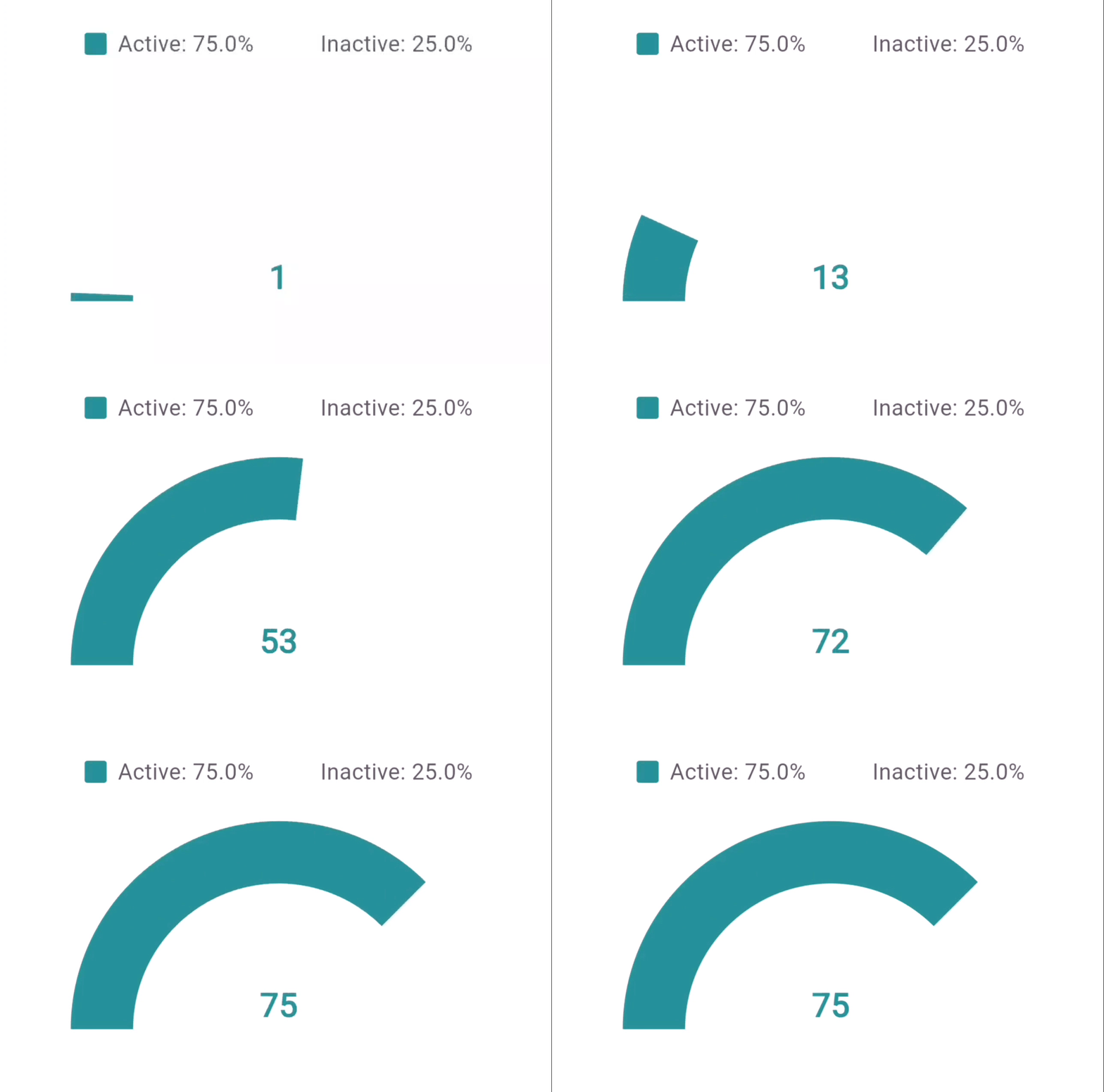
Hollow Semi Circle
A customizable progress meter in a hollow semi-circle format, ideal for displaying percentages and progress.

Gantt Chart
A versatile Gantt chart that visually represents task timelines and progress, featuring customizable colors and interactive elements.
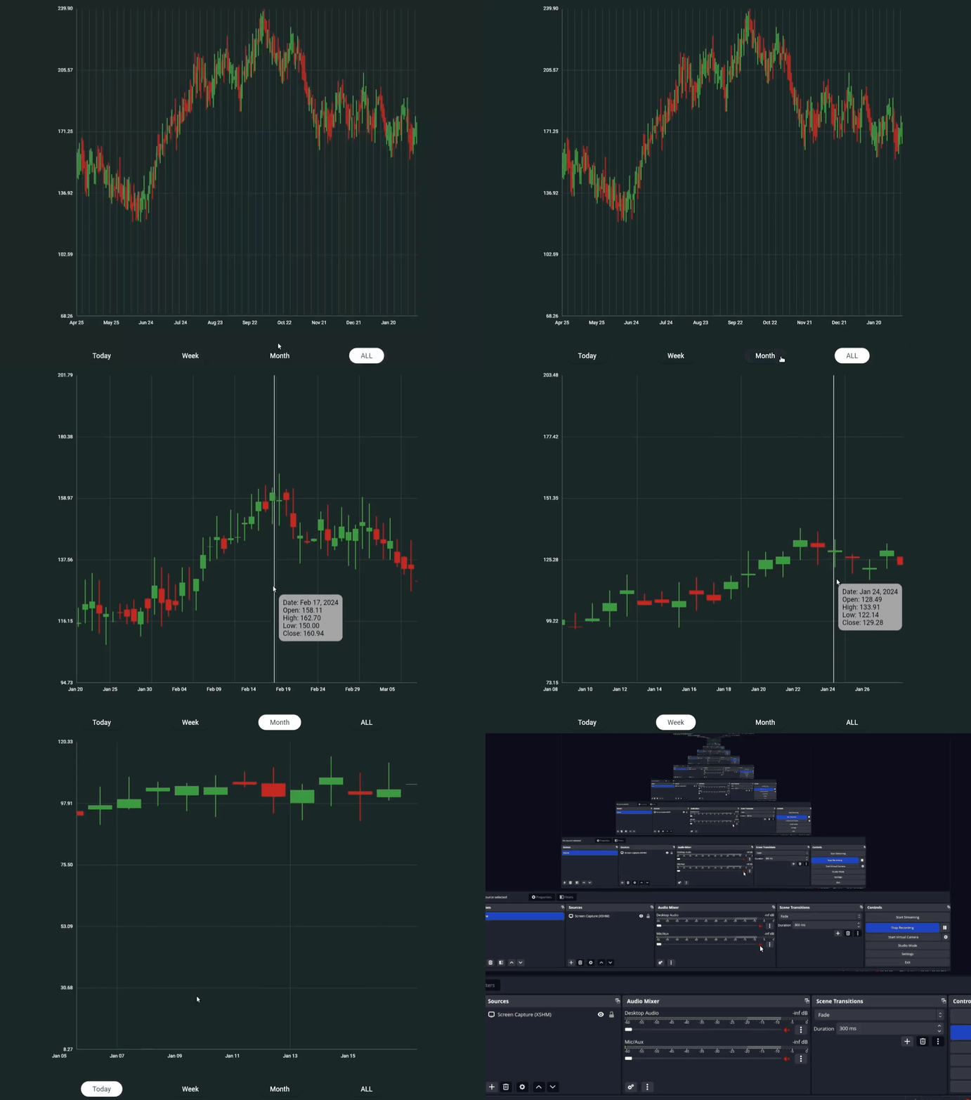
CandleStick Chart
A Flutter widget that represents financial data in the form of candlestick charts, suitable for visualizing stock price movements over time.

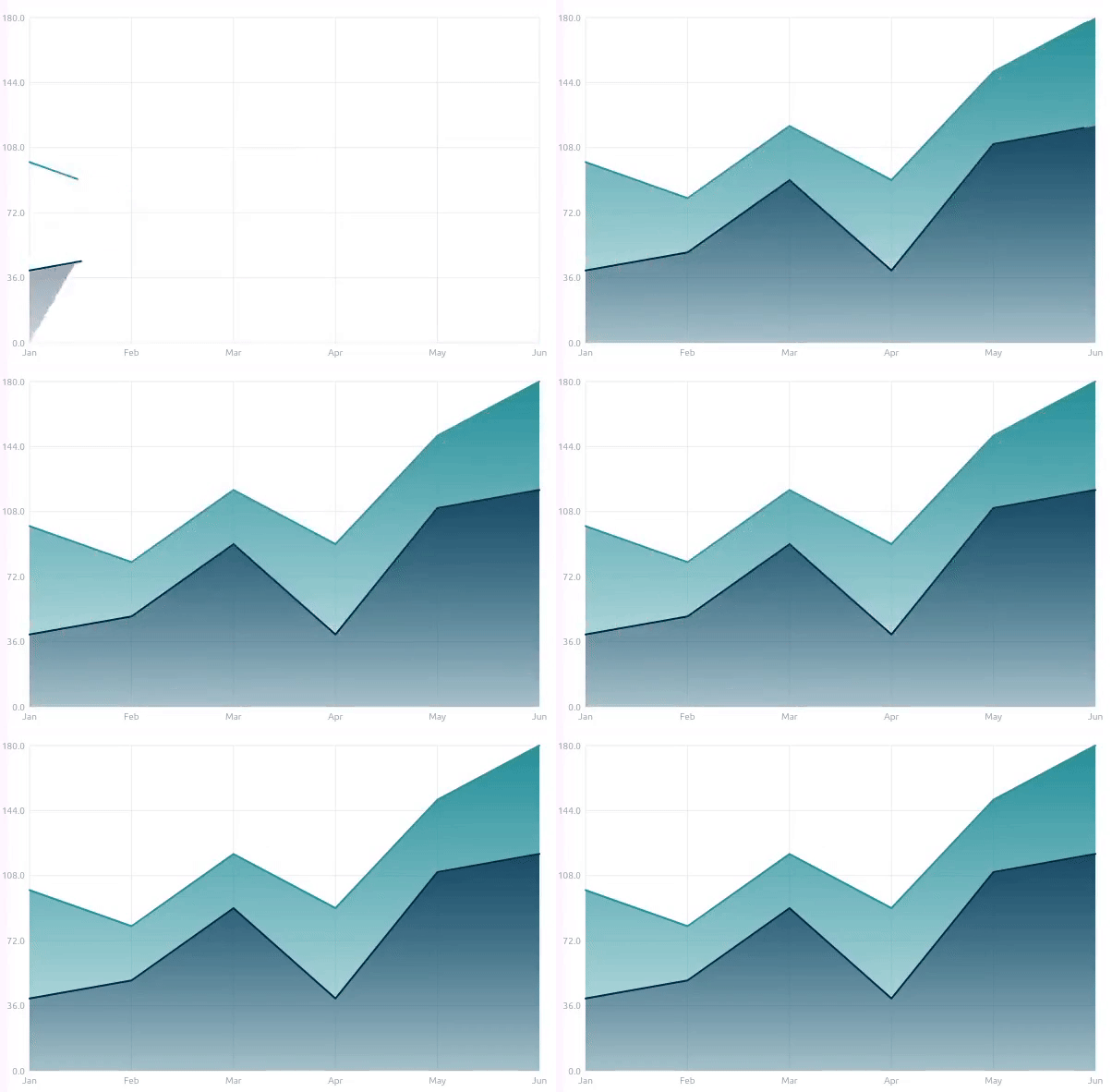
Area Chart
A customizable area chart that visually represents quantitative data over a continuous interval.

Features
Common Features Across All Charts
- 🎨 Material Design aesthetics
- ✨ Smooth animations with configurable duration and curves
- 📊 Responsive and adaptive layouts
- 🎭 Customizable color schemes
- 💫 Animation completion callbacks
- 📱 Mobile-friendly design
- ♿ Accessibility support
Bar Chart Features
- 📊 Animated bars with hover and tap interactions
- 🏷️ Customizable bar colors and labels
- 📏 Optional gridlines and padding
- 🕒 Animation support with curve control
- 🌈 Gradient or solid color options
Stacked Bar Chart Features
- 📊 Dynamic Stacking
- 🎨 Customizable Segment Colors
- 🏷️ Segment Labels
- 📏 Adjustable Bar Widths and Spacing
- 📅 Animation Support
- 📏 Optional Gridlines
- 📐 Padding Control
- 🌈 Gradient and Solid Color Options
- 🛠️ Custom Y-axis Configuration
- 📊 Responsive Sizing
Line Chart Features
- 📈 Interactive data points
- 📏 Optional gridlines
- 🏷️ Customizable labels
- 📊 Automatic scaling
- 🎯 Point highlighting
Multi-Line Chart Features
- 📈 Multiple Series Support
- ✨ Smooth Line Transitions
- 🎨 Customizable Color Palettes
- 🔍 Interactive Tooltips
- 📊 Clickable Legends for Series Selection
- 🗺️ Panning and Zooming Capabilities
- 📏 Grid Lines for Easy Reading
- 🔄 Animated Drawing of Lines
- 🗓️ Crosshair for Precision Tracking
- 📅 X and Y-Axis Label Customization
Pie Chart Features
- 📊 Segment Visualization
- 🎨 Customizable Colors
- 🔄 Smooth Animations
- 📏 Interactive Hover Effects
- 🏷️ Dynamic Labels and Values
- 📋 Legend Support
- 🔗 Connector Lines
- 📅 Animation Duration Customization
- 🗺️ Label Positioning
- ♿ Accessibility Features
Hollow Semi Circle Features
- 📊 Percentage display
- 🎯 Legend support
- 📏 Adjustable hollow radius
- 🎨 Active/inactive segment styling
- 📝 Custom formatters
Gantt Chart Features
- 🗓️ Task Timeline Visualization
- 📊 Interactive Task Bars
- 🏷️ Customizable Labels
- 🔄 Drag-and-Drop Functionality
- 🎨 Custom Color Schemes
- 📅 Date Range Filtering
- 🕒 Animation Support
- ♿ Accessibility Support
- 🎯 Highlighting Current Tasks
- 🌟 Custom Milestones
Candlestick Chart Features
- 📊 Interactive Candlestick Visualization
- 📈 Bullish and Bearish Color Coding
- 🎨 Customizable Candle and Wick Width
- 📅 Date and Price Axis Configuration
- 🌈 Tooltip Styling Options
- 🔄 Animation Support with Curved Transitions
- 📏 Adjustable Spacing Between Candles
- 📊 Optional Gridlines for Clarity
- 📏 Configurable Y-axis and X-axis Dimensions
- 🖌️ Custom Price and Date Formatting
- 📉 Vertical Line Indicators
Area Chart Features
- 📊 Visual representation of quantitative data over a continuous interval
- 🎨 Customizable colors and gradients
- 📏 Interactive points with hover effects
- 📅 Animation support for smooth transitions
- 🏷️ Customizable labels for data points
- 📈 Tooltip support for detailed data insights
Installation
Add the dependency to your pubspec.yaml:
dependencies:
  material_charts: latest_version
Chart Types and Usage
Bar Chart
Code Example
import 'package:flutter/material.dart';
import 'material_charts/bar_chart.dart';

MaterialBarChart(
  data: [
    BarChartData(value: 30, label: 'Apples', color: Colors.red),
    BarChartData(value: 70, label: 'Oranges'),
    BarChartData(value: 50, label: 'Bananas', color: Colors.yellow),
  ],
  style: BarChartStyle(
    gridColor: Colors.grey.shade300,
    backgroundColor: Colors.white,
    labelStyle: TextStyle(fontSize: 14, color: Colors.black),
    valueStyle: TextStyle(fontSize: 12, color: Colors.blueGrey),
    barSpacing: 0.3,
    cornerRadius: 6.0,
    gradientEffect: true,
    gradientColors: [Colors.purple, Colors.cyan],
    animationDuration: Duration(milliseconds: 1200),
  ),
  showGrid: true,
  showValues: true,
);
BarChartData Properties
| Property |
Type |
Description |
Default |
value |
double |
Value of the bar |
Required |
label |
String |
Name of the bar |
Required |
color |
Color? |
Color of the bar |
Colors.blue |
BarChartStyle Properties
| Property |
Type |
Description |
Default |
gridColor |
Color |
Color of the grid |
Colors.grey |
backgroundColor |
Color |
Chart background color |
Colors.white |
labelStyle |
TextStyle? |
Text style for bar labels |
null |
valueStyle |
TextStyle? |
Text style for bar values |
null |
barSpacing |
double |
Spacing between bars (0.0 - 1.0) |
0.2 |
cornerRadius |
double |
Corner radius of bars |
4.0 |
barColor |
Color |
Default color for bars |
Colors.blue |
gradientEffect |
bool |
Enables gradient on bars |
false |
gradientColors |
List<Color>? |
Colors for gradient effect |
null |
animationDuration |
Duration |
Animation duration for the bars |
Duration(milliseconds: 1500) |
animationCurve |
Curve |
Animation curve for transitions |
Curves.easeInOut |
Stacked Bar Chart
Code Example
import 'package:flutter/material.dart';
import 'package:material_charts_tests/material_charts.dart';

final data = [
  const StackedBarData(
    label: 'Q1',
    segments: [
      StackedBarSegment(
          value: 30,
          color: Color.fromRGBO(46, 142, 149, 1),
          label: 'Product A'),
      StackedBarSegment(
          value: 35,
          color: Color.fromRGBO(46, 142, 149, 0.342),
          label: 'Product B'),
    ],
  ),
  const StackedBarData(
    label: 'Q2',
    segments: [
      StackedBarSegment(
          value: 50, color: Color(0xFF605e70), label: 'Product A'),
      StackedBarSegment(
          value: 20, color: Color(0xFFa19dc7), label: 'Product B'),
      StackedBarSegment(
          value: 15, color: Color(0xFFf3f2fe), label: 'Product C'),
    ],
  ),
  const StackedBarData(
    label: 'Q3',
    segments: [
      StackedBarSegment(
          value: 40,
          color: Color.fromRGBO(46, 142, 149, 1),
          label: 'Product A'),
      StackedBarSegment(
          value: 15,
          color: Color.fromRGBO(46, 142, 149, 0.342),
          label: 'Product B'),
    ],
  ),
  const StackedBarData(
    label: 'Q4',
    segments: [
      StackedBarSegment(
          value: 20, color: Color(0xFF605e70), label: 'Product A'),
      StackedBarSegment(
          value: 50, color: Color(0xFFa19dc7), label: 'Product B'),
      StackedBarSegment(
          value: 25, color: Color(0xFFf3f2fe), label: 'Product C'),
    ],
  ),
  // Add more StackedBarData items...
];
MaterialStackedBarChart(
  showGrid: true,
  horizontalGridLines: 5,
  showValues: true,
  data: data,
  width: 400,
  height: 300,
  style: StackedBarChartStyle(
    gridColor: Colors.black,
    // showSegmentLabels: true,
    cornerRadius: 3,
    barSpacing: .7,
    valueStyle: const TextStyle(
      // backgroundColor: Color.fromARGB(68, 255, 255, 255),
      color: Colors.black87,
    ),
    labelStyle: const TextStyle(
      color: Colors.grey,
    ),
    yAxisConfig: YAxisConfig(
      minValue: 0,
      maxValue: 100,
      divisions: 5,
      showGridLines: false,
      labelFormatter: (value) => '${value.toInt()}',
      labelStyle: TextStyle(
        fontSize: 12,
        color: Colors.grey[600],
      ),
    ),
  ),
);
StackedBarChartData Properties
| Class |
Description |
StackedBarSegment |
Represents a single segment in a stacked bar, defined by its value, color, and an optional label. |
StackedBarData |
Represents the complete data for a single bar, consisting of multiple segments with a common label. |
YAxisConfig |
Configuration class for customizing the Y-axis, including min/max values, grid lines, and label styles. |
StackedBarChartStyle |
Configuration class for customizing the appearance of the stacked bar chart, including colors, spacing, and animations. |
Detailed Component Description
StackedBarSegment
| Property |
Type |
Description |
value |
double |
The numerical value of the segment contributing to the total. |
color |
Color |
The color used to render this segment in the chart. |
label |
String? |
An optional label to describe the segment, used for tooltips/legends. |
StackedBarData
| Property |
Type |
Description |
label |
String |
Label describing the entire bar, often used for X-axis/legend. |
segments |
List<StackedBarSegment> |
List of segments that make up this bar. |
totalValue |
double |
Computes the total value by summing all segment values. |
YAxisConfig
| Property |
Type |
Description |
minValue |
double? |
Minimum value displayed on the Y-axis (default: 0). |
maxValue |
double? |
Maximum value displayed on the Y-axis (defaults to largest total). |
divisions |
int |
Number of divisions on the Y-axis (default: 5). |
showAxisLine |
bool |
Whether to display the vertical axis line (default: true). |
showGridLines |
bool |
Whether to display horizontal grid lines (default: true). |
labelStyle |
TextStyle? |
Text style for Y-axis labels. |
axisWidth |
double |
Width allocated for rendering the Y-axis (default: 50.0). |
labelFormatter |
String Function(double) |
Custom formatter for Y-axis values. |
StackedBarChartStyle
| Property |
Type |
Description |
gridColor |
Color |
Color of the grid lines (default: Colors.grey). |
backgroundColor |
Color |
Background color of the chart container (default: Colors.white). |
labelStyle |
TextStyle? |
Text style for bar labels. |
valueStyle |
TextStyle? |
Text style for value labels displayed on segments. |
barSpacing |
double |
Spacing between bars as a fraction (default: 0.2). |
cornerRadius |
double |
Corner radius applied to bars (default: 4.0). |
animationDuration |
Duration |
Duration of the animation when rendering bars (default: 1500ms). |
animationCurve |
Curve |
Animation curve applied during rendering (default: Curves.easeInOut). |
yAxisConfig |
YAxisConfig? |
Optional Y-axis configuration for detailed control. |
Line Chart
Code Usage
import 'package:flutter/material.dart';

void main() => runApp(MyApp());

class MyApp extends StatelessWidget {
  @override
  Widget build(BuildContext context) {
    return MaterialApp(
      home: Scaffold(
        appBar: AppBar(title: Text('Line Chart Example')),
        body: LineChartWidget(),
      ),
    );
  }
}

class LineChartWidget extends StatelessWidget {
  final List<ChartData> data = [
    ChartData(value: 10, label: 'Jan'),
    ChartData(value: 30, label: 'Feb'),
    ChartData(value: 50, label: 'Mar'),
    ChartData(value: 40, label: 'Apr'),
  ];

  final LineChartStyle style = LineChartStyle(
    lineColor: Colors.green,
    pointColor: Colors.red,
    strokeWidth: 3.0,
    animationDuration: Duration(milliseconds: 1000),
    animationCurve: Curves.fastOutSlowIn,
  );

  @override
  Widget build(BuildContext context) {
    return Center(
      child: Text(
        'Line Chart Placeholder',
        style: TextStyle(fontSize: 18, fontWeight: FontWeight.bold),
      ),
    );
  }
}
Line Chart Properties
| Property |
Type |
Description |
Default |
value |
double |
Value of the data point |
Required |
label |
String |
Label associated with the data point |
Required |
LineChartStyle Properties
| Property |
Type |
Description |
Default |
lineColor |
Color |
Color of the chart line |
Colors.blue |
gridColor |
Color |
Color of the chart grid |
Colors.grey |
pointColor |
Color |
Color of the data points |
Colors.blue |
backgroundColor |
Color |
Background color of the chart |
Colors.white |
labelStyle |
TextStyle? |
Text style for labels |
null |
strokeWidth |
double |
Width of the chart line |
2.0 |
pointRadius |
double |
Radius of the data points |
4.0 |
animationDuration |
Duration |
Duration of the line chart animation |
Duration(milliseconds: 1500) |
animationCurve |
Curve |
Curve for animation transitions |
Curves.easeInOut |
MultiLineChart
Code Usage
final series = [
    const ChartSeries(
      name: 'Revenue',
      dataPoints: [
        ChartDataPoint(value: 40, label: 'Jan'),
        ChartDataPoint(value: 50, label: 'Feb'),
        ChartDataPoint(value: 20, label: 'Mar'),
        ChartDataPoint(value: 50, label: 'Jan'),
        ChartDataPoint(value: 40, label: 'Feb'),
        ChartDataPoint(value: 60, label: 'Mar'),
      ],
      color: Color.fromRGBO(116, 46, 149, 1),
    ),
    const ChartSeries(
      name: 'Profit',
      dataPoints: [
        ChartDataPoint(value: 20, label: 'Jan'),
        ChartDataPoint(value: 60, label: 'Feb'),
        ChartDataPoint(value: 55, label: 'Mar'),
        ChartDataPoint(value: 20, label: 'Jan'),
        ChartDataPoint(value: 60, label: 'Feb'),
        ChartDataPoint(value: 55, label: 'Mar'),
      ],
      color: Color.fromRGBO(46, 142, 149, 1),
    ),
  ];

  final style = MultiLineChartStyle(
    backgroundColor: Colors.white,
    colors: [Colors.blue, Colors.green, Colors.red],
    smoothLines: true,
    showPoints: true,
    animation: const ChartAnimation(
      duration: Duration(milliseconds: 5000),
    ),
    tooltipStyle: const MultiLineTooltipStyle(
      threshold: 20,
    ),
    forceYAxisFromZero: false,
    crosshair: CrosshairConfig(
      enabled: true,
      lineColor: Colors.grey.withOpacity(0.5),
    ),
  );

  return MultiLineChart(
    series: series,
    style: style,
    height: 700,
    width: 800,
    enableZoom: true,
    enablePan: true,
    // startYAxisFromZero: true,
    onPointTap: (point) {
      print('Tapped point: ${point.value}');
    },
  );
MultiLineChart Properties
| Class |
Description |
ChartDataPoint |
Represents a single data point with a value, optional label, and color. |
MultiLineTooltipStyle |
Configures the appearance of tooltips shown on the chart. |
ChartSeries |
Represents a series of data points, with optional line smoothing, colors, and line width. |
MultiLineChartStyle |
Styling configuration for the chart, including colors, grid settings, and animations. |
_LegendItem |
Internal class representing a legend item with text and color. |
LegendPosition |
Enum defining the position of the legend (top, bottom, left, right). |
ChartAnimation |
Configures animation settings for the chart rendering. |
CrosshairConfig |
Configures crosshair display settings, including color, width, and label visibility. |
MultiLineChart |
The main widget for displaying multiple line series with interactive and styling options. |
Detailed Component Description
ChartDataPoint
| Property |
Type |
Description |
value |
double |
The Y-axis value of the data point. |
label |
String? |
Optional label associated with the data point. |
color |
Color? |
Optional color for the data point. |
| Property |
Type |
Description |
textStyle |
TextStyle |
Style for tooltip text. |
backgroundColor |
Color |
Background color for the tooltip. |
padding |
double |
Padding inside the tooltip. |
threshold |
double |
Distance threshold for showing tooltip. |
borderRadius |
double |
Radius for rounded tooltip corners. |
shadowColor |
Color |
Color of the tooltip shadow. |
shadowBlurRadius |
double |
Blur radius for tooltip shadow. |
indicatorHeight |
double |
Height of the indicator shown on tooltip hover. |
ChartSeries
| Property |
Type |
Description |
name |
String |
Name of the series. |
dataPoints |
List<ChartDataPoint> |
List of data points in the series. |
color |
Color? |
Color of the series line. |
showPoints |
bool? |
Whether to show points on the line. |
smoothLine |
bool? |
Whether to smooth the line between points. |
lineWidth |
double? |
Width of the line. |
pointSize |
double? |
Size of points if showPoints is enabled. |
MultiLineChartStyle
| Property |
Type |
Description |
colors |
List<Color> |
Colors used for multiple series. |
defaultLineWidth |
double |
Default width for series lines. |
defaultPointSize |
double |
Default size for data points. |
gridColor |
Color |
Color of grid lines. |
backgroundColor |
Color |
Background color for the chart area. |
labelStyle |
TextStyle? |
Style for axis labels. |
legendStyle |
TextStyle? |
Style for legend text. |
smoothLines |
bool |
Enable smooth lines for all series. |
padding |
EdgeInsets |
Padding around the chart. |
showPoints |
bool |
Whether to display points on lines. |
showGrid |
bool |
Whether to show grid lines. |
showLegend |
bool |
Whether to show the legend. |
gridLineWidth |
double |
Width of grid lines. |
horizontalGridLines |
int |
Number of horizontal grid lines. |
animation |
ChartAnimation |
Configuration for chart animations. |
legendPosition |
LegendPosition |
Position of the legend on the chart. |
crosshair |
CrosshairConfig? |
Configuration for crosshair display. |
forceYAxisFromZero |
bool |
Whether to start Y-axis from zero. |
tooltipStyle |
TooltipStyle |
Style configuration for tooltips. |
ChartAnimation
| Property |
Type |
Description |
duration |
Duration |
Duration of the animation for rendering. |
curve |
Curve |
Curve of the animation. |
enabled |
bool |
Whether to enable the animation. |
CrosshairConfig
| Property |
Type |
Description |
lineColor |
Color |
Color of the crosshair line. |
lineWidth |
double |
Width of the crosshair line. |
enabled |
bool |
Whether to enable the crosshair. |
showLabel |
bool |
Whether to display labels on crosshair. |
labelStyle |
TextStyle? |
Style for crosshair labels. |
MultiLineChart
| Property |
Type |
Description |
series |
List<ChartSeries> |
List of series to display in the chart. |
style |
ChartStyle |
Styling configuration for the chart. |
height |
double? |
Height of the chart widget. |
width |
double? |
Width of the chart widget. |
onPointTap |
ValueChanged<ChartDataPoint>? |
Callback for point tap interaction. |
onChartTap |
ValueChanged<Offset>? |
Callback for tapping anywhere on the chart. |
enableZoom |
bool |
Enables zoom functionality on the chart. |
enablePan |
bool |
Enables pan functionality on the chart. |
Pie Chart / Donut Chart
Code Usage
final data = [
    PieChartData(
        value: 30,
        label: 'Category A',
        color: Color.fromARGB(255, 24, 86, 136)),
    PieChartData(
        value: 20, label: 'Category B', color: Color.fromARGB(255, 28, 60, 87)),
    PieChartData(
        value: 15, label: 'Category C', color: Color.fromARGB(255, 15, 27, 37)),
  ];

  return MaterialPieChart(
    data: data,
    width: 400,
    height: 300,
    padding: EdgeInsets.all(50),
    style: PieChartStyle(
      backgroundColor: const Color.fromARGB(255, 223, 219, 219),
      // holeRadius: 0.5, // Creates a donut chart
      showLabels: true,
      showValues: true,
      showLegend: true,
    ),
  );
PieChart Properties
| Class |
Description |
PieChartData |
Represents a single segment of the pie chart, including value, label, and optional color. |
PieChartStyle |
Configures the appearance and behavior of the pie chart, including colors, labels, and animations. |
LabelPosition |
Enum defining the position of labels (inside or outside the pie segments). |
MaterialPieChart |
The main widget for rendering the pie chart with interactive and styling options. |
Detailed Component Description
MaterialPieChart
| Property |
Type |
Description |
data |
List<PieChartData> |
List of pie chart segments. |
width |
double |
Width of the pie chart widget. |
height |
double |
Height of the pie chart widget. |
style |
PieChartStyle |
Styling configuration for the pie chart. |
padding |
EdgeInsets |
Padding around the pie chart. |
onAnimationComplete |
VoidCallback? |
Callback for when the animation completes. |
interactive |
bool |
Whether the pie chart supports interactivity. |
PieChartData
| Property |
Type |
Description |
value |
double |
The value represented by the pie segment. |
label |
String |
The label associated with the pie segment. |
color |
Color? |
Optional color for the pie segment. |
PieChartStyle
| Property |
Type |
Description |
defaultColors |
List<Color> |
Default colors used for the pie segments. |
backgroundColor |
Color |
Background color for the pie chart. |
labelStyle |
TextStyle? |
Style for segment labels. |
valueStyle |
TextStyle? |
Style for segment values. |
startAngle |
double |
Starting angle for the first pie segment. |
holeRadius |
double |
Radius for a donut hole (0 for a full pie chart). |
animationDuration |
Duration |
Duration of the animation for rendering the chart. |
animationCurve |
Curve |
Curve of the animation. |
showLabels |
bool |
Whether to show labels on the segments. |
showValues |
bool |
Whether to show values on the segments. |
labelOffset |
double |
Offset distance for labels from the segments. |
showLegend |
bool |
Whether to display the legend. |
legendPadding |
EdgeInsets |
Padding around the legend. |
labelPosition |
LabelPosition |
Position of the labels (inside or outside). |
showConnectorLines |
bool |
Whether to show connector lines from segments to labels. |
connectorLineColor |
Color |
Color of the connector lines. |
connectorLineStrokeWidth |
double |
Width of the connector lines. |
LabelPosition
| Property |
Type |
Description |
inside |
LabelPosition |
Label is displayed inside the pie segment. |
outside |
LabelPosition |
Label is displayed outside the pie segment. |
Hollow Semi-Circle Chart
Code Usage
import 'package:flutter/material.dart';
import 'material_charts/hollow_semi_circle.dart';

MaterialChartHollowSemiCircle(
  percentage: 75,
  size: 200,
  style: ChartStyle(
    activeColor: Colors.green,
    inactiveColor: Colors.grey.shade300,
    percentageStyle: TextStyle(fontSize: 24, color: Colors.black),
    animationDuration: Duration(milliseconds: 1000),
    animationCurve: Curves.fastOutSlowIn,
  ),
  onAnimationComplete: () {
    print('Animation Completed');
  },
);
Hollow Semi-Circle Properties
| Property |
Type |
Description |
Default |
percentage |
double |
The percentage value to display |
Required |
size |
double |
Diameter of the chart |
Required |
style |
ChartStyle |
Configuration for styling the chart |
ChartStyle() |
onAnimationComplete |
VoidCallback? |
Callback invoked after animation completes |
null |
ChartStyle Properties
| Property |
Type |
Description |
Default |
activeColor |
Color |
Color for the active segment of the chart |
Colors.blue |
inactiveColor |
Color |
Color for the inactive portion |
Color(0xFFE0E0E0) |
textColor |
Color? |
Optional color for percentage text |
null |
percentageStyle |
TextStyle? |
Style for percentage text |
null |
legendStyle |
TextStyle? |
Style for the legend text |
null |
animationDuration |
Duration |
Duration of the animation |
Duration(milliseconds: 1500) |
animationCurve |
Curve |
Curve used for animation |
Curves.easeInOut |
showPercentageText |
bool |
Whether to show the percentage text |
true |
showLegend |
bool |
Whether to display a legend |
true |
percentageFormatter |
String Function(double)? |
Formatter for percentage text |
null |
legendFormatter |
String Function(String, double)? |
Formatter for legend entries |
null |
Gantt Chart
Code Usage
import 'package:flutter/material.dart';
import 'package:material_charts_tests/material_charts.dart';

MaterialGanttChart exampleChart() {
  // Example timeline data points
  final timelineData = [
    GanttData(
      startDate: DateTime(2024, 1, 1),
      endDate: DateTime(2024, 1, 15),
      label: 'Project Start',
      description: 'Initial project planning phase',
      color: Colors.blue,
      icon: Icons.start,

      tapContent:
          'Additional details for the project start phase...', // Optional tap content
    ),
    GanttData(
      startDate: DateTime(2024, 1, 16),
      endDate: DateTime(2024, 1, 20),
      label: 'Kickoff Meeting',
      description: 'Project initiation and goal setting.',
      color: Colors.blue,
      icon: Icons.event,
    ),
    GanttData(
      startDate: DateTime(2024, 1, 20),
      endDate: DateTime(2024, 2, 1),
      label: 'Design Phase',
      description: 'UI/UX design and prototype creation.',
      color: Colors.orange,
      icon: Icons.design_services,
    ),
    GanttData(
      startDate: DateTime(2024, 2, 1),
      endDate: DateTime(2024, 3, 20),
      label: 'Development Phase',
      description: 'Implementation of core features.',
      color: Colors.green,
      icon: Icons.code,
    ),
    GanttData(
      startDate: DateTime(2024, 3, 21),
      endDate: DateTime(2024, 4, 5),
      label: 'Testing & QA',
      description: 'Bug fixing and quality checks.',
      color: Colors.red,
      icon: Icons.bug_report,
    ),
    GanttData(
      startDate: DateTime(2024, 4, 6),
      endDate: DateTime(2024, 4, 15),
      tapContent: "Tap",
      label: 'Release',
      description: 'Deployment and client delivery.',
      color: Colors.purple,
      icon: Icons.rocket_launch,
    ),
  ];

  // Timeline chart styling
  const style = GanttChartStyle(
    lineColor: Color.fromRGBO(96, 125, 139, 1),
    lineWidth: 8,
    pointRadius: 6,
    connectionLineWidth: 3,
    showConnections: true,
    pointColor: Colors.blue,
    connectionLineColor: Colors.grey,
    backgroundColor: Colors.white,
    labelStyle: TextStyle(
        fontSize: 14, fontWeight: FontWeight.bold, color: Colors.black87),
    dateStyle: TextStyle(fontSize: 12, color: Colors.grey),
    animationDuration: Duration(seconds: 2),
    animationCurve: Curves.easeInOut,
    verticalSpacing: 90.0, // Adjust spacing for readability
    // horizontalPadding: 120.0,
  );

  // Create the timeline chart widget
  return MaterialGanttChart(
    data: timelineData,
    width: 700,
    height: 800,
    style: style,
    onPointTap: (point) {
      debugPrint('Tapped on ${point.label}');
    },
  );
}
GanttData Properties
| Property |
Type |
Description |
Default |
startDate |
DateTime |
Start date of the task |
Required |
endDate |
DateTime |
End date of the task |
Required |
label |
String |
Name or label of the task |
Required |
description |
String? |
Optional description of the task |
null |
color |
Color? |
Color used to represent the task |
null |
icon |
IconData? |
Icon associated with the task |
null |
tapContent |
String? |
Content displayed when tapping the task |
null |
GanttChartStyle Properties
| Property |
Type |
Description |
Default |
lineColor |
Color |
Color of the timeline lines |
Colors.blue |
pointColor |
Color |
Color of data points along the timeline |
Colors.blue |
connectionLineColor |
Color |
Color of connecting lines between tasks |
Colors.grey |
backgroundColor |
Color |
Background color of the chart |
Colors.white |
labelStyle |
TextStyle? |
Text style for task labels |
null |
dateStyle |
TextStyle? |
Text style for date labels |
null |
descriptionStyle |
TextStyle? |
Text style for task descriptions |
null |
lineWidth |
double |
Thickness of the timeline lines |
2.0 |
pointRadius |
double |
Radius of data points |
4.0 |
connectionLineWidth |
double |
Width of connecting lines |
1.0 |
animationDuration |
Duration |
Duration of animation transitions |
Duration(milliseconds: 1500) |
animationCurve |
Curve |
Curve used for animations |
Curves.easeInOut |
showConnections |
bool |
Whether to display connections between tasks |
true |
dateFormat |
DateFormat? |
Format for displaying dates |
null |
verticalSpacing |
double |
Space between timeline rows |
120.0 |
horizontalPadding |
double |
Padding between tasks and chart boundaries |
32.0 |
labelOffset |
double |
Offset for task labels |
25.0 |
timelineYOffset |
double |
Offset for the vertical position of the timeline |
60.0 |
CandleStick Chart
Code Usage
import 'package:flutter/material.dart';
import 'package:material_charts_tests/material_charts.dart';


List<CandlestickData> volatileStockData = [
    CandlestickData(
      date: DateTime(2024, 1, 1),
      open: 100,
      high: 110,
      low: 95,
      close: 105,
    ),
    ...
  ];
MaterialCandlestickChart(
    data: volatileStockData,
    width: 400,
    height: 300,
    backgroundColor: Color.fromRGBO(39, 50, 51, 1),
    style: const CandlestickStyle(
      verticalLineColor: Colors.white,
      verticalLineWidth: 1,
      bullishColor: Color.fromARGB(255, 66, 148, 69),
      bearishColor: Color.fromARGB(255, 185, 51, 42),
      candleWidth: 2,
      spacing: 0.2,
      tooltipStyle: TooltipStyle(
        backgroundColor: Colors.grey,
        textStyle: TextStyle(
          fontWeight: FontWeight.w500,
          color: Colors.black,
        ),
        borderRadius: 10,
      ),
    ),
    axisConfig: const ChartAxisConfig(
      labelStyle: TextStyle(
        color: Colors.white,
        fontSize: 10,
        fontWeight: FontWeight.w500,
      ),
      priceDivisions: 5,
      dateDivisions: 6,
    ),
    showGrid: true,
  );
CandleStickChart Properties
| Class |
Description |
CandlestickData |
Represents data for a single candlestick, including opening, high, low, closing prices, and optional volume. |
TooltipStyle |
Configuration class for styling tooltips displayed on the chart. |
CandlestickStyle |
Configuration class for customizing the appearance of the candlestick chart, including colors and sizes. |
ChartAxisConfig |
Configuration for chart axes, including divisions, label styles, and custom formatters. |
MaterialCandlestickChart |
The main widget that renders the candlestick chart with data, styles, and configuration options. |
Detailed Component Description
MaterialCandlestickChart
| Property |
Type |
Description |
data |
List<CandlestickData> |
List of candlestick data to render. |
width |
double |
Width of the chart. |
height |
double |
Height of the chart. |
backgroundColor |
Color? |
Optional background color for the chart. |
style |
CandlestickStyle |
Style configuration for the chart. |
axisConfig |
ChartAxisConfig |
Axis configuration for the chart. |
padding |
EdgeInsets |
Padding around the chart. |
showGrid |
bool |
Flag to show or hide the grid. |
onAnimationComplete |
VoidCallback? |
Callback executed when the animation completes. |
CandlestickData
| Property |
Type |
Description |
date |
DateTime |
The date/time of the candlestick. |
open |
double |
The opening price of the candlestick. |
high |
double |
The highest price during the candlestick period. |
low |
double |
The lowest price during the candlestick period. |
close |
double |
The closing price of the candlestick. |
volume |
double? |
Optional volume data associated with the candlestick. |
isBullish |
bool |
Indicates whether the candlestick is bullish (green) or bearish (red). |
| Property |
Type |
Description |
backgroundColor |
Color |
Background color of the tooltip. |
borderColor |
Color |
Color of the tooltip border. |
borderRadius |
double |
Radius for rounded corners of the tooltip. |
textStyle |
TextStyle |
Text style used for displaying tooltip content. |
padding |
EdgeInsets |
Padding inside the tooltip. |
CandlestickStyle
| Property |
Type |
Description |
bullishColor |
Color |
Color used for bullish candlesticks. |
bearishColor |
Color |
Color used for bearish candlesticks. |
candleWidth |
double |
Width of the candlestick. |
wickWidth |
double |
Width of the candlestick wick. |
spacing |
double |
Spacing between candlesticks. |
animationDuration |
Duration |
Duration of the animation for rendering the candlestick. |
animationCurve |
Curve |
Animation curve for rendering. |
verticalLineColor |
Color |
Color for the vertical line indicating the current price. |
verticalLineWidth |
double |
Width of the vertical line. |
tooltipStyle |
TooltipStyle |
Styling configuration for the tooltip. |
ChartAxisConfig
| Property |
Type |
Description |
priceDivisions |
int |
Number of price divisions on Y-axis. |
dateDivisions |
int |
Number of date divisions on X-axis. |
labelStyle |
TextStyle? |
Text style for axis labels. |
yAxisWidth |
double |
Width reserved for the Y-axis. |
xAxisHeight |
double |
Height reserved for the X-axis. |
priceFormatter |
String Function(double) |
Custom formatter for price labels. |
dateFormatter |
String Function(DateTime) |
Custom formatter for date labels. |
Area Chart
Code Usage
MaterialAreaChart(
  width: 600,
  height: 400,
  interactive: true,
  style: AreaChartStyle(
    // showGrid: false,
    showPoints: false,
    animationCurve: Curves.linear,
    animationDuration: Duration(seconds: 1),
  ),
  series: [
    AreaChartSeries(
      name: 'Company 1',
      dataPoints: [
        AreaChartData(value: 100, label: 'Jan'),
        AreaChartData(value: 80, label: 'Feb'),
        AreaChartData(value: 120, label: 'Mar'),
        AreaChartData(value: 90, label: 'Apr'),
        AreaChartData(value: 150, label: 'May'),
        AreaChartData(value: 180, label: 'Jun'),
      ],
      color: Color(0xff24909B),
      // gradientColor:
      //     const Color.fromARGB(255, 243, 33, 51).withOpacity(0.2),
    ),
    AreaChartSeries(
      name: 'Company 2',
      dataPoints: [
        AreaChartData(value: 40, label: 'Jan'),
        AreaChartData(value: 50, label: 'Feb'),
        AreaChartData(value: 90, label: 'Mar'),
        AreaChartData(value: 40, label: 'Apr'),
        AreaChartData(value: 110, label: 'May'),
        AreaChartData(value: 120, label: 'Jun'),
      ],
      color: Color(0xff00284C),
    ),
  ],
),
Area Chart Properties
| Property |
Description |
Type |
Default |
| value |
Represents the Y-axis value of a data point. |
double |
- |
| label |
Optional label for the X-axis of the data point. |
String? |
null |
| tooltipConfig |
Tooltip configuration for the data point. |
TooltipConfig? |
null |
| Property |
Description |
Type |
Default |
| text |
Tooltip text. |
String? |
null |
| textStyle |
Styling for the tooltip text. |
TextStyle |
Black, font size 12. |
| backgroundColor |
Background color of the tooltip. |
Color |
White |
| borderRadius |
Tooltip border radius. |
double |
4.0 |
| padding |
Padding inside the tooltip. |
EdgeInsets |
EdgeInsets.all(8.0) |
| hoverRadius |
Radius within which the tooltip activates. |
double |
10.0 |
| enabled |
Whether the tooltip is enabled or not. |
bool |
true |
AreaChartSeries Properties
| Property |
Description |
Type |
Default |
| name |
Name of the series. |
String |
- |
| dataPoints |
List of data points for the series. |
List<AreaChartData> |
- |
| color |
Color of the series line. |
Color? |
Automatically assigned |
| gradientColor |
Gradient color of the area under the line. |
Color? |
Color with reduced opacity |
| lineWidth |
Width of the series line. |
double? |
style.defaultLineWidth |
| showPoints |
Whether to show data points. |
bool? |
style.showPoints |
| pointSize |
Size of the data points. |
double? |
style.defaultPointSize |
| tooltipConfig |
Tooltip configuration for the series. |
TooltipConfig? |
defaultTooltipConfig |
AreaChartStyle Properties
| Property |
Description |
Type |
Default |
| colors |
Default colors for the series. |
List<Color> |
[blue, green, red] |
| gridColor |
Color of the grid lines. |
Color |
Colors.grey |
| backgroundColor |
Background color of the chart area. |
Color |
Colors.white |
| labelStyle |
Style for the axis labels. |
TextStyle? |
null |
| defaultLineWidth |
Default line width for series. |
double |
2.0 |
| defaultPointSize |
Default size for data points. |
double |
4.0 |
| showPoints |
Whether to show data points by default. |
bool |
true |
| showGrid |
Whether to show grid lines. |
bool |
true |
| animationDuration |
Duration of chart animations. |
Duration |
1.5 seconds |
| animationCurve |
Curve of the animation. |
Curve |
Curves.easeInOut |
| padding |
Padding around the chart area. |
EdgeInsets |
EdgeInsets.all(24) |
| horizontalGridLines |
Number of horizontal grid lines. |
int |
5 |
| forceYAxisFromZero |
Forces the Y-axis to start from zero. |
bool |
true |
Best Practices
-
Responsive Design
- Use flexible widths and heights.
- Test on multiple screen sizes and orientations.
-
Performance
- Avoid datasets larger than 100 bars.
- Use smooth animations to improve UX.
-
Accessibility
- Provide labels and colors with proper contrast.
- Add meaningful alt-text where applicable.
Troubleshooting
Common Issues
-
Chart Not Rendering
- Verify that the
data list is not empty.
- Ensure valid size parameters are provided.
-
Animation Issues
- Check if animation duration is reasonable.
- Confirm that the widget is disposed correctly.
-
Style Not Applying
- Verify the style properties and parent widget constraints.
Contributing
We welcome contributions! Follow these steps:
- Fork the repository.
- Create a feature branch.
- Commit your changes.
- Push to your branch.
- Open a Pull Request.
Refer to our Contributing Guide for details.
Future Charts (Coming Soon)
- 🎯 Radar Chart
- 📊 Scatter Plot
License
BSD 3-Clause License

Copyright (c) 2024, Material Charts
All rights reserved.
Support
Credits
Developed with 💙 by vishnudas-bluefox
Special thanks to all contributors!
This version includes all charts' information and styling details, ensuring completeness and consistency.
