A customizable toolbar to enhance your experience of writing Markdown in Flutter apps.
This plugin uses the TextField widget from Flutter (read more below). In the future, it may become independent from it to change any text, no matter where it's coming from.
Table of Contents
Screenshots
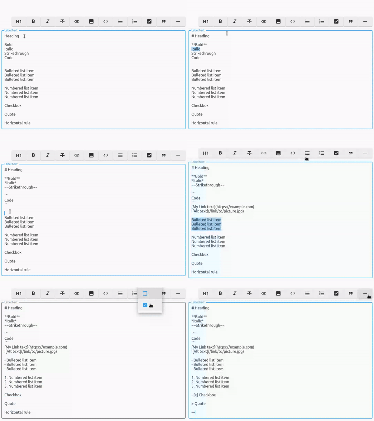
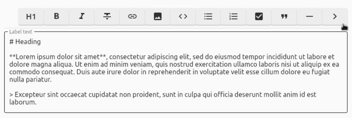
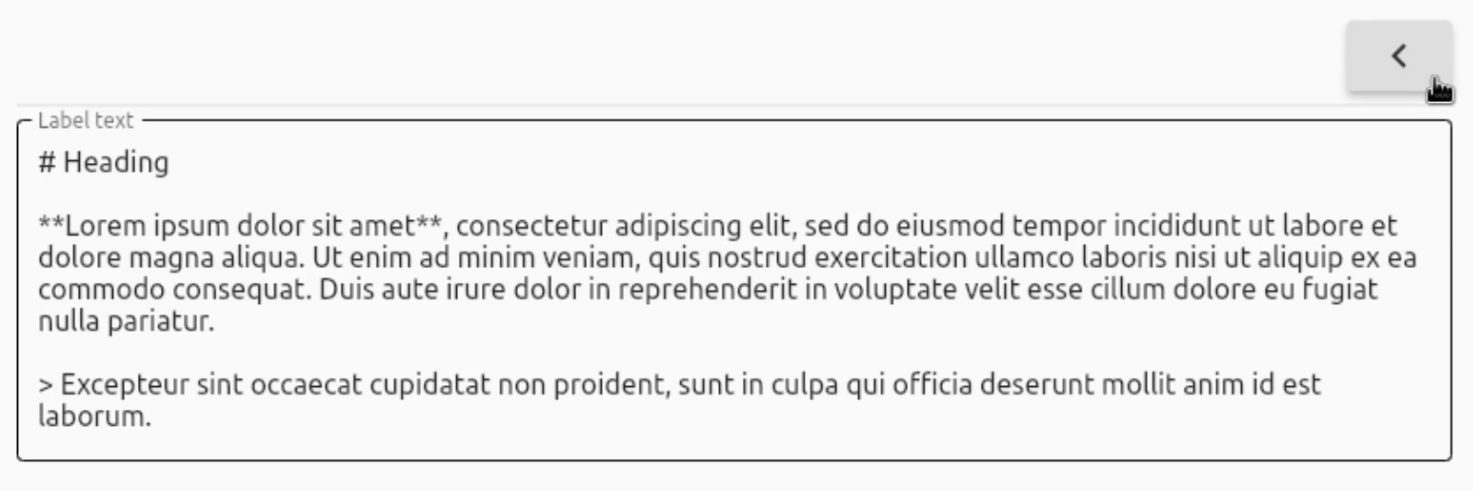
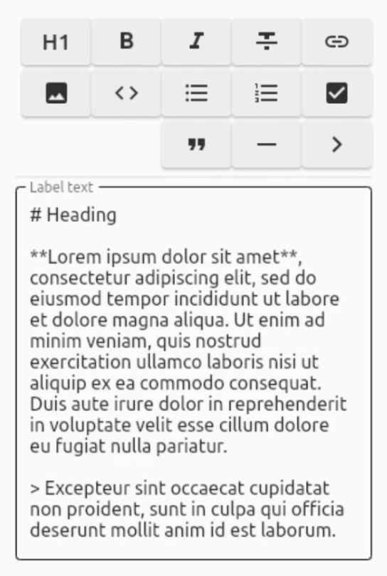
Responsive wrapping and collapsable
Features
Convert your text to these styles:
| Convert to | In Markdown | Supported |
|---|---|---|
| Heading (1-6) | # Heading |
✅ |
| Bold | **Bold** |
✅ |
| Italic | *Italic* |
✅ |
| Strikethrough | ~~Strikethrough~~ |
✅ |
| Link | [Link](https://pub.dev) |
✅ |
| Image |  |
✅ |
| Code | ```Code``` |
✅ |
| Bulleted list | - Bulleted list |
✅ |
| Numbered list | 1. Numbered list |
✅ |
| Checkbox | - [ ] Checkbox and - [x] Checkbox |
✅ |
| Quote | > Quote |
✅ |
| Horizontal rule | --- |
✅ |
About the toolbar:
- Platform-independent
- Responsive wrapping (+ optionally collapsable)
- RTL support (by setting
textDirection: TextDirection.rtlin your custom TextField) - Easy to implement
- Uses its own parser that can be made more precise over time
- No other dependencies apart from the Flutter widgets
Usage
First, import the package:
import 'package:markdown_toolbar/markdown_toolbar.dart';
You have 2 options:
1. Quick integration
For quick integration, simply add the MarkdownToolbar widget (which includes a TextField) and you're done:
const MarkdownToolbar(useIncludedTextField: true),
2. Custom TextField
However, if you want to use your own TextField, declare your TextEditingController and FocusNode and set them to the controller and focusNode fields respectively (for both the TextField and MarkdownToolbar widgets):
final TextEditingController _controller = TextEditingController(); // Declare the TextEditingController
late final FocusNode _focusNode; // Declare the FocusNode

@override
void initState() {
    _controller.addListener(() => setState(() {})); // Update the text when typing
    _focusNode = FocusNode(); // Assign a FocusNode
    super.initState();
}

@override
void dispose() {
    _controller.dispose(); // Dispose the TextEditingController
    _focusNode.dispose(); // Dispose the FocusNode
    super.dispose();
}

// Inside a Column for instance, place the widgets and assign the fields
Column(children: <Widget>[
    MarkdownToolbar(
        useIncludedTextField: false, // Because we want to use our own, set useIncludedTextField to false
        controller: _controller, // Add the _controller
        focusNode: _focusNode, // Add the _focusNode
    ),
    TextField(
        controller: _controller, // Add the _controller
        focusNode: _focusNode, // Add the _focusNode
    ),
])
For a complete example, check out example.dart.
Customization options:
| Property | Type | Default | Description |
|---|---|---|---|
| useIncludedTextField | bool | N/A, required | Use the included TextField |
| controller | TextEditingController? | N/A | Set a custom TextEditingController if useIncludedTextField is set to false |
| focusNode | FocusNode? | N/A | Set a custom FocusNode if useIncludedTextField is set to false |
| collapsable | bool | true | Show a button to collapse the toolbar |
| alignCollapseButtonEnd | bool | false | Align the collapse button at the end, not at the start |
| flipCollapseButtonIcon | bool | false | Flip the collapse button icon |
| backgroundColor | Color | Color(0xFFEEEEEE) | Background color of the buttons |
| dropdownTextColor | Color | Colors.blue | Text color in the dropdown selections |
| iconColor | Color | Color(0xFF303030) | Icon color of the buttons |
| iconSize | double | 24.0 | Icon size of the buttons |
| borderRadius | BorderRadius | BorderRadius.all(Radius.circular(6.0)) | Border radius of the buttons |
| width | double | 60.0 | Width of the buttons |
| height | double | 40.0 | Height of the buttons |
| spacing | double | 4.0 | Spacing between the buttons |
| runSpacing | double | 4.0 | Vertical spacing between the buttons |
| alignment | WrapAlignment | WrapAlignment.end | WrapAlignment of the buttons |
| boldCharacter | String | '**' | Markdown character for bold text |
| italicCharacter | String | '*' | Markdown character for italic text |
| codeCharacter | String | '```' | Markdown character for code |
| bulletedListCharacter | String | '-' | Markdown character for bulleted lists |
| horizontalRuleCharacter | String | '---' | Markdown character for horizontal rules |
hideButton 1-9 |
bool | false | Hide certain buttons in the toolbar (replace Button with the available buttons) |
| showTooltips | bool | true | Show tooltips for the buttons |
button 1-9Tooltip |
String | 'Name of button' |
Custom tooltips when hovering over the buttons (replace button with the available buttons) |
You can also hover over the MarkdownToolbar widget and its fields inside your IDE to receive more information regarding all the options.
Roadmap
- Ability to rearrange the buttons through a List (and thus remove the need for hideButton booleans, as you can simply not include the unwanted buttons inside the list)
- Custom character support for all buttons to change the added Markdown characters on click
- Custom button support
- Custom function support when clicking a button (Useful for integrating things like a File Picker when inserting an Image instead of having to manually type out the path)
- Add Emoji button


