Lightweight, customizable toast
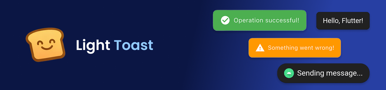
✨ Features
- Contextual Flexibility: Use Light Toast without a BuildContext for seamless integration.
- Customization: Personalize your toast messages with a wide range of colors, icons, and images (both asset-based and network-based).
- Visual Appeal: Choose to display icons or images alongside your toast text for added impact.
- Timing Control: Adjust the duration of your toast messages for optimal visibility.
- On-Demand Dismissal: Easily hide toast messages when needed.
🚀 Getting started
- Add Dependency: Include the following in your project's pubspec.yaml file:
dependencies:
  light_toast: ^1.0.0
- Import: Add the import statement to your Dart files:
import 'package:light_toast/light_toast.dart';
- Attach the navigator key to your MaterialApp:
MaterialApp(
    navigatorKey: Toast.navigatorKey,
    home: MyHomePage(),
);
📦 Usage
Simple Toast
Toast.show('Hello, Flutter!');
Custom Toast
Toast.show(
    'Saved successfully!',
    backgroundColor: Colors.green,
    textColor: Colors.white,
    icon: Icons.check_circle,
    iconColor: Colors.white,
    showLeading: true,
    duration: Duration(seconds: 3),
);
Toast with Image
Toast.show(
    'Profile updated',
    image: 'assets/images/success.png',
    showLeading: true,
);
You can also use a network image:
Toast.show(
    'New message received',
    image: 'https://example.com/icon.png',
    showLeading: true,
);
Hide Toast Manually
Toast.hide();