Large Content Viewer

A Flutter widget that mimics the iOS Large Content Viewer behavior, showing a magnified view of its child on long-press. This is particularly useful for improving accessibility for all users by making UI elements easier to see on demand.
Works on both iOS and Android.
Features
- Wraps any widget (
child). - Activates on long-press.
- Shows a styled, magnified popup above the
child. - Popup content can be a scaled version of the
child(controlled byscaleFactor) or a completely customcustomOverlayChildwidget. - Smooth popup appearance/disappearance.
- Includes haptic feedback on activation.
- Highly customizable appearance (background color, border radius, elevation, padding, constraints, text style, icon theme, content scale factor) via
LargeContentViewerThemeandLargeContentViewerThemeData. - Lightweight and uses only Flutter SDK components.
Usage
Wrap the widget you want to provide a large content view for with LargeContentViewer.
Basic Example (Scaled Child):
LargeContentViewer(
  scaleFactor: 2.5, // How much to scale the child if customOverlayChild is null
  child: IconButton(
    icon: Icon(Icons.settings),
    onPressed: () {
      // Action for settings
    },
    tooltip: 'Settings',
  ),
)
Example with Custom Overlay Child and Theming:
LargeContentViewerTheme(
  data: LargeContentViewerThemeData(
    backgroundColor: Colors.blueGrey.withOpacity(0.9),
    borderRadius: BorderRadius.circular(16.0),
    elevation: 10.0,
    padding: const EdgeInsets.all(16.0),
    textStyle: const TextStyle(fontSize: 18, color: Colors.white),
    iconTheme: const IconThemeData(size: 32, color: Colors.white),
  ),
  child: LargeContentViewer(
    child: Column(
      mainAxisSize: MainAxisSize.min,
      children: const [
        Icon(Icons.home),
        Text('Home'),
      ],
    ),
    // Optional: Provide a completely custom widget for the popup
    customOverlayChild: Container(
      padding: const EdgeInsets.all(20.0),
      child: Row(
        mainAxisSize: MainAxisSize.min,
        children: const [
          Icon(Icons.home, size: 40, color: Colors.lightBlueAccent),
          SizedBox(width: 12),
          Text('Enlarged Home', style: TextStyle(fontSize: 22, color: Colors.lightBlueAccent)),
        ],
      ),
    ),
  ),
)
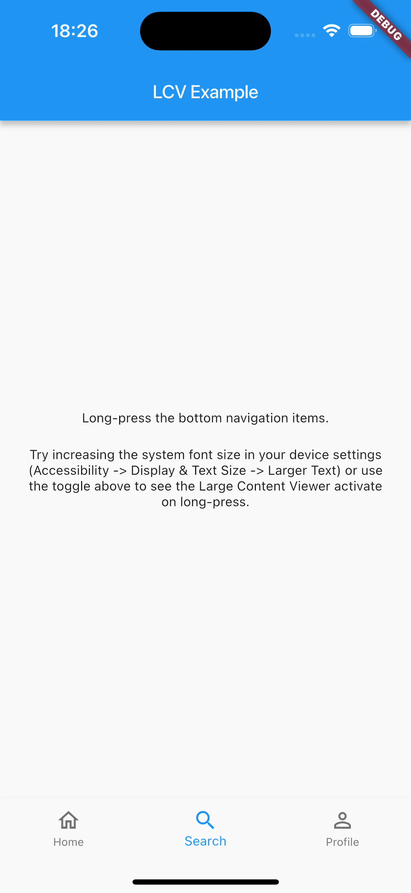
See the example/ directory for a more detailed example using BottomNavigationBar.
Configuration
LargeContentViewer Widget Parameters
| Parameter | Description | Default |
|---|---|---|
child |
Required. The widget to wrap and display normally. | |
customOverlayChild |
An optional widget to display in the popup instead of the scaled child. |
null |
scaleFactor |
How much to scale the child in the popup (if customOverlayChild is null). |
2.0 |
enabledFromTextScaleFactor |
The minimum text scale factor at which the popup becomes active. This allows the viewer to appear only for users with larger accessibility text. | 1.6 |
LargeContentViewerThemeData Properties
Use LargeContentViewerTheme to provide custom styling for all LargeContentViewer widgets in a subtree.
| Property | Description | Default |
|---|---|---|
backgroundColor |
Background color of the popup. | Theme-based grey with opacity (colorScheme.surface.withOpacity(0.85)) |
elevation |
Shadow elevation of the popup. | 20.0 |
borderRadius |
Border radius of the popup. | BorderRadius.circular(16.0) |
padding |
Padding inside the popup. | EdgeInsets.symmetric(vertical: 20.0, horizontal: 24.0) |
constraints |
Constraints for the size of the popup. | min/maxWidth: 150/300, min/maxHeight: 80/300 |
textStyle |
Default text style for content within the popup. | Theme's bodyLarge with onSurface color, w500 weight |
iconTheme |
Default icon theme for icons within the popup. | Theme's onSurface color, size 32.0 |
contentScaleFactor |
Overrides scaleFactor of individual LargeContentViewer widgets in the subtree. |
null (uses widget's scaleFactor) |
Additional information
Contributing
Contributions are welcome! If you find a bug or have a feature request, please file an issue on the GitHub repository. If you'd like to contribute code, please fork the repository and submit a pull request.
Filing Issues
When filing an issue, please provide a clear description of the problem, steps to reproduce it, and any relevant code snippets or screenshots. This will help in quickly understanding and addressing the issue.
License
This package is licensed under the MIT License - see the LICENSE file for details.