Jalali Flutter Date Picker
Jalali Flutter Date Picker is a customizable Jalali (Persian) date picker widget for Flutter. This package allows you to easily integrate a Jalali date picker into your Flutter applications with various customization options, including colors for different date states.(Supporting Dari Language)
Features
- Selectable Date Range: Define a range of selectable dates using `firstDateRange` and `lastDateRange` properties.
- Customizable Colors: Set different colors for enabled, disabled, selected, and today's dates using various properties.
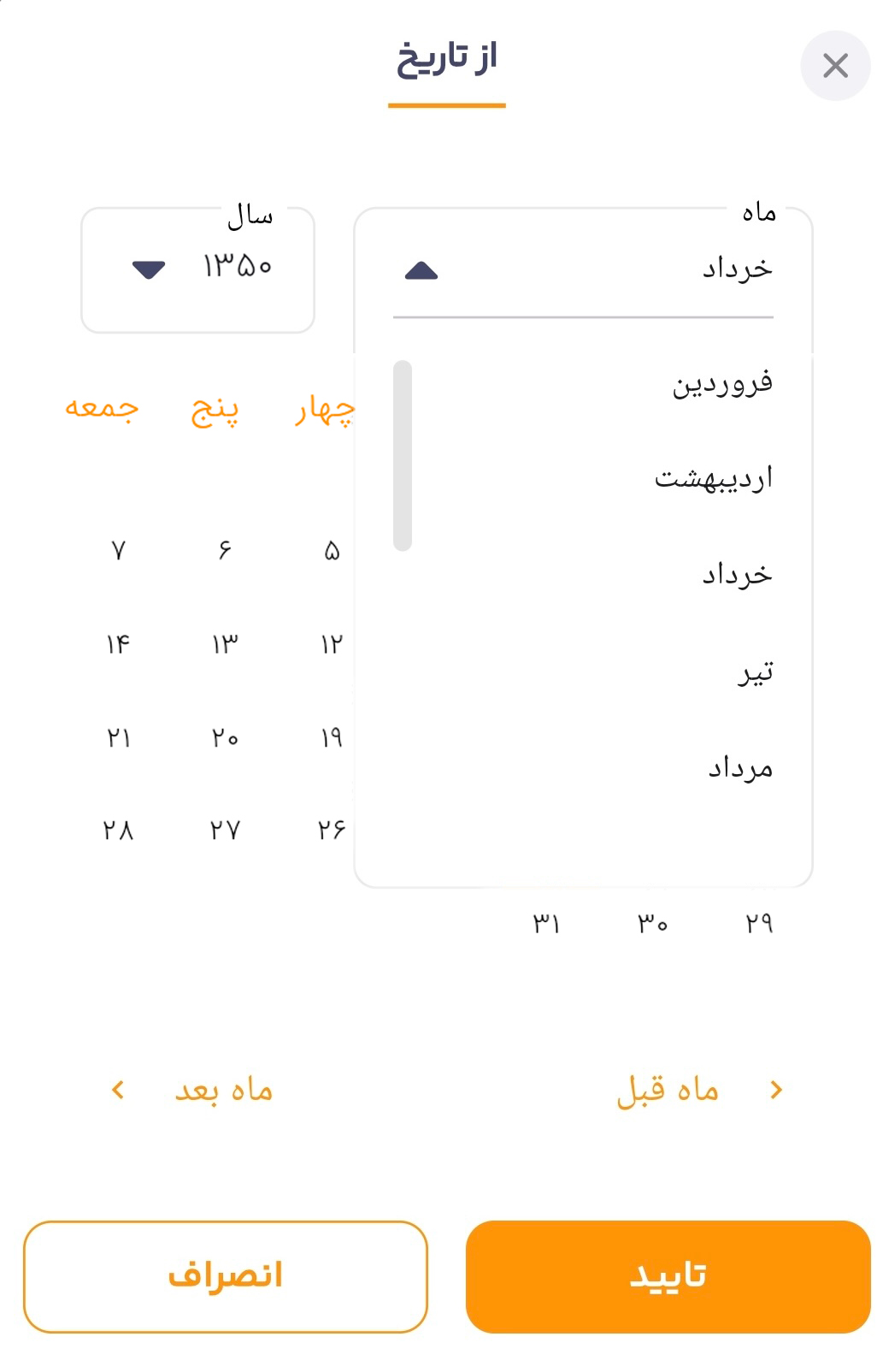
- Year Selection: Navigate between years using the built-in dropdown menus.
- Dynamic Month & Year: Months and years are generated dynamically based on the selectable date range.
- Fully Customizable: Adjust the look and feel of the date picker to match your app's design.
Installation
To use Jalali Flutter Date Picker in your project, add it to your `pubspec.yaml` file:
  dependencies:
    jalali_flutter_datepicker: ^latest_version
Then, run `flutter pub get` to install the package.
Usage
Import the package in your Flutter code:
import 'package:jalali_flutter_datepicker/jalali_flutter_datepicker.dart';
Example
This example demonstrates how to use the `JalaliFlutterDatePicker` widget in your application:
void main() => runApp(const MyApp());
class MyApp extends StatelessWidget {
const MyApp({super.key});
@override
Widget build(BuildContext context) {
return MaterialApp(
theme: ThemeData(
fontFamily: 'iransans',
primaryColor: const Color(0xff007AFF), // Using a modern blue color
textTheme: const TextTheme(
bodyLarge: TextStyle(color: Colors.black87),
bodyMedium: TextStyle(color: Colors.black54),
),
),
debugShowCheckedModeBanner: false,
home: const JalaliHomePage(),
);
}
}
class JalaliHomePage extends StatelessWidget {
const JalaliHomePage({super.key});
@override
Widget build(BuildContext context) {
return Scaffold(
backgroundColor: Colors.white, // Light grayish background
appBar: AppBar(
title: const Text(
'Jalali Flutter Date Picker',
style: TextStyle(
fontSize: 22,
fontWeight: FontWeight.bold,
color: Colors.white,
),
),
backgroundColor: const Color(0xffFF6D00), // Vibrant orange for the AppBar
elevation: 5,
),
body: Center(
child: Padding(
padding: const EdgeInsets.all(16.0),
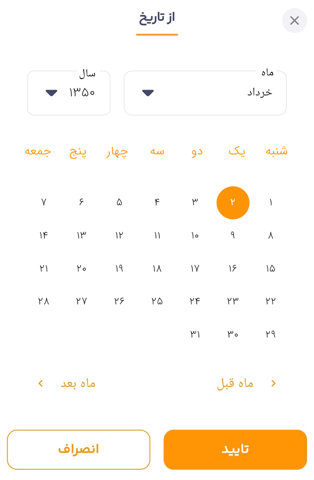
child: JalaliFlutterDatePicker(
onDateChanged: (value) {
},
// language: "dari",
initialDate: Jalali(1350, 5, 2),
firstDateRange: Jalali(1340, 3, 1),
lastDateRange: Jalali(1360, 8, 29),
disabledDayColor: Colors.grey.shade300,
enabledDayColor: Colors.black,
selectedDayBackground: const Color(0xffFF6D00), // Orange for selected day
selectedDayColor: Colors.white,
todayColor: const Color(0xffFFA726), // Softer orange for today
footerIconColor: const Color(0xffFF6D00), // Orange icons
footerTextStyle: const TextStyle(
color: Color(0xffFF6D00),
fontSize: 16,
fontWeight: FontWeight.w600,
),
headerTextStyle: const TextStyle(
color: Color(0xffFF6D00),
fontSize: 20,
fontWeight: FontWeight.bold,
),
selectedMonthTextStyle: const TextStyle(
fontSize: 16,
fontWeight: FontWeight.bold,
color: Colors.black87,
),
monthDropDownItemTextStyle: const TextStyle(
fontSize: 15,
color: Colors.black54,
),
selectedYearTextStyle: const TextStyle(
fontSize: 16,
fontWeight: FontWeight.bold,
color: Colors.black87,
),
yearsDropDownItemTextStyle: const TextStyle(
fontSize: 15,
color: Colors.black54,
),
customArrowWidget: const Icon(
Icons.arrow_drop_down,
size: 30,
color: Color(0xffFF6D00), // Orange arrow for dropdown
),
),
),
),
);
}
}
)
Explanation of Fields
onDateChanged: A callback function triggered when the user selects a date.initialDate: The initial date displayed when the date picker opens.firstDateRange: The earliest selectable date.lastDateRange: The latest selectable date.- (Color Properties): Customize the colors for different date states.
footerIconColor,footerTextStyle,headerTextStyle: Style the footer and header text.