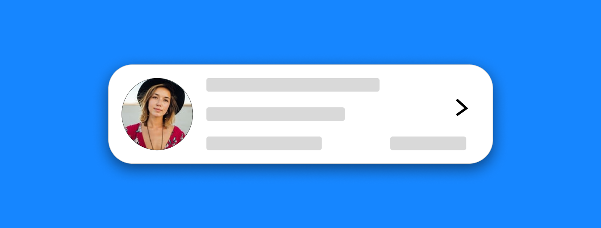
Hybrid List Tile
⚠️ IMPORTANT NOTICE - Future Breaking Changes
Version 2.0.0 will introduce a complete API redesign that will break compatibility with the current API.
- Current version (1.x): Parameter-based configuration
- Upcoming version (2.0.0): Modern architecture with improved maintainability
What this means for you:
- The 1.x versions will remain available and supported for existing projects
- New projects can continue using 1.x but should plan for future migration
- When 2.0.0 is released, a detailed migration guide will be provided
Stay updated by watching the repository for the 2.0.0 release announcement.
The Widget consists of 4 parts:
- The first part is common and independent of the type of HybridListTile desired, which is for configuration.
- The second part is the leading of the Tile.
- The third part is the content of the Tile, which includes title, subtitle...
- And the last part is the icon of the Tile.
EXAMPLES
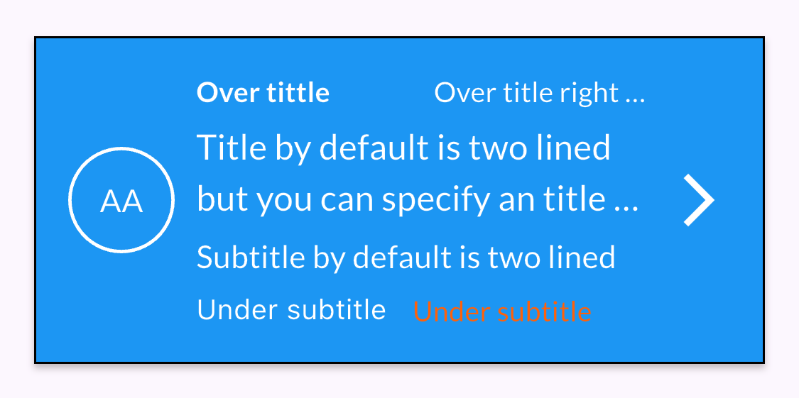
Example 1: Leading with text, border and overtitle
HybridListTile(
    paddingTileTop: 20,
    paddingTileBottom: 20,
    paddingTileLeft: 16,
    paddingTileRight: 16,
    tileBackgroundColor: Colors.blue,
    borderTileColor: Colors.black,
    leadingText: 'AA',
    leadingTextColor: Styles.whiteColor,
    isOutlined: true,
    outlinedColor: Styles.whiteColor,
    overTitleLeft: 'Over tittle Bold without ellipsis',
    overTitleLeftColor: Styles.whiteColor,
    overTitleLeftBold: true,
    overTitleRight: 'Over title right needs overflow',
    overTitleRightColor: Colors.white,
    overTitleRightOverflow: TextOverflow.ellipsis,
    title: 'Title by default is two lined but you can specify an title overflow to make it one lined',
    needsTitleTwoLined: true,
    titleColor: Styles.whiteColor,
    titleOverFlow: TextOverflow.ellipsis,
    subtitle: 'Subtitle by default is two lined but you can specify an overflow to make it one lined',
    subtitleColor: Styles.whiteColor,
    underSubtitleLeft: 'Under subtitle left',
    underSubtitleLeftColor: Styles.whiteColor,
    underSubtitleRight: 'Under subtitle right',
    underSubtitleRightColor: Styles.whiteColor,
    trailingIcon: Icons.arrow_forward_ios,
    trailingIconSize: 30,
    trailingIconColor: Styles.whiteColor)
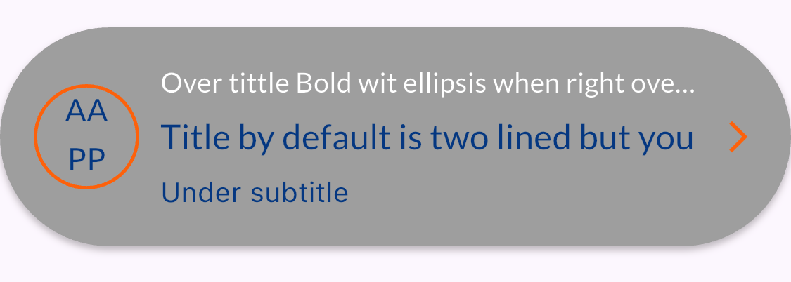
Example 2: Leading with two-line text and border
HybridListTile(
    paddingTileBottom: 30,
    leadingText: 'AA',
    leadingTextColor: Styles.secondaryColor,
    tileBackgroundColor: Colors.grey,
    isOutlined: true,
    isLeadingTwoLined: true,
    leadingTextLineTwo: 'PP',
    outlinedColor: Styles.secondaryColor,
    borderTileRadius: 80.0,
    overTitleLeft: 'Over tittle Bold wit ellipsis when right overflow whitout over title right',
    overTitleLeftOverflow: TextOverflow.ellipsis,
    overTitleLeftColor: Styles.whiteColor,
    title: 'Title by default is two lined but you can specify an title overflow to make it one lined',
    subtitleOverFlow: TextOverflow.ellipsis,
    underSubtitleLeft: 'Under subtitle left',
    trailingIcon: Icons.arrow_forward_ios,
    trailingIconSize: 18,
    trailingIconColor: Styles.secondaryColor)
Example 3: Leading with icon and border

HybridListTile(
    paddingTileLeft: 20,
    paddingTileBottom: 10,
    isLeadingIcon: true,
    leadingIcon: Icons.tv,
    leadingIconColor: Styles.secondaryColor,
    isOutlined: true,
    outlinedColor: Styles.primaryColor,
    borderTileColor: Colors.black,
    borderTileRadius: 16.0,
    title: 'Title by default is two lined but you can specify an title overflow to make it one lined',
    subtitleOverFlow: TextOverflow.fade,
    subtitle: 'Subtitle by default is two lined but you can specify an overflow to make it one lined',
    underSubtitleLeft: 'Under subtitle left',
    underSubtitleLeftColor: Styles.blackColor,
    trailingIcon: Icons.arrow_forward_ios,
    trailingIconSize: 25,
    trailingIconColor: Styles.secondaryColor)
Example 4: Leading with icon and colored background

HybridListTile(
    paddingTileRight: 35,
    isLeadingIcon: true,
    leadingIcon: Icons.tv,
    leadingIconColor: Colors.purple,
    leadingIconBackgroundColor: Styles.secondaryColor,
    leadingColor: Styles.secondaryColor,
    borderTileColor: Colors.red,
    borderTileRadius: 100.0,
    title: 'Title by default is two lined but you can specify an title overflow to make it one lined',
    titleOverFlow: TextOverflow.ellipsis,
    subtitle: 'Subtitle by default is two lined but you can specify an overflow to make it one lined',
    subtitleOverFlow: TextOverflow.ellipsis,
    subtitleColor: Colors.purple,
    underSubtitleLeft: 'Under subtitle left',
    trailingIcon: Icons.arrow_forward_ios,
    trailingIconSize: 50,
    trailingIconColor: Styles.secondaryColor)
Example 5: Leading with icon, background and colored border
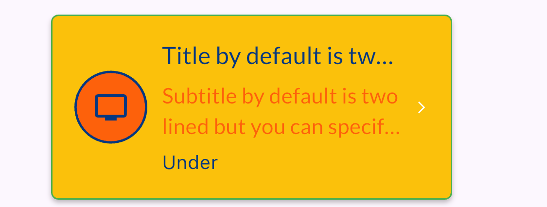
HybridListTile(
    paddingTileTop: 30,
    paddingTileLeft: 35,
    paddingTileRight: 65,
    isLeadingIcon: true,
    leadingIcon: Icons.tv,
    tileBackgroundColor: Colors.amber,
    leadingIconColor: Styles.primaryColor,
    leadingIconBackgroundColor: Styles.secondaryColor,
    leadingColor: Styles.secondaryColor,
    coloredBackgoundOutlineColor: Styles.primaryColor,
    borderTileColor: Colors.green,
    splashTileColor: Colors.red,
    borderTileRadius: 5.0,
    title: 'Title by default is two lined but you can specify an overflow to make it one lined',
    titleOverFlow: TextOverflow.ellipsis,
    subtitleOverFlow: TextOverflow.ellipsis,
    subtitle: 'Subtitle by default is two lined but you can specify an overflow to make it one lined',
    needsSubtitleTwoLined: true,
    underSubtitleLeft: 'Under subtitle left',
    trailingIcon: Icons.arrow_forward_ios,
    trailingIconSize: 10,
    trailingIconColor: Styles.whiteColor)
Example 6: Leading with network image
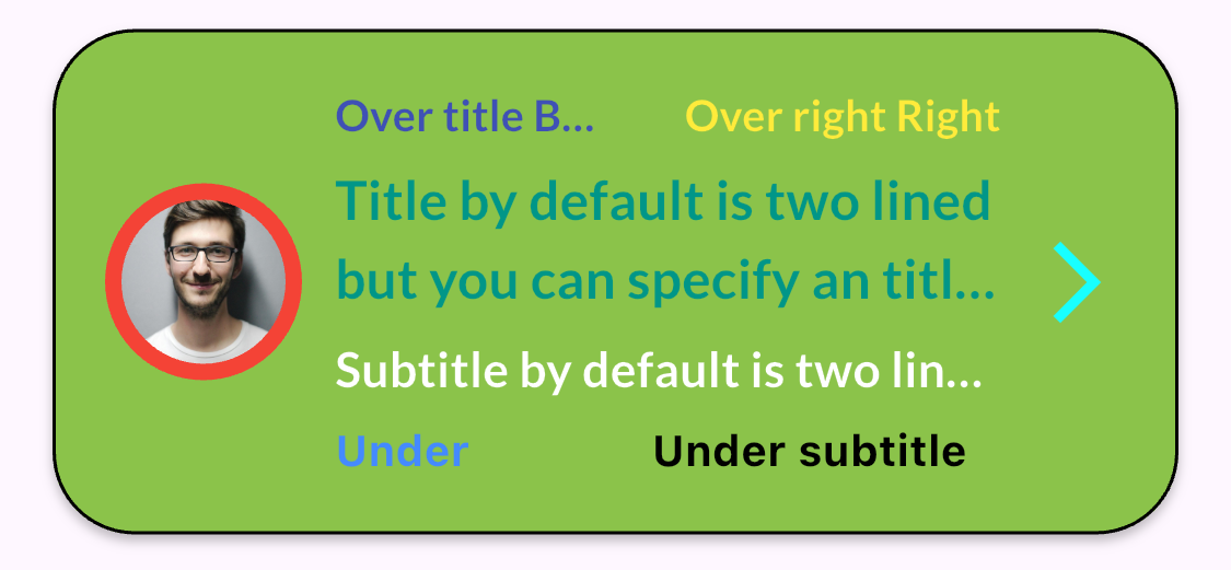
HybridListTile(
    paddingTileTop: 16,
    paddingTileBottom: 16,
    paddingTileLeft: 16,
    paddingTileRight: 16,
    imagefromNetwork: Constants.imageUrl,
    tileBackgroundColor: Colors.lightGreen,
    borderTileColor: Colors.black,
    borderTileRadius: 25.0,
    splashTileColor: Colors.yellow,
    trailingIcon: Icons.arrow_forward_ios,
    trailingIconSize: 30,
    trailingIconColor: Colors.cyanAccent,
    overTitleLeft: 'Over title Bold ellispsis',
    overTitleLeftColor: Colors.indigo,
    overTitleLeftBold: true,
    overTitleLeftOverflow: TextOverflow.ellipsis,
    overTitleRight: 'Over right Right bold',
    overTitleRightBold: true,
    overTitleRightColor: Colors.yellow,
    title: 'Title by default is two lined but you can specify an title overflow to make it one lined',
    needsTitleTwoLined: true,
    titleColor: Colors.teal,
    titleBold: true,
    titleOverFlow: TextOverflow.ellipsis,
    subtitle: 'Subtitle by default is two lined but you can specify an overflow to make it one lined',
    subtitleOverFlow: TextOverflow.ellipsis,
    subtitleBold: true,
    subtitleColor: Styles.whiteColor,
    underSubtitleLeft: 'Under subtitle left bold',
    underSubtitleLeftColor: Colors.blueAccent,
    underSubtitleLeftBold: true,
    underSubtitleRight: 'Under subtitle right bold',
    underSubtitleRightColor: Colors.black,
    underSubtitleRightBold: true)
Example 7: Leading with network image and error border
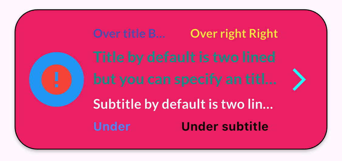
HybridListTile(
    paddingTileTop: 16,
    paddingTileBottom: 16,
    paddingTileLeft: 16,
    paddingTileRight: 16,
    imagefromNetwork: 'Constants.imageUrl',
    imagefromNetworkErrorColor: Colors.red,
    imagefromNetworkBorder: Colors.blue,
    tileBackgroundColor: Colors.pink,
    borderTileColor: Colors.black,
    borderTileRadius: 25.0,
    trailingIcon: Icons.arrow_forward_ios,
    trailingIconSize: 30,
    trailingIconColor: Colors.cyanAccent,
    overTitleLeft: 'Over title Bold ellispsis',
    overTitleLeftColor: Colors.indigo,
    overTitleLeftBold: true,
    overTitleLeftOverflow: TextOverflow.ellipsis,
    overTitleRight: 'Over right Right bold',
    overTitleRightBold: true,
    overTitleRightColor: Colors.yellow,
    title: 'Title by default is two lined but you can specify an title overflow to make it one lined',
    needsTitleTwoLined: true,
    titleColor: Colors.teal,
    titleBold: true,
    titleOverFlow: TextOverflow.ellipsis,
    subtitle: 'Subtitle by default is two lined but you can specify an overflow to make it one lined',
    subtitleOverFlow: TextOverflow.ellipsis,
    subtitleBold: true,
    subtitleColor: Styles.whiteColor,
    underSubtitleLeft: 'Under subtitle left bold',
    underSubtitleLeftColor: Colors.blueAccent,
    underSubtitleLeftBold: true,
    underSubtitleRight: 'Under subtitle right bold',
    underSubtitleRightColor: Colors.black,
    underSubtitleRightBold: true)
Example 8: Leading with asset image
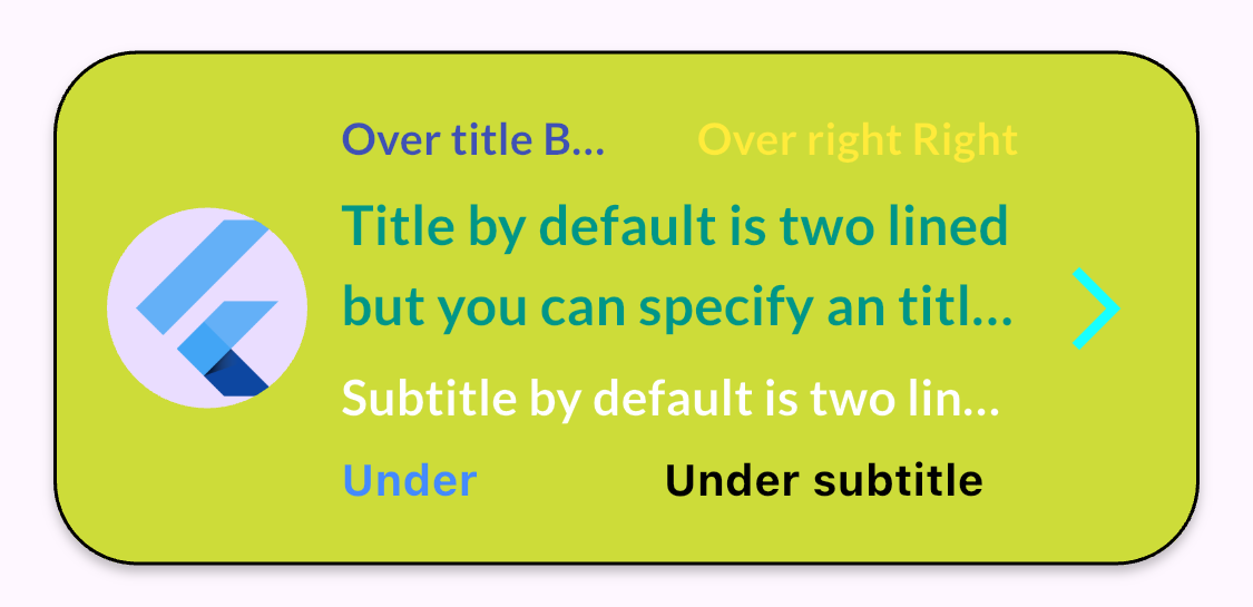
HybridListTile(
    paddingTileTop: 16,
    paddingTileBottom: 16,
    paddingTileLeft: 16,
    paddingTileRight: 16,
    imageLeadingFromAsset: 'assets/images/Flutter.png',
    tileBackgroundColor: Colors.lime,
    borderTileColor: Colors.black,
    borderTileRadius: 25.0,
    trailingIcon: Icons.arrow_forward_ios,
    trailingIconSize: 30,
    trailingIconColor: Colors.cyanAccent,
    overTitleLeft: 'Over title Bold ellispsis',
    overTitleLeftColor: Colors.indigo,
    overTitleLeftBold: true,
    overTitleLeftOverflow: TextOverflow.ellipsis,
    overTitleRight: 'Over right Right bold',
    overTitleRightBold: true,
    overTitleRightColor: Colors.yellow,
    title: 'Title by default is two lined but you can specify an title overflow to make it one lined',
    needsTitleTwoLined: true,
    titleColor: Colors.teal,
    titleBold: true,
    titleOverFlow: TextOverflow.ellipsis,
    subtitle: 'Subtitle by default is two lined but you can specify an overflow to make it one lined',
    subtitleOverFlow: TextOverflow.ellipsis,
    subtitleBold: true,
    subtitleColor: Styles.whiteColor,
    underSubtitleLeft: 'Under subtitle left bold',
    underSubtitleLeftColor: Colors.blueAccent,
    underSubtitleLeftBold: true,
    underSubtitleRight: 'Under subtitle right bold',
    underSubtitleRightColor: Colors.black,
    underSubtitleRightBold: true)
Example 9: Leading with asset image and border
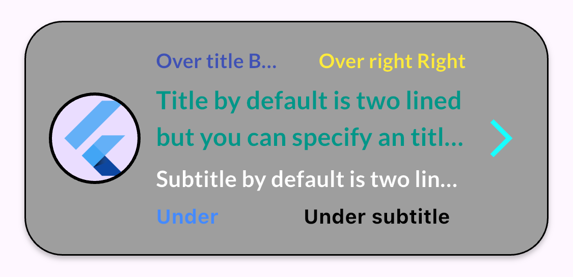
HybridListTile(
    paddingTileTop: 16,
    paddingTileBottom: 16,
    paddingTileLeft: 16,
    paddingTileRight: 16,
    imageLeadingFromAsset: 'assets/images/Flutter.png',
    imageLeadingFromAssetBorder: Colors.black,
    tileBackgroundColor: Colors.grey,
    borderTileColor: Colors.black,
    borderTileRadius: 25.0,
    trailingIcon: Icons.arrow_forward_ios,
    trailingIconSize: 30,
    trailingIconColor: Colors.cyanAccent,
    overTitleLeft: 'Over title Bold ellispsis',
    overTitleLeftColor: Colors.indigo,
    overTitleLeftBold: true,
    overTitleLeftOverflow: TextOverflow.ellipsis,
    overTitleRight: 'Over right Right bold',
    overTitleRightBold: true,
    overTitleRightColor: Colors.yellow,
    title: 'Title by default is two lined but you can specify an title overflow to make it one lined',
    needsTitleTwoLined: true,
    titleColor: Colors.teal,
    titleBold: true,
    titleOverFlow: TextOverflow.ellipsis,
    subtitle: 'Subtitle by default is two lined but you can specify an overflow to make it one lined',
    subtitleOverFlow: TextOverflow.ellipsis,
    subtitleBold: true,
    subtitleColor: Styles.whiteColor,
    underSubtitleLeft: 'Under subtitle left bold',
    underSubtitleLeftColor: Colors.blueAccent,
    underSubtitleLeftBold: true,
    underSubtitleRight: 'Under subtitle right bold',
    underSubtitleRightColor: Colors.black,
    underSubtitleRightBold: true)
Example 10: Without leading
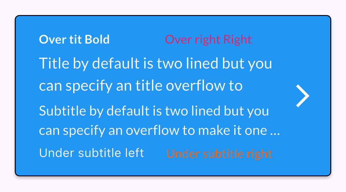
HybridListTile(
    paddingTileTop: 20,
    paddingTileBottom: 20,
    paddingTileLeft: 16,
    paddingTileRight: 16,
    tileBackgroundColor: Colors.blue,
    borderTileColor: Colors.black,
    outlinedColor: Styles.whiteColor,
    overTitleLeft: 'Over tit Bold',
    overTitleLeftColor: Styles.whiteColor,
    overTitleLeftBold: true,
    overTitleRight: 'Over right Right',
    overTitleRightColor: Colors.pink,
    title: 'Title by default is two lined but you can specify an title overflow to make it one lined',
    needsTitleTwoLined: true,
    titleColor: Styles.whiteColor,
    subtitle: 'Subtitle by default is two lined but you can specify an overflow to make it one lined',
    subtitleColor: Styles.whiteColor,
    underSubtitleLeft: 'Under subtitle left',
    underSubtitleLeftColor: Styles.whiteColor,
    underSubtitleRight: 'Under subtitle right',
    underSubtitleRightColor: Styles.whiteColor,
    trailingIcon: Icons.arrow_forward_ios,
    trailingIconSize: 30,
    trailingIconColor: Styles.whiteColor,
    splashTileColor: Colors.red,
    borderTileRadius: 5.0,
    subtitleOverFlow: TextOverflow.ellipsis,
    needsSubtitleTwoLined: true)
Author ✒️
- Pablo Suárez Pantaleón - Flutter Developer - pablosuarez@rudo.es
With ❤️ by RudoApps Flutter Team 😊