Horizontal Gauge

A customizable gauge widget library for Flutter featuring both horizontal linear gauges and circular arc gauges. Perfect for dashboards, control panels, automotive interfaces, and data visualization applications.
🎯 Features
📏 Horizontal Gauge
- Interactive Controls: Drag and tap to change values
- Smooth Animations: Fluid transitions with boundary detection
- Rich Theming: 20+ customization options
- Custom Builders: Build your own title, value, indicator, and tick widgets
- Responsive Design: Automatic scaling for all screen sizes
- Smart Boundaries: 500ms timeout at min/max values
🎡 Circular Gauge
- Car Dashboard Style: Realistic automotive gauge appearance
- Arc-based Design: 180-degree semicircle layout
- Animated Needle: Smooth 800ms transitions with easeInOut curves
- Progress Arc: Colored arc showing current value
- Tick Marks: Major and minor ticks with smart labeling
- Read-only Mode: Perfect for data visualization
- Gradient Support: SweepGradient and LinearGradient options
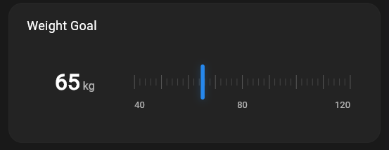
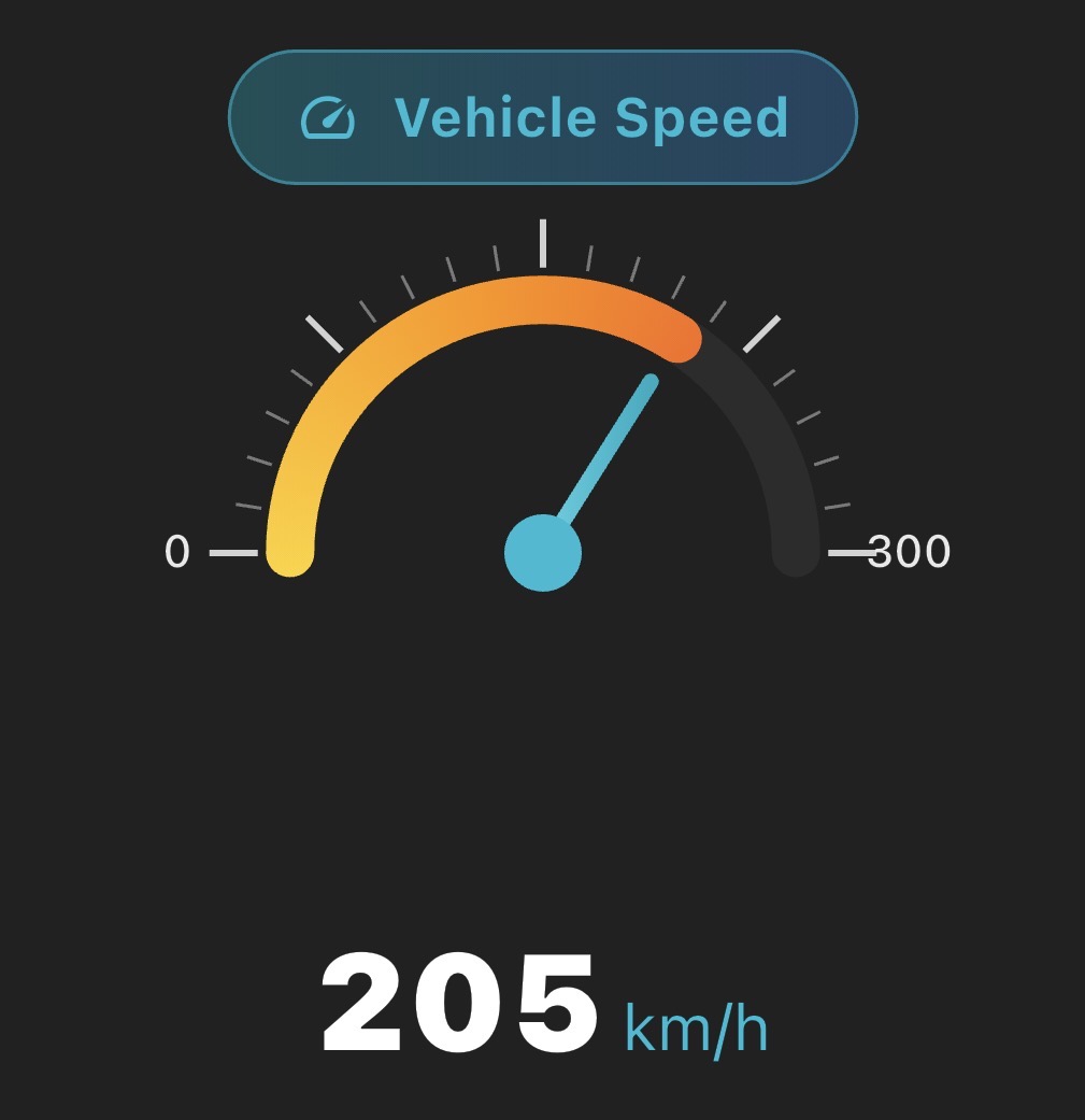
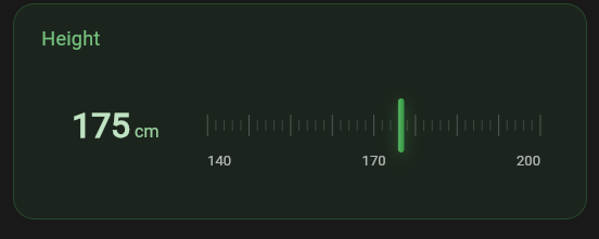
📸 Screenshots
| Horizontal Gauges | Circular Gauges |
|---|---|
| Interactive sliders with custom themes | Car dashboard style with live animation |
| Drag and tap controls | Speedometer, RPM, fuel, temperature |
🚀 Getting Started
Add this to your package's pubspec.yaml file:
dependencies:
  horizontal_gauge: ^2.0.2
Import the package:
import 'package:horizontal_gauge/horizontal_gauge.dart';
📖 Usage
Basic Horizontal Gauge
HorizontalGauge(
  title: 'Temperature',
  min: 0.0,
  max: 100.0,
  value: 65.0,
  unit: '°C',
  color: Colors.blue,
  onChanged: (value) {
    print('New value: $value');
  },
)
Basic Circular Gauge
CircularGauge(
  title: 'Speed',
  min: 0.0,
  max: 200.0,
  value: 80.0,
  unit: 'km/h',
  color: Colors.blue,
  size: 250,
)
🎨 Advanced Theming
Horizontal Gauge Theme
HorizontalGauge(
  title: 'Custom Gauge',
  min: 0.0,
  max: 100.0,
  value: 75.0,
  unit: '%',
  color: Colors.green,
  theme: HorizontalGaugeTheme(
    backgroundColor: Colors.green.withOpacity(0.1),
    borderColor: Colors.green.withOpacity(0.3),
    titleColor: Colors.green[300],
    valueColor: Colors.white,
    indicatorGradient: LinearGradient(
      colors: [Colors.green[400]!, Colors.green[600]!],
    ),
    indicatorShadows: [
      BoxShadow(
        color: Colors.green.withOpacity(0.5),
        blurRadius: 10,
        offset: Offset(0, 3),
      ),
    ],
  ),
  onChanged: (value) => print(value),
)
Circular Gauge Theme
CircularGauge(
  title: 'RPM',
  min: 0.0,
  max: 8000.0,
  value: 3500.0,
  unit: 'rpm',
  color: Colors.red,
  size: 200,
  theme: CircularGaugeTheme(
    titleColor: Colors.red[300],
    valueColor: Colors.white,
    needleColor: Colors.red[400],
    centerDotColor: Colors.white,
    progressGradient: LinearGradient(
      colors: [Colors.orange, Colors.red],
    ),
    arcStrokeWidth: 8,
    progressStrokeWidth: 8,
    needleWidth: 3,
  ),
)
🛠 Custom Builders
Custom Title Builder
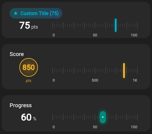
HorizontalGauge(
  title: 'Score',
  min: 0.0,
  max: 100.0,
  value: 85.0,
  unit: 'pts',
  color: Colors.purple,
  titleBuilder: (context, title, value) {
    return Container(
      padding: EdgeInsets.symmetric(horizontal: 12, vertical: 6),
      decoration: BoxDecoration(
        gradient: LinearGradient(
          colors: [Colors.purple.withOpacity(0.3), Colors.blue.withOpacity(0.3)],
        ),
        borderRadius: BorderRadius.circular(20),
      ),
      child: Row(
        mainAxisSize: MainAxisSize.min,
        children: [
          Icon(Icons.star, color: Colors.purple, size: 16),
          SizedBox(width: 8),
          Text(
            '$title (${value.round()})',
            style: TextStyle(color: Colors.purple, fontWeight: FontWeight.bold),
          ),
        ],
      ),
    );
  },
  onChanged: (value) => print(value),
)
Custom Value Builder
CircularGauge(
  title: 'Fuel',
  min: 0.0,
  max: 100.0,
  value: 60.0,
  unit: '%',
  color: Colors.green,
  valueBuilder: (context, value, unit) {
    return Column(
      mainAxisAlignment: MainAxisAlignment.center,
      children: [
        Container(
          padding: EdgeInsets.all(12),
          decoration: BoxDecoration(
            shape: BoxShape.circle,
            gradient: RadialGradient(
              colors: [Colors.green.withOpacity(0.3), Colors.green.withOpacity(0.1)],
            ),
            border: Border.all(color: Colors.green, width: 2),
          ),
          child: Text(
            value.round().toString(),
            style: TextStyle(fontSize: 24, fontWeight: FontWeight.w900, color: Colors.green),
          ),
        ),
        SizedBox(height: 4),
        Text(unit, style: TextStyle(fontSize: 12, color: Colors.green.withOpacity(0.8))),
      ],
    );
  },
)
🎮 Interactive vs Read-only
Interactive Horizontal Gauge
HorizontalGauge(
  title: 'Volume',
  min: 0.0,
  max: 100.0,
  value: currentVolume,
  unit: '%',
  color: Colors.blue,
  onChanged: (value) {
    setState(() {
      currentVolume = value;
    });
  }, // User can drag/tap to change
)
Read-only Circular Gauge
CircularGauge(
  title: 'Speed',
  min: 0.0,
  max: 200.0,
  value: currentSpeed,
  unit: 'km/h',
  color: Colors.blue,
  // No onChanged - read-only display
)
🚗 Automotive Dashboard Example
Column(
  children: [
    // Main speedometer
    CircularGauge(
      title: 'Speed',
      min: 0.0,
      max: 200.0,
      value: 120.0,
      unit: 'km/h',
      color: Colors.blue,
      size: 280,
      theme: CircularGaugeTheme(
        progressGradient: SweepGradient(
          colors: [Colors.green, Colors.yellow, Colors.orange, Colors.red],
          stops: [0.0, 0.4, 0.7, 1.0],
        ),
        needleWidth: 5,
        centerDotRadius: 12,
      ),
    ),

    // Secondary gauges
    Row(
      children: [
        Expanded(
          child: CircularGauge(
            title: 'Fuel',
            min: 0.0,
            max: 100.0,
            value: 75.0,
            unit: '%',
            color: Colors.green,
            size: 150,
          ),
        ),
        Expanded(
          child: CircularGauge(
            title: 'RPM',
            min: 0.0,
            max: 8000.0,
            value: 3500.0,
            unit: 'rpm',
            color: Colors.red,
            size: 150,
          ),
        ),
      ],
    ),
  ],
)
📋 API Reference
HorizontalGauge Parameters
| Parameter | Type | Default | Description |
|---|---|---|---|
title |
String |
required | Title text displayed above the gauge |
min |
double |
required | Minimum value |
max |
double |
required | Maximum value |
value |
double |
required | Current value |
unit |
String |
required | Unit text (e.g., 'kg', '°C', '%') |
color |
Color |
required | Primary color for the gauge |
onChanged |
ValueChanged<double>? |
null | Callback when value changes |
height |
double? |
auto | Custom height override |
padding |
EdgeInsetsGeometry? |
auto | Custom padding |
borderRadius |
double? |
auto | Border radius |
theme |
HorizontalGaugeTheme? |
null | Custom theme |
showTicks |
bool |
true | Show tick marks |
showLabels |
bool |
true | Show min/mid/max labels |
customTickCount |
int? |
41 | Number of tick marks |
CircularGauge Parameters
| Parameter | Type | Default | Description |
|---|---|---|---|
title |
String |
required | Title text displayed above the gauge |
min |
double |
required | Minimum value |
max |
double |
required | Maximum value |
value |
double |
required | Current value |
unit |
String |
required | Unit text |
color |
Color |
required | Primary color |
onChanged |
ValueChanged<double>? |
null | Callback (null = read-only) |
size |
double? |
auto | Gauge diameter |
padding |
EdgeInsetsGeometry? |
16.0 | Container padding |
theme |
CircularGaugeTheme? |
null | Custom theme |
showTicks |
bool |
true | Show tick marks |
showLabels |
bool |
true | Show min/max labels |
showProgressArc |
bool |
true | Show colored progress arc |
🎨 Theme Properties
HorizontalGaugeTheme
- Colors:
backgroundColor,borderColor,titleColor,valueColor,unitColor,tickColor,majorTickColor,labelColor,indicatorColor - Text Styles:
titleStyle,valueStyle,unitStyle,labelStyle - Dimensions:
indicatorWidth,indicatorHeight,tickHeight,majorTickHeight - Effects:
indicatorBorderRadius,indicatorShadows,backgroundGradient,indicatorGradient
CircularGaugeTheme
- Colors:
titleColor,valueColor,unitColor,tickColor,majorTickColor,labelColor,needleColor,centerDotColor,arcColor,progressColor - Text Styles:
titleStyle,valueStyle,unitStyle,labelStyle - Dimensions:
needleWidth,centerDotRadius,arcStrokeWidth,progressStrokeWidth - Effects:
backgroundGradient,needleGradient,progressGradient
🔧 Requirements
- Flutter SDK: >=3.0.0
- Dart SDK: >=3.0.0
🤝 Contributing
Contributions are welcome! Please feel free to submit a Pull Request.
📄 License
This project is licensed under the MIT License - see the LICENSE file for details.
🔗 Links
Made with ❤️ by SpinexIO for the Flutter Community.