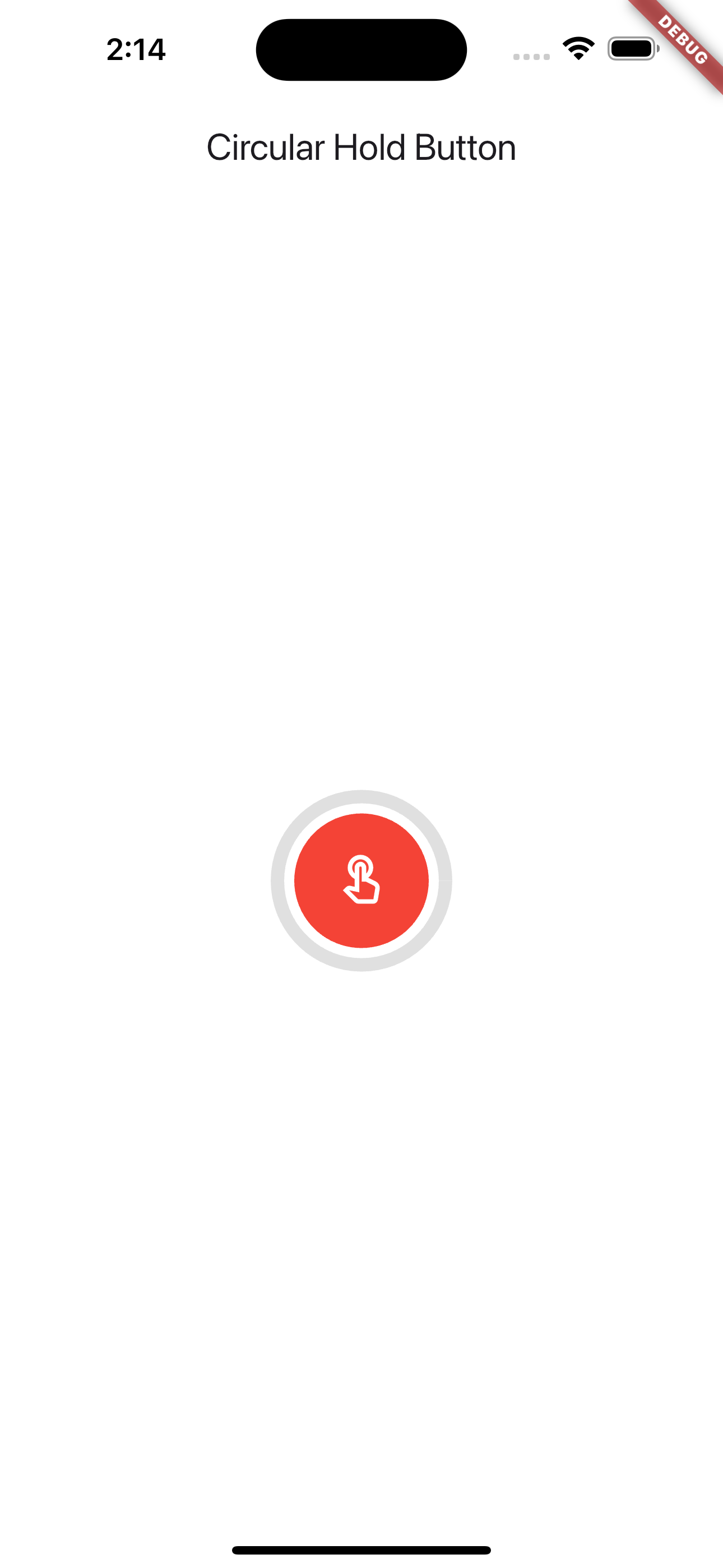
Holdable Circular Button
A customizable Flutter widget for a circular button with a progress indicator.
Features
- Holdable Button: Press and hold the button to trigger a progress animation.
- Customizable: You can change the size, color, and duration of the button and progress indicator.
- Progress Indicator: Visual progress indicator around the button, which completes after a set duration.
Screen Recording
Example
import 'package:flutter/material.dart';
import 'package:holdable_circular_button/holdable_circular_button.dart';

class _HomeScreenState extends State<HomeScreen> {
  bool isFinished = false;
  @override
  Widget build(BuildContext context) {
    return Scaffold(
      backgroundColor: Colors.white,
      appBar: AppBar(
        title: Text('Holdable Circular Button'),
        elevation: 0,
      ),
      body: SafeArea(
        child: Center(
          child: HoldableCircularButton(
            progressColor: Colors.green,
            buttonColor: Colors.red,
            onComplete: () {},
            icon: Icon(Icons.touch_app_outlined),
          ),
        ),
      ),
    );
  }
}
Installation
Add this to your pubspec.yaml file:
dependencies:
  holdable_circular_button: ^0.0.5