Hexagon
A widget in a shape of hexagon. Inspired by fantastic hexagons analysis available on redblobgames.


Installation
Add this to your package's pubspec.yaml file:
dependencies:
  hexagon: ^0.2.0
Usage
import 'package:hexagon/hexagon.dart';

//...
Single widget
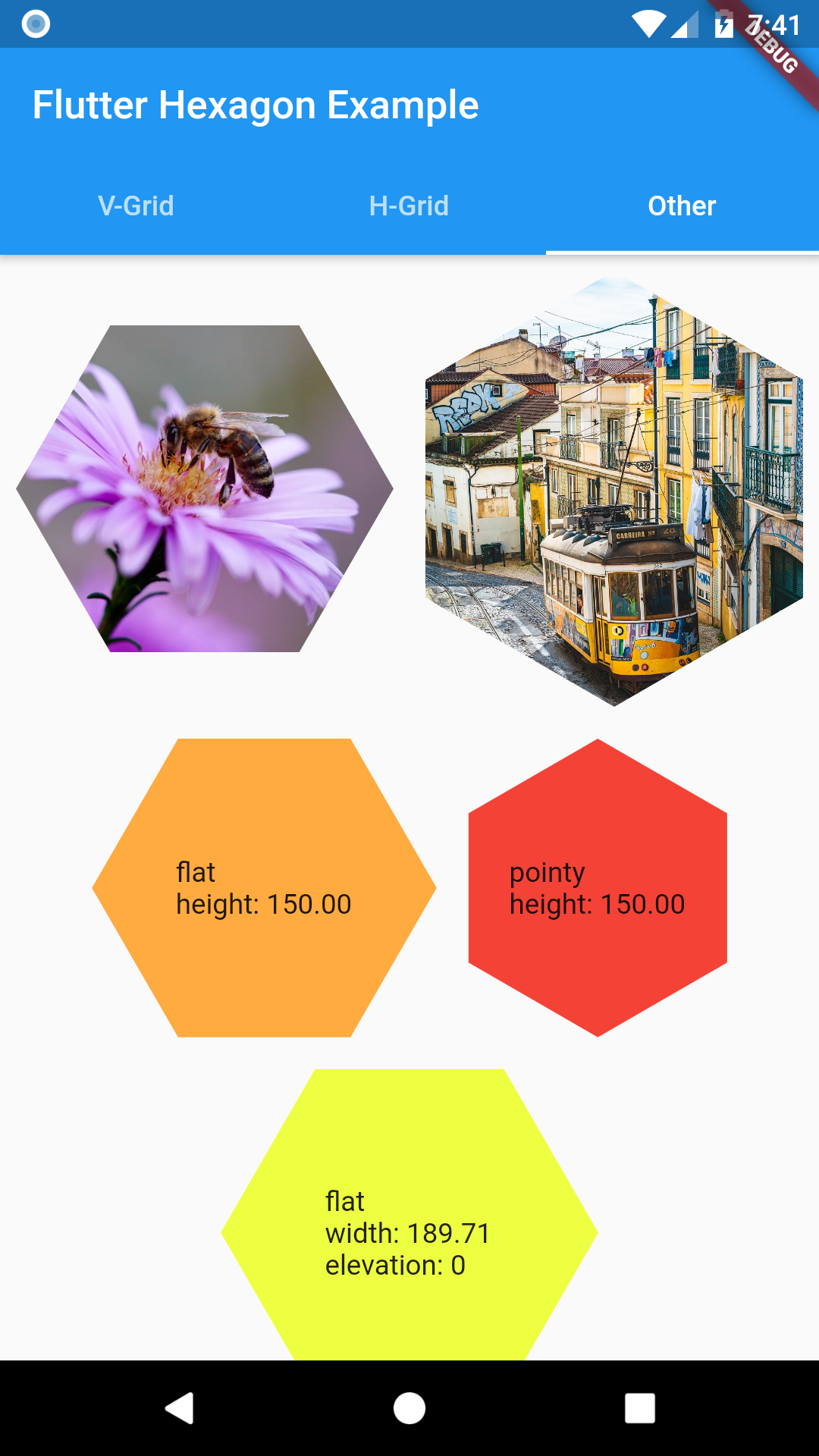
Width or height must be set when defining a HexagonWidget. The other dimension is calculated based on selected HexagonType. Use named constructors for flat or pointy for simple shaped hexagon. Elevation changes hexagon shadow size.
HexagonWidget.flat(
  width: w,
  color: Colors.limeAccent,
  padding: 4.0,
  child: Text('A flat tile'),
),
HexagonWidget.pointy(
  width: w,
  color: Colors.red,
  elevation: 8,
  child: Text('A pointy tile'),
),
Grids
Offset Grid
Check Coordinates Offset on redblobgames
Simple coordinate system similar to regular table.
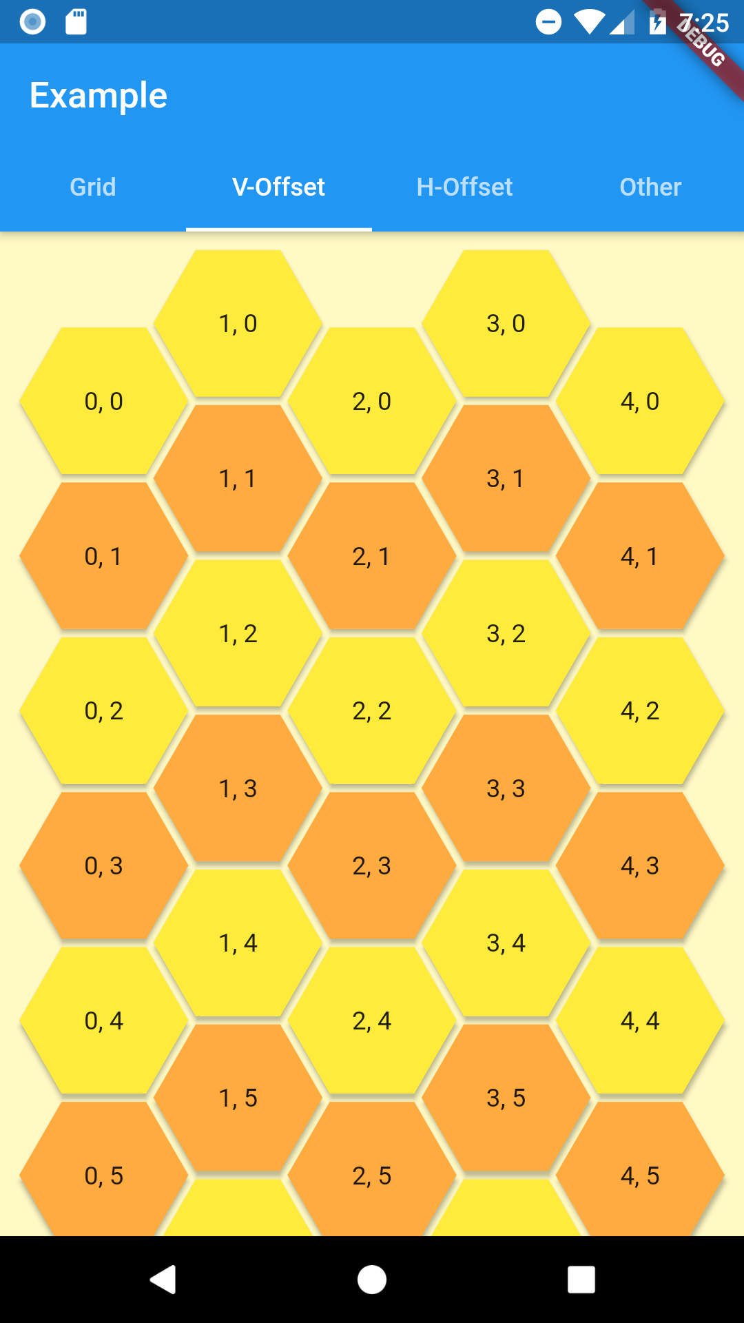
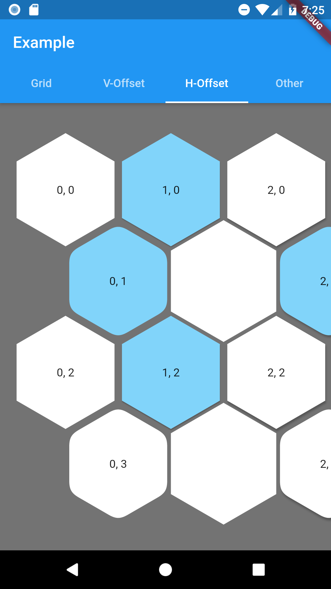
As hexagon columns or rows can begin with hex or an empty space this grid has 4 named constructors to represent all combinations with flat and pointy hexagons.
- oddPointy
- evenPointy
- oddFlat
- evenFlat
Every constructor requires columns and rows params.
At least one of grid constrains must be finite. The grid will fit given rows and columns in given space.
Column(
  crossAxisAlignment: CrossAxisAlignment.stretch,
  children: [
    HexagonOffsetGrid.oddPointy(
      columns: 5,
      rows: 10,
      buildTile: (col, row) => HexagonWidgetBuilder(
        color: row.isEven ? Colors.yellow : Colors.orangeAccent,
        elevation: 2,
      ),
      buildChild: (col, row) {
        return Text('$col, $row');
      },
    ),
  ],
),
To customize any HexagonWidget in grid use buildHexagon function and return a HexagonWidgetBuilder for tile of your choosing.
If you provide a buildChild function it will override any child provided in builder.
Hexagon Grid
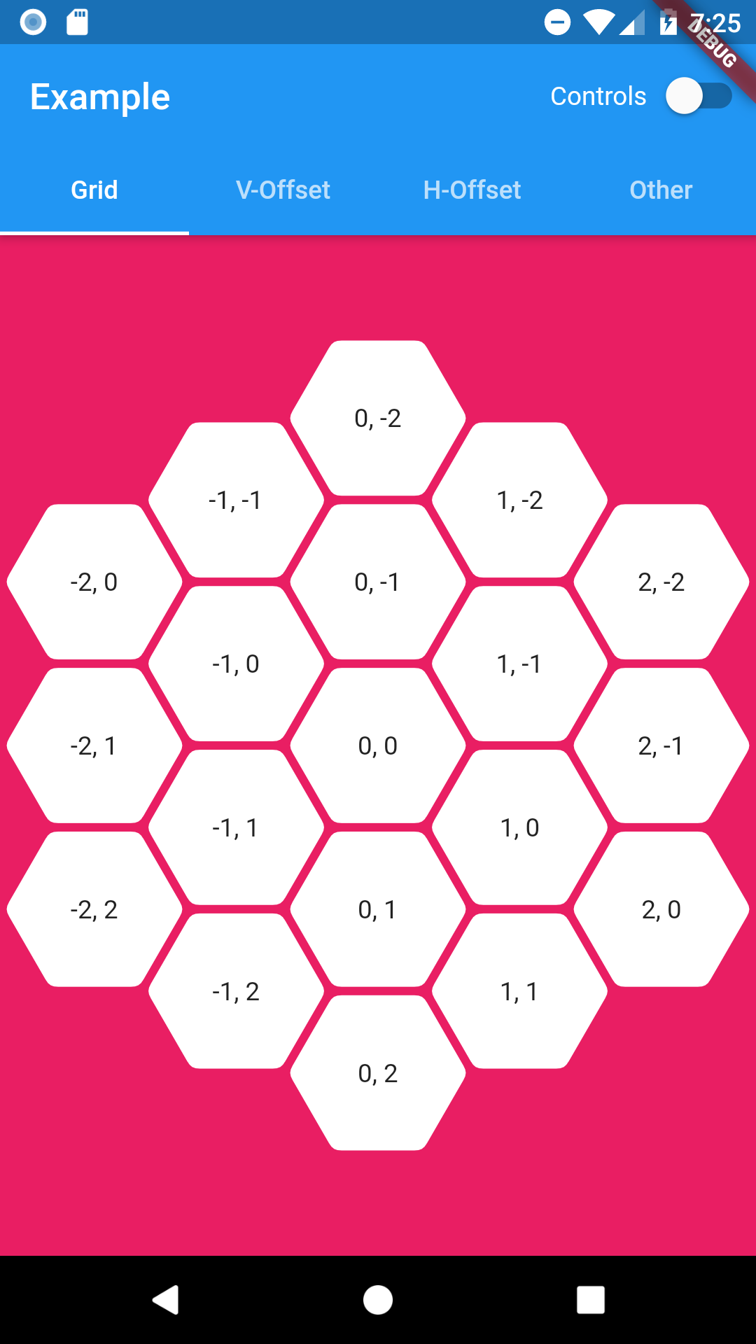
As it is expected this grid is in a shape of hexagon. Since offset coordinates wouldn't be intuitive in this case HexagonGrid uses cube and axial coordinates systems. You can read about them here: Cube coordinates, Axial coordinates.
Coordinates class combines both of them as they are easily convertible between each other.
Coordinates tileQR = Coordinates.axial(q, r);

Coordinates tileXYZ = Coordinates.cube(x, y, z);
HexagonGrid requires to be constrained by its parent or else you have to provide at lest one size dimension (width or height). Currently this widget will fit itself to fill given space or best match to given size.
Everything related to customize hexagon tiles is similar as in offset grid above.
Below example of using HexagonGrid with InteractiveViewer.
InteractiveViewer(
  minScale: 0.2,
  maxScale: 4.0,
  constrained: false,
  child: HexagonGrid.pointy(
    color: Colors.pink,
    depth: depth,
    width: 1920,
    buildTile: (coordinates) => HexagonWidgetBuilder(
      padding: 2.0,
      cornerRadius: 8.0,
      child: Text('${coordinates.q}, ${coordinates.r}'),
    ),
  ),
)
Road map
Margins between tiles in HexagonOffsetGrid(Added padding since0.0.5)Hexagonal shaped grid (using cube/axial coordinates system)(since0.1.0)null-safety(since0.2.0)- Solve content spacing in hexagon widget
- Check performance - any ideas how?
