helix_indicator
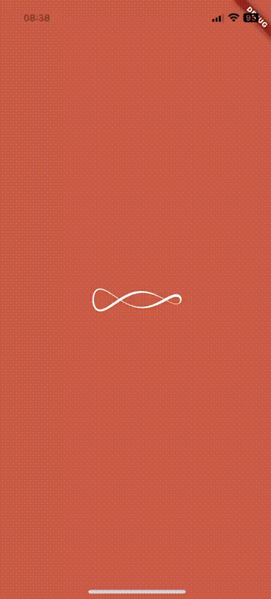
A customizable animated Helix indicator widget for Flutter.
Demo
Features
- Smooth animation.
- Customizable color, size, and padding.
- Easy to integrate.
Usage
class MyApp extends StatelessWidget {
	const MyApp({super.key});

	@override
	Widget build(BuildContext context) {
		return MaterialApp(
			title: 'Her OS Loader',
			theme: ThemeData.dark(),
			home: const Scaffold(
				backgroundColor: Color(0xffd1684e),
				body: Center(
					child: HelixIndicator(color: Colors.white, size: 150),
				),
			),
		);
	}
}
Customization Options
The HelixIndicator provides several customization options:
HelixIndicator(
	color: Colors.purple,       // Required - sets the color of the helix
 	size: 64.0,                 // Optional - sets the size (default: 32.0)
	padding: EdgeInsets.all(8), // Optional - adds padding around the indicator
)
Notes
- The animation runs automatically when the widget is built
- The helix effect is created using 3D projection with perspective
- The widget is optimized to only repaint when necessary
License
MIT