Grouped Checkbox Widget for Flutter
Overview
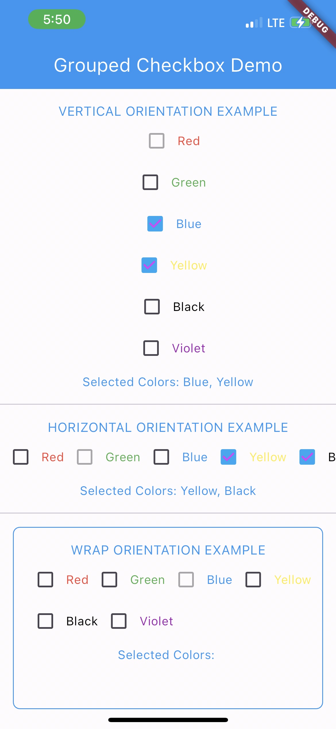
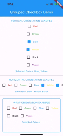
The GroupedCheckbox widget enables displaying a list of checkboxes in various orientations and styles. It's designed for flexibility, supporting generic types, and offers customizable options.
Features
- Supports generic data types.
- Vertical, horizontal, and wrap orientations.
- Disabled state support.
- Callbacks for state changes.
Installation
Add grouped_checkbox to your Flutter project's dependencies.
Usage
To use this plugin, add grouped_checkbox as a dependency in your pubspec.yaml file.
dependencies: grouped_checkbox: 2.0.0
Example
import 'package:grouped_checkbox/grouped_checkbox.dart';
    final List<ColorItem> allItemList = [
      ColorItem('Red', Colors.red),
      ColorItem('Green', Colors.green),
      ColorItem('Blue', Colors.blue),
      ColorItem('Yellow', Colors.yellow),
      ColorItem('Black', Colors.black),
      ColorItem('Violet', Colors.purple)
    ];

    class ColorItem {
      String name;
      Color color;

      ColorItem(this.name, this.color);
    }

    GroupedCheckbox<ColorItem>(
      itemList: allItemList,
      checkedItemList: selectedItems,
      disabled: disabledItems,
      onChanged: (itemList) {
        updateFunction(itemList!);
      },
      orientation: orientation,
      checkColor: Colors.purpleAccent,
      activeColor: Colors.lightBlue,
      itemWidgetBuilder: (item) => Text(item.name, style: TextStyle(color: item.color)),
    )