Gradient Glow Border


A professional Flutter package for creating stunning animated gradient borders with support for solid, dashed, and dotted styles. This package allows you to easily add animated borders to your widgets with customizable colors, radius, thickness, glow effects, and animation controls.
✨ Features
- Animated Gradient Borders: Create smooth, animated gradient borders around any widget
- Multiple Border Styles:
- Solid: A continuous animated gradient border
- Dashed: A dashed animated gradient border with customizable dash spacing
- Dotted: A dotted animated gradient border with customizable dot spacing
- Custom Border Radius: Apply different border radii to each corner
- Glow Effect: Add a glowing shadow effect with customizable blur and spread
- Animation Control: Control animation duration, curve, and enable/disable animation
- High Performance: Optimized rendering with minimal rebuilds
- Fully Customizable: Control every aspect of border appearance
- Easy to Use: Simple API with factory constructors
📦 Installation
Add the package to your pubspec.yaml file:
dependencies:
  gradient_glow_border: ^2.0.2
Then, run:
flutter pub get
🚀 Usage Examples
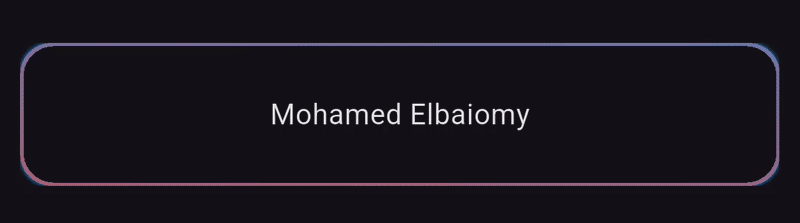
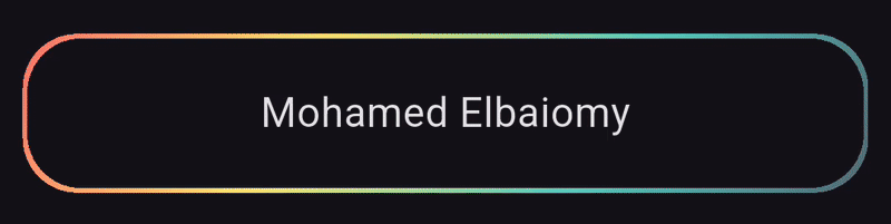
Example 1: Solid Animated Gradient Border
SizedBox(
  height: 70,
  width: double.infinity,
  child: GradientGlowBorder.solid(
    borderRadius: BorderRadius.all(Radius.circular(15)),
    blurRadius: 1,
    colors: [
      Colors.blue,
      Colors.red,
    ],
    animate: true,
    animationCurve: Curves.linear,
    animationDuration: Duration(seconds: 2),
    glowOpacity: 1,
    spreadRadius: 0,
    thickness: 3,
    child: Center(
      child: Text("Mohamed Elbaiomy"),
    ),
  ),
)
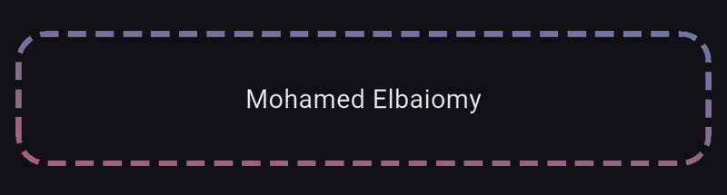
Example 2: Dashed Gradient Border
SizedBox(
  height: 70,
  width: double.infinity,
  child: GradientGlowBorder.dashed(
    borderRadius: BorderRadius.all(Radius.circular(15)),
    colors: [
      Colors.blue,
      Colors.red,
    ],
    animationDuration: Duration(seconds: 2),
    thickness: 3,
    spacing: 5,
    child: Center(
      child: Text("Mohamed Elbaiomy"),
    ),
  ),
)
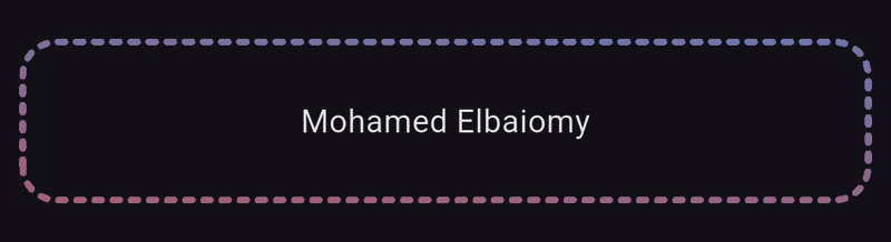
Example 3: Dotted Gradient Border
SizedBox(
  height: 70,
  width: double.infinity,
  child: GradientGlowBorder.dotted(
    borderRadius: BorderRadius.all(Radius.circular(15)),
    colors: [
      Colors.blue,
      Colors.red,
    ],
    animationDuration: Duration(seconds: 2),
    thickness: 3,
    spacing: 5,
    child: Center(
      child: Text("Mohamed Elbaiomy"),
    ),
  ),
)
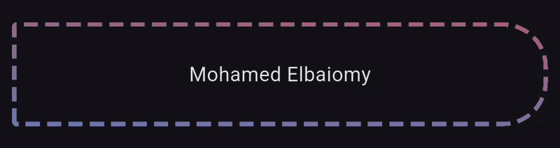
Example 4: Asymmetric Border Radius
SizedBox(
  height: 70,
  width: double.infinity,
  child: GradientGlowBorder.dashed(
    borderRadius: BorderRadius.only(
      topRight: Radius.circular(30),
      topLeft: Radius.circular(1),
      bottomRight: Radius.circular(30),
      bottomLeft: Radius.circular(1),
    ),
    spacing: 5,
    colors: [
      Colors.red,
      Colors.blue,
    ],
    animationDuration: Duration(seconds: 2),
    thickness: 3,
    child: Center(
      child: Text("Mohamed Elbaiomy"),
    ),
  ),
)
Example 5: Advanced Custom Configuration
SizedBox(
  height: 70,
  child: GradientGlowBorder(
    config: BorderConfig(
      borderRadius: BorderRadius.circular(24),
      colors: const [
        Color(0xFFFF6B6B),
        Color(0xFFFFE66D),
        Color(0xFF4ECDC4),
        Color(0xFF556270),
      ],
      thickness: 4,
      blurRadius: 16,
      spreadRadius: 3,
      glowOpacity: 0.8,
      borderStyle: BorderStyle.solid,
      animate: true,
      animationDuration: const Duration(seconds: 3),
      animationCurve: Curves.easeInOut,
    ),
    child: const Center(
      child: Text(
        'Mohamed Elbaiomy',
        style: TextStyle(fontSize: 18),
      ),
    ),
  ),
)
📖 API Reference
Factory Constructors
GradientGlowBorder.solid()
Creates a solid gradient border.
Parameters:
borderRadius(BorderRadius, required): Border radius for cornerscolors(Listthickness(double, default: 2.0): Border thicknessblurRadius(double, default: 8.0): Glow blur radiusspreadRadius(double, default: 0.0): Glow spread radiusglowOpacity(double, default: 1.0): Glow opacity (0.0 to 1.0)animate(bool, default: true): Enable/disable animationanimationDuration(Duration, default: 2 seconds): Animation durationanimationCurve(Curve, default: Curves.linear): Animation curvechild(Widget?): Child widget
GradientGlowBorder.dashed()
Creates a dashed gradient border.
Parameters:
- All parameters from
solid()plus: spacing(double, default: 5.0): Space between dashesdashLength(double, default: 10.0): Length of each dash
GradientGlowBorder.dotted()
Creates a dotted gradient border.
Parameters:
- All parameters from
solid()plus: spacing(double, default: 5.0): Space between dots
BorderConfig Class
For advanced usage, use BorderConfig with all available parameters:
BorderConfig(
  borderRadius: BorderRadius,    // Required
  colors: List<Color>,           // Required (min 2 colors)
  thickness: double,             // Default: 2.0
  blurRadius: double,            // Default: 8.0
  spreadRadius: double,          // Default: 0.0
  glowOpacity: double,           // Default: 1.0 (0.0 to 1.0)
  borderStyle: BorderStyle,      // Default: BorderStyle.solid
  spacing: double,               // Default: 5.0
  dashLength: double,            // Default: 10.0
  animate: bool,                 // Default: true
  animationDuration: Duration,   // Default: Duration(seconds: 2)
  animationCurve: Curve,         // Default: Curves.linear
)
BorderStyle Enum
enum BorderStyle {
  solid,   // Continuous border
  dashed,  // Dashed border
  dotted,  // Dotted border
}
📊 Quick Reference Table
| Parameter | Type | Description | Default |
|---|---|---|---|
borderRadius |
BorderRadius |
Border radius for each corner | Required |
colors |
List<Color> |
List of gradient colors (minimum 2) | Required |
thickness |
double |
Border thickness | 2.0 |
blurRadius |
double |
Glow blur radius | 8.0 |
spreadRadius |
double |
Glow spread radius | 0.0 |
glowOpacity |
double |
Glow opacity (0.0 to 1.0) | 1.0 |
spacing |
double |
Space between dashes/dots | 5.0 |
dashLength |
double |
Length of each dash (dashed style only) | 10.0 |
animate |
bool |
Enable/disable animation | true |
animationDuration |
Duration |
Duration of animation | 2 seconds |
animationCurve |
Curve |
Animation curve | Curves.linear |
borderStyle |
BorderStyle |
Style: solid, dashed, or dotted | solid |
child |
Widget? |
Child widget to wrap with border | null |
💡 Complete Example
import 'package:flutter/material.dart';
import 'package:gradient_glow_border/gradient_glow_border.dart';

void main() {
  runApp(const MyApp());
}

class MyApp extends StatelessWidget {
  const MyApp({super.key});

  @override
  Widget build(BuildContext context) {
    return MaterialApp(
      title: 'Gradient Glow Border',
      theme: ThemeData.dark(),
      debugShowCheckedModeBanner: false,
      home: TestGradientGlowBorder(),
    );
  }
}

class TestGradientGlowBorder extends StatefulWidget {
  const TestGradientGlowBorder({super.key});

  @override
  State<TestGradientGlowBorder> createState() => _TestGradientGlowBorderState();
}

class _TestGradientGlowBorderState extends State<TestGradientGlowBorder> {
  @override
  Widget build(BuildContext context) {
    return Scaffold(
      appBar: AppBar(
        title: Text("Gradient Glow Border"),
      ),
      body: Center(
        child: Padding(
          padding: const EdgeInsets.all(10),
          child: Column(
            mainAxisAlignment: MainAxisAlignment.spaceEvenly,
            children: [
              // Example 1: Solid animated gradient border
              SizedBox(
                height: 70,
                width: double.infinity,
                child: GradientGlowBorder.solid(
                  borderRadius: BorderRadius.all(Radius.circular(15)),
                  blurRadius: 1,
                  colors: [Colors.blue, Colors.red],
                  animate: true,
                  animationCurve: Curves.linear,
                  animationDuration: Duration(seconds: 2),
                  glowOpacity: 1,
                  spreadRadius: 0,
                  thickness: 3,
                  child: Center(
                    child: Text("Mohamed Elbaiomy"),
                  ),
                ),
              ),

              // Example 2: Dashed border
              SizedBox(
                height: 70,
                width: double.infinity,
                child: GradientGlowBorder.dashed(
                  borderRadius: BorderRadius.all(Radius.circular(15)),
                  colors: [Colors.blue, Colors.red],
                  animationDuration: Duration(seconds: 2),
                  thickness: 3,
                  spacing: 5,
                  child: Center(
                    child: Text("Mohamed Elbaiomy"),
                  ),
                ),
              ),

              // Example 3: Dotted border
              SizedBox(
                height: 70,
                width: double.infinity,
                child: GradientGlowBorder.dotted(
                  borderRadius: BorderRadius.all(Radius.circular(15)),
                  colors: [Colors.blue, Colors.red],
                  animationDuration: Duration(seconds: 2),
                  thickness: 3,
                  spacing: 5,
                  child: Center(
                    child: Text("Mohamed Elbaiomy"),
                  ),
                ),
              ),

              // Example 4: Different border radius per corner
              SizedBox(
                height: 70,
                width: double.infinity,
                child: GradientGlowBorder.dashed(
                  borderRadius: BorderRadius.only(
                    topRight: Radius.circular(30),
                    topLeft: Radius.circular(1),
                    bottomRight: Radius.circular(30),
                    bottomLeft: Radius.circular(1),
                  ),
                  spacing: 5,
                  colors: [Colors.red, Colors.blue],
                  animationDuration: Duration(seconds: 2),
                  thickness: 3,
                  child: Center(
                    child: Text("Mohamed Elbaiomy"),
                  ),
                ),
              ),

              // Example 5: Custom configuration
              SizedBox(
                height: 70,
                child: GradientGlowBorder(
                  config: BorderConfig(
                    borderRadius: BorderRadius.circular(24),
                    colors: const [
                      Color(0xFFFF6B6B),
                      Color(0xFFFFE66D),
                      Color(0xFF4ECDC4),
                      Color(0xFF556270),
                    ],
                    thickness: 4,
                    blurRadius: 16,
                    spreadRadius: 3,
                    glowOpacity: 0.8,
                    borderStyle: BorderStyle.solid,
                    animate: true,
                    animationDuration: const Duration(seconds: 3),
                    animationCurve: Curves.easeInOut,
                  ),
                  child: const Center(
                    child: Text(
                      'Mohamed Elbaiomy',
                      style: TextStyle(fontSize: 18),
                    ),
                  ),
                ),
              ),
            ],
          ),
        ),
      ),
    );
  }
}
🎨 Use Cases
- Highlighting premium features or subscription cards
- Creating eye-catching call-to-action buttons
- Designing modern profile cards
- Building futuristic UI elements
- Adding visual emphasis to important content
- Creating loading indicators with style
🤝 Contributing
Contributions are welcome! If you find a bug or have a feature request, please open an issue on GitHub. If you'd like to contribute code, feel free to submit a pull request.
📄 License
This project is licensed under the MIT License. See the LICENSE file for details.
🔗 Connect with Mohamed Elbaiomy
Made with ❤️ by Mohamed Elbaiomy