Glass UI Kit 🌫️
A beautifully crafted Flutter plugin for building Glassmorphism-styled UI components with ease. Includes customizable glass containers, clipping shapes (wave, blob, star, etc.), and modern blur effects.
Features
- ✅ Beautiful glass containers with customizable blur, color, and border
- ✅ Clip with custom shapes: wave, star, hexagon, triangle, diagonal, blobs, and more
- ✅ Easy integration with a single widget
- ✅ Perfect for modern, minimalistic, and frosted-glass UI designs
Preview
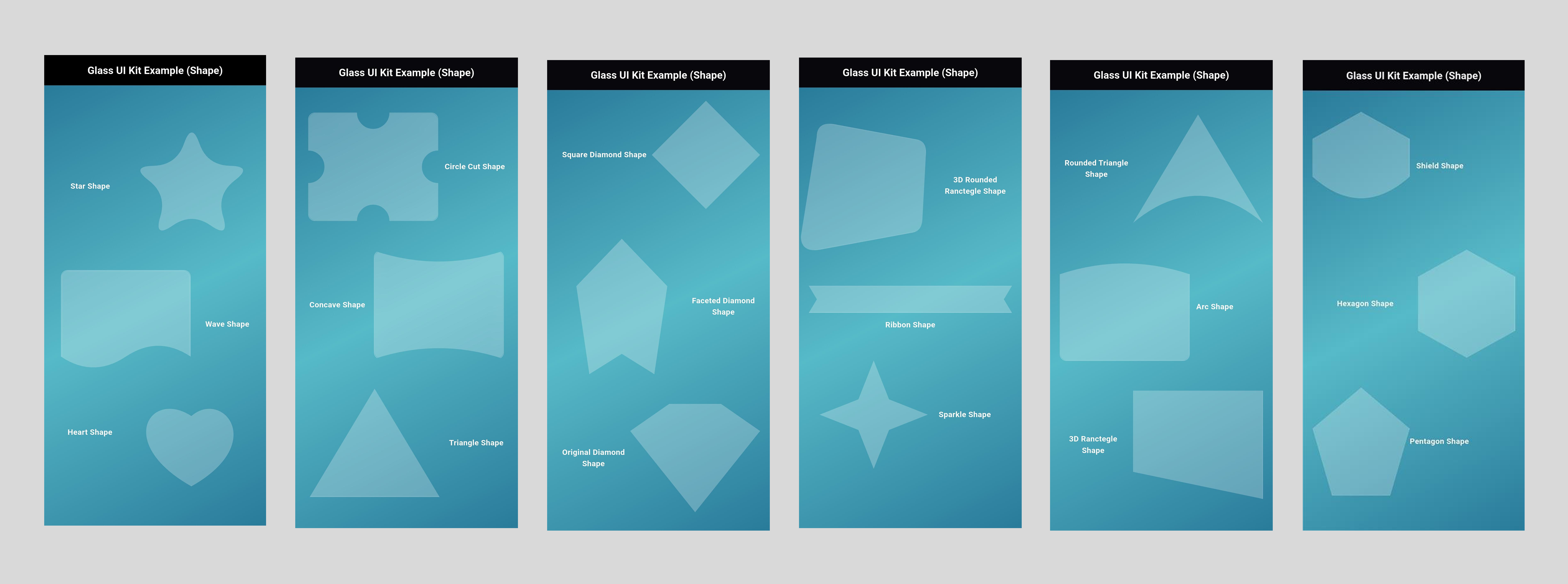
Normal Glass Shapes
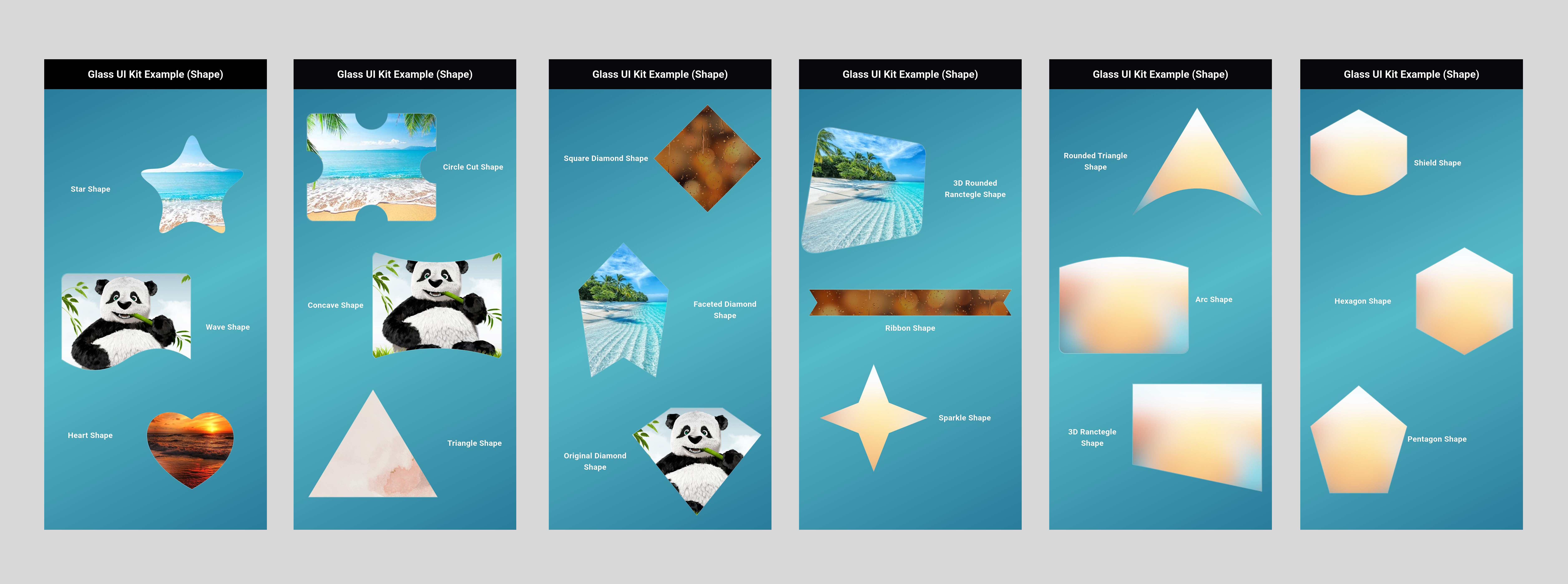
Glass Shapes with Image
Installation
You can install the package by running:
With Dart:
dart pub add glass_ui_kit
With Flutter:
flutter pub add glass_ui_kit
This will add the following to your pubspec.yaml:
dependencies:
  glass_ui_kit: ^0.0.1
Then import it in your Dart code:
import 'package:glass_ui_kit/glass_ui_kit.dart';
Available Clipper Shapes
| Clipper Name | Clipper Name |
|---|---|
| ArcClipper | ConcaveClipper |
| BottomWaveClipper | PentagonClipper |
| CircleCutClipper | ShieldClipper |
| CurveBottomClipper | BlobClipper |
| DiagonalClipper | BlobClipper2 |
| RoundedDiagonalClipper | FacetedDiamondClipper |
| TriangleClipper | OriginalDiamondClipper |
| WaveClipper | SkewedRoundedClipper |
| StarClipper | RibbonClipper |
| HexagonClipper | SparkleClipper |
| HeartClipper | RoundedTriangleClipper |
| SquareDiamondClipper |
How to Use
Glass Container with an Image
GlassContainer(
  height: 200,
  width: 200,
  blur: 10,
  clipper: HeartClipper(),
  borderRadius: 20,
  backgroundColor: Colors.white.withOpacity(0.25),
  border: Border.all(color: Colors.white.withOpacity(0.3)),
  child: ClipPath(
    clipper: HeartClipper(),
    child: Image.network(
      "https://www.cleanlink.com/resources/editorial/2019/beach-23965.jpg",
      fit: BoxFit.cover,
      width: double.infinity,
      height: double.infinity,
    ),
  ),
)
Glass Container with Normal Shapes & Text
GlassContainer(
  height: 180,
  width: 180,
  blur: 8,
  clipper: StarClipper(numberOfPoints: 5),
  borderRadius: 15,
  backgroundColor: Colors.white.withOpacity(0.25),
  border: Border.all(color: Colors.white.withOpacity(0.3)),
  child: Center(
    child: Text(
      "Star Shape",
      style: TextStyle(
        color: Colors.white,
        fontSize: 18,
        fontWeight: FontWeight.bold,
      ),
      textAlign: TextAlign.center,
    ),
  ),
)
Example Usage
Here's a quick example of how you can create a simple glass UI card:
import 'package:flutter/material.dart';
import 'package:glass_ui_kit/glass_ui_kit.dart';

class ExamplePage extends StatelessWidget {
  @override
  Widget build(BuildContext context) {
    return Scaffold(
      backgroundColor: Colors.blueGrey[900],
      body: Center(
        child: GlassContainer(
          height: 250,
          width: 250,
          blur: 15,
          borderRadius: 25,
          backgroundColor: Colors.white.withOpacity(0.2),
          border: Border.all(color: Colors.white.withOpacity(0.3)),
          child: Center(
            child: Text(
              "Hello Glass UI",
              style: TextStyle(
                color: Colors.white,
                fontSize: 22,
                fontWeight: FontWeight.bold,
              ),
            ),
          ),
        ),
      ),
    );
  }
}
License
This project is licensed under the MIT License - see the LICENSE file for details.
Author
Harshil Gajipara