Glass One NavBar
A modern, highly customizable, and elegant Glassmorphism navigation bar for Flutter. Designed to be lightweight, adaptive, and visually stunning with smooth liquid-growth animations.

✨ Features
- Glassmorphism Design: High-quality blur effects using
BackdropFilter. - Adaptive Bubbles: Selection "pills" that automatically adapt to text length (supports 1 or 2 lines).
- Smooth Animations: Elastic liquid-growth effect for selection and scale transitions.
- Highly Customizable: Control everything from blur intensity and border width to custom gradients and colors.
- Accessibility Ready: Integrated Semantics and Tooltips for a better user experience.
- Theme Aware: Easily adapts to Light and Dark modes.
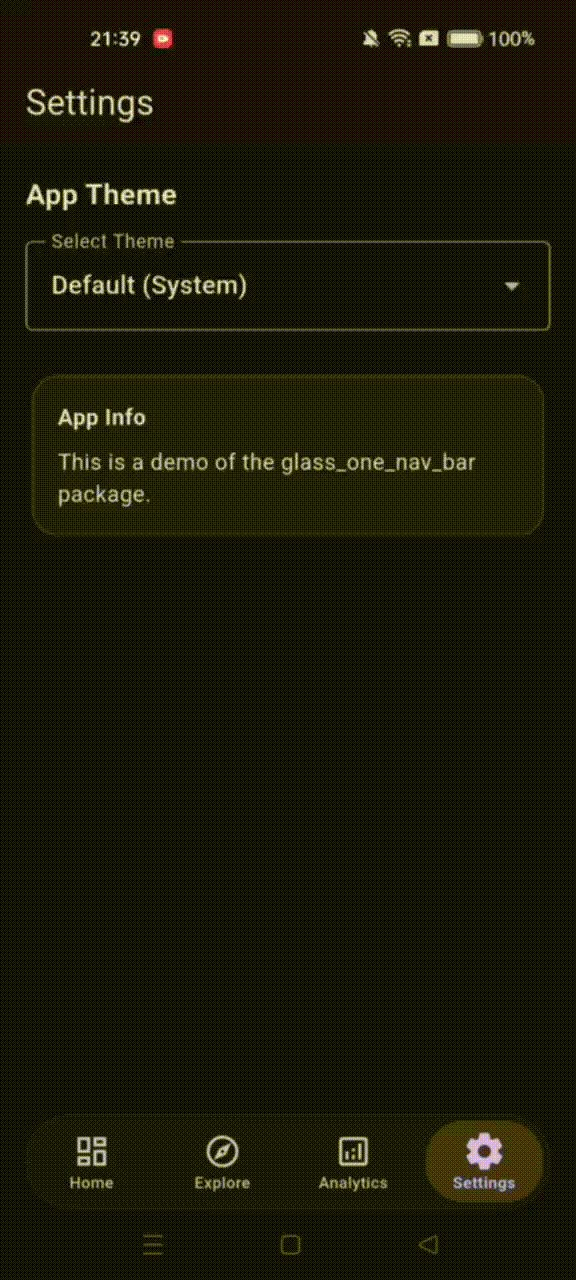
📸 Screenshots
| Light Mode | Dark Mode | Custom Styling |
|---|---|---|
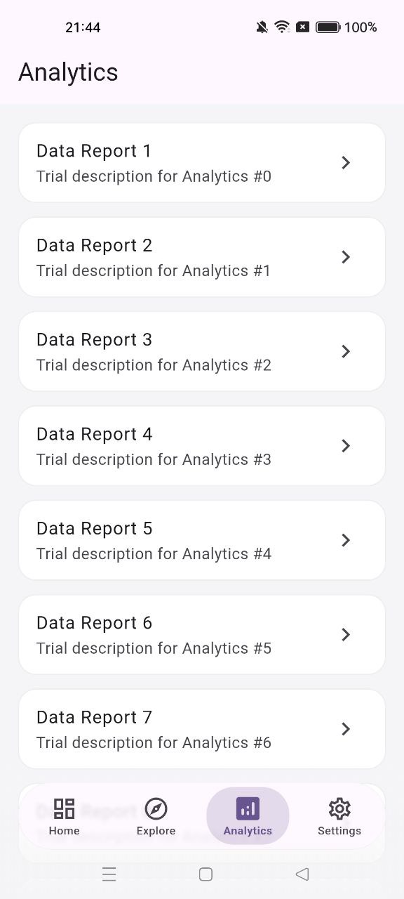 |
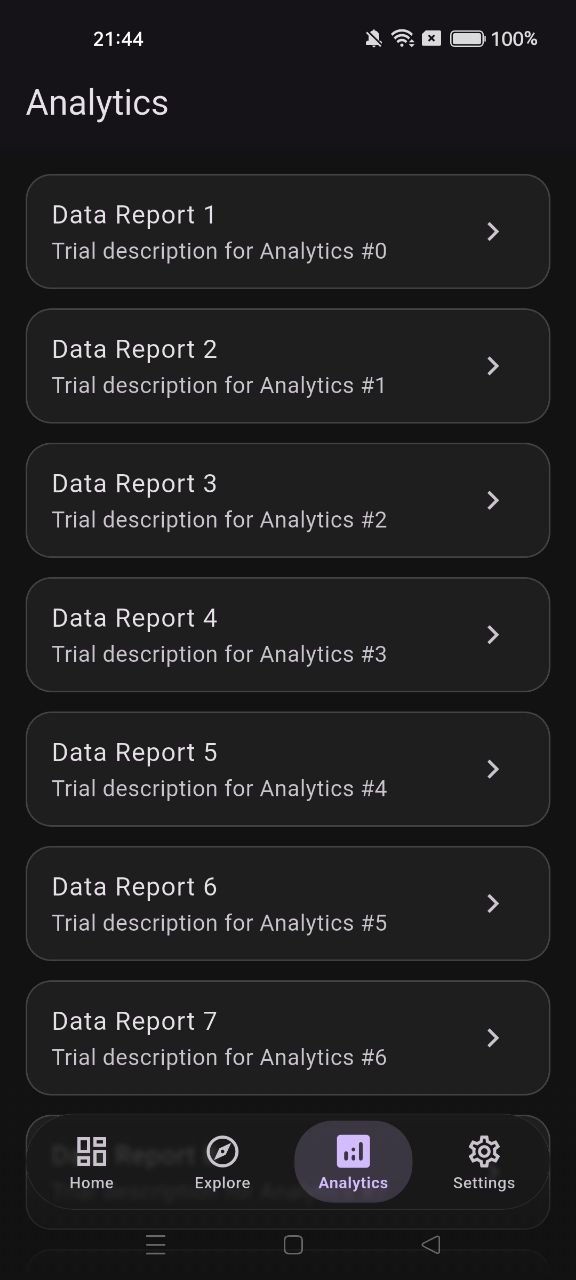 |
 |
🎬 Animation Demo
🚀 Getting Started
Add the package to your pubspec.yaml:
dependencies:
  glass_one_nav_bar: ^1.0.0
Import the library:
import 'package:glass_one_nav_bar/glass_one_nav_bar.dart';
🛠️ Usage
Basic Implementation
GlassOneNavBar(
  currentIndex: _selectedIndex,
  onTap: (index) => setState(() => _selectedIndex = index),
  items: [
    GlassOneNavItem(
      icon: Icons.home_outlined,
      activeIcon: Icons.home_rounded,
      label: 'Home',
    ),
    GlassOneNavItem(
      icon: Icons.explore_outlined,
      activeIcon: Icons.explore_rounded,
      label: 'Explore',
    ),
    GlassOneNavItem(
      icon: Icons.settings_outlined,
      activeIcon: Icons.settings_rounded,
      label: 'Settings',
    ),
  ],
)
Advanced Customization
Use GlassOneStyle to fine-tune the look and feel:
GlassOneNavBar(
  currentIndex: _selectedIndex,
  onTap: _onTap,
  items: [...],
  style: GlassOneStyle(
    height: 80.0,
    blurSigma: 15.0,
    borderRadius: 32.0,
    activeColor: Colors.deepPurple,
    inactiveColor: Colors.grey,
    borderWidth: 0.5,
    showLabels: true,
    itemPadding: EdgeInsets.symmetric(vertical: 8, horizontal: 12),
  ),
)
🎨 Customization Options (GlassOneStyle)
| Property | Description | Default |
|---|---|---|
height |
Height of the navigation bar | 72.0 |
borderRadius |
Corner radius of the glass container | 28.0 |
blurSigma |
Intensity of the blur effect | 10.0 |
itemPadding |
Internal padding for the selection pill | symmetric(v:8, h:0) |
activeColor |
Color for selected icons/labels/pills | Theme primary |
inactiveColor |
Color for unselected items | Theme onSurfaceVariant |
showLabels |
Whether to display text labels | true |
iconSize |
Size of the icons | 24.0 |
enableHaptics |
Trigger haptic feedback on tap | true |
🧪 Testing
The library is built with reliability in mind, achieving >90% code coverage. You can run tests locally using:
flutter test --coverage
📄 License
This project is licensed under the MIT License - see the LICENSE file for details.
Made with ❤️ by Andrei Lazar