Girix Code Gauge

A Flutter package for creating customizable progress linear, linear gauges, radial gauges, and more. girix_code_gauge provides a collection of widgets to easily integrate dynamic and visually appealing gauges and shapes into the applications.
Table of Contents
- Girix Code Gauge
- Table of Contents
- Features
- Preview
- Installation
- Getting Started
- Importing the Package
- Usage: Linear Gauge
- Progress Linear Gauge
- Stepper Gauge
- Scale Linear Gauge
- Usage: Radial Gauge
- Customization
- License
- Additional Resources
Features
- Draw basic gauges like progress, scale, bar linear gauges using customizable widgets.
- Create linear gauges with various styles and animations.
- Implement radial gauges with flexible customization options.
- Support for different needle types and positions.
- Customizable ranges and scales for gauges.
- Animated transitions for gauge values.
- Easy integration and usage with simple APIs.
Preview


Installation
Add the following to your pubspec.yaml:
dependencies:
  girix_code_gauge: latest
Then run:
flutter pub get
Getting Started
Importing the Package
Import girix_code_gauge in your Dart code:
import 'package:girix_code_gauge/girix_code_gauge.dart';
Usage: Linear Gauge
Progress Linear Gauge
The GxProgressLinearGauge widget is used to display a progress linear gauge.
Properties
-
value: An instance of theGaugeValueclass that holds the value of the gauge.value: The value of the progress linear gauge.min: The minimum value of the progress linear gauge.max: The maximum value of the progress linear gauge.
-
style: An instance of theProgressLinearStyleclass that holds the style properties of the progress linear gauge.color: The color of the active part of the progress linear gauge.backgroundColor: The color of the background part of the progress linear gauge.dense: Whether the progress linear gauge is dense.thickness: The thickness of the progress linear gauge.radius: The radius of the progress linear gauge.strokeCap: The stroke cap of the progress linear gauge.paintingStyle: The painting style of the progress linear gauge.
-
label: An instance of theGaugeLabelclass that holds the label properties of the progress linear gauge.label: The label of the progress linear gauge.style: The style of the label.textAlign: The alignment of the label.spaceExtent: The space extent of the label.offset: The offset of the label.
-
needle: An instance of theLinearNeedleclass that holds the needle properties of the progress linear gauge.enabled: Whether the needle is enabled.position: The position of the needle.size: The size of the needle.color: The color of the needle.needleType: The type of the needle and more.
-
customDrawNeedle: A function that allows you to draw a custom needle on the progress linear gauge. -
reverse: Whether the progress linear gauge is reversed. -
showLabel: Whether the label is shown. -
height: The height of the progress linear gauge.
1. Default
Add a simple progress linear gauge widget as a child of any widget.
SizedBox(
    height: 80
    child: GxProgressLinearGauge(
        value: GaugeValue(value: 50),
    )
)
2. Needle
Add a linear needle to the progress linear gauge widget by passing the needle property. You can customize the needle by changing the position, size, color, and needleType.
You can add a style to the gauge by passing the style property.

Example
SizedBox(
    height: 80,
    child: GxProgressLinearGauge(
        value: const GaugeValue(value: 80, min: 0, max: 100),
        style: const ProgressLinearStyle(
            color: Colors.orange,
        ),
        needle: LinearNeedle(
            position: LinearGaugeNeedlePosition.center,
            size: const Size(20, 20),
            color: Colors.blueGrey,
            needleType: LinearGaugeNeedleType.diamond
        )
    )
)
3. Label
Add a label to the progress linear gauge widget by passing the label property. You can customize the label by changing the label, style, textAlign, and spaceExtent. You can show the label by passing the showLabel property. The {value} in the label will be replaced by the actual value of the gauge.

Example
SizedBox(
    height: 100,
    child: GxProgressLinearGauge(
        label: GaugeLabel(
            label: '{value} %',
            style: TextStyle(
                color: Colors.black,
                fontSize: 15,
                fontWeight: FontWeight.bold),
            textAlign: TextAlign.center,
            spaceExtent: 4),
        showLabel: true,
        height: 30,
        value: GaugeValue(value: 39, min: 00, max: 100),
        style: ProgressLinearStyle(
            color: Colors.orange, dense: false, thickness: 6),
    ),
)
4. Animated Progress Linear Gauge
Add an animated progress linear gauge widget by passing the animationType property of GxAnimatedProgressLinearGauge widget. You can customize the animation by changing the animationType.
This widget is in development. It can be used to show the progress of a task.
SizedBox(
    height: 80,
    child: GxAnimatedProgressLinearGauge(
        value: 60,
        style: ProgressLinearStyle(
            color: Colors.deepOrange.shade100, thickness: 10),
        animationType: GaugeAnimationType.linear,
        needle: const LinearNeedle(
            position: LinearGaugeNeedlePosition.bottom,
            size: Size(20, 20),
            color: Colors.deepOrange,
            needleType: LinearGaugeNeedleType.triangle),
    )
)
Stepper Gauge
GxStepperLinearGauge is a linear gauge that displays the progress of a process in a step-by-step manner.
Properties of GxStepperLinearGauge:
value: The current value of the gauge.stepperPointers: The list of pointers to be displayed in the gauge. Each pointer represents a step in the process.
1. Default Stepper

Example
 const TextStyle textStyle = TextStyle(
      fontSize: 12,
      color: Colors.black,
    );

GxStepperLinearGauge(
    value: GaugeValue(
        value: 77,
        min: 0,     // Optional
        max: 100    // Optional
    ),
    stepperPointers: [
        StepperPointer(
            label: GaugeLabel(label: 'Ordered', style: textStyle)
        ),
        StepperPointer(
            label: GaugeLabel(label: 'Packed', style: textStyle)
        ),
        StepperPointer(
            label: GaugeLabel(label: 'Shipped', style: textStyle)
        ),
        StepperPointer(
            label: GaugeLabel(label: 'Delivered', style: textStyle)
        )
    ]
),
Scale Linear Gauge
The Scale Linear Gauge is used to display a linear gauge with scale with different customization options.
Properties of ScaleLinearGauge
minimum- The minimum value of the gauge. Default is0.maximum- The maximum value of the gauge. Default is100.interval- The interval value of the gauge. Default is10.minorTicksPerInterval- The number of minor ticks per interval. Default is1.axisSpaceExtent- The space extent of the axis. Default is0.labelPosition- The position of the label. Default isLinearGaugeLabelPosition.bottomCenter.tickPosition- The position of the tick. Default isLinearElementPosition.inside.axisTrackStyle- The style of the axis track. Default isLinearAxisTrackStyle().majorTickStyle- The style of the major tick. Default isLinearTickStyle().minorTickStyle- The style of the minor tick. Default isLinearTickStyle().markerPointers- The list of marker pointers. Default isnull.barPointers- The list of bar pointers. Default isnull.barHeight- The height of the bar. Default is10.barOffset- The offset of the bar. Default is0.needle- The needle of the gauge. Default isnull.valueToLabelFormatCallback- The callback to format the label. Default isnull.valueToMajorTickStyleCallback- The callback to format the major tick style. Default isnull.valueToLabelStyleCallback- The callback to format the label style. Default isnull.fillAreaPointers- The list of fill area pointers. Default isnull.showAxisLabel- Whether to show the axis label. Default istrue.showAxisTrack- Whether to show the axis track. Default istrue.showMinorTicks- Whether to show the minor ticks. Default istrue.
*1. Default Scale
Create a default scale linear gauge widget and add it to your widget.
GxScaleLinearGauge()
2. Basic Style
Create a scale linear gauge widget with basic customized style with minimum, maximum, interval, minorTicksPerInterval, axisSpaceExtent, majorTickStyle.
GxScaleLinearGauge(
  minimum: 0,
  maximum: 100,
  interval: 20,
  minorTicksPerInterval: 5,
  axisSpaceExtent: 2,
  majorTickStyle: LinearTickStyle(
    length: 20,
    thickness: 2,
    color: Colors.blue,
  )
)
3. Axis Tick Position
Create a scale linear gauge widget with tick position such as inside, outside, outAndIn, inAndOut.

Example
GxScaleLinearGauge(
    tickPosition: LinearElementPosition.inside,
    minorTickStyle: LinearTickStyle(
        length: 20,
        thickness: 1,
    ),
    majorTickStyle: LinearTickStyle(
        length: 40,
        thickness: 1,
    ),
    axisTrackStyle: LinearAxisTrackStyle(
        thickness: 2, strokeCap: StrokeCap.butt, color: Colors.orange
    )
 )
4. Axis and Major Tick Style
Create a scale linear gauge widget with customized axis and major tick style with axisLabelStyle, valueToLabelFormatCallback, labelPosition, majorTickStyle, axisTrackStyle, minorTickStyle properties.

Example
GxScaleLinearGauge(
    tickPosition: LinearElementPosition.inAndOut,
    minorTickStyle: const LinearTickStyle(
        length: 10,
        thickness: 1,
    ),
    majorTickStyle: const LinearTickStyle(
        length: 60,
        thickness: 4,
    ),
    axisTrackStyle: const LinearAxisTrackStyle(
        thickness: 4, strokeCap: StrokeCap.round, color: Colors.black),
    showMinorTicks: false,
    valueToMajorTickStyleCallback: (value, index) {
        return LinearTickStyle(
        length: 60,
        thickness: value == 50 ? 16 : 4,
        color: Colors.primaries[index % Colors.primaries.length],
        );
    },
)
5. Needle
Create a scale linear gauge widget with customized linear needle with needle, offset, enabled, color, size, position, needleType properties.

Example
GxScaleLinearGauge(
    minimum: 0,
    maximum: 100,
    interval: 10,
    minorTicksPerInterval: 2,
    axisLabelStyle: const TextStyle(
        color: Colors.deepOrange,
        fontSize: 14,
    ),
    valueToLabelFormatCallback: (value, index) => value,
    labelPosition: LinearGaugeLabelPosition.topCenter,
    majorTickStyle: const LinearTickStyle(
        length: 40,
        thickness: 2,
        color: Colors.deepOrange,
    ),
    axisTrackStyle: const LinearAxisTrackStyle(
        color: Colors.deepOrange,
    ),
    minorTickStyle: const LinearTickStyle(
        color: Colors.deepOrange, thickness: 2, length: 18),
    value: 80,
    needle: const LinearNeedle(
        offset: 20,
        enabled: true,
        color: Colors.deepOrange,
        size: Size(20, 20),
        position: LinearGaugeNeedlePosition.bottom,
        needleType: LinearGaugeNeedleType.triangle,
    )
)
6. Fill Area and Marker Pointers
Create a scale linear gauge widget with fill area and marker pointers with fillAreaPointers, markerPointers properties.

Example
GxScaleLinearGauge(
    tickPosition: LinearElementPosition.outAndIn,
    minorTickStyle: const LinearTickStyle(
        length: 10,
        thickness: 1,
    ),
    majorTickStyle: const LinearTickStyle(
        length: 60,
        thickness: 1,
    ),
    axisTrackStyle: const LinearAxisTrackStyle(
        thickness: 2,
        strokeCap: StrokeCap.round,
        color: Colors.black26),
    showMinorTicks: false,
    valueToMajorTickStyleCallback: (value, index) {
        return LinearTickStyle(
        length: 60,
        thickness: (value == 30 || value == 80) ? 4 : 1,
        color: (value == 30 || value == 80)
            ? Colors.green
            : Colors.black26,
        );
    },
    valueToLabelFormatCallback: (value, index) =>
        value.length == 1 ? '0$value' : value,
    markerPointers: [
        LinearMarkerPointer(
            value: 10,
            needle: const LinearNeedle(
                enabled: true,
                color: Colors.blueGrey,
                size: Size(2, 70),
                position: LinearGaugeNeedlePosition.center,
                needleType: LinearGaugeNeedleType.pipe,
                offset: 10,
            ),
        ),
        LinearMarkerPointer(
            value: 70,
            needle: const LinearNeedle(
                enabled: true,
                color: Colors.blueGrey,
                size: Size(2, 70),
                position: LinearGaugeNeedlePosition.center,
                needleType: LinearGaugeNeedleType.pipe,
                offset: 10,
            ),
        ),
    ],
    valueToLabelStyleCallback: (value, index) => TextStyle(
        color:
            (value == 10 || value == 70) ? Colors.black : Colors.black38,
        fontWeight: (value == 10 || value == 70)
            ? FontWeight.bold
            : FontWeight.normal,
    ),
    fillAreaPointers: [
        FillAreaPointer(
            thickness: 60,
            startValue: 30,
            endValue: 80,
            color: Colors.green.withOpacity(0.3))
        ],
    )
7. Multi Range
Create a range scale linear gauge with multiple ranges.

Example
GxScaleLinearGauge(
    minimum: 0,
    maximum: 100,
    interval: 20,
    minorTicksPerInterval: 5,
    axisSpaceExtent: 2,
    labelPosition: LinearGaugeLabelPosition.topCenter,
    tickPosition: LinearElementPosition.outside,
    axisTrackStyle: const LinearAxisTrackStyle(
        thickness: 3,
    ),
    majorTickStyle: const LinearTickStyle(
        length: 50,
        thickness: 2,
    ),
    minorTickStyle: const LinearTickStyle(
        length: 30,
        thickness: 1,
    ),
    barOffset: 1,
    barHeight: 35,
    barPointers: [
    LinearBarPointer(
        label: const GaugeLabel(label: 'Low'),
        value: barValue,
        thickness: 5,
        color: Colors.brown),
    LinearBarPointer(
        label: const GaugeLabel(label: 'Medium'),
        color: Colors.yellow.shade700,
        value: barValue,
        thickness: 5),
    LinearBarPointer(
        label: const GaugeLabel(label: 'High'),
        color: Colors.cyan.shade700,
        value: barValue,
        thickness: 5),
    ]
)
8. Multi Range: Color on Axis Tick
Create a range scale linear gauge with multiple ranges and apply bar color on axis tick using applyBarColorOnAxisTick property.

Example
GxScaleLinearGauge(
    tickPosition: LinearElementPosition.inside,
    labelPosition: LinearGaugeLabelPosition.bottomCenter,
    minorTickStyle: const LinearTickStyle(
        length: 20,
        thickness: 1,
    ),
    majorTickStyle: const LinearTickStyle(
        length: 40,
        thickness: 1,
    ),
    barHeight: 10,
    barOffset: 80,
    applyBarColorOnAxisTick: true,
    barPointers: [
    LinearBarPointer(
        value: barValue, thickness: 5, color: Colors.red.shade400),
    LinearBarPointer(
        color: Colors.tealAccent.shade700,
        value: barValue,
        thickness: 5),
    LinearBarPointer(
        color: Colors.orangeAccent.shade400,
        value: barValue,
        thickness: 5),
    ]
),
9. Multi Range: Color on Axis Tick for In and Out
Create a range scale linear gauge with multiple ranges and apply bar color on axis tick for in and out.

Example
GxScaleLinearGauge(
    tickPosition: LinearElementPosition.inAndOut,
    minorTickStyle: const LinearTickStyle(
        length: 10,
        thickness: 1,
    ),
    majorTickStyle: const LinearTickStyle(
        length: 40,
        thickness: 2,
    ),
    applyBarColorOnAxisTick: true,
    barPointers: [
        LinearBarPointer(
            value: barValue, thickness: 5, color: Colors.red.shade400),
        LinearBarPointer(
            color: Colors.tealAccent.shade700,
            value: barValue,
            thickness: 5),
        LinearBarPointer(
            color: Colors.orangeAccent.shade400,
            value: barValue,
            thickness: 5),
        ]
    )
Usage: Radial Gauge
GxRadialGauge
The GxRadialGauge widget is used to display a RadialGauge with different styles of customization.
Properties
value: The value of the gauge. The value is required.style: The style of the gauge. The default value isRadialGaugeStyle(). The style is optional.size: The size of the gauge. The default value isSize(200, 200). The size is optional.labelTickStyle: The style of the label tick. The default value isRadialTickLabelStyle(). The labelTickStyle is optional.showMajorTicks: The default value isfalse. The showMajorTicks is optional.showMinorTicks: The default value isfalse. The showMinorTicks is optional.showLabels: The default value isfalse. The showLabels is optional.majorTickStyle: The default value isRadialTickStyle(). The majorTickStyle is optional.minorTickStyle: The default value isRadialTickStyle(). The minorTickStyle is optional.interval: The default value is10. The interval is optional.minorTicksPerInterval: The default value is10. The minorTicksPerInterval is optional.startAngleInDegree: The default value is0. The startAngleInDegree is optional.sweepAngleInDegree: The default value is360. The sweepAngleInDegree is optional.showValueAtCenter: The default value istrue. The showValueAtCenter is optional.showNeedle: The default value isfalse. The showNeedle is optional.needle: The needle of the gauge. The needle is optional.valueToLabelFormatCallback: The value to label format callback. The valueToLabelFormatCallback is optional.valueToLabelStyleCallback: The value to label style callback. The valueToLabelStyleCallback is optional.valueToMajorTickCallback: The value to label style callback. The valueToMajorTickCallback is optional.pointers: The radial pointers. The pointers is optional.rangeBars: The range bars. The rangeBars is optional.
1. Default

Example 1
GxRadialGauge(
    size: twinSize,
    value: GaugeValue(
        value: value,
    ),
    style: const RadialGaugeStyle(
        color: Colors.orange, thickness: 20
    )
),
GxRadialGauge(
    size: twinSize,
    value: GaugeValue(
        value: value,
    ),
    style: const RadialGaugeStyle(
        backgroundColor: Colors.amber,
        color: Colors.green,
        thickness: 20
    )
),
2. Angle customisation
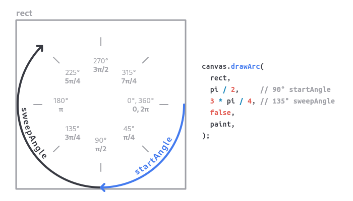
By using startAngleInDegree and sweepAngleInDegree properties, we can customise the start and swipe angle of the gauge.
Find out more about angle on canvas, visit flutter canvas arc

Example 2
 GxRadialGauge(
    showValueAtCenter: true,
    size: twinSize,
    startAngleInDegree: 180,
    sweepAngleInDegree: 180,
    value: GaugeValue(
        value: value,
    ),
    style: const RadialGaugeStyle(
        strokeCap: StrokeCap.butt,
        color: Colors.amber,
        thickness: 20
    )
),
GxRadialGauge(
    showValueAtCenter: true,
    size: twinSize,
    startAngleInDegree: 270,
    sweepAngleInDegree: 180,
    value: GaugeValue(
        value: value,
    ),
    style: RadialGaugeStyle(
        color: Colors.cyanAccent.shade700,
        thickness: 20
    )
),
3. Major and minor Tick customisation
By using majorTickStyle and minorTickStyle properties, we can customise the major and minor ticks of the gauge respectively.

Example 3
// 1st row
GxRadialGauge(
    size: twinSize,
    startAngleInDegree: 135,
    sweepAngleInDegree: 270,
    value: GaugeValue(
        value: 75,
    ),
    showMajorTicks: true,
    interval: 10,
    majorTickStyle: const RadialTickStyle(
        position: RadialElementPosition.inside,
        alignment: RadialElementAlignment.end,
        length: 20,
        thickness: 2,
        color: Colors.blue),
    style:
        const RadialGaugeStyle(color: Colors.blue, thickness: 20),
),
GxRadialGauge(
    size: twinSize,
    startAngleInDegree: 180,
    value: GaugeValue(
        value: 75,
    ),
    showMajorTicks: true,
    interval: 5,
    valueToMajorTickCallback: (value, index) {
    final bool isOdd = index.isOdd;
    return RadialTickStyle(
        position: RadialElementPosition.outside,
        alignment: RadialElementAlignment.start,
        length: 20,
        thickness: 2,
        color: isOdd
            ? Colors.deepOrange.shade200
            : Colors.deepOrange.shade300);
    },
    style: const RadialGaugeStyle(
        color: Colors.deepOrange, thickness: 20),
),

// 2nd row
 GxRadialGauge(
    value: GaugeValue(
        value: 75,
    ),
    showMajorTicks: true,
    showMinorTicks: true,
    minorTicksPerInterval: 20,
    showLabels: true,
    interval: 10,
    labelTickStyle: const RadialTickLabelStyle(
        padding: 2, position: RadialElementPosition.outside),
    majorTickStyle: const RadialTickStyle(
        position: RadialElementPosition.inside,
        alignment: RadialElementAlignment.end,
        length: 20,
        thickness: 2,
        color: Colors.red),
    minorTickStyle: const RadialTickStyle(
        position: RadialElementPosition.outside,
        alignment: RadialElementAlignment.center,
        length: 20,
        thickness: 1,
        color: Colors.redAccent),
    style: const RadialGaugeStyle(
        strokeCap: StrokeCap.butt,
        color: Colors.orangeAccent,
        thickness: 25),
),
GxRadialGauge(
    value: GaugeValue(
        value: 75,
    ),
    showMajorTicks: true,
    showMinorTicks: true,
    showLabels: true,
    interval: 10,
    majorTickStyle: const RadialTickStyle(
        position: RadialElementPosition.inside,
        alignment: RadialElementAlignment.center,
        length: 15,
        thickness: 3,
        color: Colors.blue),
    minorTickStyle: const RadialTickStyle(
        position: RadialElementPosition.outside,
        alignment: RadialElementAlignment.center,
        length: 20,
        thickness: 1,
        color: Colors.lightBlueAccent),
    style: const RadialGaugeStyle(
        color: Colors.lightBlueAccent, thickness: 15),
),
4. Needle customisation
By using needle property, we can customise the needle of the gauge. The showNeedle property is used to show and hide the needle.

Example 4
// 1st row
GxRadialGauge(
    showValueAtCenter: false,
    value: GaugeValue(
        value: 75,
    ),
    showLabels: true,
    interval: 10,
    showNeedle: true,
    needle: const RadialNeedle(
        circle: NeedleCircle(
            radius: 10, paintingStyle: PaintingStyle.fill),
        color: Colors.red,
        bottomOffset: 1.0,
        thickness: 20,
        topOffest: 0,
        alignment: RadialElementAlignment.start),
    style:
        const RadialGaugeStyle(color: Colors.cyan, thickness: 10),
),
GxRadialGauge(
    showValueAtCenter: false,
    startAngleInDegree: 135,
    sweepAngleInDegree: 270,
    value: GaugeValue(
        value: 75,
    ),
    interval: 10,
    showNeedle: true,
    needle: const RadialNeedle(
        circle: NeedleCircle(
            radius: 12,
            strokeWidth: 5,
            innerColor: Colors.orange,
            paintingStyle: PaintingStyle.stroke),
        color: Colors.indigo,
        bottomOffset: 1.0,
        thickness: 20,
        topOffest: 0,
        alignment: RadialElementAlignment.end),
    style: const RadialGaugeStyle(
        color: Colors.indigo, thickness: 15),
),

// 2nd row
GxRadialGauge(
    showValueAtCenter: false,
    startAngleInDegree: 90,
    sweepAngleInDegree: 180,
    size: twinSize,
    value: GaugeValue(
        value: 75
    ),
    interval: 10,
    showNeedle: true,
    showMajorTicks: true,
    valueToMajorTickCallback: (tickValue, index) {
    return RadialTickStyle(
        position: RadialElementPosition.inside,
        alignment: RadialElementAlignment.end,
        length: 12,
        thickness: 2,
        color: tickValue < value
            ? Colors.amber
            : Colors.amber.withOpacity(0.3)
        );
    },
    needle: const RadialNeedle(
        circle: NeedleCircle(
            radius: 8,
            strokeWidth: 5,
            innerColor: Colors.orange,
            paintingStyle: PaintingStyle.fill
        ),
        color: Colors.brown,
        bottomOffset: 20.0,
        thickness: 10,
        topOffest: 12,
        alignment: RadialElementAlignment.start
    ),
    style: const RadialGaugeStyle(
        color: Colors.amber, thickness: 15
    )
),
GxRadialGauge(
    showValueAtCenter: false,
    size: twinSize,
    value: GaugeValue(
        value: 75
    ),
    showLabels: true,
    interval: 10,
    showNeedle: true,
    needle: const RadialNeedle(
        shape: RadialNeedleShape.line,
        circle: NeedleCircle(
            radius: 8,
            strokeWidth: 4,
            paintingStyle: PaintingStyle.stroke
        ),
        color: Colors.grey,
        bottomOffset: 20.0,
        thickness: 4,
        topOffest: 0,
        alignment: RadialElementAlignment.start
    ),
    style: const RadialGaugeStyle(
        color: Colors.blueGrey, thickness: 10
    )
),
5. Pointers
By using pointers property, we can add pointers to the gauge.

Example 5
 GxRadialGauge(
    showValueAtCenter: false,
    startAngleInDegree: 270,
    size: twinSize,
    value: GaugeValue(value: ratioValue, min: 0, max: 144),
    showLabels: true,
    labelTickStyle: const RadialTickLabelStyle(
        padding: 20,
    ),
    interval: 12,
    style: const RadialGaugeStyle(
        color: Colors.pinkAccent, thickness: 15),
    valueToLabelFormatCallback: (value, index) {
        if (index == 0) {
            return '';
        }
        return (value / 12).toInt().toString();
    },
    pointers: [
        RadialPointer(
            value: ratioValue,
            shape: RadialPointerShape.circle,
            showNeedle: false,
            style: const RadialPointerStyle(
                color: Colors.indigoAccent,
                paintingStyle: PaintingStyle.fill,
                size: 12,
                thickness: 2
            ),
        ),
        RadialPointer(
            value: hours * 5,
            shape: RadialPointerShape.circle,
            showPointer: false,
            style: const RadialPointerStyle(
                color: Colors.blueGrey,
                paintingStyle: PaintingStyle.fill,
                size: 12,
                thickness: 2),
            needle: const RadialNeedle(
                thickness: 3.5,
                topOffest: -30,
                color: Colors.black,
                shape: RadialNeedleShape.line,
                alignment: RadialElementAlignment.end
            )
        ),
        RadialPointer(
            value: minutes,
            showPointer: false,
            needle: const RadialNeedle(
                thickness: 2.5,
                color: Colors.indigo,
                shape: RadialNeedleShape.line,
                topOffest: -10,
                alignment: RadialElementAlignment.end
            )
        ),
        RadialPointer(
            value: seconds,
            showPointer: false,
            needle: const RadialNeedle(
                thickness: 2,
                color: Colors.indigo,
                shape: RadialNeedleShape.line,
                topOffest: -28,
                bottomOffset: 10,
                alignment: RadialElementAlignment.end
            )
        ),
    ],
),
GxRadialGauge(
    showValueAtCenter: false,
    size: twinSize,
    startAngleInDegree: 180,
    value: GaugeValue(
        value: 75,
    ),
    interval: 20,
    style: const RadialGaugeStyle(
        color: Colors.indigoAccent, thickness: 15),
    pointers: [
        RadialPointer(
            alignment: RadialElementAlignment.start,
            value: value,
            shape: RadialPointerShape.triangle,
            style: const RadialPointerStyle(
                color: Colors.indigoAccent,
                paintingStyle: PaintingStyle.fill,
                size: 20,
                thickness: 2
            ),
        ),
        RadialPointer(
            value: value,
            shape: RadialPointerShape.circle,
            alignment: RadialElementAlignment.center,
            showNeedle: true,
            showPointer: true,
            style: const RadialPointerStyle(
                color: Colors.pinkAccent,
                paintingStyle: PaintingStyle.fill,
                size: 12,
                thickness: 2
            ),
            needle: const RadialNeedle(
                thickness: 2,
                bottomOffset: 20,
                circle: NeedleCircle(
                    color: Colors.pinkAccent,
                    strokeWidth: 3,
                    paintingStyle: PaintingStyle.stroke),
                color: Colors.pinkAccent,
                shape: RadialNeedleShape.line,
                alignment: RadialElementAlignment.end
            )
        ),
    ],
),
6. Gradient color
By using gradient property of the RadialGaugeStyle , we can customise the style of the gauge.

Example 6
GxRadialGauge(
    showValueAtCenter: true,
    value: GaugeValue(
        value: value,
    ),
    showLabels: false,
    labelTickStyle: const RadialTickLabelStyle(
        padding: 30,
    ),
    interval: 10,
    style: const RadialGaugeStyle(
        color: Colors.cyan,
        thickness: 35,
        gradient: LinearGradient(
            colors: [
                Colors.cyan,
                Colors.blue,
                Colors.purple,
                Colors.pinkAccent,
                Colors.redAccent,
            ],
            begin: Alignment.topCenter,
            end: Alignment.bottomCenter,
            stops: [0.0, 0.2, 0.4, 0.6, 1.0]
        ),
    ),
),
GxRadialGauge(
    showValueAtCenter: false,
    startAngleInDegree: 180,
    sweepAngleInDegree: 180,

    value: GaugeValue(
        value: 75,
    ),
    showLabels: true,
    showMajorTicks: true,
    showNeedle: true,
    needle: const RadialNeedle(
        color: Colors.lightBlue,
        shape: RadialNeedleShape.tapperedLine,
        thickness: 18,
        alignment: RadialElementAlignment.end,
        circle: NeedleCircle(
            radius: 15,
        ),
        gradient: LinearGradient(colors: [
            Colors.yellow,
            Colors.indigo,
            Colors.lightBlue,
            Colors.limeAccent,
            Colors.redAccent,
        ]),
    ),
    majorTickStyle: const RadialTickStyle(
        color: Colors.pink,
        thickness: 1,
        length: 25,
        position: RadialElementPosition.outside,
        alignment: RadialElementAlignment.start
    ),
    labelTickStyle: const RadialTickLabelStyle(
        padding: 20,
        position: RadialElementPosition.outside,
    ),
    interval: 10,
    style: const RadialGaugeStyle(
        color: Colors.pink,
        thickness: 35,
        backgroundGradient: LinearGradient(colors: [
            Colors.yellow,
            Colors.indigo,
            Colors.lightBlue,
            Colors.limeAccent,
            Colors.redAccent,
        ]),
        gradient: LinearGradient(colors: [
            Colors.yellow,
            Colors.indigo,
            Colors.lightBlue,
            Colors.limeAccent,
            Colors.redAccent,
        ]),
    ),
)
7. Ranges
By using rangeBars property, we can plot the range bars.

Example 7
GxRadialGauge(
    value: GaugeValue(
        value: 75,
    ),
    showLabels: true,
    labelTickStyle: const RadialTickLabelStyle(
        padding: 30,
    ),
    interval: 10,
    style: const RadialGaugeStyle(
        color: Colors.cyan,
        thickness: 5,
    ),
    rangeBars: const [
        RadialBarRange(
            offset: 10,
            height: 30,
            startValue: 0,
            endValue: 33,
            color: Colors.green,
        ),
        RadialBarRange(
            height: 30,
            startValue: 33,
            endValue: 66,
            color: Colors.yellow,
        ),
        RadialBarRange(
            height: 30,
            startValue: 66,
            endValue: 100,
            color: Colors.red,
        ),
    ],
),
Customization
girix_code_gauge offers extensive customization options:
- Needle Types: Choose from
circle,triangle,diamond,rectangle, or provide a custom needle. - Gauge Styles: Customize colors, sizes, thicknesses, and more.
- Animations: Use built-in animations or define custom animation curves.
- Scales and Ranges: Define custom scales, intervals, and ranges for your gauges.
- Orientation: Use gauges in both horizontal and vertical orientations.
License
This project is licensed under the MIT License - see the LICENSE file for details.
Additional Resources
- Documentation: API Reference
- Example Project: Check out the example app for a full implementation.
- Issue Tracker: Have a bug or a feature request? Please open an issue.
Thank you for using girix_code_gauge! If you find this package useful, please ⭐ star the repository.
For questions or suggestions, feel free to reach out at mrutyunjaya@girixcode.com.