Gauges
A gauge, in science and engineering, is a device used to make measurements or in order to display certain dimensional information. A wide variety of tools exist which serve such functions, ranging from simple pieces of material against which sizes can be measured to complex pieces of machinery.Here in Flutter you can use this package to plot a machinery information effortlessly.
Features
- LinerGauge
Getting started
Run this command
$flutter pub add geekyants_flutter_gauges
This will add a line like this to your package's pubspec.yaml (and run an implicit flutter pub get):
dependencies:
  geekyants_flutter_gauges: ^0.0.5
Usage
Import it inside your main.dart
import 'package:geekyants_flutter_gauges/gauges.dart';
Use it as below
class _MyGaugeExampleState extends State<MyGaugeExample> {
  @override
  Widget build(BuildContext context) {
    return Scaffold(
      body: Center(
        child: SizedBox(
          width: MediaQuery.of(context).size.width,
          child: const LinearGauge(
          ),
        ),
      ),
    );
  }
}
Screens
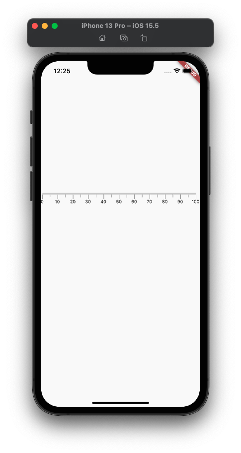
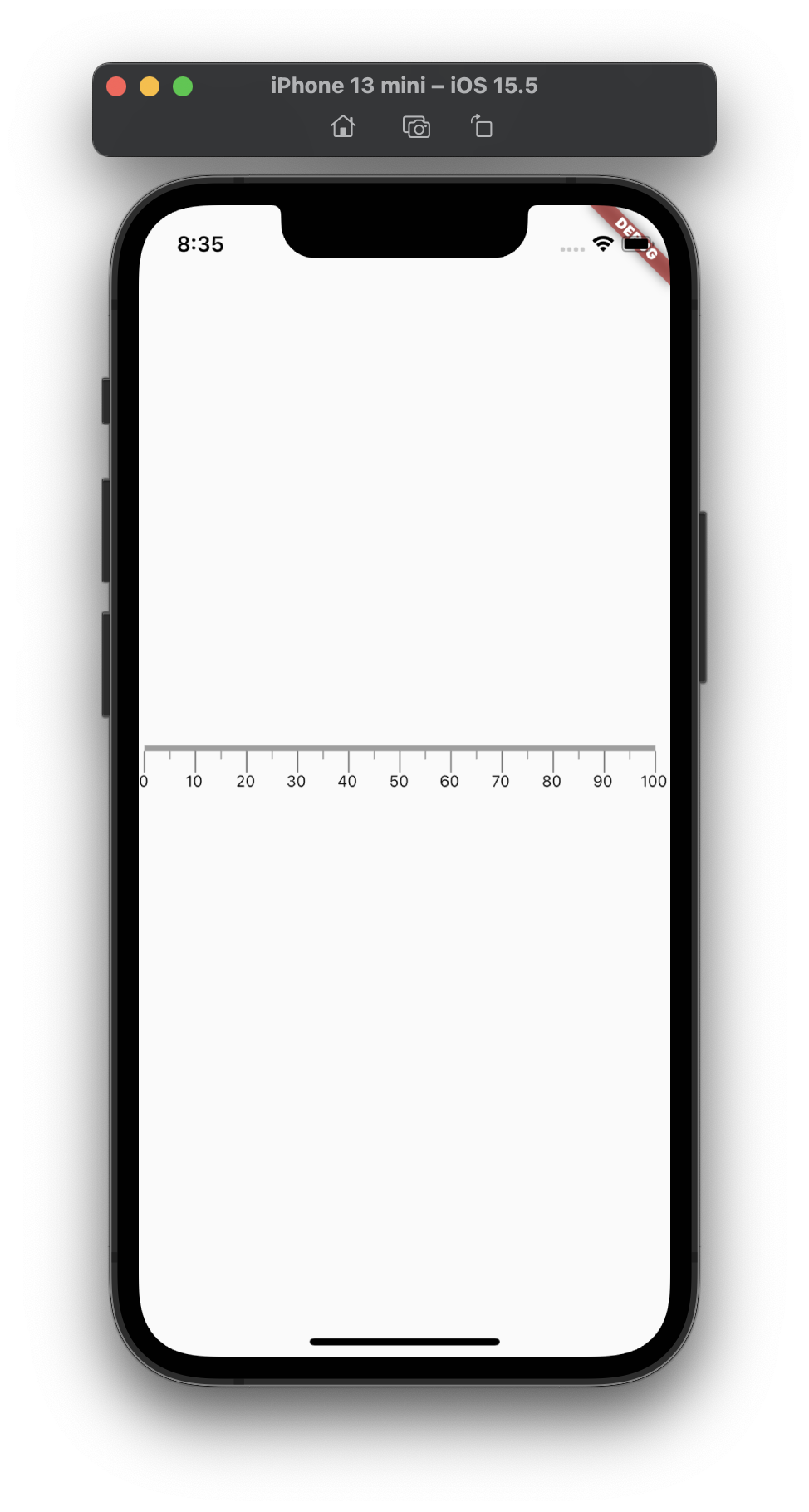
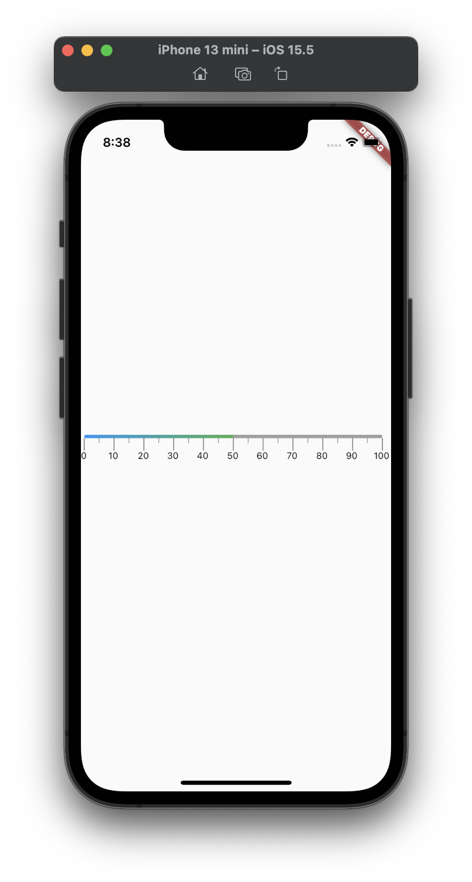
1. Default Styles
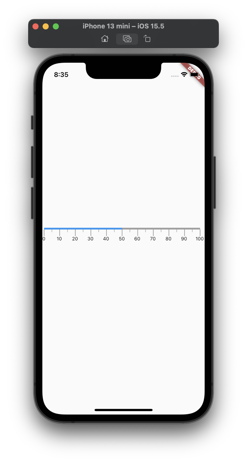
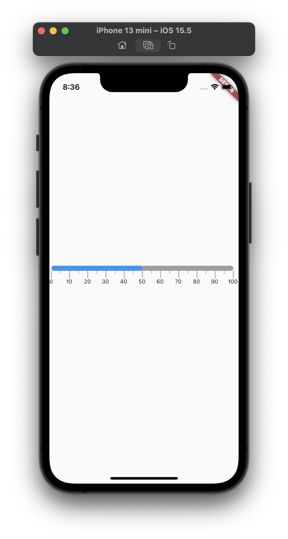
2. Value on Gauge with Border Radius
3. Higher label values with LinearGradient Color

4. Labels being adjusted depending on screen width

Public API's to customize the LinearGauge
| Properties | Description |
|---|---|
| start | Starts from the value given in double. It is Default to 0.0 |
| end | Ends at the value given in double. It is Default to 100 |
| Value | plots the value between the start and end on the LinearGauge. It is Default to 0 |
| steps | Increment the interval between Primary Labels with the given steps .Its Default to 0. The Intervals will be calculated automatically as per the device width Note displaying double values on label is not supported yet |
| showLinearGaugeContainer | Display or Hide the LinearGauge container with the help of given bool value. It is Default to true |
| gaugeOrientation | Sets the Orientation of the Gauge to Horizontal or Vertical with the help given GaugeOrientation value.It is Default to GaugeOrientation.horizontal, Note vertical is not supported yet |
| primaryRulersWidth | Sets the width of the Primary rulers from the value given in double. It is Default to 1.0 |
| primaryRulersHeight | Sets the height of the Primary rulers from the value given in double. It is Default to 15.0 |
| primaryRulersColor | Sets the color of the Primary rulers from the value given in Color. It is Default to Colors.black54 |
| secondaryRulersWidth | Sets the width of the Secondary rulers from the value given in double. It is Default to 1.0 |
| secondaryRulersHeight | Sets the height of the Secondary rulers from the value given in double. It is Default to 1.0 |
| secondaryRulersColor | Sets the color of the Secondary rulers from the value given in Color. It is Default to Colors.grey |
| labelTopMargin | Sets the margin from top using the value given in double. It is Default to 0.0 |
| linearGaugeBoxDecoration | Sets the style of linear gauge container from the given styles in linearGaugeBoxDecoration |
| secondaryRulerPerInterval | Increase or Decrease the number of secondary rulers to drawn between primary labels from the given value in double. It is Default to 1.0 |
Road Map
- Label Font Size.
- Label Font Color.
- Show/Hide Labels and Rulers.
- Padding for Gauge Container.
- Pointer for showing the Current Reading on Gauge.
- Vertical Linear Gauge.
- Label Placement on different sides.
- Animation for Linear Gauge