Formify
Formify is a Flutter library that simplifies form handling for developers. With Formify, you can quickly and easily create forms with customizable widget and strong validation.
Features
Formify provides a variety of features to help you create and manage forms, including:
- Customizable form generator. Formify provides a customizable form generator to create forms that meet your needs.
- Built-in validation. Formify provides a variety of common validation rules, such as email validation and number validation. You can also add custom validation rules.
- Error message handling. Formify will automatically display error messages if there is invalid input.
- Saving input values. Formify will store the input values in a single variable, so you can easily access them later.
By using Formify, you can save time and effort in creating and managing forms.
Usage
create a class that extends Family Forms, and prepare the attributes that will be used, you can use the following code:
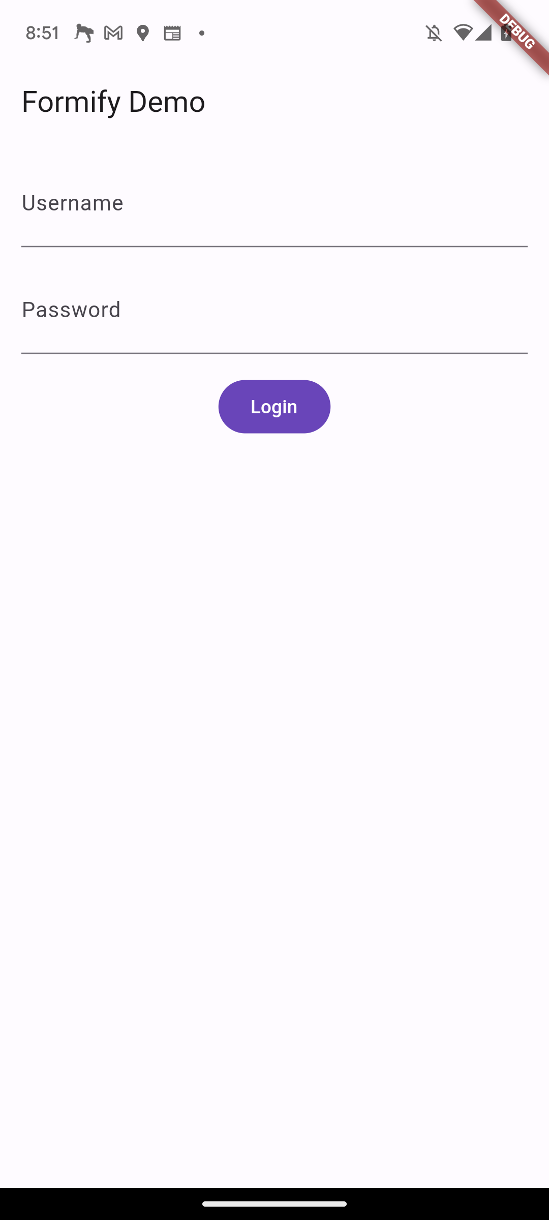
class FormDemo extends FormifyForms {
  @override
  Map<String, String> get attributes => {
    'username': 'text',
    'password': 'password',
  };
}
The getWidgets() method returns a list of widgets that represent the form fields. You can use this method to add the form fields to your app.
For example, the following code would add the form fields to a Column widget:
...
Column(
  children: formDemo.getWidgets(),
)
...
You can also use the spread operator (...) to add the form fields to other widgets. For example,
the following code would add the form fields to a Column widget:
...
Column(
  children: [
    ...formDemo.getWidgets(),
    FilledButton(
      onPressed: () {},
      child: const Text('Login'),
    ),
  ],
)
...
Attribute Types
class FormDemo extends FormifyForms {
  @override
  Map<String, String> get attributes => {
    'username': 'text',
    'password': 'password',
  };
}
This code defines a class called FormDemo that extends the FormifyForms class. The FormifyForms
class is a base class that provides common functionality for all form fields.
The attributes property is a map that maps attribute names to attribute values.
In this case, the username attribute is set to the value text and
the password attribute is set to the value password.
The FT class is a class that provides constants for the different types of form fields.
The constants in this class are in string form, so you can use them directly in the attributes property.
For example, the following code would set the username attribute to a text form field:
class FormDemo extends FormifyForms {
  @override
  Map<String, String> get attributes => {
    'username': FT.text,
    'password': FT.password,
  };
}
| Type | Description |
|---|---|
| text | The default type. It returns a generic TextFormField. |
| numeric | The keyboard that appears is a numeric keyboard. |
| password | The obscureText property is set to true. |
| The keyboard that appears is an email keyboard. | |
| multiline | The keyboard that appears is a multiline keyboard. |
| phone | The keyboard that appears is a phone keyboard. |
| name | The TextCapitalization property is set to TextCapitalization.words. |
Custom Label
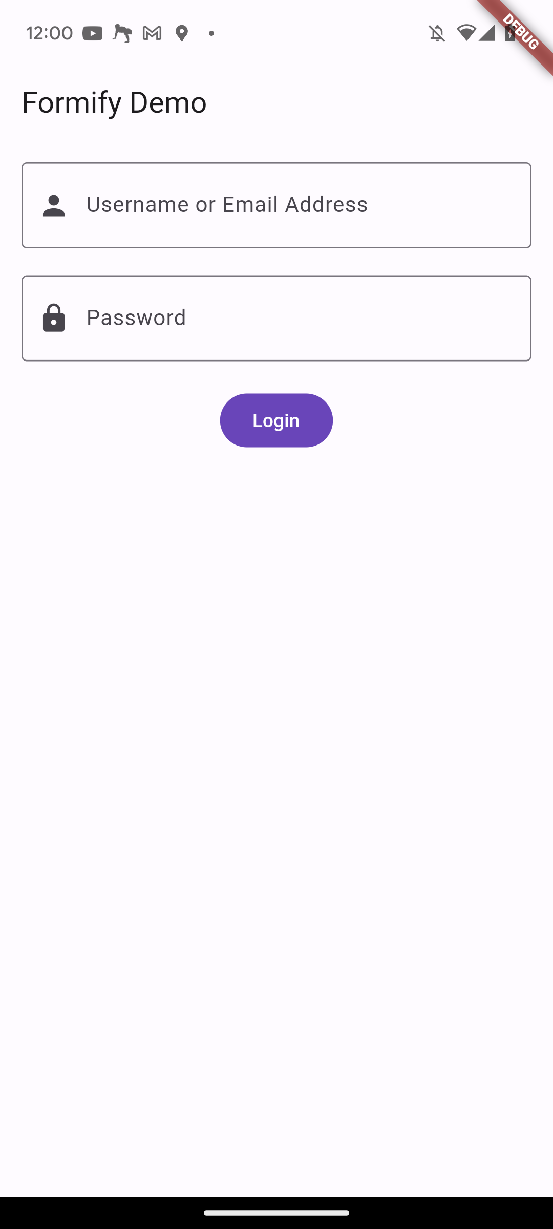
By default, the label that will be displayed on a text form field will take the key of the attribute that was previously created, with underscores replaced by spaces and the first letter capitalized. For example, if the attribute is fist_name, the label will be First Name.
You can also customize the label by adding the labels property, as shown in the following example:
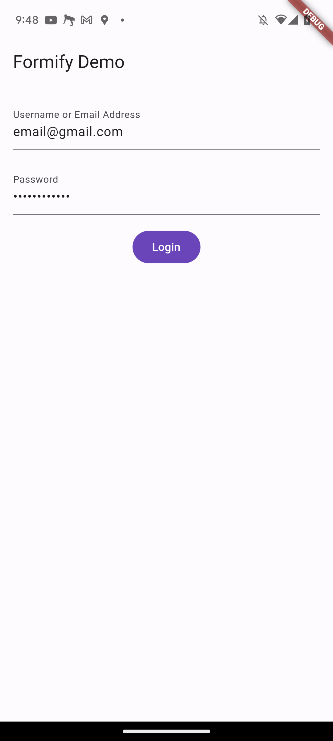
class FormDemo extends FormifyForms {
  @override
  Map<String, String> get attributes => {
    'username': 'text',
    'password': 'password',
  };

  @override
  Map<String, String> get labels => {
    'username': 'Username or Email Address',
  };
}
You don't need to define all of the attributes, just the ones you want to change.
Validation
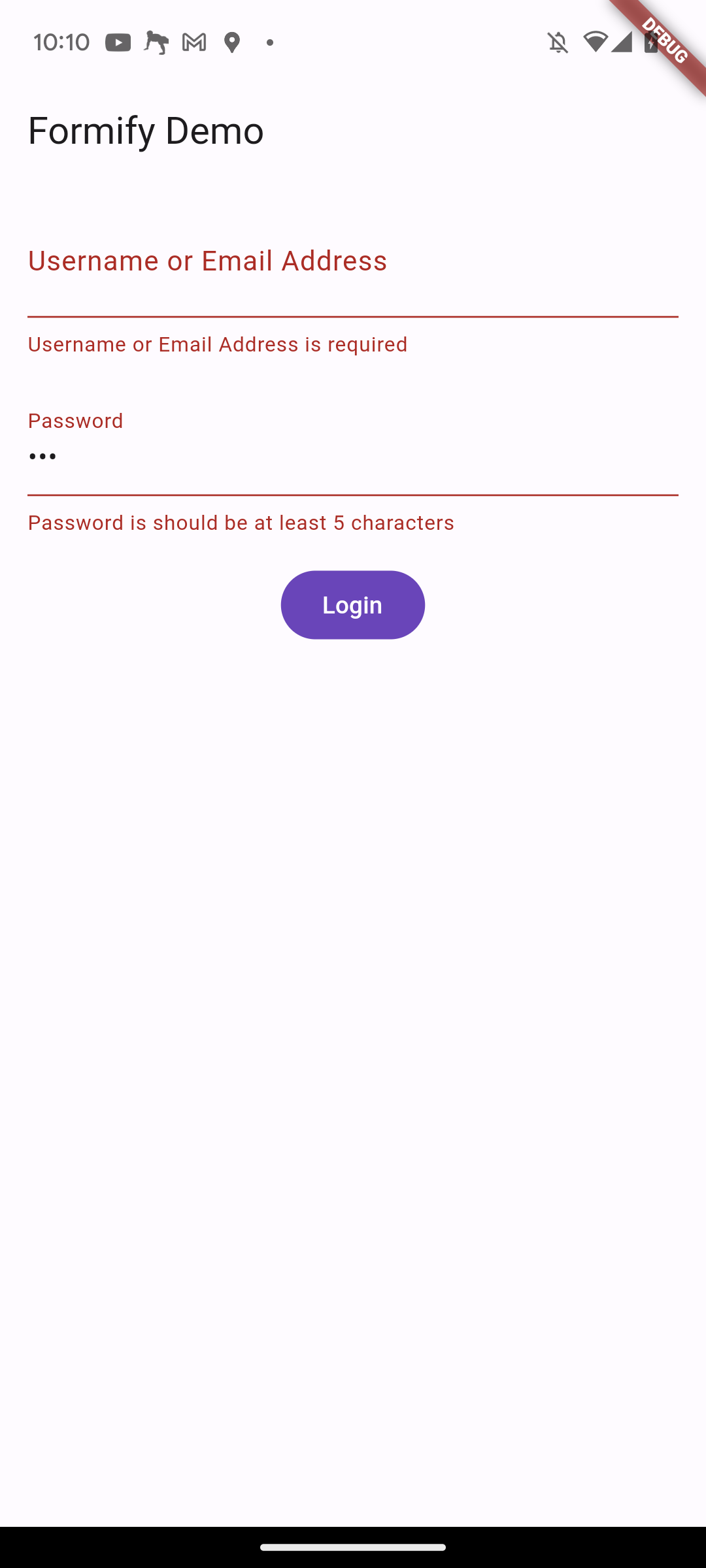
You can customize validation rules by adding the rules property, as shown in the following example:
...
@override
Map<String, List> get rules => {
  'username': ['required'],
  'password': ['required', 'min:5'],
};
In addition to using strings, you can also use the FR class.
The FR class is a class that provides constants for the different validation rules.
...
@override
Map<String, List> get rules => {
    'username': [FR.required],
    'password': [FR.required, FR.min(5)],
};
The rules property is a map that maps attribute names to a list of validation rules. In this example, the username attribute is required and the password attribute is required and must be at least 5 characters long.
If the user enters an invalid value for an attribute, an error message will be displayed. The error message will be customized based on the validation rule. For example, if the user enters an empty value for the username attribute, the error message will be "Username is required."
The following is a list of the available validation rules:
| Rule | Example | Description |
|---|---|---|
| required | 'required' or FR.required |
The field is required. The form will not be submitted if the field is empty. |
| numeric | 'numeric' or FR.numeric |
The field must be number. |
| integer | 'integer' or FR.integer |
The field must be integer. |
| double | 'double' or FR.double |
The field must be double value. |
| between | 'between' or FR.between(1, 2) |
The field must be a number between 1 and 2. |
| min | 'min:10' or FR.min(10) |
The field must contain at least 10 characters. |
| max | 'max:10' or FR.max(10) |
The field must contain at most 10 characters. |
| gt | 'gt:10' or FR.gt(10) |
The field must be a number greater than 10. |
| gte | 'gte:10' or FR.gte(10) |
The field must be a number greater than or equal to 10. |
| lt | 'lt:10' or FR.lt(10) |
The field must be a number less than 10. |
| lte | 'lte:10' or FR.lte(10) |
The field must be a number less than or equal to 10. |
| starts_with | 'starts_with:mr' or FR.starts_with('mr') |
The field must start with the value 'mr'. |
| ends_with | 'ends_with:S.Kom' or FR.ends_with('S.Kom') |
The field must end with the value 'S.Kom'. |
| same | 'same:good' or FR.same('good') |
The field must be the same as the value 'good'. |
| lowercase | 'lowercase' or FR.lowercase |
The field must be lowercase. |
| uppercase | 'uppercase' or FR.uppercase |
The field must be uppercase. |
| alpha_num | 'alpha_num' or FR.alphaNumeric |
The field must be string or number |
'email' or FR.email |
The field must be valid email address | |
| ip | 'ip' or FR.ip |
The field must be valid IP address |
| url | 'url' or FR.url |
The field must be valid URL |
| in | 'in:[you,me,they]' or FR.inItems(['you','me','they']) |
The field must one in the list |
| not_in | 'not_in:[you,me,they]' or FR.notInItems(['you','me','they']) |
The field must not one in the list |
| regex | 'regex:r"^dog"' or FR.regEx(r"^dog") |
The field must match regex expression |
You can also customize validation messages by adding the validationMessage property,
followed by the validation rule and the message. The system will replace the @attribute and @extra placeholders with the actual values.
...
@override
Map<String, String> get validationMessage => {
  'min': 'The @attribute must contain at least @extra characters.'
};
By default, Formify will automatically validate your input.
However, you can change this by adding the isAutoValidation property and setting it to false.
...
@override
bool get isAutoValidation => false;
Then, you can validate your form by calling the isFormValid() function. This function returns a bool,
which you can use to decide what to do next.
FilledButton(
  onPressed: () {
    if(formDemo.isFormValid()){
      //DO SOMETHING
    }
  },
  child: const Text('Login'),
),
Manual Error Message
You can manually set error message by call addErrorMessage, setErrorMessage, or setErrorMessages function, for example:
addErrorMessage append error message to existing list error message.
FilledButton(
  onPressed: () {
    formDemo.addErrorMessage('username', 'manual error message');
  },
  child: const Text('Login'),
),
setErrorMessage replace error message to existing one error message.
FilledButton(
  onPressed: () {
    formDemo.setErrorMessage('username', 'manual error message');
  },
  child: const Text('Login'),
),
setErrorMessages replace error message to existing list error message.
FilledButton(
  onPressed: () {
    formDemo.setErrorMessages('username', ['manual error message', 'manual error message too']);
  },
  child: const Text('Login'),
),
Customize Form Widget (InputDecoration)
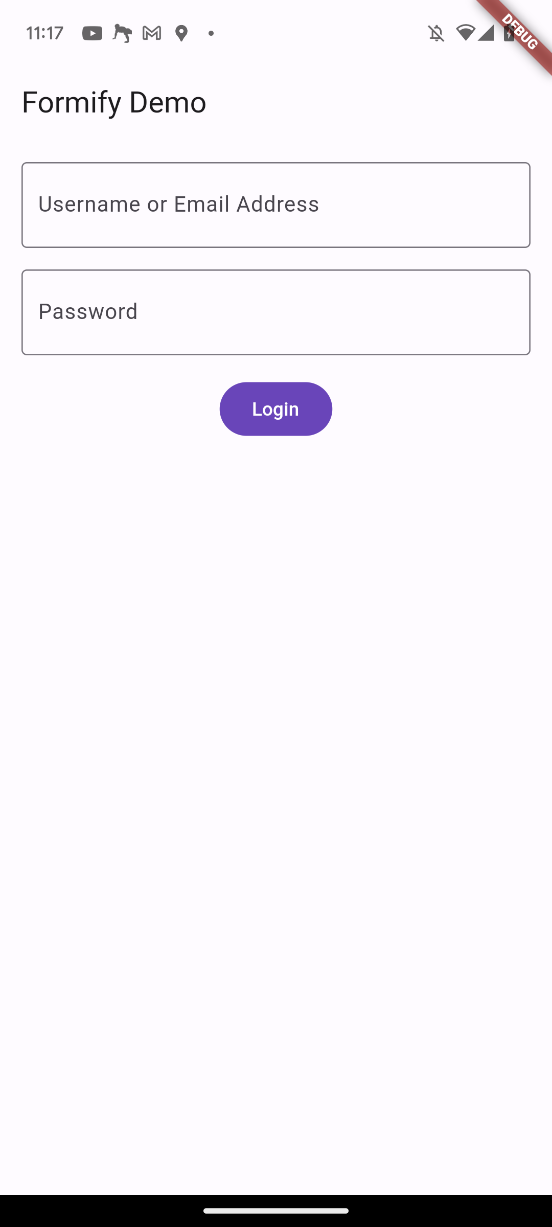
You can customize your text form field by adding the inputDecoration property and setting it to your desired values.
@override
InputDecoration? get inputDecoration =>
    const InputDecoration(
      border: OutlineInputBorder(),
      focusedBorder: OutlineInputBorder(
        borderSide: BorderSide(color: Colors.purple),
      ),
    );
Customize Form Widget (formBuilder)
If you want to customize more deeply, you can do so by adding the formBuilder property.
The form builder is a function that returns a widget and takes three parameters:
BuildContext, Formify object, and FormifyTextField widget.
The Formify object allows you to get the following values:
attribute: The attribute key of the fieldlabel: The label of the formvalue: The value that has been enterederrors: The error values in a list of strings, if anyerror: The error value in a stringformKey: The GlobalKeyisLoading: A boolean value that indicates if the form is in a loading state. This is typically used to make the form readonly when it is loading.onChanged: function that can update the value of your form.
The FormifyTextField widget is a custom widget contain TextFormField widget.
Because of that you can change its properties by using the copyWith().
the properties almost identical with TextFormField.
For example, if you want to make two different prefix icons for the username and password fields,
you can modify the FormifyTextField with the copyWith() method and return it.
@override
FormifyFormBuilder? get formBuilder => (
    BuildContext context,
    Formify formify,
    FormifyTextField child,
) {
  if (formify.attribute == 'username') {
    return child.copyWith(prefixIcon: const Icon(Icons.person));
  }
  if (formify.attribute == 'password') {
    return child.copyWith(prefixIcon: const Icon(Icons.lock));
  }
  return child;
};
formBuilder allows you to create a completely new widget.
The formBuilder function will be called whenever there is a change in the value, loading state,
or error state for any of its attributes.
Customize Form Separator Widget
Formify separates the form with a SizedBox with a height of 16. If you don't think this is suitable,
you can modify it by adding the separatorBuilder property, as shown in the following example:
@override
FormifySeparatorBuilder? get separatorBuilder => (
  BuildContext context,
  Formify formify,
  Widget child,
) {
  return const SizedBox(height: 20);
};
Initial Value
Let's say in the case of an edit form, you will need an initial value to fill in the initial value of your form. You can do this in two ways.
set initial value once at a time.
@override
void initState() {
  super.initState();
  formDemo.setInitialValue('username', 'thisismyusername');
}
set initial value once in bulk.
@override
void initState() {
  super.initState();
  formDemo.setInitialValues({
    'username': 'thisismyusername',
    'password': 'password',
  });
}
Libraries
- constants/fr
- constants/ft
- constants/fv
- extensions/string_extensions
- formify
- formify_forms
- rules/_base_validator
- rules/alpha_numeric
- rules/between
- rules/double
- rules/email
- rules/ends_with
- rules/gt
- rules/gte
- rules/in
- rules/integer
- rules/ip
- rules/lowercase
- rules/lt
- rules/lte
- rules/max
- rules/min
- rules/not_in
- rules/numeric
- rules/regex
- rules/required
- rules/rules
- rules/same
- rules/starts_with
- rules/uppercase
- rules/url
- widgets/formify_text_field